

You might find filters popping up everywhere — from flight booking websites to e-commerce apps, they’ve become a must-have feature in any search experience, helping users quickly cut through endless lists of options to find exactly what they need.
Filters also play a crucial role in data-rich environments like SaaS dashboards, where users work with complex datasets daily. A well-designed dashboard filter UX helps users quickly surface the information they need, streamlining the data-driven decision-making process.
However, designing a filter system that fits your product isn’t as simple as dropping in a few checkboxes. It takes thoughtful consideration of user needs, use cases, and product context to create a seamless, frustration-free experience.
In this blog, we’ll dive into the world of Filter UX Design: Exploring why it matters, the common filter methods and UI UX patterns in SaaS products, and the best practices to build filters that truly work for your users.
Filter UX design is the practice of creating effective filtering tools within a user interface, enabling users to narrow down data lists and quickly find the information they’re looking for. It plays a vital role in enhancing search efficiency and supporting better decision-making, particularly in data-heavy environments like SaaS dashboards, e-commerce platforms, and booking systems.
In SaaS platforms, filters aren’t just a nice-to-have feature; they’re essential for helping users navigate large datasets, complex workflows, and dynamic content.
Here are 5 key reasons why filter UX design matters:
Filters don’t just vary in how they look; they also differ in how users interact with them. Depending on the dataset size, system load, and user behavior, SaaS products choose different filtering interaction models to balance speed, control, and performance.
Below are 3 commonly used filtering methods, along with filter UX design examples of LinkedIn:
Live filtering automatically updates results in real-time as soon as a user selects or deselects a filter option—no need to click an “Apply” button. This approach works best when datasets are lightweight and system response times are fast, making it ideal for scenarios where users want to explore freely and see immediate feedback without committing to a final selection.
Example: On LinkedIn’s search page, if you switch between search types like Posts, People, or Companies, the results update immediately without needing an extra click.
Per filtering allows users to apply filters one category at a time, giving them control over how each group of filters impacts the results. This approach works best when filters are clearly organized into distinct groups and when it’s helpful for users to see the effect of each category separately. It strikes a balance between instant updates and user control, preventing the system from reloading results for every small selection across all categories.
Example: On LinkedIn’s connection search, if you filter by Industry, Company, or School, each time you adjust a filter, you need to confirm that change by clicking “Show results” before proceeding to other filters.
Batch filtering allows users to select multiple filters across different categories first, then apply them all at once with a single “Apply” or “Search” action. This is ideal when filters are complex or when applying each filter individually would trigger expensive database queries. By batching the selections, the system processes the query only once, improving performance and efficiency.
Example: LinkedIn’s “All filters” option lets users select multiple fields (such as Job Title, Location, and Years of Experience) before clicking Apply to load results all at once.
When designing filter experiences in SaaS products, choosing the right UI UX filter pattern is key to helping users interact with the data efficiently. Each filter type serves a specific purpose, supporting different user needs and data contexts.
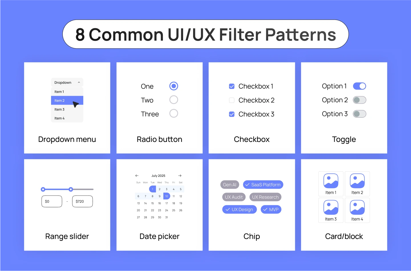
Below are 8 widely used filter UX patterns and how they function in SaaS design interfaces:
You might want to explore: Best Practices for Data Visualization in SaaS Products
Below are key UX practices that can help your SaaS filters UI UX design work smarter and feel smoother for your users:
As users explore different filter combinations, they often want a quick way to reset their search. Manually deselecting each filter option can be tedious, especially when multiple filters are applied across different categories. By offering a visible “Clear All” button, you provide a simple escape hatch that resets the entire filter set in one action.
This not only saves users time but also encourages them to explore your content more freely, knowing they can easily revert back to the full results whenever needed.
When users apply filters, they want immediate clarity on how those filters affect their search results. Showing the number of matching items helps users gauge whether their selections are too broad, too narrow, or just right.
Placing this information near the filters — or integrating it into the Apply button — allows users to make adjustments before they commit to viewing results. This reduces unnecessary page loads and helps prevent frustration from dead-end searches with zero results, ultimately streamlining the discovery process.
Filtering and sorting serve different yet complementary purposes in search experiences. While filters remove unwanted results based on strict criteria, sorting organizes the remaining items according to user preferences, such as price, popularity, or recency.
Some users hesitate to use filters because they fear accidentally excluding relevant options. By providing both filtering and sorting, you empower users to fine-tune their search without the risk of missing out. This combination supports both expert users who know exactly what they need and exploratory users who are still figuring out their preferences.
Once users start applying multiple filters, it’s easy for them to lose track of what’s active. That’s why it’s important to display applied filters in 2 places: directly in the filter controls (e.g., highlighted checkboxes) and in a centralized overview area. This overview gives users a clear summary of their current search criteria. By making it easy to see and remove active filters at a glance, you also reduce confusion and help users stay in control of their search journey.
When filter UI UX options are presented as an unstructured list, it becomes difficult for users to scan and find what they need. Grouping related filters into categories — such as size, brand, or price — creates a more organized and approachable interface. This structure helps users navigate quickly, reducing the time they spend hunting for specific criteria. In addition, using visual dividers and spacing between groups enhances readability, guiding the user’s eye and reducing cognitive load.
When a filter category contains dozens of options (e.g., brands, locations, or product types), the scrolling experience becomes inefficient and frustrating. Adding a search box within the filter panel allows users to type in a few letters and instantly find the specific option they need. A search field within filters not only speeds up the filtering process but also makes the overall experience feel more responsive and thoughtful.
When users interact with filters, their goal is to quickly narrow down results and find what they need. Forcing them to select options and then manually click an “Apply” button after each change slows down the process and disrupts their flow. Instead, auto-applying filters—where results update instantly as users make selections—create a smoother, faster experience.
This live filtering approach gives immediate feedback, helping users adjust their choices in real-time without extra clicks. It’s most effective in cases where the system can process updates quickly, improving usability and encouraging exploration without frustrating delays.
You might want to explore: The Power of Progressive Disclosure in B2B SaaS UX Design
In this blog, we’ve uncovered how essential thoughtful filter UX design is—especially in SaaS, where data complexity can overwhelm users. When designed well, this feature empower users to quickly pinpoint vital insights, make informed decisions, and feel in control of their data workflows.
If you’re looking for expert guidance on crafting an impactful SaaS product design, Lollypop is here to support. As a globally recognized SaaS UX design agency, we specialize in crafting intuitive, user-centered solutions that drive engagement and business growth.
Get in touch with us for a FREE consultation and see how we can transform your SaaS platform design into something your users will love.
Filtering and sorting both help users manage data, but they serve different purposes. Filtering narrows down a dataset by showing only items that match specific criteria, helping users focus on the most relevant results. Sorting, on the other hand, organizes the entire dataset in a chosen order—such as by price, date, or popularity—without removing any items. Together, filtering reduces what you see, and sorting arranges how you see it.
The choice between multi-select and single-select depends on the nature of the options and user intent. Use multi-select when users may need to choose multiple items at once, such as selecting several product categories or tags. Use single-select when only one option makes sense at a time, like selecting a payment method or sorting order. The key is to match the selection type with how users naturally approach the decision.
The choice between vertical and horizontal filters depends on the product layout and the number of filter options. Vertical filters (on the side) work best when there are multiple filter groups or complex options, providing space and clarity. Horizontal filters (above the results) are ideal for simpler filters and when screen space is limited. For data-heavy SaaS platforms, vertical filters are more common as they handle complexity better and support scalability.
Effective SaaS filter design UX follows five key principles. First, simplicity and clarity ensure users quickly understand and use filters without confusion. Second, responsiveness and feedback help users see the impact of their choices instantly. Third, prioritization highlights the most important filters upfront, hiding less-used options. Fourth, flexibility and control let users easily reset or adjust their selections. Finally, visibility and accessibility ensure filters are easy to find and interact with, creating a smooth and helpful experience.


