

In today’s data-driven world, businesses have access to massive datasets to uncover patterns and drive smarter decisions. But data alone isn’t enough—it needs to be clear, accessible, and actionable to create real value.
That’s where dashboard designs comes in. A great dashboard design helps transform complex data into meaningful insights, enabling businesses to track performance, identify trends, and make informed decisions—all at a glance.
However, not all dashboards are effective. Poor design can overwhelm users, hide key insights, and lead to missed opportunities. That’s why understanding how to design a dashboard is essential for businesses to maximize their data’s potential.
In this article, we delve into dashboard design, discovering its fundamental definition, common types, considerations with quicksight dashboard design tips for an intuitive UI.
Ready to dive in? Let’s get started!
Dashboard design refers to the process of creating a visual interface that presents key data, metrics, and insights in an organized and easily digestible format.
With vast amounts of data available, processing information can feel overwhelming. Dashboard design UI simplify this by filtering relevant data and displaying it visually, making complex information easier to understand. By presenting insights effectively, dashboards help users monitor performance, track trends, and make informed decisions with ease.
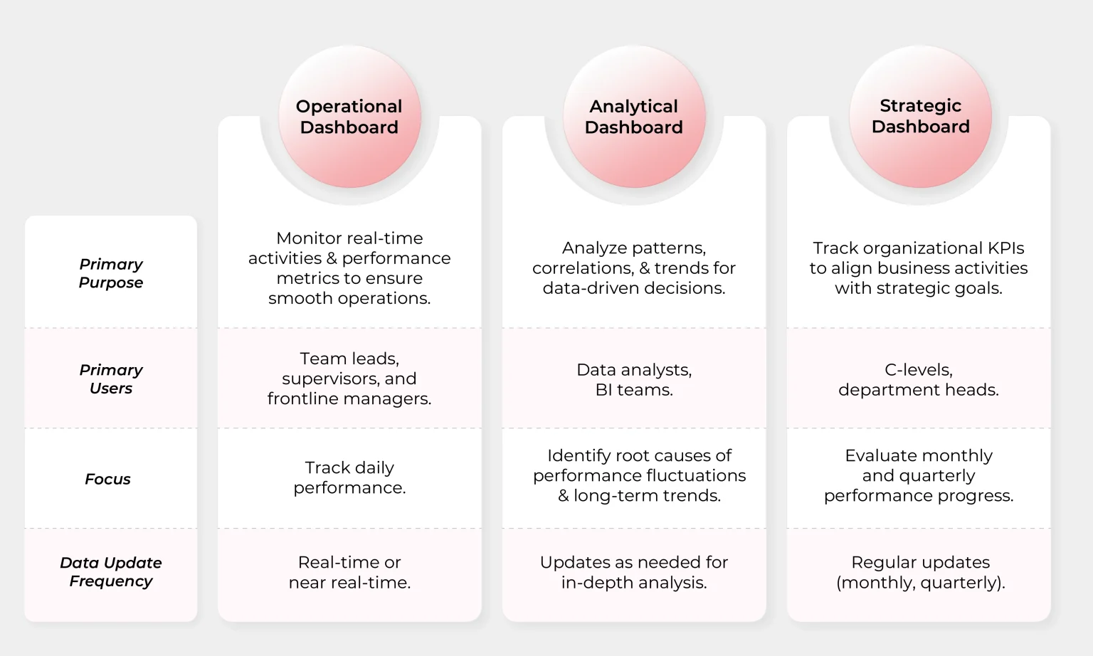
Operational dashboards provide real-time data to monitor ongoing activities and ensure smooth daily operations. These dashboards update frequently, offering a live view of critical metrics to help teams identify and address issues promptly.
Key Characteristics:
Key metrics to track: Real-time website traffic (active users, session duration), Customer support performance (ticket volume, response time), Inventory & Order fulfillment (stock levels, shipment status).
Analytical dashboards focus on historical data to uncover patterns, identify trends, and support long-term decision-making. These dashboards help businesses analyze large datasets and generate insights that drive strategic improvements.
Key Characteristics:
Key metrics to track: Sales trends (monthly revenue, conversion rates), Customer retention & churn (repeat purchase rate, churn percentage), and Marketing performance (ROI, cost per acquisition).
Strategic dashboards provide a high-level overview of business performance, focusing on Key Performance Indicators (KPIs) that align with long-term goals. Designed for C-levels, department heads, or senior managers, these dashboards present insights clearly and concisely to guide strategic planning.
Key Characteristics:
Key metrics to track: Company-wide KPIs (revenue growth, market share), operational efficiency (cost reduction, productivity rate), employee engagement (retention, satisfaction score).
A UI design dashboard is only effective when it serves its users’ needs. To design a truly user-centric dashboard, it’s essential to understand who the users are, what their goals are, and how they will interact with the dashboard daily.
Different user roles may require different data types, detail levels, and functionality. For example, executives might need high-level KPIs at a glance, while analysts require deeper data exploration. Identifying pain points, such as information overload or missing key insights, helps ensure that the dashboard provides meaningful, actionable data rather than just displaying numbers.
Actionable Tips:
A well-structured dashboard directs users’ focus to the most important information first. Without a clear visual hierarchy, users may struggle to find key insights, leading to wasted time and confusion. By using size, color, contrast, and spacing strategically, designers can create a natural flow that enhances readability and decision-making. Prioritizing essential data while minimizing distractions ensures a seamless user experience.
Actionable Tips:
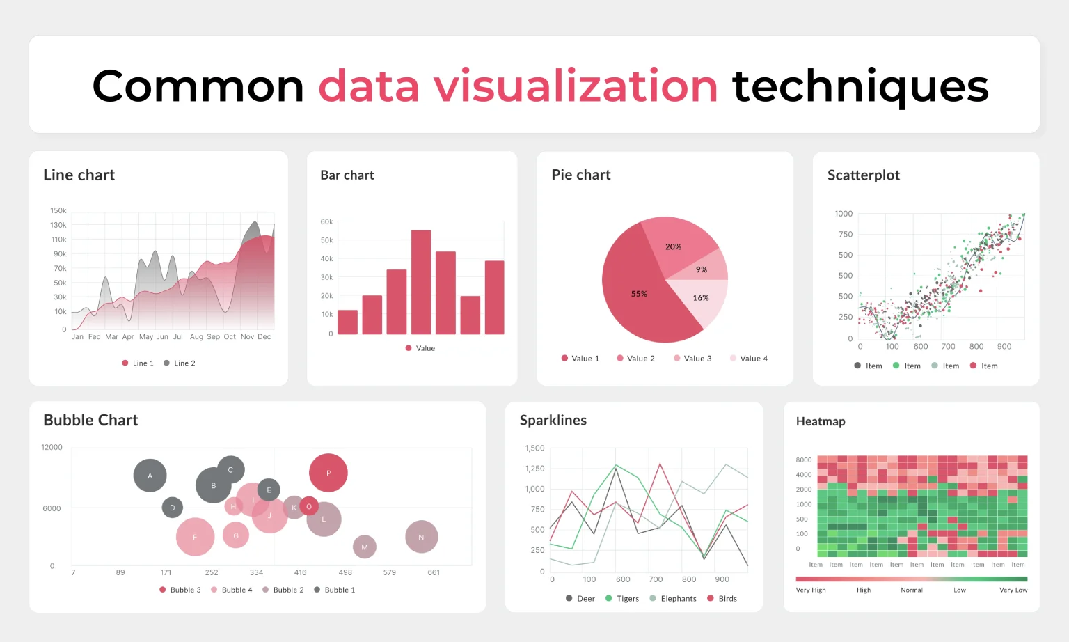
When creating a dashboard ui design, choosing the right data visualization method is key to make information clear and easy to understand. Each type of chart serves a different purpose, and using the wrong one can lead to confusion or misinterpretation. The goal is to simplify complex information, highlight key trends, and make comparisons easy for users.
Some commonly used data visualization techniques include:
Data alone doesn’t tell the full story—without context, numbers and charts can be misleading or difficult to interpret. A well-designed dashboard should provide users with explanations, comparisons, and trends that make the information meaningful and actionable. Context helps users understand not just what the data is, but why it matters and how it connects to overall goals.
For example, if a sales dashboard shows that revenue for the month is $100,000, is that good or bad? Users may struggle to draw accurate conclusions without additional context—such as a comparison to previous months, a target goal, or industry benchmarks. Labels, tooltips, trend indicators, and benchmarks help eliminate confusion and improve decision-making.
Actionable Tips:

Color is a powerful tool in modern dashboard design—it guides attention, improves readability, and conveys meaning beyond just aesthetics. When used effectively, color helps users interpret data quickly and navigate the interface effortlessly. However, poor color choices can cause confusion, mislead users, or reduce accessibility.
Understanding color psychology, contrast, and hierarchy ensures a seamless user experience where information is clear and easy to digest.
Actionable Tips:

A consistent UI dashboard design improves usability by making interactions predictable and intuitive. When elements like layout, colors, typography, and icons are uniform, users don’t have to spend extra time figuring out how to navigate. Inconsistent designs force users to relearn the interface, leading to frustration and inefficiency. A structured, standardized approach ensures a smoother user experience and faster data interpretation.
Actionable Tips:
A flexible dashboard adapts to diverse user needs, allowing individuals to personalize their view based on roles, preferences, or tasks. Customization enhances usability by enabling users to surface relevant metrics, rearrange components, or toggle between data visualization styles.
Without this flexibility, users may struggle with irrelevant information, reducing efficiency and engagement. Providing intuitive customization options ensures that the dashboard remains functional across different workflows and experience levels.
Actionable Tips:
In this blog, Lollypop – A Terralogic Company – has shared seven key UI design considerations along with essential tips for crafting an intuitive information dashboard design. A well-designed dashboard goes beyond merely displaying data—it can tell a story, empowering you to recognize patterns, uncover hidden insights, and make informed decision.
Need expert guidance on designing an intuitive dashboard to maximize the potential of your database? Our UI design experts at Lollypop Design Studio are here to support you. As a leading UI/UX design company, we go beyond aesthetics —we focus on UX research to uncover real user needs and apply UI UX Design principles to create tailored solutions that align with specific businesses.
Contact us today for a FREE consultation and discover how to create the best dashboard design version tailored to your business needs!
A well-designed dashboard is crucial for businesses as it provides a clear, intuitive, and data-driven overview of key metrics, enabling informed decision-making. A good dashboard enhances efficiency by presenting complex data in a visually digestible format, reducing the time spent analyzing reports. It improves collaboration by offering real-time insights and ensuring all stakeholders are aligned. Additionally, a user-friendly design enhances accessibility, allowing users to interact with data effortlessly, identify trends, and take timely action, ultimately driving better business performance.
An enterprise dashboard design should be intuitive, scalable, and data-driven, delivering real-time insights for quick decision-making. It must have clear data visualization for easy understanding, customization options for different user needs, and seamless integration with business tools like CRM and ERP. Strong security ensures data protection with role-based access, while optimized performance allows smooth handling of large datasets without delays.
An app dashboard design is optimized for mobile and tablet interfaces, prioritizing a compact layout, touch-friendly elements, and efficient navigation due to limited screen space. It often includes simplified visuals, collapsible menus, and gesture-based interactions to enhance usability on smaller screens. In contrast, a website dashboard design is built for larger screens, allowing for more complex data visualization, multi-column layouts, and detailed interactions like hover effects and drag-and-drop functionality. Websites also leverage keyboard shortcuts and extensive tooltips, whereas apps focus on responsive design and adaptive components to ensure seamless functionality across different devices.


