

Do you think Search Bar Design is a simple process?
At first glance, designing a search bar seems straightforward. But when you dive into the details, it quickly becomes more complex! Let’s take Netflix as an example.
When users log in to Netflix, they’re searching for something to watch. However, with an extensive and ever-growing content library, navigating through thousands of options manually would be overwhelming. How does Netflix help users find what they want?
The answer lies in its dynamic search bar. Positioned in the homepage’s top-right corner, the search bar allows users to explore content based on mood, genre, language, actors, or directors, making discovery more intuitive. Netflix’s algorithm also analyzes search patterns, viewing history, and trending content to generate real-time suggestions. In addition, search results are enhanced with visual thumbnails and quick previews, allowing users to make faster decisions without needing to open multiple pages.
And this is just the case with Netflix! While a search bar should maintain its core components, it must also be tailored to the specific business needs and user behaviors.
In this blog, we’ll dive deep into search bar design—exploring best practices and providing actionable tips to create an effective search experience.
A search bar, also known as a search box or search field, is an input field on a website or application that allows users to enter keywords or phrases to find relevant information, products, or content quickly. It enhances navigation by retrieving results based on user queries, improving accessibility and efficiency in exploring a platform.
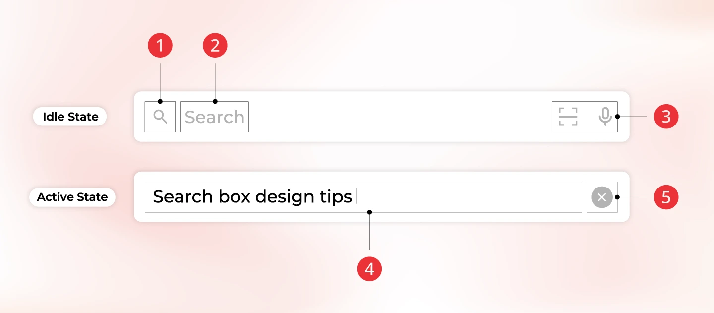
The search feature operates in two main states, including (1) Idle State where no interaction occurs; and (2) Active State which is triggered when users engage with the search bar.
At its most basic level, a search bar consists of 5 key components:
Learn more about UI/UX design concepts and processes to expand your knowledge and apply them to your projects.

Users have developed a strong expectation of where search bars should be located based on their experiences with popular websites and applications. Placing the search bar in an unexpected position can lead to frustration, reduced engagement, and increased bounce rates.
Note:

A search box that is too short can cut off user queries, making it difficult to read or edit text, while an excessively long one may take up unnecessary space. The ideal input field size should accommodate common search queries without requiring excessive scrolling or typing in a confined space. A well-sized search field enhances usability, ensuring users can enter their queries comfortably without frustration.
Note:
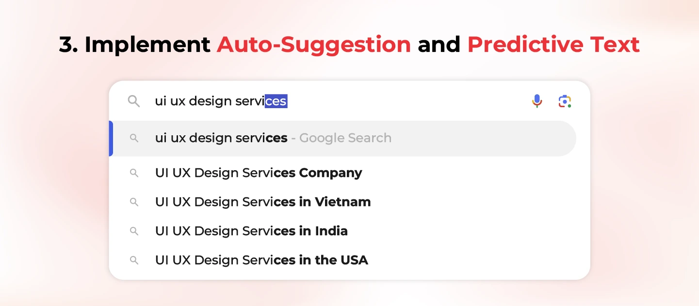
Auto-suggestion and predictive text enhance the search experience by offering real-time query recommendations as users type. Auto-suggestion displays commonly searched terms, while predictive text anticipates and completes user queries, reducing typing effort and errors. These features improve search efficiency, guide users toward relevant results, and enhance engagement.
Note:
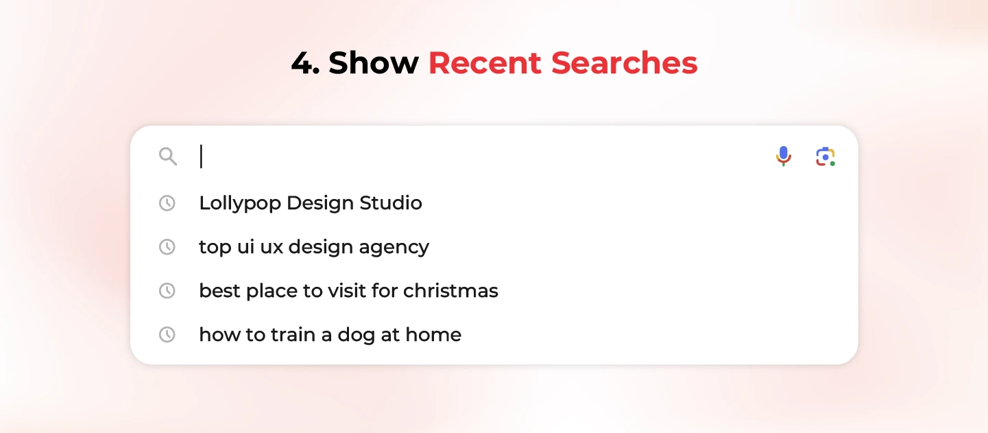
Displaying recent searches allows users to quickly revisit previous queries without retyping, improving efficiency and user experience. This feature is especially useful for returning users who frequently search for similar items, saving time and effort. It also helps users stay engaged by reminding them of their past interests.
Note:
Filters and sorting options help users refine their search results, making it easier to find relevant items. Search filter UI Design narrows down results based on specific criteria (e.g., price, category, brand) while sorting organizes them by relevance, popularity, or date. These features enhance usability by reducing search fatigue and improving navigation.
Note:
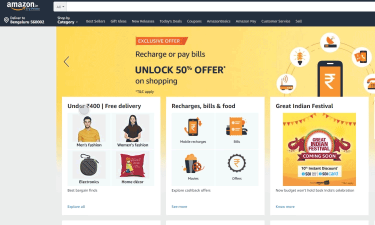
Search box design examples: Amazon
Further information: SEO vs GEO vs AEO: The Future of Search Optimization in 2025
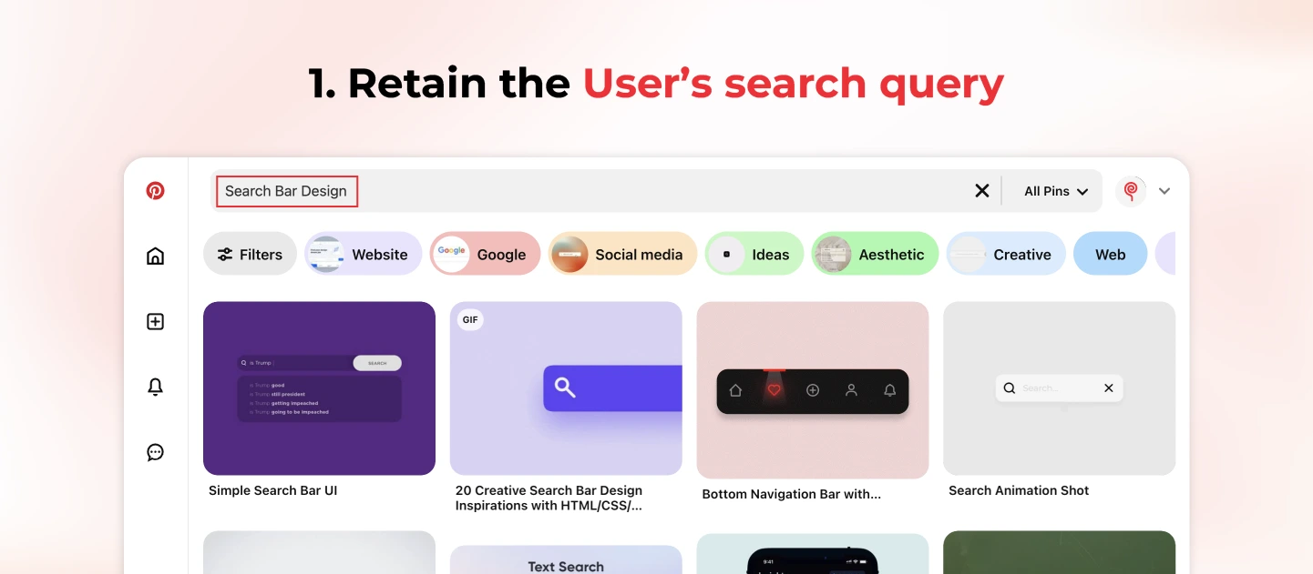
Data shows that users rarely get the perfect search results on their first attempt. They often refine their queries by adjusting keywords, changing phrasing, or correcting typos to find more relevant results. If the original query disappears after the search is executed, users are forced to retype everything from scratch, leading to frustration and inefficiency. Hence, keeping the search query visible allows users to quickly modify their input without extra effort, improving the overall search experience.
Note:
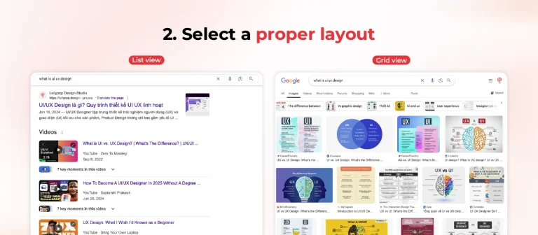
Different types of content require different presentation styles to enhance readability and usability. A well-structured layout ensures that users can quickly scan, compare, and comprehend the information presented without unnecessary effort.
For instance, a text-heavy search result benefits from a list view, which aligns text neatly for easy reading. Conversely, a grid layout is more effective for image-based or product-related searches, where visual previews are essential for quick decision-making.
Note:

Showing the total number of search results helps users assess the scope of their query and decide whether to refine or browse further. It provides clarity, sets expectations, and improves navigation by indicating the volume of available content. Users can quickly determine if they need to adjust their search terms or use filters to narrow down results.
Note:

With decreasing attention spans, users expect fast and responsive search experiences. When results take time to load, a visible progress indicator reassures users that the system is actively processing their requests. This reduces frustration, prevents premature abandonment, and keeps users engaged.
Note:

Encountering a “No Results” page can be frustrating, especially when users have already attempted multiple searches. Instead of presenting a dead end, provide helpful alternatives to keep users engaged and guide them toward relevant content. By offering suggestions such as alternative keywords, related searches, or trending topics, you improve search success rates and reduce user frustration. Additionally, spelling corrections or autocomplete can help users refine their queries, ensuring they find what they need without unnecessary effort.
Note:
You may want to read more: Top 7 Best AI Search Engines for Website Optimization in 2025
Throughout this blog, we’ve explored essential search field design tips to create a seamless search experience. In today’s digital landscape, even the most straightforward design elements—like a search bar—are designed with careful consideration of user behavior in mind. Otherwise, you risk frustrating users and missing valuable opportunities to boost conversions.
Need expert guidance on search box optimization, or how to improve User Experience (UX) for your digital product? Our experts at Lollypop Design Studio are here to help. As a leading UI/UX design company, we go beyond aesthetics—focusing on UX research to identify real user pain points, applying proven design principles for a stunning visual hierarchy, and integrating technical feasibility into every solution.
Contact us today for a FREE consultation and discover user-centered mobile app design & development solutions tailored to your business needs!
Placeholder text is a short, descriptive hint displayed inside an input field (such as a search bar or form field) to indicate what type of information users should enter. It disappears when the user starts typing and is typically used to provide examples or clarify the expected input.
A great design search bar should be prominently placed, easy to locate, and highly responsive. It should feature clear placeholder text to indicate its function, provide real-time autocomplete suggestions, and support typo tolerance for better UX. The design should allow filtering and sorting options, handle natural language queries, and prioritize relevant results based on user behavior.
Other search formats include voice search (e.g. Google Assistant, Apple Siri,…), which allows users to find information using spoken queries; reverse image search (e.g. Google Images, Bing Visual Search,…), which identifies similar or related images based on an uploaded picture; image pattern recognition (e.g. Google Lens), which detects objects, text, or patterns within an image; and music recognition search (e.g. Shazam, SoundHound,…), which identifies songs by analyzing audio clips. These advanced search methods enhance accessibility and accuracy, catering to diverse user needs.
An e-commerce search bar is designed to help users find specific products and often includes advanced features like auto-suggestions, filters, sorting options, and AI-driven recommendations to enhance the shopping experience. In contrast, a traditional website search bar typically focuses on retrieving informational content, such as articles or FAQs, and may have simpler functionality without extensive search and filter UI or product-based results.


