Designers frequently encounter a common UX dilemma: Users expect powerful tools with a wide range of features to meet their diverse needs, yet they also demand simplicity and ease of use!
Balancing these expectations is especially challenging in SaaS products, where rich functionality is essential but can lead to a cluttered interface. When users are confronted with too many options at once, it can result in cognitive overload—slowing them down, causing confusion, and ultimately leading to frustration or drop-off.
This is where Progressive Disclosure becomes a powerful design technique. Instead of exposing all features and options upfront, it shows only the most essential information at first, and reveals more advanced details as users engage deeper. This allows new users to get started without confusion, while still giving experienced users access to the depth they need.
In this blog, we’ll explore progressive disclosure definition, why it matters, the key UI patterns it involves, and how it can be effectively applied in SaaS design.
Progressive disclosure is a UX design technique that reduces cognitive load by gradually revealing information as users move through an interface.
Introduced in 1995 by Jakob Nielsen, co-founder of the Nielsen Norman Group, this approach was designed to help users avoid errors in complex systems. By presenting content step-by-step, progressive disclosure UX allows users to focus on one task at a time, making complicated processes feel more manageable and less overwhelming.
Types of Progressive Disclosure:
Progressive disclosure prevents users from being overwhelmed by too much information at once. According to Cognitive load theory (Sweller, 1988), the human brain can only process a limited amount of information at a time. By deferring non-essential details and focusing attention on what’s immediately relevant, designers help users make decisions with less mental effort. This is especially important in SaaS applications, where users often face complex workflows or unfamiliar features.
By revealing functionality gradually, users can explore features in manageable stages. It creates a smoother learning curve for beginners, enabling them to build confidence without being forced to understand every function upfront.
For experienced users, progressive disclosure ensures they aren’t slowed down by irrelevant details. By removing clutter and only showing actionable elements when needed, users can locate and complete tasks faster.
By structuring interactions in logical, progressive steps and showing only valid or relevant inputs, users are less likely to make mistakes. This supports Nielsen’s usability heuristics principle of “preventing errors”. Progressive disclosure enforces constraints and guidance, reducing the chance of misconfigurations or incorrect data entry.
Progressive disclosure is most effective when an interface contains information or functionality that would otherwise overwhelm users. Instead of exposing every option at once, designers reveal additional content only when it becomes relevant to the user’s current task.
You should consider using progressive disclosure when:
Multi-step registration, onboarding, or checkout forms become easier to complete when users focus on one section at a time.
Enterprise platforms often include dozens of tools. Displaying advanced settings only when needed helps new users learn the product without intimidating them.
Dashboards can initially present key metrics while allowing users to drill down into detailed reports through expandable cards, filters, or interactive charts.
Limited screen space makes progressive disclosure particularly valuable. Hidden navigation, bottom sheets, accordions, and expandable sections help maximize usability without overcrowding the interface.
Applications with beginner and expert users can present essential options first while keeping advanced configurations accessible on demand.
Successful progressive disclosure is not simply about hiding information. It requires presenting the right information at the right moment in a user’s journey.
Display only the information users need to complete their current task.
Additional options should appear only when they become relevant through user interaction.
Users should never lose their place when expanding additional information.
Buttons such as “Show More,” “Advanced Settings,” or expandable sections should clearly communicate what users can expect.
Novice users benefit from simplified interfaces, while experienced users should still be able to access advanced functionality efficiently.
In reality, UX Progressive Disclosure is applied in various UI Patterns. In this section, let’s explore 7 common UI Patterns and use cases, along with progressive disclosure examples of a Human Resource Management System (HRMS).
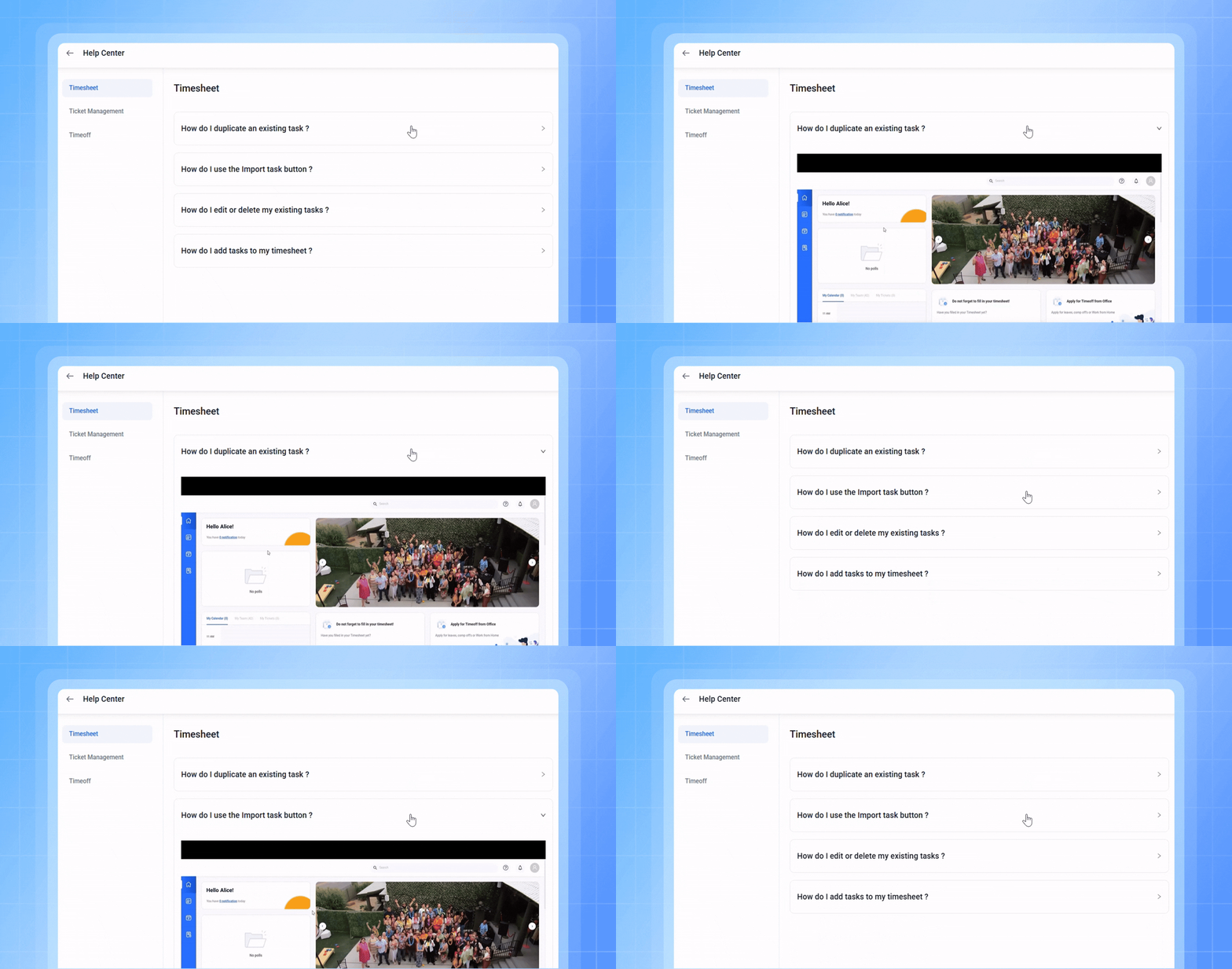
An accordion is a vertically stacked list of expandable headers that show or hide content when clicked. It helps reduce visual clutter and cognitive load by presenting information only when the user needs it.
Example of Accordion: The video recording above shows a “Raise ticket” screen, where employees can report an issue by filling out a form. When selecting a “Support Team” or “Query Type,” additional sub-options remain hidden until the user clicks the dropdown.
Use cases in SaaS:
A stepper guides users through a process one step at a time, simplifying complex tasks by dividing them into manageable stages. This helps users stay focused and reduces the risk of errors.
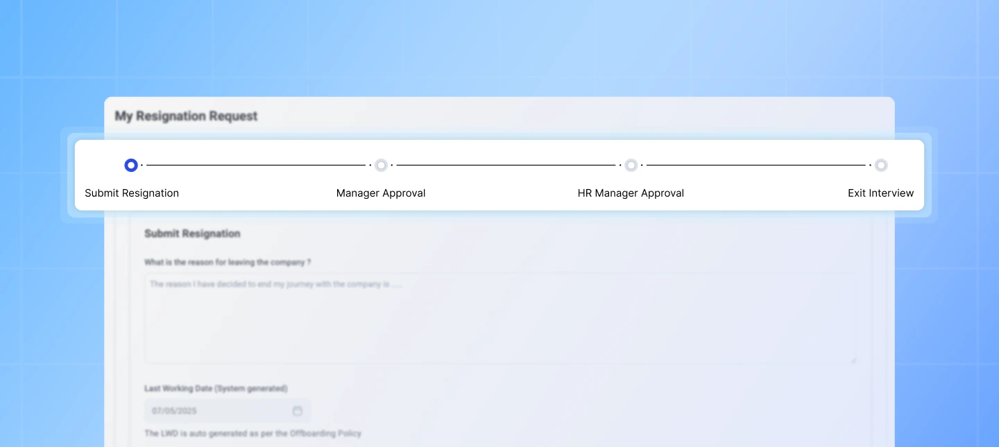
Example of Stepper: The image above displays a “Resignation” screen where employees can submit a resignation request to their manager. A stepper visually guides users through the four key stages of the process—Resignation submit, Manager approval, HR approval, and the final exit interview, making it easy to understand progress and next steps.
Use cases in SaaS:
Tabbed interfaces divide content into labeled sections, displaying only one section at a time. This keeps interfaces clean and makes it easy to switch between related content without scrolling.
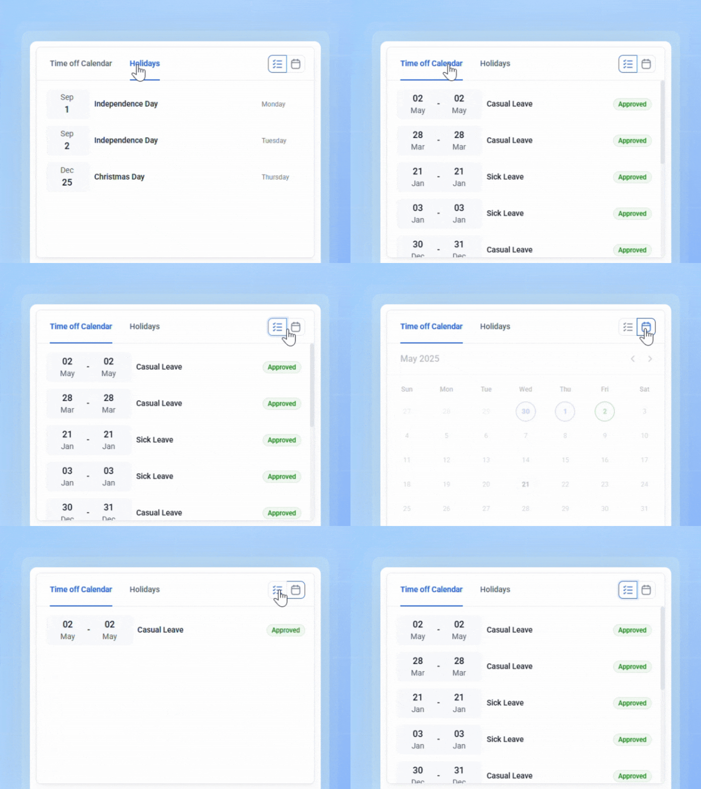
Example of tabs: In the video recording above, the “Time Off Calendar” and “Holidays” are organized into 2 separate tabs. This allows users to view previous leave requests without being distracted by public holidays, and vice versa—helping them quickly find the information they need based on context.
Use cases in SaaS:
Read more: The Ultimate Guide to Tab Design – Anatomy, Types, and Tips
Scrolling allows users to view long or dynamic content in a continuous flow. It reduces the need for multiple clicks and works well for information that’s meant to be consumed in sequence or volume.
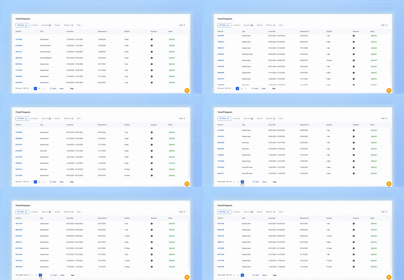
Example of Scrolling: The video recording above shows a “Time Off Requests” screen displaying recent requests. As the user scrolls down, older requests are progressively loaded and revealed.
Use cases in SaaS:
Menus consolidate navigation or actions into a compact structure, enabling users to find and access features without cluttering the interface.
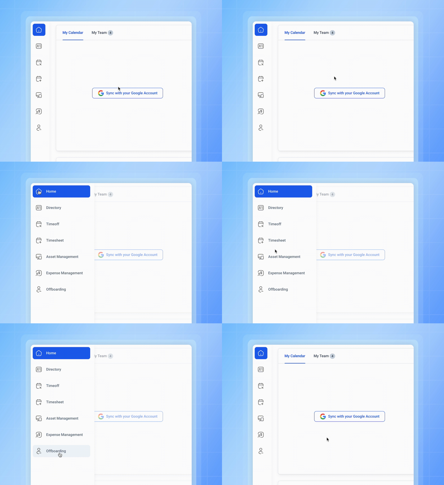
Example of Menus: The video recording above shows a side menu that expands when the user hovers over the home symbol, revealing the meaning of each symbol and providing navigation labels for easier access.
Use cases in SaaS:
You may want to read more: Anatomy of an Effective SaaS Navigation Menu Design
Tooltip-on-Demand provides contextual help or explanations when users hover over or click specific icons or text. It supports user learning without interrupting the flow of interaction.
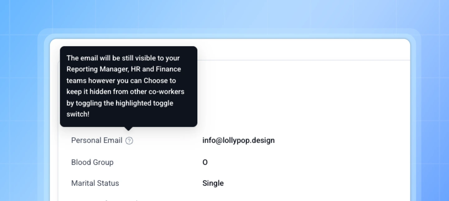
Example of Tooltips: The image above shows a “Profile” screen where a tooltip appears when the user hovers over the question mark icon. It explains who can view the user’s personal email and informs them that this information can be hidden.
Use cases in SaaS:
Modals and popups are overlays that appear temporarily to display additional options, actions, or alerts. They prevent users from losing context while offering deeper control.
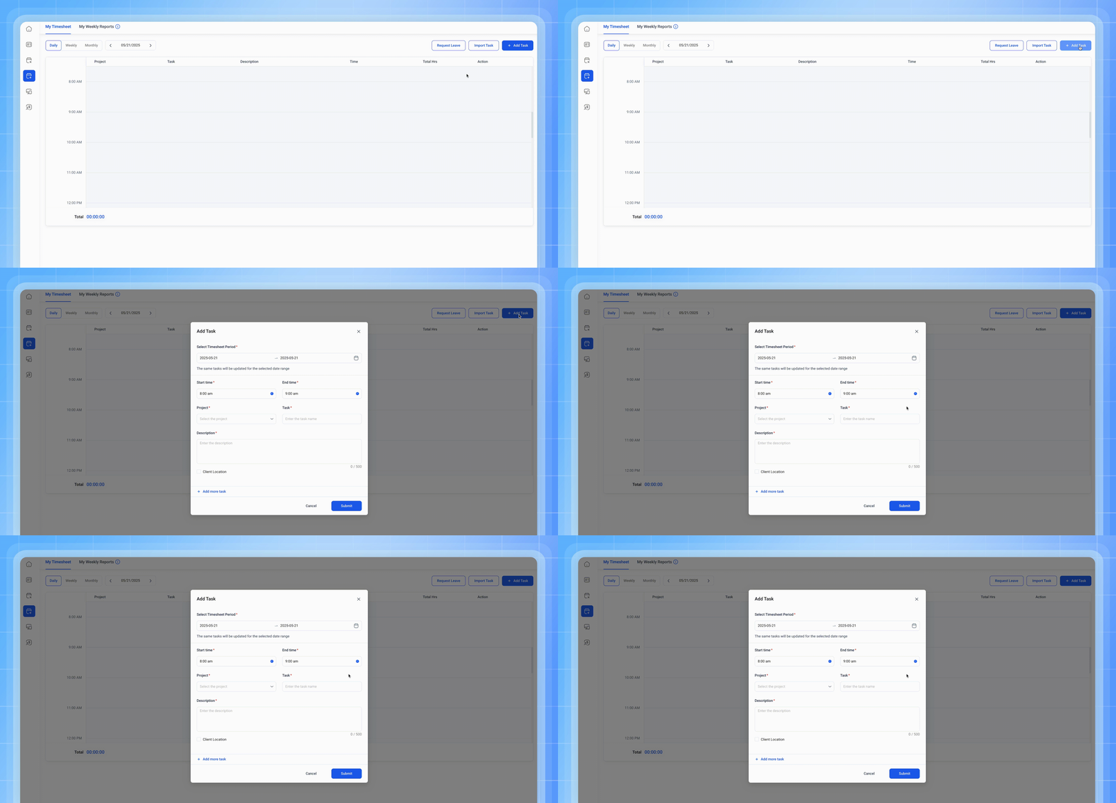
Example of Popup: The video recording above shows a “Timesheet Submission” screen where employees log their work hours. When the user clicks the “Add Tasks” button, a popup appears, allowing them to enter the tasks completed during the week without navigating away from the main screen.
Use cases in SaaS:
Although progressive disclosure simplifies interfaces, poor implementation can create confusion rather than clarity.
Users should never be forced to search for information required to complete essential tasks.
Too many layers of menus or expandable sections increase navigation effort and reduce discoverability.
Buttons and links should clearly indicate what additional information or actions will appear.
Opening unnecessary modal windows or redirecting users away from their current task interrupts the experience.
Expanding dozens of new controls simultaneously defeats the purpose of progressive disclosure.
Progressive disclosure is often confused with other interaction patterns, but each serves a different purpose.
Through this blog, you’ve explored the critical role of progressive disclosure in crafting user-friendly experiences—especially within the complexity of SaaS products. When applied effectively, progressive disclosure in SaaS UX Design reduces friction, enhances usability, and helps users focus on what matters most.
If you’re looking for expert guidance on crafting an impactful SaaS product, Lollypop is here to support. As a globally recognized SaaS UX design agency, we specialize in creating intuitive, user-centric designs with trendy SaaS design techniques that drive business growth.
Reach out to us for a FREE consultation and discover how we can enhance your SaaS user experience.
Progressive disclosure is a UX design technique that reduces cognitive load by gradually revealing information as users move through an interface
Progressive disclosure reveals interface complexity over time, whereas progressive onboarding introduces product features and guidance to help new users become familiar with an application.
Yes. When implemented correctly, progressive disclosure reduces cognitive load, improves task completion, lowers error rates, and creates a smoother learning experience for both novice and experienced users.