

If you’re building a SaaS product or a CRM system, chances are you’ve worked with data tables — one of the most common ways to present structured information.
For UX/UI designers, building an effective data table design isn’t simple. The challenge is creating a layout that stays compact while still allowing users to quickly scan information, understand relationships, and take action efficiently.
In many products, tables can contain hundreds or even thousands of rows. At that scale, the design must do more than just display data. Without a clear structure and thoughtful interaction patterns, large tables can quickly become cluttered and difficult to use.
In this guide, we’ll explore the anatomy of a great data table design, the common challenges of working with large datasets, and practical best practices to help make complex tables easier to navigate and interact with.
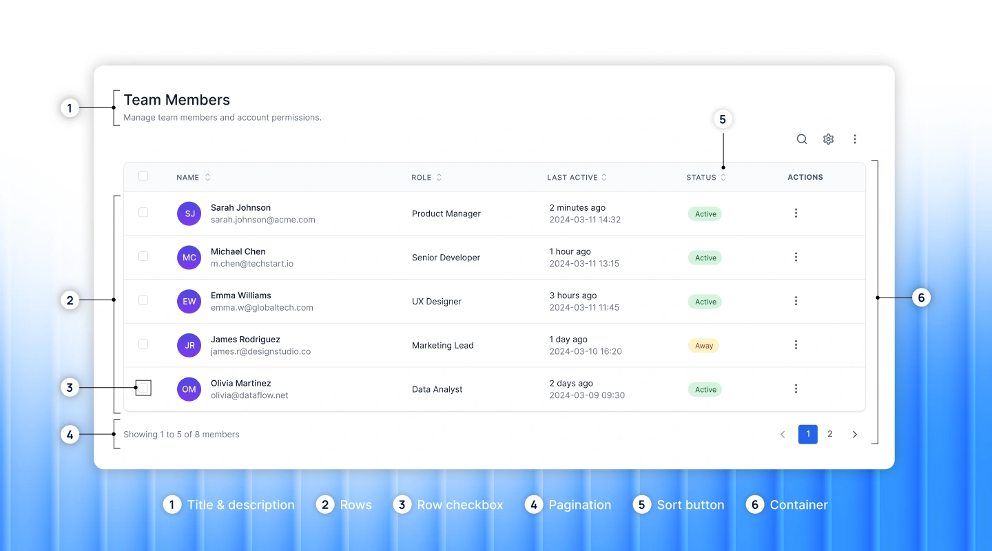
A good data table design should organize information clearly and help users quickly scan data. Below are the key components of an effective table UX design.
Building a data table design with a large dataset introduces a different level of complexity. A CRM system is a good example — sales data, contact details, and communication history all need to live in one place. When a table contains thousands of rows, maintaining performance, clarity, and ease of navigation becomes much harder.
Below are common challenges in data table UX design:
Before jumping into the UI design, it’s helpful to step back and answer a few key questions. These considerations will guide many of the decisions you make when structuring the table.
When designed thoughtfully, data tables can turn complex datasets into information that’s easy to scan, understand, and act on. A well-structured table helps users quickly find what they need, compare values, and perform actions without friction.
Below are 7 best practices to help you design tables that are clear, efficient, and user-friendly in SaaS products.
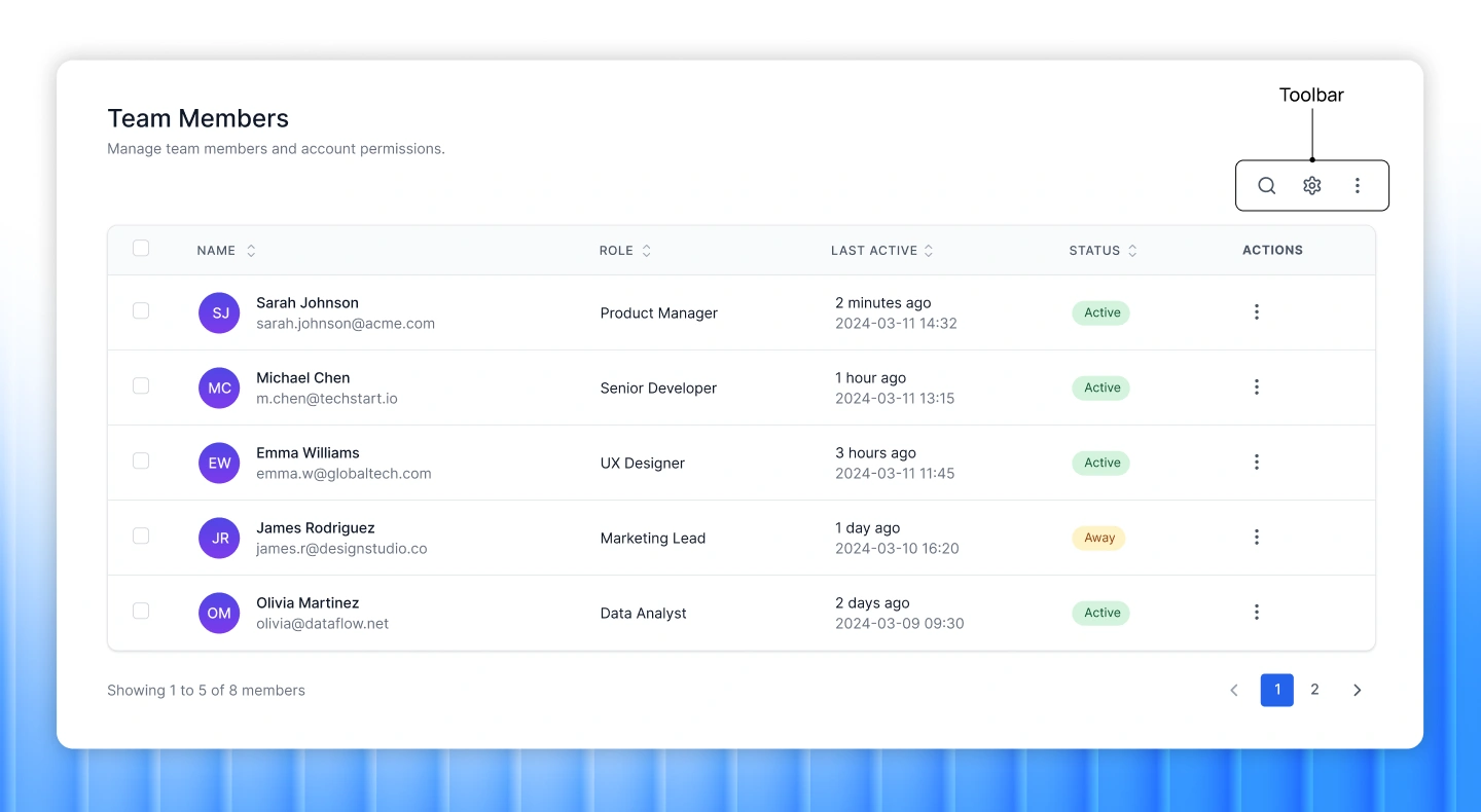
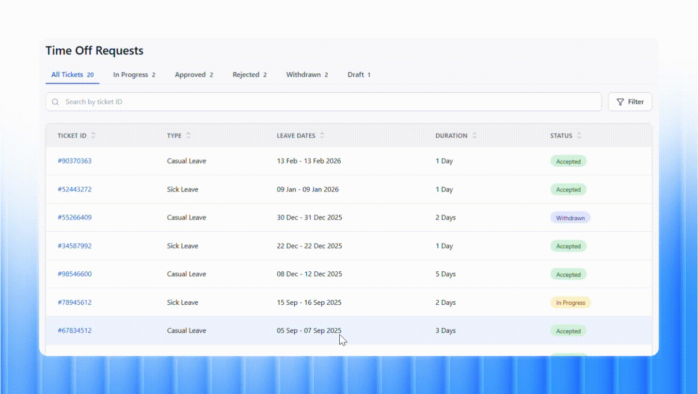
Placing a toolbar above the table can greatly improve usability by giving users quick access to essential actions.
A well-designed toolbar typically includes features such as search bar, filter UX design controls, sorting, exporting, and printing. These tools help users quickly locate specific data, organize information based on different criteria, and easily save or share the results.
By centralizing these controls in one place, toolbars make large datasets easier to navigate and significantly improve the overall usability of the table.
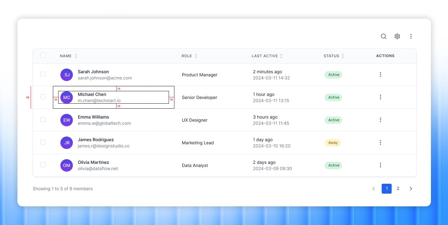
Row height plays an important role in how easily users can read and scan table data. Common row sizes include condensed (40px), regular (48px), and relaxed (56px).
Condensed rows allow more information to fit on the screen and reduce scrolling — useful in complex table UI design where showing more rows at once is critical. However, in most cases, regular or relaxed heights provide a better reading experience.
In addition to row height, proper spacing improves clarity. Maintain at least 16px padding on both the left and right of each column, ensuring a minimum of 32px between columns to keep the layout clean and readable.

Subtext is an effective way to provide extra information without adding more columns or cluttering the table layout. It can be used to display secondary details directly beneath the primary content in a cell.
For example, instead of creating separate columns for a user’s name and email, the email can appear as subtext below the name. This approach keeps tables compact while still giving users access to relevant information at a glance.
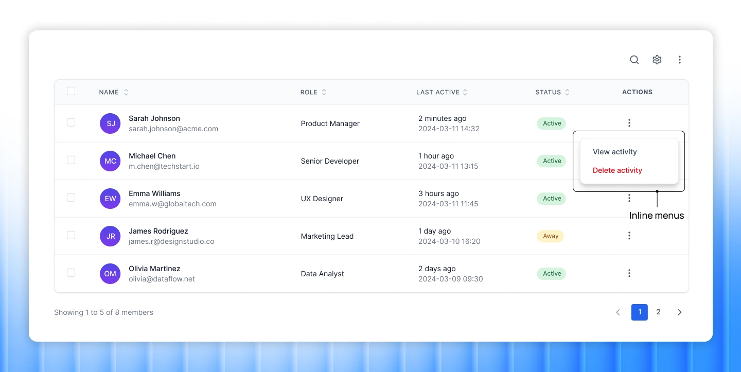
When rows require multiple actions, inline menus offer a clean and space-efficient solution. Actions can be hidden behind a kebab (three-dot) menu, allowing users to access options such as edit, duplicate, or delete without overcrowding the table with buttons. This design reduces visual clutter and keeps the focus on the data itself.

Sorting and filtering are essential for managing large datasets. Without them, navigating a complex table can quickly become overwhelming.
Users should be able to sort rows alphabetically, numerically, or chronologically, in both ascending and descending order. In more advanced cases, custom sorting criteria can help tailor the table to specific workflows or data types.
Combined with filtering, these features allow users to quickly narrow down results and view data in the way that is most useful to them.
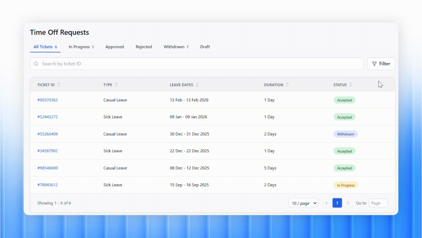
Tables often contain many rows with similar visual structures, making it easy for users to lose track of where they are. A hover state can highlight a row when the cursor moves over it, typically through a subtle background color change. This helps users follow data across the row and interact with specific entries more confidently.
When users select rows for bulk actions, the selected rows should stand out clearly. Instead of relying only on a small checkbox, using a noticeable background color or highlight makes the selection much easier to recognize.
Instead of splitting tables into multiple pages, a Load more button or infinite scrolling can create a smoother browsing experience by gradually revealing additional rows.
Infinite scrolling works well when users need continuous access to large datasets without interruption. However, it also has limitations. Since pages are not clearly defined, users may find it harder to return to previously viewed data, and the total amount of data may not be immediately clear.
Explore more: Progressive Disclosure UI Patterns & Use Cases in SaaS
When designing tables for large datasets, it’s important to balance usability, performance, and clarity. Start by understanding the user’s goals and the purpose of the table. From there, apply clear design principles to ensure the data is structured and easy to navigate. With the help of features such as bulk editing, pagination, or advanced filtering, you can build data tables that handle complex information while remaining efficient and user-friendly.
If you’re looking for a UI/UX design partner to elevate your product experience, Lollypop Design Studio is here to help. As a specialized saas design agency, Lollypop works with product teams to turn complex information into simple, intuitive, and scalable experiences. From onboarding ux flows to feature-rich dashboards, every design decision focuses on improving clarity, usability, and long-term product performance.
Schedule a free consultation to explore how strategic UX design can reduce cognitive load, increase user engagement, and support your product as it scales.
Table UX design refers to the practice of designing data tables so users can easily read, scan, and interact with structured information. Good table UX design focuses on clarity, organization, and usability, so users can quickly find information, compare values, and perform actions like sorting or filtering without confusion.
Data table UI design plays a crucial role in SaaS products because tables are often the main interface for viewing and managing large datasets. If a table is poorly designed, users struggle to understand the data or complete tasks efficiently. A well-designed table improves readability, supports quick data visualization design, and enables users to take actions smoothly.
Designing effective tables UI UX design can be challenging because they must present complex information in a limited space while remaining easy to understand. Designers need to balance readability, functionality, and performance. Additional challenges include responsive table design UX across devices, supporting actions like sorting and filter UX design without cluttering the interface, and ensuring the table stays clear as more data and features are added.


