
A polished ecommerce website can still make shopping difficult. Customers may arrive knowing exactly what they want, browse with no specific product in mind, compare several options, or need more information before they are ready to buy. The challenge is not simply making the interface easy to use. It is helping customers make progress at each point in the buying journey.
That is why ecommerce website design is about more than creating an attractive storefront. It is about understanding what customers are trying to accomplish, what questions they need answered, and what might prevent them from moving forward.
A useful way to think about that journey is: Discover → Evaluate → Decide → Purchase
Every interaction should help customers move through these stages with less uncertainty. Navigation should help them find what they need. Product pages should answer the questions that stand between interest and purchase. Trust signals should make expectations clear. Checkout should make the final transaction predictable and easy to complete.
This article explores the UX principles behind effective ecommerce website design, the role of each key page, how product and checkout experiences can reduce friction, and why ecommerce UX needs to change depending on what customers are buying and how they make decisions.
Good ecommerce UX starts with understanding what customers are trying to accomplish—not simply what the business wants them to click.
The goal is not simply to move every visitor toward the same “Buy Now” button. Someone browsing a new category has a different need from someone searching for a specific product, while a B2B buyer may need to compare suppliers, request a quote, or involve several stakeholders before making a decision.
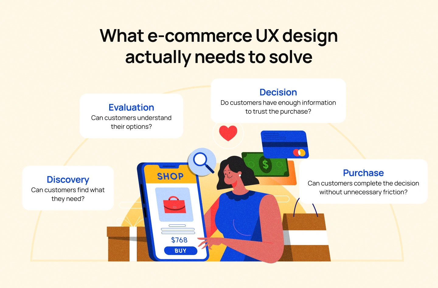
Across these different journeys, ecommerce UX needs to solve four fundamental problems.
Discovery begins with the structure of the store.
Navigation, category architecture, search, filters, sorting and recommendations all determine how easily customers can move from a broad need to a relevant product. A large catalog can quickly become overwhelming when these systems are poorly organized.
Search is especially important for high-intent customers. Someone who already knows what they are looking for should not have to navigate through several layers of categories to reach it.
The design challenge is to reduce the distance between what the customer wants and what the experience helps them find.
Finding a product is only the beginning.
Customers need enough information to determine whether it actually meets their needs. Depending on the product, that could mean specifications, dimensions, compatibility, materials, reviews, imagery, size information or comparisons with alternatives.
This is where ecommerce design moves beyond navigation and into decision support.
A product card that looks attractive but communicates very little may encourage clicks without helping customers make progress. The interface needs to provide the right amount of information at the right point in the journey.
Online shoppers cannot physically inspect a product, speak to a salesperson or experience it before purchasing. The website has to compensate for that absence of physical interaction.
Clear pricing, delivery expectations, return policies, reviews, availability and product information all contribute to confidence.
Trust is therefore not something that should be added through a collection of badges at the end of the design process. It is built through clarity and consistency throughout the experience.
Once a customer is ready to buy, the interface should not introduce new uncertainty.
The cart and checkout need to make the total cost, delivery expectations, payment options and required information clear. Errors should be recoverable, and customers should understand where they are in the process.
The objective is not to remove every step possible. It is to make every necessary step feel understandable and worthwhile.
The strongest ecommerce UX reduces uncertainty at every stage of the buying journey
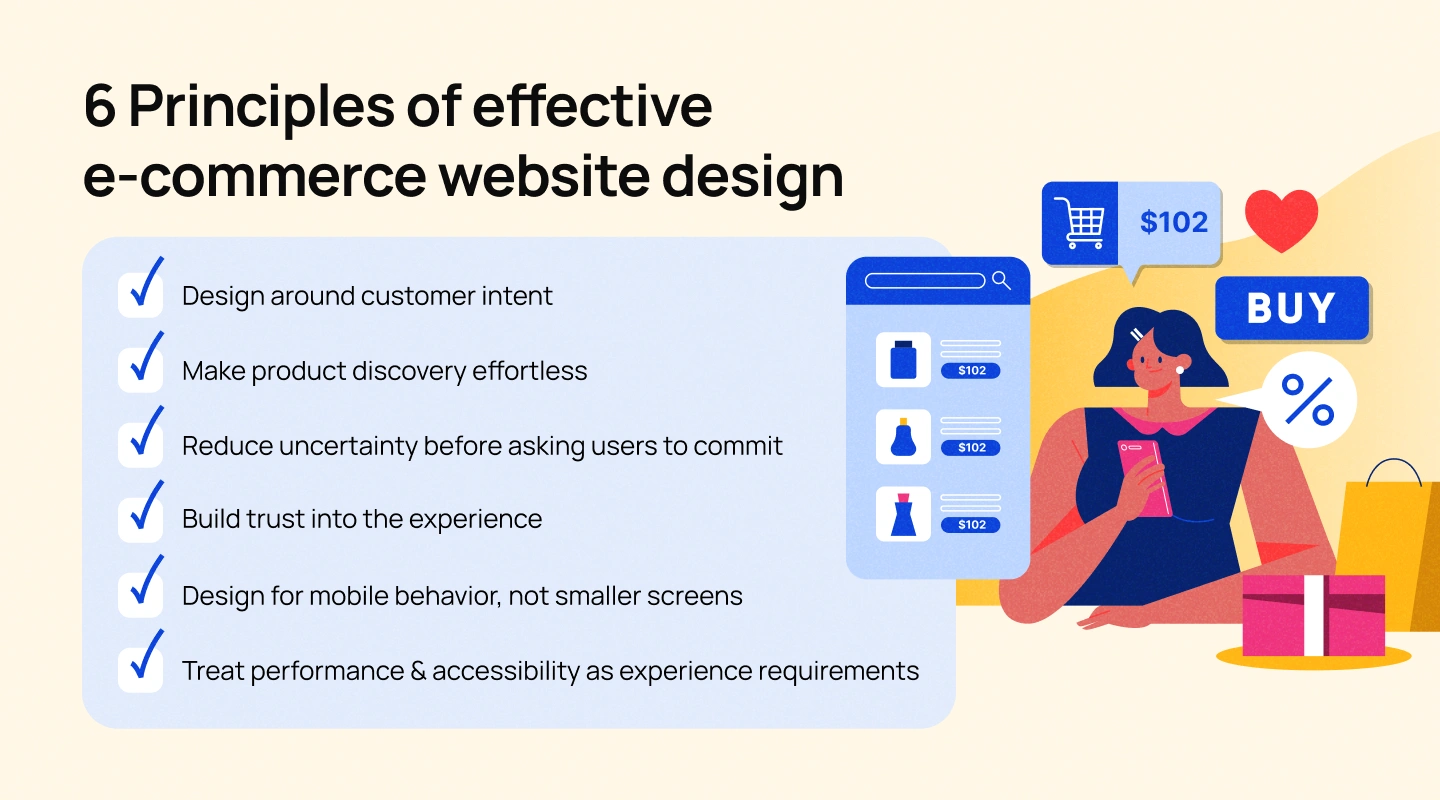
Understanding the customer journey provides the foundation. The next step is to translate it into design principles that guide the experience.
Not every visitor arrives with the same level of intent.
A first-time visitor may want to explore a category and understand what the brand offers. A returning customer may already know the product they want. Another visitor may be comparing several alternatives before deciding.
Designing around intent means giving different users appropriate paths through the experience.
For example, strong search and filtering help high-intent users get to a relevant product quickly, while curated categories and recommendations can support users who are still exploring.
The principle is simple: don’t force every customer through the same journey when their reasons for being there are different.
A customer should not have to understand the internal structure of an ecommerce business to navigate its website.
Navigation labels should reflect how customers think about products. Filters should prioritize attributes that actually help narrow a decision. Search should handle realistic queries rather than expecting customers to use exact product names.
For larger catalogs, the challenge becomes even more significant. A useful filtering system can turn hundreds or thousands of products into a manageable set of relevant options.
Discovery also includes what happens when the customer finds nothing. A useful zero-results state can suggest alternatives, correct a search query or guide the user toward another category instead of simply displaying an empty page.
The closer a customer gets to buying, the more important unanswered questions become.
Is the product available? Will it fit? When will it arrive? What happens if it needs to be returned? Is the displayed price the final price?
Good ecommerce design anticipates these questions.
This is particularly important on product pages, where the customer has moved beyond discovery and is actively evaluating whether the product is right for them.
The interface should provide enough context for a customer to make a decision without having to search elsewhere for basic information.
Trust is often treated as a visual problem: add reviews, security icons and a “trusted” badge.
In reality, trust is created through the consistency of the entire experience.
A customer is more likely to feel confident when the product information is clear, pricing is transparent, policies are easy to find, reviews appear credible and the interface behaves predictably.
That means trust should be considered across the journey rather than concentrated at checkout.
Trust is designed through clarity, not decoration.
A mobile ecommerce experience should not simply be a compressed version of desktop.
The way people browse, search, compare and purchase on a smaller screen changes the interaction itself.
Product galleries need to support touch. Filters need to remain accessible without overwhelming the screen. Important actions may need to stay within thumb reach. Checkout forms need to work comfortably with mobile keyboards and autofill.
This is why “mobile-first” should be understood as a behavior and interaction principle, not simply a responsive layout exercise.
Performance and accessibility are often separated from UX, but customers experience both through the interface.
A slow page affects whether people can continue their journey. Poor contrast, unclear focus states or inaccessible controls can prevent people from completing basic tasks.
Accessibility standards such as WCAG 2.2 provide testable guidance for making web content accessible across devices and to people with different disabilities. W3C also notes that following accessibility guidance can often improve usability more broadly.
For ecommerce teams, this means accessibility and performance should be considered part of product quality from the beginning rather than treated as final-stage compliance checks.
An ecommerce website is made up of many screens, but each one should have a clear role in the customer’s decision-making process.

1. Homepage: Establish orientation
The homepage should help customers understand the brand and where they can go next.
That does not necessarily mean filling the first screen with every category, promotion and campaign. The priority is to establish useful entry points based on what customers are likely to need.
PLPs help customers move from a broad category toward a manageable set of options.
Visual hierarchy, filtering, sorting and product information all matter here. The challenge is balancing enough information to support comparison without making the page difficult to scan.
Search is often the shortest route between a customer’s intent and a product.
Autocomplete, relevant suggestions, useful filters and well-designed zero-results states can make a significant difference to this journey.
The product page needs to answer the questions that prevent a customer from making a decision.
This makes it one of the most information-rich parts of the ecommerce experience.
The cart is not merely a place to display selected products. It is also where customers confirm what they are buying, review costs, and decide whether to continue.
Checkout then needs to make the transaction clear and recoverable.
The experience does not end when payment succeeds.
Order confirmation, delivery information, tracking, returns and support all shape what happens after conversion. For brands focused on repeat purchases, the post-purchase experience can be just as important as the transaction itself.
A product page should answer the questions a customer would otherwise ask before buying.
The exact structure will vary by category, but the underlying goal remains the same: help customers understand whether the product is right for them and feel confident acting on that decision.
Product imagery should give customers enough context to understand what they are buying.
Depending on the category, this might include multiple views, zoom, video, demonstrations, specifications or images that show the product in use.
The right media is not simply about making the page more visually appealing. It compensates for information customers would normally gain through physical interaction.
Suitability depends on the product.
For clothing, customers may need size, fit and measurement information. For electronics, they may need specifications and compatibility details. For furniture, dimensions and material information may be essential.
A strong product page anticipates the criteria customers use to evaluate the product.
Reviews, ratings and customer-generated content can help customers evaluate a product through the experiences of others.
But their value depends on context and presentation.
Reviews should be easy to find and understand, while product information and brand policies should remain consistent and transparent.
Price should not be considered in isolation.
Customers may also need to understand shipping, taxes, discounts, delivery timing and availability before deciding whether to proceed.
The earlier important cost information becomes clear, the less likely the customer is to encounter an unwelcome surprise later in the journey.
Once a customer has enough information to make a decision, the purchase action should be obvious.
This includes clear variant selection, quantity controls, availability states and appropriate purchase actions across devices.
The interface should make the next step easy without competing with the information the customer still needs to evaluate.
Lollypop’s work with Zudio illustrates how these principles become more complex when designing for a large fashion ecommerce experience.
The project began with stakeholder discovery, competitor analysis and information architecture before moving into mobile-first wireframes and responsive design. The team focused on creating a cohesive shopping experience while maintaining usability and accessibility.
The broader lesson is that product-page design cannot be separated from the structure around it. When customers are navigating a large product catalog, product discovery, information architecture and the product experience need to work as one system.
Checkout is where the experience shifts from helping people make a decision to helping them complete it. At this stage, the interface should stop competing for attention and make the next step obvious.
That does not mean stripping the checkout down to the fewest possible fields. The right amount of information depends on the business model, fulfillment requirements, payment methods, and the customer’s context. The goal is to ask only for what is necessary at that point in the journey and make the purpose of each interaction clear.
A well-designed checkout should make four things easy to understand: what the customer is buying, what they will pay, how and when the order will be fulfilled, and what they need to do next. Costs that appear unexpectedly, unclear delivery information, unfamiliar payment flows, or difficult-to-correct errors can all introduce uncertainty at the moment when confidence matters most.
The same principle applies to form design. Autofill, clear labels, sensible defaults, inline validation, and useful error messages can reduce unnecessary effort without hiding information customers need to make an informed purchase.
On mobile, these details become even more important. Smaller screens, touch input, and on-the-go shopping make unnecessary typing and unclear interactions more costly. Checkout should therefore be designed around the actual context in which customers complete a purchase, rather than simply adapting a desktop form to a smaller viewport.
The objective is simple: make completing the purchase feel like a natural continuation of the decision the customer has already made.
There is no single ecommerce experience that works equally well across every category. The right UX depends on what customers need to understand before they are willing to buy.
A customer choosing a fashion item may care about fit, measurements, customization, styling, and delivery. Someone buying a complex product may need specifications, compatibility information, documentation, and expert guidance. A B2B buyer may need to compare hundreds of products, evaluate technical attributes, check availability, request a quote, or coordinate the purchase with other stakeholders.
The interface has to reflect those differences.
For products where fit, appearance, or personal preference plays a major role, ecommerce UX needs to help customers imagine whether a product is right for them.
Lollypop’s work with eShakti is a useful example. The experience needed to support customized women’s clothing, making product discovery, measurements, customization, and purchase decisions easier to navigate. Rather than treating customization as an isolated feature, the design integrated it into the broader shopping journey.
This illustrates a broader principle: when the product itself is configurable, the UX should make the configuration process feel like part of shopping—not an obstacle between discovery and purchase.
For products with technical specifications, compatibility requirements, or multiple configurations, the product page has a different responsibility.
Customers may need to understand specifications, compare options, identify compatibility, review documentation, and assess whether the product meets a particular use case before they are ready to purchase.
In these situations, visual simplicity alone is not enough. The experience needs an information architecture that supports evaluation without overwhelming the customer.
The question is not simply, “How can we show more product information?”
It is:
“What information does this customer need to make a confident decision, and when do they need it?”
B2B ecommerce introduces another layer of complexity because the person browsing a product may not be the only person involved in the decision.
Buyers may need to evaluate a large catalog, compare technical specifications, check availability, review pricing, request quotes, or share information with procurement and other stakeholders. In some cases, the purchase itself is only one step within a longer business process.
Lollypop’s work with Fibre2Fashion demonstrates this difference. The platform operates within the global textile and apparel industry, where users need to navigate substantial amounts of product and business information across a complex B2B environment.
The design challenge therefore goes beyond making products easy to find. It is about making complex information usable enough to support business decisions.
That distinction matters when designing a B2B ecommerce experience. Applying a consumer-style shopping interface to a procurement-heavy workflow can simplify the surface while making the underlying task harder.
A redesign should not begin with a new visual direction. It should begin by understanding where the existing experience is helping or hindering the buying journey.
Start with the business model, product portfolio, customer segments, commercial goals, and existing digital ecosystem. Different customers may arrive with different levels of product knowledge and different reasons for visiting the site.
The objective is to understand the decisions the experience needs to support before deciding what the interface should look like.
Review the full journey rather than evaluating individual screens in isolation. Look at navigation, search, category pages, product discovery, product information, cart, checkout, mobile behavior, content structure, and post-purchase interactions.
Analytics can show where users drop off or behave differently from expectations. Qualitative research can help explain why.
This combination matters because a high-exit page is not automatically a bad page. It may be doing exactly what it needs to do—or it may be exposing a deeper problem elsewhere in the journey.
Not every UX issue deserves the same level of attention.
Prioritize problems based on factors such as customer impact, business impact, frequency, technical feasibility, and strategic importance. A small interaction that affects thousands of users may deserve more attention than a visually noticeable issue that rarely affects the journey.
The result should be a clear set of experience priorities, not a long list of interface changes.
Once the problems are understood, define how the experience should work before refining how it should look.
This can include information architecture, navigation, search and filtering logic, product discovery, content hierarchy, interaction patterns, and responsive behavior.
At this stage, the goal is to create a coherent system that supports the buying journey across touchpoints.
Design decisions should be tested against real customer needs and business requirements before being rolled out across the entire ecommerce ecosystem.
Depending on the problem, validation can involve usability testing, prototype testing, content testing, analytics, accessibility evaluation, or other research methods.
The point is not to eliminate every uncertainty before launch. It is to reduce the risk of investing heavily in an experience that solves the wrong problem.
Ecommerce is becoming less dependent on the traditional model of a customer arriving at a homepage, browsing a catalog, opening a product page, and checking out.
AI is increasingly becoming part of product discovery. In 2026, Shopify has continued expanding infrastructure for agentic commerce, including integrations that allow merchants and products to appear across AI-driven shopping experiences. Its Universal Commerce Protocol is designed to support how AI agents discover and transact with merchants.
This changes an important assumption about ecommerce design: the website may no longer be the only place where the buying journey begins.
That makes product information, structured product data, clear descriptions, availability, pricing, and other machine-readable signals increasingly important. Google similarly emphasizes making ecommerce data and site structure understandable so its systems can discover and parse products across Search and other surfaces.
Personalization is also becoming more contextual. Instead of treating personalization as simply recommending another product, ecommerce experiences can increasingly adapt content, recommendations, and pathways based on what a customer is trying to accomplish.
At the same time, the fundamentals remain. Faster pages, mobile usability, security, accessibility, and clear interaction design still shape the quality of the experience. Google recommends looking at page experience holistically, including Core Web Vitals, mobile display, HTTPS, and intrusive interstitials rather than optimizing a single metric in isolation.
Accessibility should be treated as part of that foundation rather than a final compliance check. WCAG 2.2 organizes accessibility around four principles—perceivable, operable, understandable, and robust—and applies across devices, including mobile experiences.
The implication for ecommerce teams is broader than adding another trend to the roadmap. As discovery becomes more distributed, the experience needs to work across more entry points while maintaining the same underlying product information, brand logic, and customer journey.
A great ecommerce experience is rarely created by optimizing one page at a time. It comes from understanding how people discover products, evaluate their options, build confidence, and decide what to do next—and then designing the experience around those decisions.
That is where ecommerce website design becomes a product design challenge. The right solution has to balance customer behavior, business goals, product complexity, technology, accessibility, and the realities of how people shop across devices and channels.
At Lollypop, we approach ecommerce experiences through research-led design, combining user understanding, product strategy, UX, and UI to create journeys that make discovery and purchase feel more intuitive. Our work across Zudio, eShakti, and Fibre2Fashion reflects how that approach changes depending on the product, customer, and business model.
For brands rethinking their ecommerce experience, the opportunity is bigger than creating a more polished storefront. It is about building an experience that helps customers make better decisions—and gives the business a stronger digital foundation for what comes next.
Explore Lollypop’s ecommerce design expertise. Schedule a consultation with our team.
Ecommerce website design is the process of designing the digital experience through which customers discover, evaluate, purchase, and manage products or services online. It combines visual design, UX, information architecture, interaction design, content, and technical considerations.
A good ecommerce website makes it easy for customers to find relevant products, understand their options, build confidence, and complete a purchase. The exact experience depends on the product category, business model, customer needs, and complexity of the buying decision.
UX design influences how easily customers can navigate the store, find products, understand product information, compare options, resolve uncertainty, and complete a purchase. It can also shape the experience after purchase through order tracking, support, returns, and account management.
A product page should provide the information customers need to evaluate the product with confidence. Depending on the category, this can include product imagery, descriptions, specifications, sizing or compatibility information, pricing, availability, delivery details, returns information, reviews, and clear purchase actions.
B2B ecommerce UX design focuses on digital purchasing experiences where customers may need to manage complex catalogs, technical information, pricing structures, procurement workflows, multiple stakeholders, or recurring purchases. The experience needs to support business decision-making rather than simply replicate a consumer shopping journey.
Start by understanding your customers, business model, and existing experience. Audit the full buying journey, identify and prioritize the most important problems, redesign the underlying experience architecture, and validate key decisions before scaling the solution across the site.