

Every time you log into an app, search for a product, or fill out a form, you’re using a text field. These simple input boxes are everywhere in digital interfaces, yet they’re rarely given much thought—until something goes wrong.
Poor text field design shows up in different ways. Unclear labels make users pause and second-guess what to enter. Small or poorly positioned fields create frustration on mobile devices. Vague error messages leave users confused about how to fix their mistakes. Any of these issues can cause users to abandon the task entirely.
This guide walks through the essential principles of text field design. You’ll learn what makes an input field effective, how to structure text fields for better usability, and the design decisions that help users complete tasks quickly and confidently.
A text field (also known as a text box input or input box) is a UI component that allows users to enter, edit, or view text-based information. In SaaS UX design, text fields appear across dashboards, settings, search input fields, and multi-step SaaS Onboarding flows.
In practice, a text field input acts as the primary bridge between users and systems. It translates human input into machine-readable data. Given that, even small design decisions, such as label placement or error messaging, can significantly impact usability. Designing a field correctly ensures clarity, reduces cognitive load, and helps users complete tasks efficiently.
A text field is not a single element. It is a combination of multiple UI components working together to guide users, collect accurate input, and reduce friction. Understanding each part of the input field anatomy helps designers create clearer, more usable form experiences.
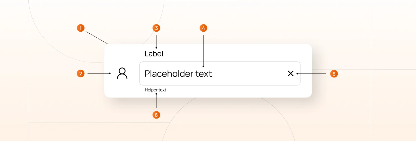
An input field typically consists of the following parts:
The outer boundary that defines the clickable and focusable area. Its appearance changes to communicate different states like default, focused, disabled, or error.
An icon at the start of the field that provides visual context for the expected input, such as a search icon or user icon.
Text that explains what information the user should enter. Should remain visible at all times to maintain clarity and support accessibility.
Placeholder text appears before typing begins, often showing an example or format hint. It’s replaced by the user’s actual input once they start typing.
An icon at the end of the text box field used for actions like clearing text, toggling password visibility, or validating input.
Additional guidance that appears below the field. Shows formatting rules during input or specific error messages when validation fails.
Text fields come in different styles, each designed to support a specific type of user input and interaction. Selecting the right style helps users understand what is expected, reduces errors, and improves overall usability. Below are seven common text field types used in modern UI and SaaS products.
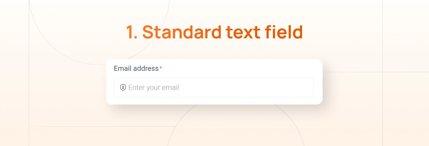
A standard text field is the most basic and commonly used input type. It is designed for short, simple text such as names, titles, or labels. This field works best when the expected input is brief and does not require special formatting or validation beyond basic text entry.
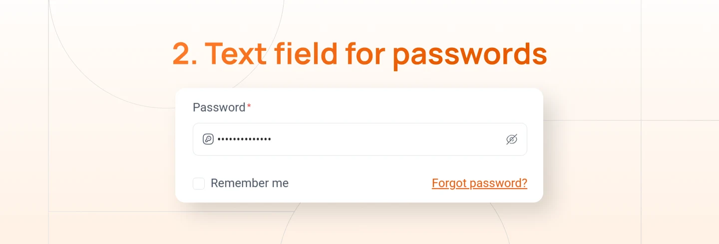
A password text field is used for sensitive information and masks user input to protect privacy. It is commonly found in sign-up, login, and security-related flows. Many designs include a visibility toggle so users can confirm their input while still maintaining security.
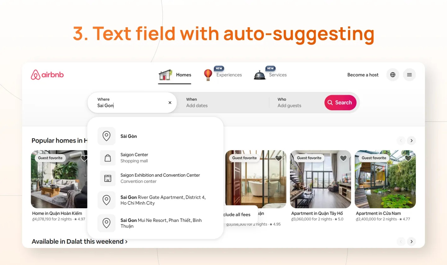
An auto-suggesting text field provides real-time suggestions based on user input. It is commonly used for search, location entry, or selecting known values. By offering relevant suggestions, this field speeds up input and reduces typing effort.
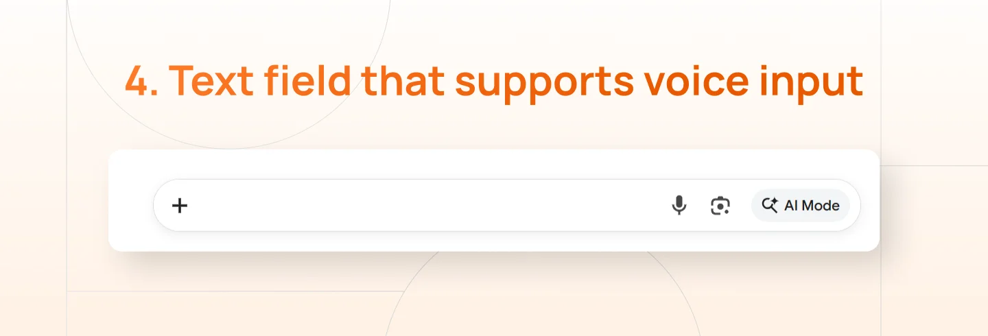
A voice-enabled text field allows users to enter text using speech instead of typing. This is especially useful in hands-free situations, accessibility scenarios, or on mobile devices. Voice input can improve speed and convenience when designed with clear feedback and error handling.
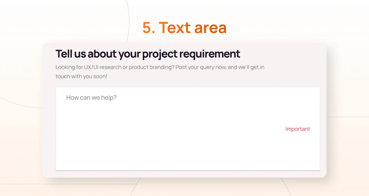
A text area is designed for long, multi-line input such as messages, descriptions, or feedback. It provides more vertical space and signals that detailed input is expected. Text areas are best used when users need freedom to write without strict length or formatting constraints.
Text fields are fundamental interface elements that appear wherever users need to search, enter, or provide information. They’re used so frequently that even small design decisions can significantly impact usability, efficiency, and error rates. Well-designed text fields reduce uncertainty and friction, while poorly designed ones slow users down and introduce avoidable mistakes.
The following best practices that lead to better user experiences:
Users should never have to search for or guess where to type. When an input field doesn’t stand out visually, users pause to interpret the interface instead of moving forward confidently.
Apply these techniques:
Users need to understand what information is expected before, during, and after they enter data. If labels disappear or instructions are unclear, users will hesitate and make more mistakes.
Apply these techniques:
Effective text fields support users as they type, not just when they submit. Waiting until submission to show errors forces users to backtrack and figure out what went wrong, especially important when you design a field for complex inputs.
Apply these techniques:
People scan interfaces from top to bottom when completing forms. Unclear structure causes users to lose track of their progress and increases cognitive effort.
Apply these techniques:
Typing takes time and effort, especially on mobile devices. If the system already knows information or can predict what users need, let them select it instead of typing it manually.
Apply these techniques:
You might want to explore: Progressive Disclosure UI Patterns & Use Cases in SaaS ux design
In this blog, we explored how thoughtful text field design directly shapes usability, efficiency, and user confidence across digital interfaces. From making inputs visually clear to guiding users during entry and reducing unnecessary effort, each design decision plays a role in minimizing friction and preventing avoidable errors.
Well-designed text fields are especially important in complex digital products, where users are often required to search, enter data, or complete multi-step workflows. When designed with clarity and intention, text fields help users move faster, make fewer mistakes, and feel more confident throughout their interactions.
If you’re building a digital product and want expert guidance on crafting interfaces your users will love, Lollypop is here to help. As a globally recognized SaaS design agency, we specialize in creating user-centered experiences that balance usability, scalability, and business growth.
Reach out to us for a FREE consultation, and let’s explore how we can elevate your SaaS product’s user experience together.
A text field is also commonly referred to as an input field, text input, input box, or text box. These terms are often used interchangeably to describe an interface element that allows users to enter text-based information.
Input fields come in many forms depending on the type of data required. Common examples include standard text fields, password fields, search fields, auto-suggest inputs, voice-enabled inputs, number fields, and text areas for longer content.
Input fields are interactive elements where users enter data, such as text fields, dropdowns, or checkboxes. Form fields refer to the broader collection of all elements within a form, including labels, buttons, and input fields. Essentially, input fields are components within form fields, and understanding input fields vs form fields helps clarify how individual inputs fit into the complete form design structure.


