


Color contrast is one of the most common reasons products fail accessibility checks. What looks clean and minimal in a design file can become unreadable in real conditions, especially across devices, lighting environments, or for users with visual impairments. Without clear measurement, teams often rely on visual judgment, which is inconsistent and difficult to validate.
Color contrast tools solve this by turning perception into data. Using a color contrast checker or accessibility color checker, teams can test combinations, verify compliance, and make informed adjustments early in the design process.
In this guide, we’ll break down how contrast is measured, what WCAG requires, and the best tools for testing and improving accessibility across websites and design systems.
Key Takeaways
Color contrast is one of the most overlooked yet critical aspects of accessibility. What may look visually appealing in design can quickly become unreadable in real-world conditions. By relying on measurable standards instead of visual judgment, teams can ensure their products remain usable across different users, devices, and environments.
- Color contrast should be measured, not guessed — visual judgment is unreliable across users and devices.
- WCAG contrast ratios (4.5:1 for AA, 7:1 for AAA) provide clear, testable accessibility standards.
- Combining tools across design, development, and QA ensures accessibility is maintained throughout the product lifecycle.
- Testing must reflect real conditions — including images, states, and different display environments.
- Small visual choices, like light text or subtle colors, can significantly impact readability and usability.
What Is a Color Contrast Tool?
A color contrast tool checks how easy it is to read text or UI elements against a background. It compares two colors and shows a contrast ratio that indicates whether the combination is readable according to WCAG accessibility standards.
Instead of guessing if a color combination looks “clear enough,” teams can use these tools to quickly test and confirm if their design meets accessibility requirements before it goes live.
These tools are used across the product lifecycle:
- Designers validate UI decisions and ensure text and UI elements remain readable across color palettes
- Developers implement accessible styles and verify contrast in code
- QA teams catch contrast issues during testing across devices and states
- Accessibility auditors ensure compliance with WCAG standards at scale
How contrast ratio is calculated
Contrast ratio compares how light or dark two colors are against each other, based on their relative luminance. The result is expressed as a ratio from 1:1 (no contrast, e.g., white on white) up to 21:1 (maximum contrast, e.g., black on white).
In practical terms, the ratio tells you how distinguishable the foreground is from the background. For example, a 4.5:1 ratio means the text is 4.5 times brighter or darker than its background, which is generally readable for most users. As the ratio increases, the separation between the two colors becomes clearer, improving readability across different devices, lighting conditions, and user abilities.
To make this more actionable, WCAG defines specific thresholds that indicate whether text is accessible or not:
- 4.5:1 ratio (minimum for standard text)
- Required for most body text to meet WCAG AA standards
- Works well for regular-sized text (below 18pt or 14pt bold), where readability is more sensitive to low contrast
- Often fails when using light gray text on white backgrounds, a common issue in modern UI design
- 7:1 ratio (enhanced accessibility)
- Required for WCAG AAA compliance, representing a stricter accessibility standard
- Improves readability for users with low vision or reduced contrast sensitivity
- Especially important for critical content such as long-form reading, forms, or dense information interfaces
Why visual judgment fails
At first glance, it feels easy to judge contrast by eye. But in reality, what looks clear to one person may be hard to read for another. Several factors affect how we perceive color and contrast, making visual checks unreliable.
- People see colors differently: Users with color vision deficiencies may not distinguish certain color combinations, even if they look fine to others
- Screens don’t display colors the same way: Brightness, contrast settings, and display quality can change how colors appear across devices
- Real-world conditions affect readability: Glare, sunlight, or low-light environments can reduce visibility, even if the design looks fine on your screen
- Design decisions become inconsistent: Without a clear standard, teams rely on personal judgment, which leads to inconsistent and sometimes inaccessible results
WCAG Color Contrast Requirements Explained
To ensure text remains readable for different users and environments, WCAG defines clear contrast ratio rules. These are the standards that any WCAG contrast checker uses to determine whether a color combination passes or fails accessibility requirements.
Understanding these levels helps teams move from subjective design decisions to measurable accessibility compliance.

WCAG AA — 4.5:1 for normal text, 3:1 for large text
WCAG AA is the baseline level of accessibility required for most public websites and digital products. It balances readability with design flexibility, making it the standard most teams target for compliance.
In practice, teams use a WCAG AA contrast checker during design and development to ensure all essential content meets this minimum requirement.
At this level, contrast requirements ensure that core content remains readable for the majority of users, including those with moderate visual impairments or reduced contrast sensitivity.
- 4.5:1 for normal text: Applies to body text, form labels, and standard UI copy where text size is smaller and harder to read. This threshold ensures sufficient separation between text and background so users can scan and read content without strain. Low-contrast combinations like light gray on white typically fail this requirement.
- 3:1 for large text: Applies to text that is at least 18pt or 14pt bold. Larger text is naturally easier to read, so WCAG allows a lower contrast ratio while still maintaining accessibility. This is commonly used for headings, buttons, and prominent UI elements.
WCAG AAA — 7:1 for normal text, 4.5:1 for large text
WCAG AAA represents a higher level of accessibility, designed for products that need to support users with more severe visual impairments. It prioritizes maximum readability, often at the cost of reduced visual flexibility.
A WCAG AAA contrast checker is often used when products aim for enhanced accessibility, especially in content-heavy platforms, public services, or compliance-driven industries.
While not always required, AAA is commonly adopted in industries such as healthcare, government, and education, where accessibility needs are more critical.
- 7:1 for normal text: Requires strong contrast for body text, making content easier to read for users with low vision or poor contrast sensitivity. This level significantly reduces eye strain and improves readability in challenging conditions.
- 4.5:1 for large text: Ensures that headings and large UI elements remain clearly visible, even when viewed on low-quality screens or in poor lighting. It provides an additional safety margin beyond AA standards.
Exceptions — logos, decorative images, and disabled UI components
While WCAG defines strict contrast rules for readable content, it also recognizes that not every visual element serves a functional purpose. Some elements are exempt because they do not impact usability or information access in the same way as text or interactive UI components.
- Logos and brand elements: Brand logos are exempt because they are not considered essential for reading or interaction. Their purpose is recognition, not communication of critical content. For example, a low-contrast logo does not block users from completing tasks or understanding information.
- Decorative elements: Background images, illustrations, or purely aesthetic visuals do not need to meet contrast requirements as long as they do not contain important information. However, if text is placed on top of these elements, the text itself must still meet contrast standards.
- Disabled UI components: Elements that are inactive, such as disabled buttons or unavailable form fields, are not required to meet contrast ratios because users are not expected to interact with them. However, they should still be visually distinguishable from active elements to avoid confusion.
12 Best Color Contrast Tools in 2026
Choosing the right color contrast tools depends on how and where you test accessibility. Some tools are designed for quick checks, while others integrate directly into design workflows or development pipelines.
The 12 tools below cover different use cases, from simple validation to full accessibility audits:
1. WebAIM Contrast Checker
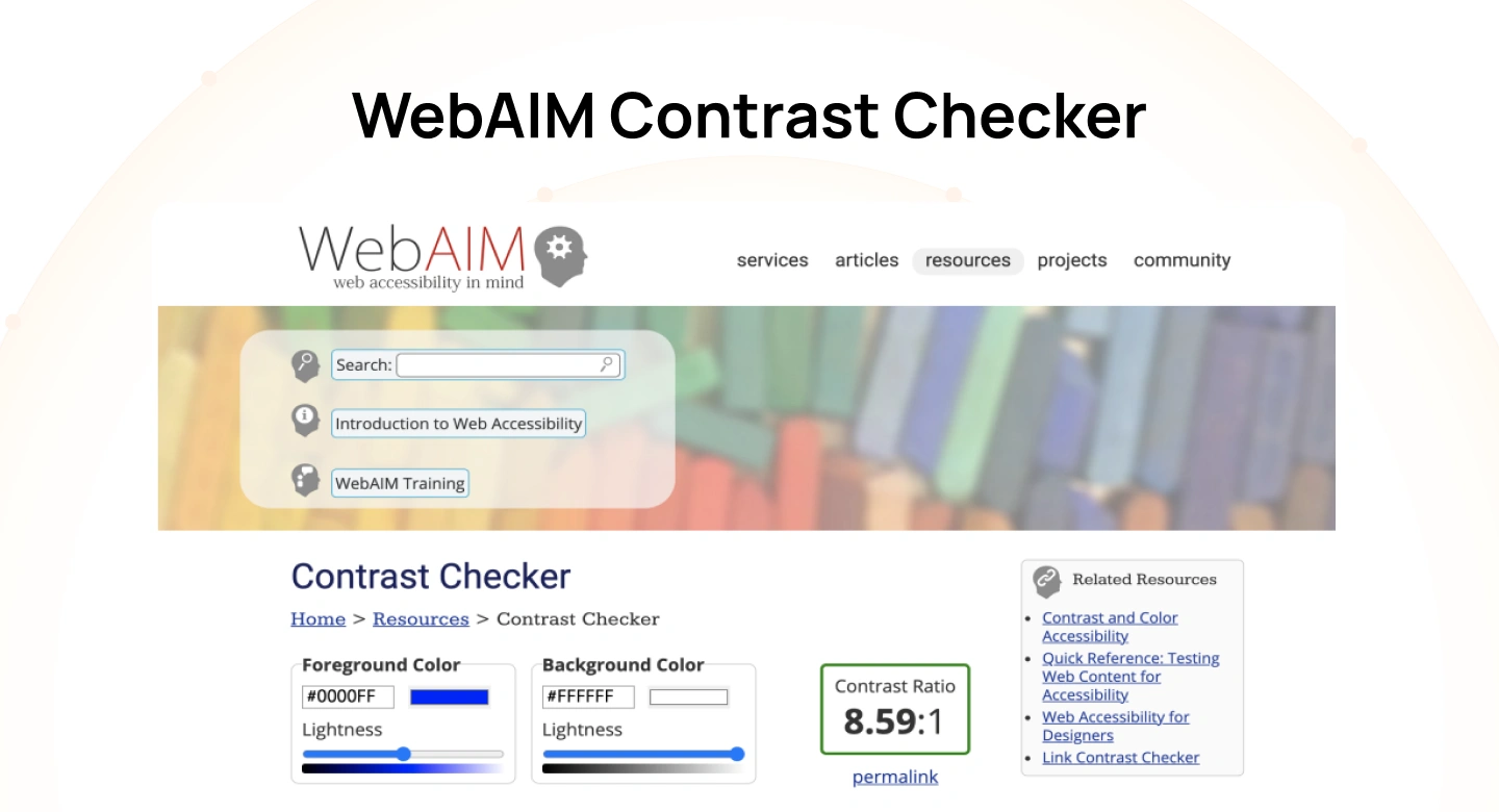
Read More: WebAIM Contrast Checker
The WebAIM contrast checker is one of the most widely referenced tools for testing color contrast against WCAG standards. It allows users to input hex values and immediately see contrast ratios, along with pass or fail results for AA and AAA.
What makes it reliable is its alignment with WCAG definitions and its widespread use in accessibility audits and documentation.
- WCAG Levels Supported: A, AA, and AAA
- Best for: Quick, standards-aligned validation during design or development
- Example: A developer implementing a form takes the HEX values from the design and inputs them into WebAIM to verify the text and background meet AA contrast before pushing to production.
2. Adobe Color Accessibility Tools
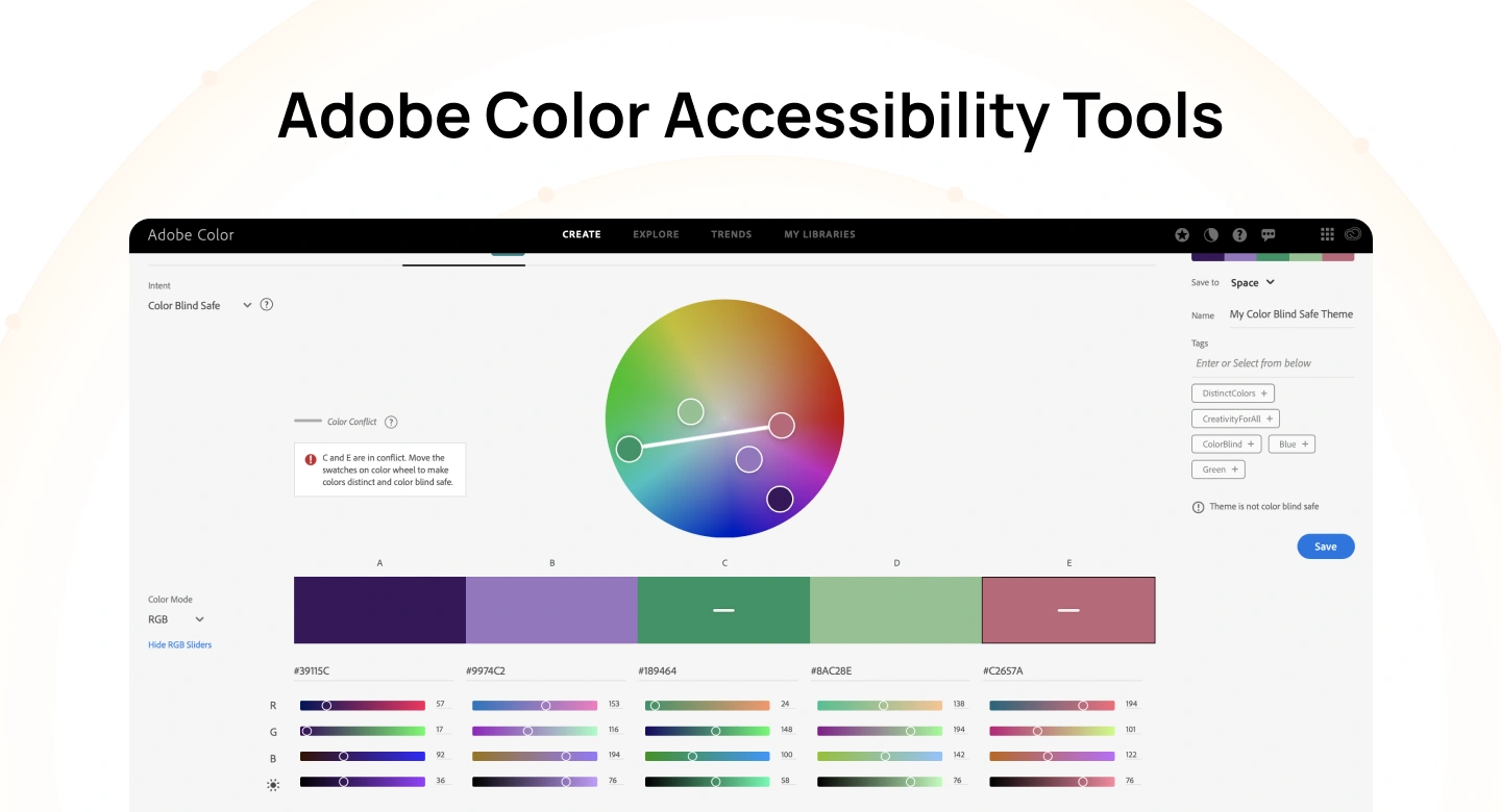
Read More: Adobe Color Accessibility Tools
The Adobe color contrast checker is part of Adobe Color and focuses on evaluating entire color palettes rather than just single combinations. It helps designers build accessible palettes from the start.
This makes it particularly useful in branding and design system work, where multiple colors need to work together.
- WCAG Levels Supported: AA and AAA
- Best for: Creating accessible color palettes within Adobe workflows
- Example: A brand designer builds a color palette in Adobe Color and checks how primary and secondary colors pair with white or dark text to ensure they meet AA before adding them to a design system.
3. Stark (Figma & Sketch)
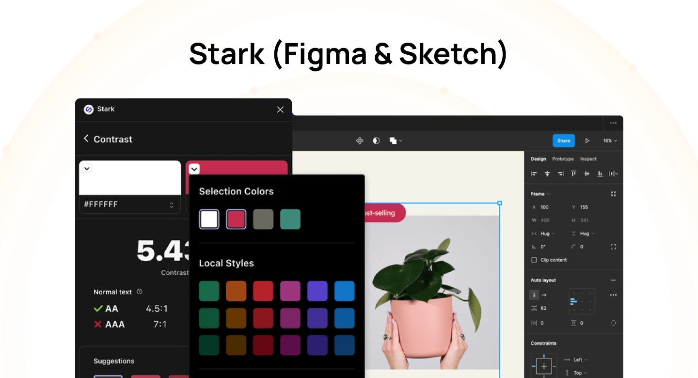
Read More: Stark (Figma & Sketch)
Stark is a design plugin that integrates directly into tools like Figma and Sketch. It allows designers to check contrast within actual UI components, rather than testing colors in isolation.
This contextual testing helps teams identify accessibility issues earlier in the design process.
- WCAG Levels Supported: A, AA, and AAA
- Best for: Real-time accessibility checks inside design tools
- Example: A UI designer selects a button layer in Figma, runs Stark, and immediately sees whether the text and background pass AA, adjusting colors directly in the component.
4. Contrast Plugin for Figma
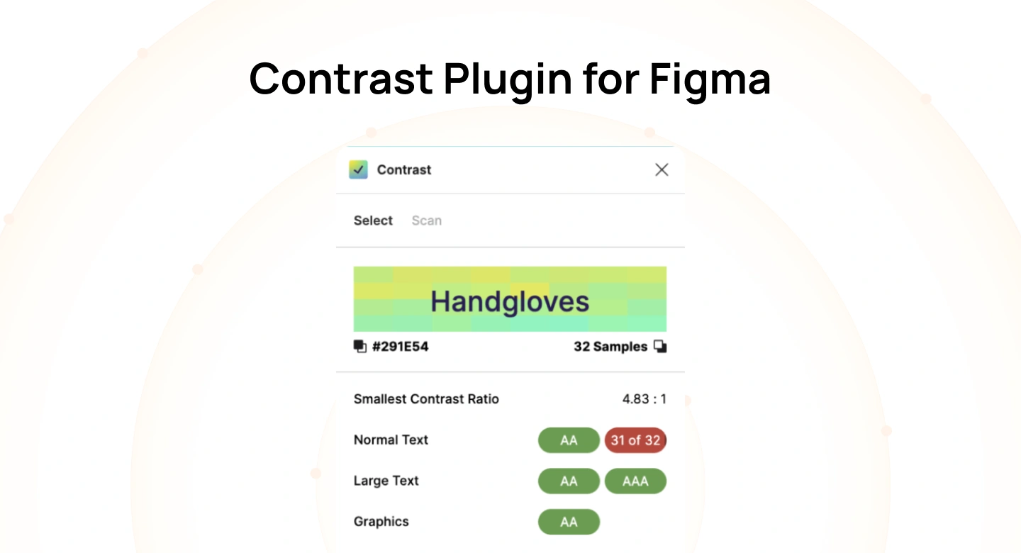
Read More: Contrast Plugin for Figma
The Figma color contrast checker plugin provides a simple way to check contrast between selected layers in Figma. It focuses on speed and ease of use without additional features.
This makes it useful for quick validation during early design stages.
- WCAG Levels Supported: AA and AAA
- Best for: Fast, in-file contrast checks in Figma
- Example: While designing a screen in Figma, a designer selects a text layer and background shape, uses the plugin to check contrast, and tweaks the color style if it fails AA.
5. Contrast Ratio (Lea Verou)

Read More: Contrast Ratio (Lea Verou)
Contrast Ratio is a simple and reliable tool created by Lea Verou that helps designers and developers quickly test color combinations against WCAG standards. It focuses on clarity, showing contrast ratios instantly as you adjust colors.
Its lightweight interface makes it ideal for quick checks without switching between complex tools.
- WCAG Levels Supported: AA and AAA
- Best for: Fast, no-friction contrast checking
- Example: A developer tweaks text and background colors in real time to ensure a button meets the 4.5:1 requirement before implementation.
6. Tanaguru Contrast Finder

Read More: Tanaguru Contrast Finder
Tanaguru Contrast Finder is designed to calculate the closest accessible color that meets WCAG contrast requirements. It focuses on precision, making it useful when exact adjustments are needed.
Unlike basic checkers, it helps you fix contrast issues with minimal deviation from original colors.
- WCAG Levels Supported: AA and AAA
- Best for: Precise color correction for accessibility compliance
- Example: A designer enters a failing color pair into Tanaguru and applies the suggested adjusted HEX value so the UI component passes AA without redesigning the layout.
7. WAVE Accessibility Tool
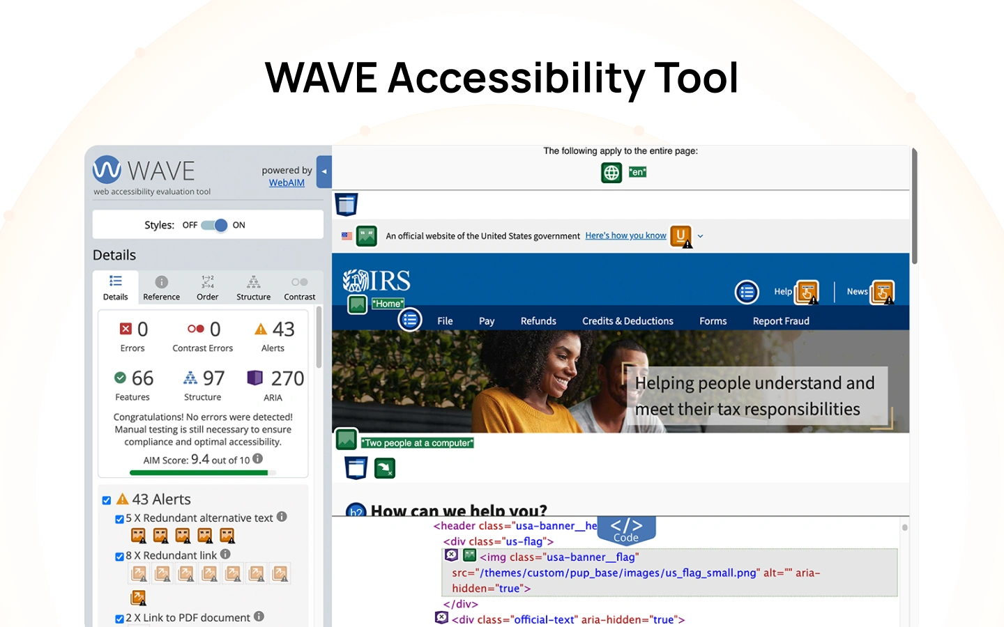
Read More: WAVE Accessibility Tool
WAVE is a browser-based accessibility evaluation tool that analyzes entire web pages, including color contrast issues in context. Instead of checking isolated colors, it highlights contrast problems directly on the page.
This makes it useful for identifying real-world accessibility issues during QA or audits.
- WCAG Levels Supported: A, AA, and AAA
- Best for: Full-page accessibility testing in browsers
- Example: A QA tester runs WAVE on a live webpage and identifies low-contrast text in a footer that was missed during design.
8. axe DevTools
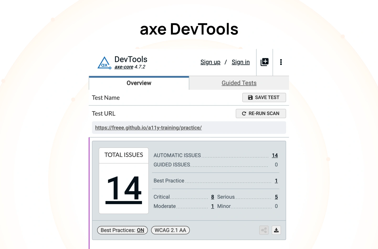
Read More: axe DevTools
axe DevTools is a developer-focused accessibility testing tool that integrates into browsers and CI/CD pipelines. It automatically scans for accessibility issues, including contrast failures, during development.
This makes it ideal for teams that want to embed accessibility into their engineering workflow.
- WCAG Levels Supported: A, AA, and AAA
- Best for: Automated accessibility testing in development workflows
- Example: A developer runs axe in the browser dev tools to catch contrast issues before merging code into production.
9. BrowserStack Accessibility Testing
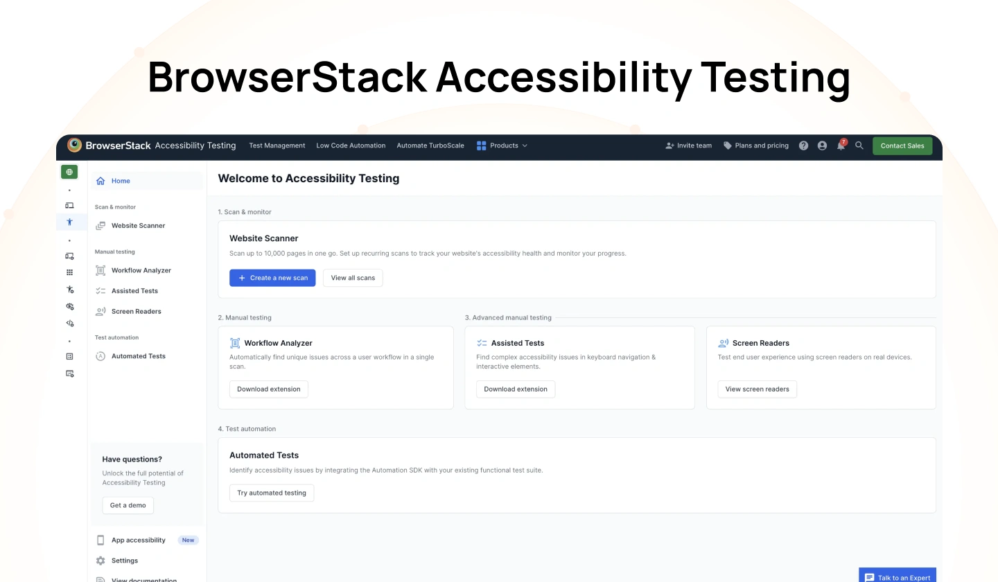
Read More: BrowserStack Accessibility Testing
BrowserStack provides cloud-based accessibility testing across real devices and browsers. It includes contrast checking as part of a broader accessibility testing suite.
This is useful for validating accessibility across different environments and devices.
- WCAG Levels Supported: A and AA
- Best for: Cross-device accessibility testing at scale
- Example: A team tests a website on multiple devices in BrowserStack to ensure contrast remains readable across screen types.
10. Color Contrast Analyzer by TPGi

Read More: Color Contrast Analyzer by TPGi
The color contrast analyser by TPGi is a desktop application that allows users to pick colors directly from the screen and evaluate contrast. It also includes a simulation for color vision deficiencies.
This makes it especially useful for testing real interfaces outside the browser.
- WCAG Levels Supported: AA and AAA
- Best for: Testing live interfaces and simulating visual impairments
- Example: A designer uses the tool to pick colors from a running app and verify contrast without needing HEX values.
11. Coolors Contrast Checker
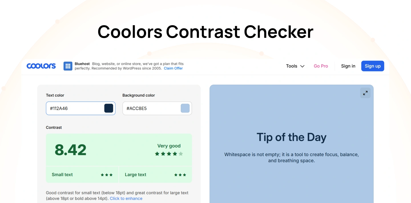
Read More: Coolors Contrast Checker
Coolors includes a contrast checker as part of its palette generation tool. It allows designers to test multiple color combinations within a palette quickly.
This is useful when working on broader color systems rather than individual UI elements.
- WCAG Levels Supported: AA and AAA
- Best for: Reviewing contrast across full color palettes
- Example: A designer tests multiple palette combinations in Coolors to ensure all text/background pairs meet accessibility standards.
12. UseContrast
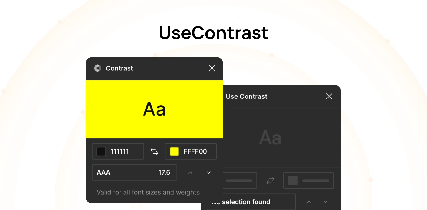
Read More: UseContrast
UseContrast is a lightweight Mac menu bar app that allows designers to quickly check contrast without switching tools. It is designed for speed and convenience.
This makes it useful for quick, repeated checks during daily design work.
- WCAG Levels Supported: AA and AAA
- Best for: Quick contrast checks on Mac
- Example: A designer checks the contrast between two colors directly from the menu bar while working across different design tools.
How to Check Color Contrast for Accessibility — Website & Figma
Checking color contrast should be part of everyday work, not just a final QA step. The goal is simple: make sure text is easy to read in real conditions. The steps below show how to do this on a live website and inside Figma.
1. On a website
When testing a live website, you are validating how users actually experience your product. Unlike design files, live pages include layered styles, dynamic content, and device-specific rendering, all of which can affect contrast in ways that are not immediately visible in design.
Because of this, contrast testing on a website is about verifying real, rendered output, not just intended colors. The steps below help ensure what users see is truly readable.
Step 1: Find the text and background colors
Start by identifying the exact text and its background on the page. For example, use browser DevTools (Inspect) or a color picker to select the element. Make sure you capture the final rendered colors, not just what’s defined in the design or CSS. If overlays, gradients, or transparency are applied, the actual visible color may be different.
Step 2: Enter colors into a checker
Take the HEX or RGB values of both the text (foreground) and background, and paste them into a color contrast checker or website contrast checker. These tools will automatically calculate the contrast ratio for you.
Step 3: Understand the ratio result
The tool will return a ratio like 4.5:1 or 7:1. This number shows how distinguishable the text is from its background. A higher ratio means better readability, especially for users with visual impairments or in poor lighting conditions.
Step 4: Compare with WCAG standards
Use a WCAG contrast checker to determine if the ratio passes accessibility standards:
- AA: Minimum requirement for most products (4.5:1 for normal text, 3:1 for large text)
- AAA: Stricter standard for enhanced accessibility (7:1 for normal text, 4.5:1 for large text)
Make sure you are comparing against the correct requirement based on text size and use case.
Step 5: Fix issues and retest
If the combination fails, adjust the text or background color in your CSS, design tokens, or variables. After making changes, run the same check again to confirm it now passes. Repeat this process until all critical UI elements meet the required contrast level.
Tip: Tools like axe and WAVE can scan a whole page and flag contrast issues automatically. They’re helpful for QA, but you should still verify important components manually.
2. In Figma
In Figma, contrast checking happens during the design phase, before any code is written. At this stage, decisions about color, typography, and layout are still flexible, which makes it the most efficient place to catch and fix accessibility issues.
However, designs in Figma are often cleaner than real interfaces. They don’t account for implementation details like overlays, states, or rendering differences. This means designers need to be intentional about testing contrast in realistic scenarios. The steps below help ensure your designs are ready for development.
Step 1: Select text and its background
Select both the text layer and the background layer it sits on. This could be a solid color, image, or gradient. If the background is complex, identify the worst-case area where contrast is lowest, as this determines accessibility.
Step 2: Run a contrast plugin
Use tools like Stark or a Figma contrast checker plugin to evaluate the selected layers. The plugin will instantly show whether the combination passes AA or AAA standards, along with the exact ratio.
Step 3: Check within real UI components
Avoid testing colors in isolation. Instead, check them inside actual UI components like buttons, cards, and forms. Factors like font size, weight, and spacing can affect readability in context.
Step 4: Test images and gradients carefully
When text sits on images or gradients, contrast can vary across different areas. Move the text or test multiple points to ensure it remains readable everywhere. If needed, add a semi-transparent overlay (scrim) or adjust colors to stabilize contrast.
Step 5: Update styles or design tokens
If a color fails, update it at the style or token level instead of fixing individual elements. This ensures consistency across the entire design system and prevents repeated issues.
Step 6: Validate outside Figma
Figma plugins are helpful, but they are not a guaranteed source of WCAG compliance. Before handoff, verify key combinations using an accessibility color checker or test directly in a browser to ensure accuracy in real conditions.
Common Color Contrast Mistakes That Fail Accessibility
Even when teams run a color accessibility test or use a color contrast accessibility checker, issues still slip through. The gap usually comes from context: contrast changes with states, backgrounds, and real usage conditions that static mocks don’t fully represent.
1. Light gray text on white backgrounds
Neutral grays are common in design systems for a clean, minimal look. However, many gray-on-white combinations (e.g., #999 on #FFF) fall below 4.5:1, especially at smaller sizes or on lower-quality screens. This becomes more noticeable in long-form content, forms, and tables where users need to scan quickly.
Consider: Use a darker body text token that consistently meets ≥4.5:1, and reserve lighter grays for non-essential UI like dividers or secondary metadata.
2. Text layered over images or gradients
Hero banners and marketing sections often place text on photos or gradients. Because luminance varies across the background, the same text can pass in one area and fail in another. This leads to inconsistent readability as users scroll or as images change responsively.
Consider: Add a consistent overlay (scrim), blur the image, or place text in a solid container. Validate contrast at multiple points, including the lowest-contrast area.
3. Placeholder text in form fields
Browsers typically render placeholder text in low-contrast gray. Teams sometimes rely on placeholders to convey instructions, which makes low contrast a functional issue, not just visual polish. It also disappears on input, increasing cognitive load.
Consider: Use persistent labels for instructions, keep placeholders optional, and increase placeholder contrast if it carries meaning. Validate both empty and filled states.
4. Hover and focus states not tested
Contrast is often checked only in the default state. On hover or focus, colors may shift (e.g., lighter text on lighter backgrounds or reduced opacity), causing failures. Keyboard focus states are especially prone to being overlooked.
Consider: Test all states (default, hover, focus, active, disabled) with a checker. Define accessible tokens for each state and verify focus indicators meet visibility requirements.
5. Using color alone to communicate meaning
Status messages commonly rely on color (red for errors, green for success). Users with color vision deficiencies may not distinguish these states, and low-contrast badges can be missed entirely.
Consider: Pair color with text and icons (e.g., “Error” label, warning icon) and ensure the text itself meets contrast. This aligns with WCAG 1.4.1.
6. Only testing light mode
Dark mode reverses luminance relationships. Colors that pass in light mode (e.g., dark text on light background) may fail when inverted, especially with brand colors and tinted surfaces.
Consider: Define separate tokens for dark mode and validate both themes. Test real components, not just palette pairs, to catch issues introduced by elevation, shadows, and overlays.
Final thoughts
Color contrast is one of the most overlooked aspects of accessibility, yet it directly affects how users read, navigate, and complete tasks. Small visual decisions, like using lighter text or subtle backgrounds, can quickly turn into usability barriers when tested against real conditions.
By using the right color contrast tools and integrating checks into both design and development workflows, teams can move from guesswork to measurable standards. This not only ensures WCAG compliance but also improves clarity and usability across all users and devices.
At Lollypop Design Studio, we help product teams translate accessibility standards into practical design systems and real-world user experiences. If you’re looking to improve accessibility without compromising design quality, our team can help you build scalable, accessible products. Schedule a consultation to evaluate your product’s accessibility and define a clear path to WCAG compliance.
Frequently Asked Questions (FAQs)
1. What is the best color contrast checker?
The best color contrast checker depends on your workflow. Tools like WebAIM are widely used for quick validation, while plugins like Stark work directly in design tools. The key is choosing one that fits your process and consistently checking contrast during design and development.
2. What contrast ratio is required for WCAG AA?
WCAG AA requires a contrast ratio of at least 4.5:1 for normal text and 3:1 for large text. These thresholds ensure content is readable for most users, including those with moderate visual impairments or reduced contrast sensitivity.
3. Is there a free WCAG contrast checker?
Yes, there are many free WCAG contrast checker tools available. WebAIM, Accessible Colors, and Figma plugins offer free ways to test contrast. These tools allow teams to quickly validate color combinations without additional cost.
4. How do I check color contrast in Figma?
To check color contrast in Figma, use a Figma contrast checker plugin like Stark or Contrast. Select the text and background layers, and the plugin will show whether the combination passes WCAG AA or AAA standards directly within your design file.
5. What is the difference between AA and AAA contrast requirements?
The difference between AA and AAA contrast requirements lies in the strictness. AA is the minimum standard (4.5:1), while AAA requires higher contrast (7:1) for improved readability. AAA is typically used for products with higher accessibility needs.
6. How do I test text over an image for accessibility?
To test text over an image, use a color contrast checker on multiple areas of the background. Since images vary in brightness, check the lowest-contrast section. If it fails, add an overlay or adjust colors to maintain consistent readability.
