

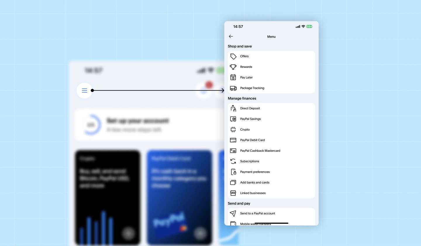
When we talk about the hamburger menu, we’re not referring to fast food—but to the familiar three-line icon that reveals hidden navigation on websites and apps!
The hamburger menu icon is one of the most recognizable symbols in interface design and has become a go-to solution for saving space, especially on mobile.
But here’s the thing: while the hamburger menu can simplify navigation and help keep interfaces clean, it doesn’t work well in every situation. That’s why understanding when it shines, when it’s inappropriate, and how to use it effectively is essential for designers.
In this guide, you’ll learn everything about hamburger menu design: how it works, the pros and cons, best practices to improve usability, and when alternative navigation patterns might serve your users better.
Let’s get started!
Hamburger Menu is a navigation icon consisting of three horizontal lines, indicating that additional options are hidden behind it. When users click or tap the icon, a panel or drop-down navigation menu expands to show the full set of navigation items.
Its core function is to apply progressive disclosure—showing only what’s necessary at first, and revealing additional options on demand. This makes the hamburger menu especially effective on mobile and small screens, where saving space while maintaining full navigation access is crucial.
The three-line icon is widely understood—much like Home, Search, or Settings icons. Its distinct visual form signals “navigation lives here,” making it easy for users to identify across different interfaces.
Hamburger menus are great for keeping interfaces clean, especially when there are too many items to show at once. By hiding non-essential links, they reduce cognitive load and prevent users from being overwhelmed.
A hamburger menu can store secondary actions, niche features, or settings that don’t need constant visibility. It can be placed in a header, merged into a tab bar, or adapted to different layouts. This flexibility makes it an easy way to provide access to additional functionality without crowding the interface.
By hiding information behind an icon, key pages become less visible. Users must actively open the menu to see available options, and many may skip this step entirely—resulting in low visibility for important content.
Opening the menu requires an additional tap or click, which slows users down. On mobile, the top corners of the screen are also harder to reach, making the interaction less ergonomic and less likely to be used frequently.
Items placed behind a hamburger menu often get fewer interactions compared to elements that are always visible. This can be problematic for products targeting older audiences, users with accessibility needs, or anyone less familiar with hidden navigation patterns.
Based on the pros & cons discussed above, here’s a clearer guide on when a hamburger menu works and when it may harm the user experience.
Suggestion: Consider the “80-20 rule” when deciding on a hamburger menu. If the navigation items you plan to hide make up less than 20% of total user interactions, placing them inside a hamburger menu is acceptable. If they account for more, keep them visible!
Given the drawbacks of the Hamburger Menu, there are some cases where we should not use this navigation pattern. So, what are the best alternatives for a Hamburger Menu?
Let’s explore the key alternatives below!
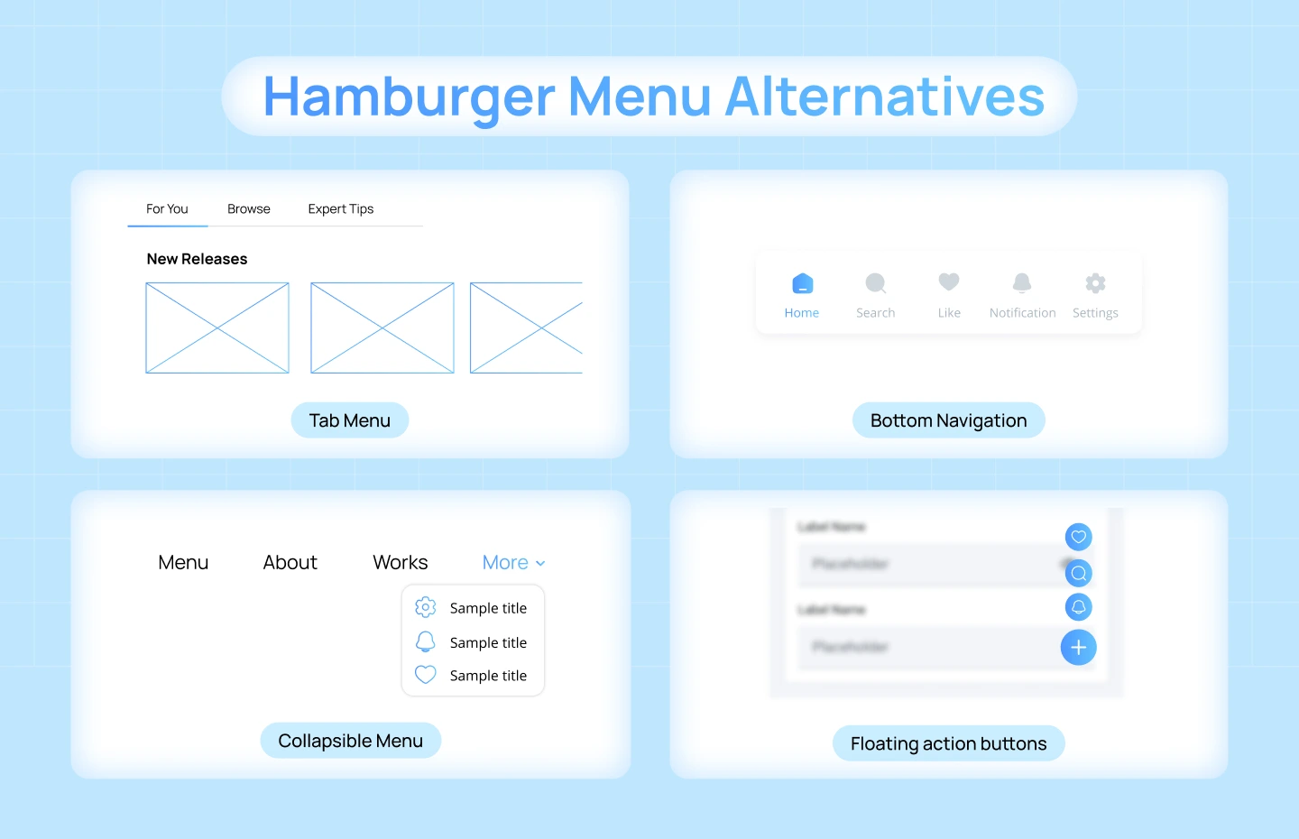
Tabs present the most important sections of a product at first glance, eliminating the friction of opening a hidden menu. They reduce cognitive load by keeping navigation options visible at all times and help users move quickly between core areas of the product. This makes them one of the most intuitive and familiar navigation patterns on mobile.
Best for: Products with 3–5 primary sections (e.g., Home, Search, Activity, Profile).
Bottom navigation places the primary destinations within easy thumb reach, making navigation faster and more comfortable on mobile. With all major options visible, users can move between screens without breaking their flow or searching for hidden actions. It creates a predictable navigation experience for high-frequency use.
Best for: Mobile apps where users frequently switch between major screens.
A collapsible sidebar keeps navigation partially visible to strengthen orientation while still allowing designers to save screen space. It supports complex navigation structures, showing key categories at a glance and hiding deeper options until expanded. This helps users retain a sense of place without overwhelming the interface.
Best for: Desktop and dashboard-style products needing to show many options while preserving screen real estate.
A FAB elevates the primary action of a product by giving it constant visibility and easy access, rather than burying important tasks inside a hidden menu. It draws attention through its placement and visual weight, reducing decision-making and guiding users toward the main workflow.
Best for: Apps with one main action (e.g., compose, create, add).
Designing a hamburger menu isn’t just about placing 3 lines on the screen—it requires careful decisions to maintain clarity, usability, and efficiency.
Below are practical tips to help your hamburger menu improve the overall user experience, along with hamburger menu examples that illustrate how this pattern is applied effectively in real products.

Place the hamburger icon menu where users expect it—typically the top-left or top-right corner. Consistent placement reduces cognitive effort and helps users recognize it instantly. Good visibility ensures the menu doesn’t get lost in the interface, especially on mobile, where screen space is limited.

The hamburger menu icon alone can be vague, so consider adding a text label like “Menu” to improve discoverability and helps ensure that all users—especially newcomers—can find essential navigation options.

Thoughtful animated hamburger menu—such as a sliding panel or a fade-in effect—helps users understand where the menu appears from and how to close it. Smooth transitions strengthen spatial awareness and make the interface feel more cohesive.
Since hamburger menus hide navigation, only place items inside them that users don’t need constantly. Keep high-frequency actions outside the menu in more visible locations. This prevents important tasks from being buried and improves overall usability.
Every product serves different users, so continuously test whether people can locate, understand, and use your hamburger menu effectively. Use these insights to refine placement, labels, structure, and animation.
You might want to explore: Filter UX Design – Best Practices for SaaS Product Experience
In this blog, we explored why effective hamburger menu icon design plays a crucial role in delivering intuitive, user-friendly product experiences—especially for complex SaaS platforms.
Still, there are cases where using a hamburger menu can do more harm than good, leading to confusion and unnecessary friction. That’s why it’s important to keep the “when to use” guidelines in mind to avoid common design pitfalls.
If you’re seeking expert support in crafting UX navigation design or SaaS Onboarding that truly delights users, Lollypop is here to help. As a globally recognized SaaS design agency, we specialize in building SaaS UX Design experiences that drive real business impact.
Reach out to us for a FREE consultation and discover how we can elevate your SaaS user experience.


