

In every digital product, the smallest interactions often shape how users perceive the entire experience. Before users reach advanced features or beautifully designed layouts, their journey begins with simple choices—selecting a country, opening a menu, filtering data, or completing a form.
Within these micro-interactions, the dropdown menu is one of the most frequently used. It appears across Saas onboarding flows, navigation bars, filters, and forms, guiding users through decisions that influence the pace and clarity of the entire experience.
This guide introduces the fundamentals of dropdown menu design, what it is, how it works, and why it matters, and best practices that help you create intuitive and user-friendly experiences.
Dropdown menu design is an interface element that displays a list of options when a user clicks or taps on it. It follows the principle of progressive disclosure, showing only essential information initially, while hiding additional options until needed.
Dropdowns are commonly used in navigation menus, form fields, filters, sorting controls, etc. Regardless of where they appear, their purpose is the same: to help users make a selection smoothly and efficiently, without adding friction or confusion.
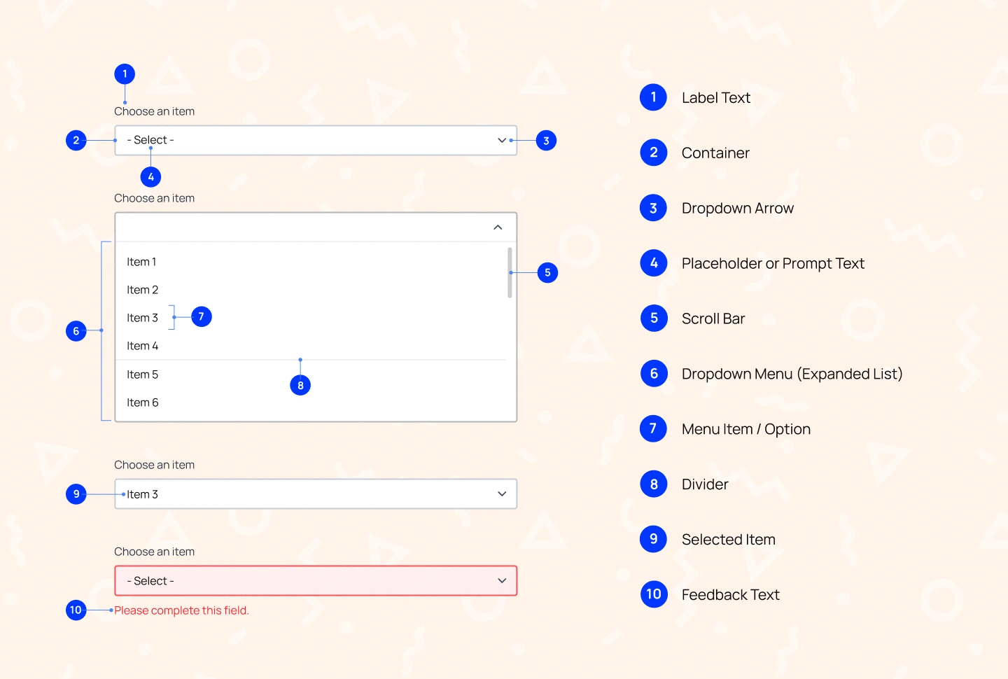
A detailed dropdown menu includes 10 key elements that define how it looks, behaves, and guides user interaction.
Dropdowns are commonly used in two major interface contexts: navigation and forms. Understanding these differences ensures that designers choose the right dropdown type for the right moment.
Navigation dropdowns reveal menu options when clicked, allowing users to navigate the interface without cluttering the screen. They need to be easy to scan, quick to understand, and stable enough to prevent accidental selections.
Below are some of the most common examples used in navigation design:

A standard navigation dropdown reveals a short list of secondary pages or actions when hovered over or clicked. It keeps the primary navigation clean while still giving users direct access to related sections. This dropdown design works best in dashboards or websites where users need predictable, straightforward paths to move from one area to another.

A mega menu is a large, expanded dropdown panel that organizes many options into clear groups. It is particularly useful for content‑heavy platforms where categories, subcategories, and featured content need to be displayed at once. Dropdown menu style helps reduce cognitive overload by presenting complex information in a structured, easy‑to‑scan format.

A locale switcher dropdown is designed to change an interface’s language, region, or currency. It often includes visual cues such as flags, language codes, or country names to help users quickly recognize and select their preferred locale. This type of dropdown is especially useful on global websites and apps where users need a simple way to switch between localized experiences.
Form dropdowns help users select or input information efficiently. Each is designed to support users at different levels of familiarity, whether they know exactly what they’re looking for or need guidance to find it.
Below are some of the most common examples used in form design:
A standard form dropdown is the most basic and familiar type of selection field. When users click or tap it, a list of predefined options appears, allowing them to choose without typing. This pattern works best for short, straightforward lists where users can quickly scan all options and make a selection with minimal effort.
A dropdown with autosuggest automatically filters options as the user types, showing only the most relevant matches. This makes it much easier to navigate long lists without endless scrolling. It’s especially useful in forms where users already have a specific term in mind and want to locate it quickly and efficiently.
A date picker dropdown opens into a visual calendar, allowing users to select a date by viewing days, weeks, and months at a glance. This format is especially helpful for scheduling or planning tasks, where users benefit from seeing the broader time context. By presenting dates visually rather than requiring manual input, the selection process becomes faster, clearer, and more intuitive.
Read more: What is an Accordion UI Design – Tips & Examples
Dropdown menus are a versatile interface element that helps organize information and keep layouts clean. When used appropriately, they improve usability, efficiency, and overall user satisfaction.
The following guide outlines the situations where dropdowns work well:
Dropdowns are useful when users need a clear, organised menu to browse choices at their own pace. This applies to both short lists and more complex, multi‑level structures like mega dropdowns. By grouping related items and hiding them until needed, dropdowns help keep information tidy and prevent visual overload.
Dropdowns are ideal when accuracy and consistency are essential. Because users can only choose from the available options, data remains clean and standardized, preventing issues such as typos, formatting inconsistencies, or invalid entries. This makes dropdowns reliable for structured inputs.
Dropdowns keep layouts clean by hiding options until the user interacts with them. This makes them especially effective in interfaces where screen space is limited—such as mobile layouts, dense forms, or multi-step processes. They allow access to multiple choices without cluttering the screen.
Designing an effective dropdown menu involves more than just listing options; it requires thoughtful consideration of usability, accessibility and visual clarity. Below are the best practices for creating dropdown menus:
Users should be able to recognize and understand each option the moment they see it. Avoid long or overly technical labels that make scanning difficult. Organize items alphabetically or into meaningful groups so users can predict where to find what they need. When options are clear and structured, users make faster, more confident selections.
Consider: Concise labels, consistent terminology, grouping by category or relevance.
A placeholder acts as the first hint about what the dropdown is for. Instead of generic prompts like “Select,” use specific, contextual instructions that help users understand what the field expects. A well‑written placeholder reduces hesitation, guides first-time users, and sets the right expectations before they open the dropdown.
Consider: Action-driven prompts such as “Select a country,” “Choose a department,” or “Pick a time slot.”
Dropdown options should be large enough for users to tap or click without worrying about hitting the wrong item, especially on mobile. When options are packed too closely or the touch area is too small, users must be overly precise, which leads to mistakes and frustration. Giving each option enough space makes the dropdown easier to use, more comfortable to interact with, and more accessible for everyone.
Consider: 40–44px minimum height per option, generous spacing between items, and sufficiently large touch areas.
Dropdowns with many options can overwhelm users and make the selection process feel slow. Adding search or autosuggest allows users to type a few letters and instantly narrow down the list. This reduces scrolling, speeds up selection, and makes long datasets manageable.
Consider: Built‑in search bars, real-time filtering, highlighting matched text, or showing recent or popular selections.
Users should always understand what is currently happening as they interact with the dropdown. Clear states for hover, focus, and selection guide users visually and help prevent mistakes. These cues are essential for accessibility and offer reassurance that actions are being registered.
Consider: Rotating chevrons, subtle background color changes, bold text for selected states, smooth and consistent motion to indicate state transitions.
Read more: The Essential Guide to Onboarding UX Design for SaaS Products
In this blog, we explored the importance of designing dropdown menus that are both intuitive and user-friendly. From clear labeling to accessible interaction states, thoughtful dropdown design plays a key role in reducing friction and helping users make confident choices.
Effective dropdown design is especially important in complex digital products, where clarity and usability directly influence how smoothly users move through key workflows. When applied well, dropdown menus simplify decision-making, create cleaner interfaces, and support a more seamless overall experience.
If you’re building a digital product and want expert guidance on crafting interfaces your users will love, Lollypop Design Studio is here to help. As a globally recognized saas design agency, we specialize in creating user-centered experiences that drive business growth.
Reach out to us for a FREE consultation, and let’s explore how we can elevate your SaaS product’s user experience together.


