

Imagine you run an E-commerce site and attract a large number of visitors. They select products, and add them to their carts, but don’t proceed to checkout. The abandonment rate is increasing, and you wonder: “What’s wrong with my Website/App?”
The situation above is a clear sign that the user experience (UX) needs improvement. This is when you should perform a UX Audit (UX Review) to identify the root causes and develop appropriate solutions.
So what is the UX audit definition? When should we perform a UX Site Audit? And how does this process take place? Let’s explore through the article below!
A UX audit (User Experience Audit) is a comprehensive evaluation of a digital product’s user experience, such as a website or mobile app. While it primarily focuses on identifying user experience issues, it also highlights areas of strength—such as well-performing user flows or features that engage users effectively. By understanding both the pain points and the positive aspects, a UX audit empowers businesses with the insights needed to make impactful, data-driven design improvements.
Specifically, a UX audit aims to answer key questions, including:
With these insights, businesses can establish specific goals, such as enhancing usability, increasing conversion rates, or aligning the user journey more closely with business objectives.
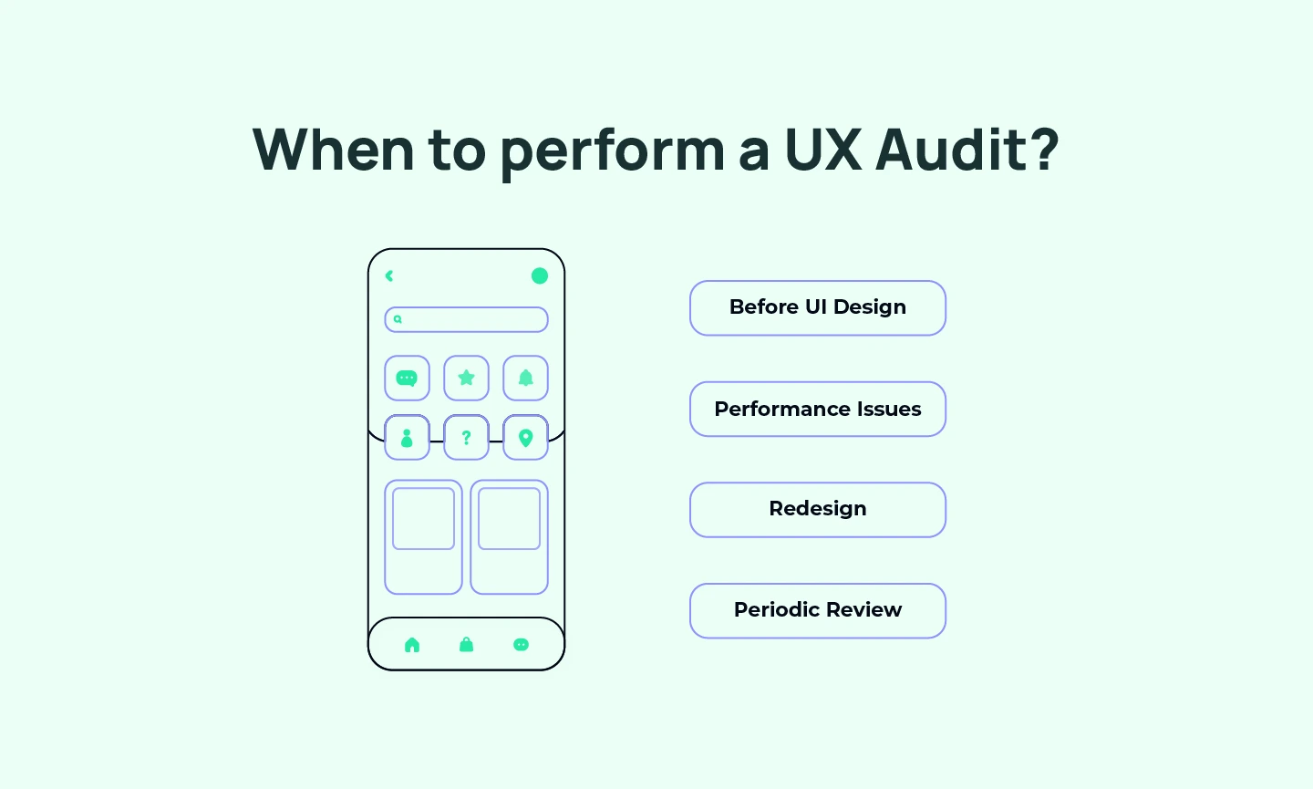
There are several key stages in the lifecycle of a digital product when a UX audit can deliver the most value:
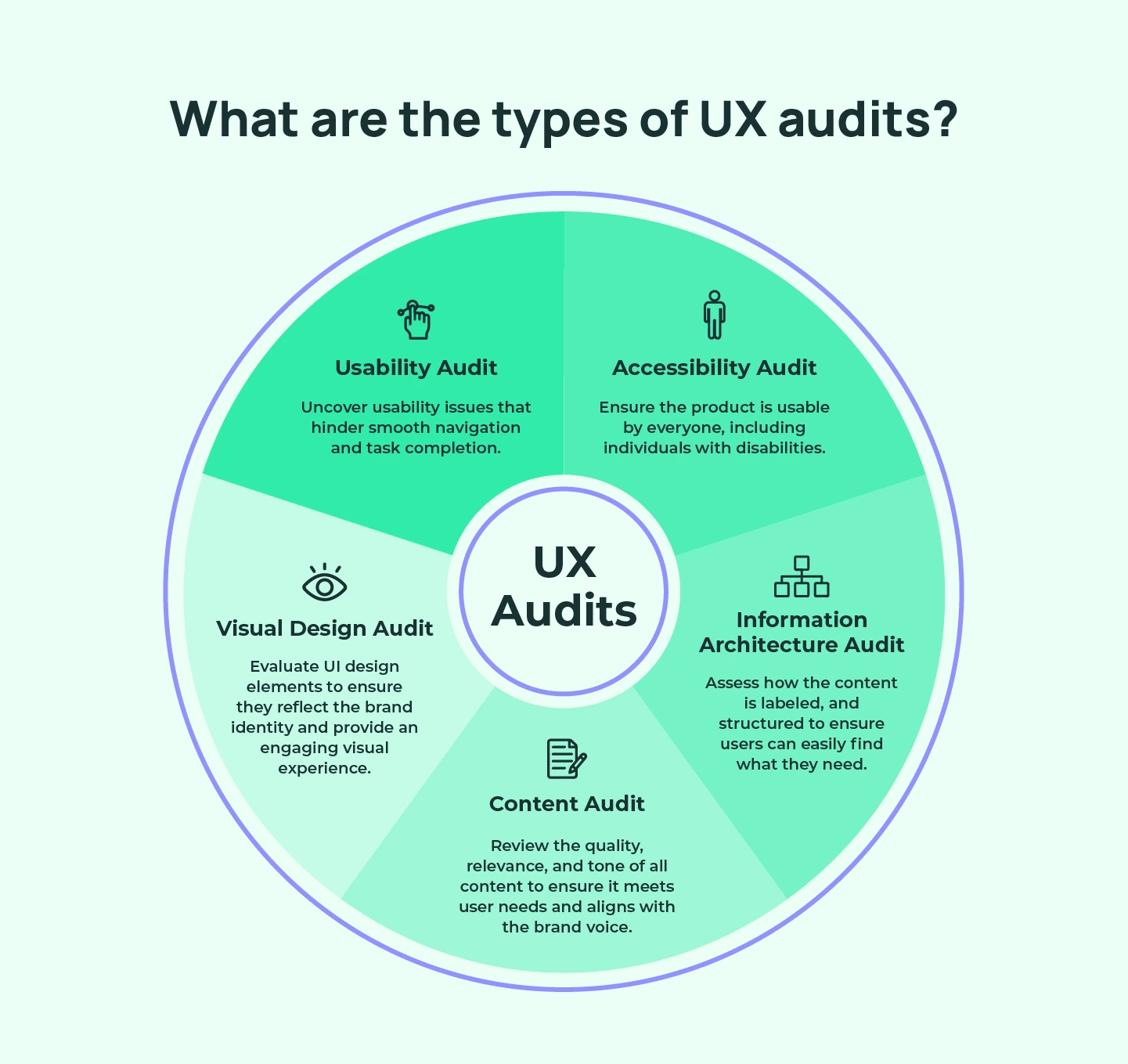
A usability audit dives deep into the user journey to uncover any usability issues that could hinder smooth navigation and task completion. This type of is by using Usibility Testing to examines key factors like navigation flow, interaction design, information layout, and overall functionality, ensuring that users can intuitively navigate your product without frustration.
By addressing usability challenges, you remove friction points that can lead to task abandonment or user frustration, ultimately enhancing user satisfaction and engagement.
An Accessibility Audit ensures your product is usable by everyone, including individuals with disabilities. This audit assesses compliance with the Web Content Accessibility Guidelines (WCAG) by examining keyboard navigation, screen reader compatibility, color contrast, alternative text for images, etc.
Beyond meeting legal standards, an accessibility audit promotes inclusivity by making your product accessible to a diverse user base, supporting equal access and fostering positive brand perception.
An Information Architecture Audit evaluates how your content is structured or labeled within the product, and whether users can intuitively locate what they need. This audit reveals content gaps, redundant pages, or confusing structures that can disrupt the user journey.
By enhancing the IA, businesses create a clear, logical content flow that helps users find information quickly, reducing cognitive UX load and improving navigation.
A visual design audit assesses the UI design components of your product – layout, color schemes, typography, and brand consistency. This audit ensures that the design aligns with brand identity and delivers an engaging visual experience. By carefully evaluating each design choice, the visual audit ensures that the visuals support usability and provide an attractive, memorable experience for users.
A ux content audit evaluates the quality, relevance, and tone of all product content to ensure alignment with user needs and brand voice. From text to images, the audit identifies outdated information, inconsistencies, and gaps that might hinder the user journey. By refining content, businesses strengthen user trust, clarity, and overall engagement, ensuring that each interaction delivers meaningful value.
When it comes to carrying out a UX audit, businesses have the option to leverage their in-house team or engage an external design agency. While using in-house resources can help save costs in the long term, collaborating with a specialized UX Design Agency can often provide more comprehensive and unbiased insights.
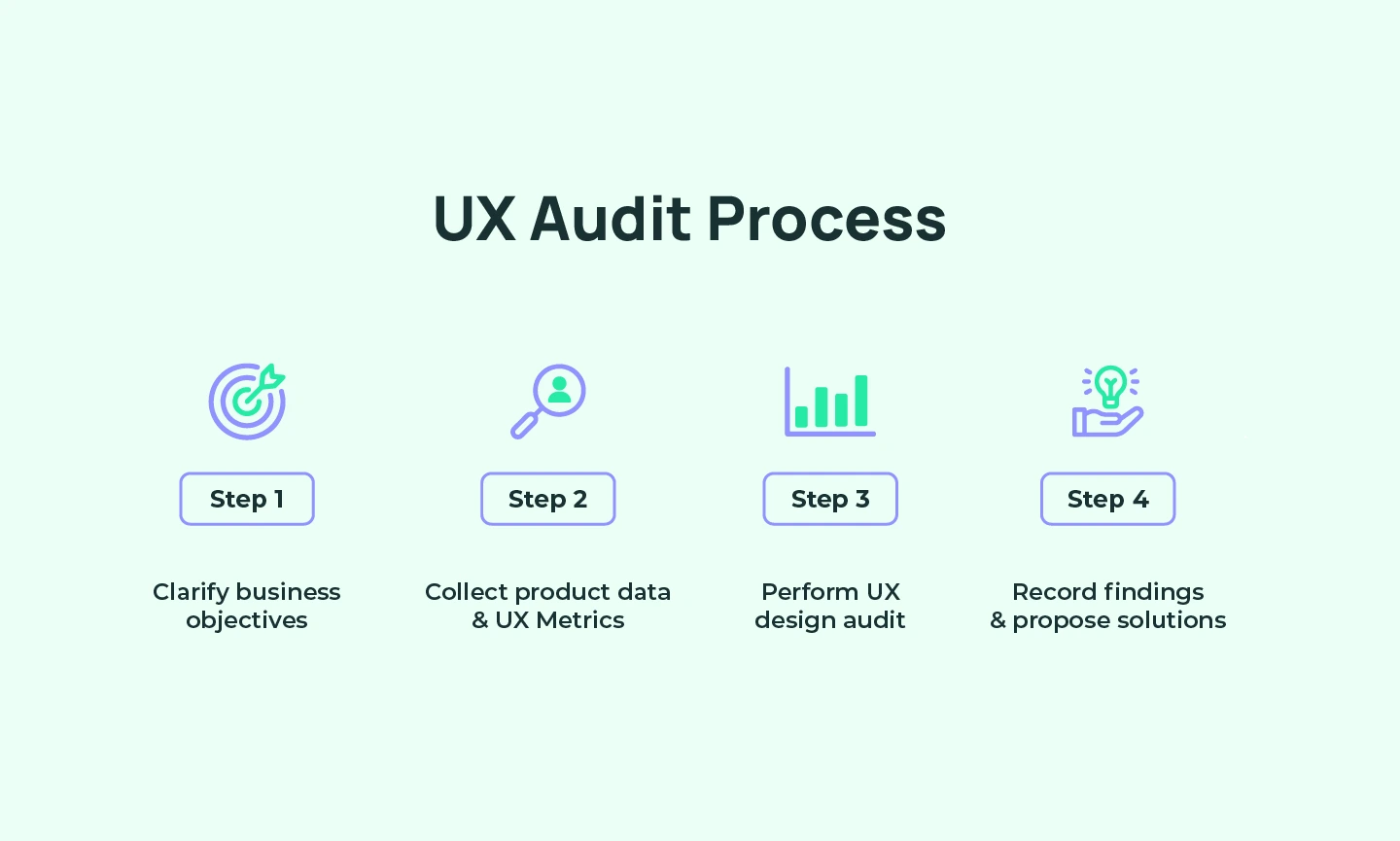
Now, let’s explore the 5 basic stages in the UX Audit process!
To begin, it’s essential to hold a meeting with all stakeholders to align on the objectives of the UX Audit – whether that’s to increase conversions, enhance user experience on the website or app, or address another goal. This initial alignment allows the design auditing team to accurately plan tasks, allocate resources, and define measurable metrics to track the progress and effectiveness of the Audit.
Note: Setting goals is essential, but setting the right goals is the key!
As management consultant Peter Drucker wisely said, “What gets measured gets improved.” To ensure objectives are well-defined, consider using the SMART framework: Specific, Measurable, Attainable, Relevant, and Time-bound.
For example: Rather than a general objective like “Increase website conversions,” a more SMART goal could be, “Increase website conversion rate by 20% over six months, from Q2 to Q4 of 2024.” This goal covers ⅘ SMART criteria, with the “Attainable” aspect requiring analysis of past data to set a realistic target.
In particular, you need to look at the revenue growth in the previous 6 months or during the same period in 2023 is useful. If growth was only 2% in that period, a target of 5-8% may be more appropriate!

Before beginning your assessment, it’s crucial to review key product documents like the product roadmap, user personas, user journey,… to understand the initial intent behind the build. Next, collect all relevant performance analytics, including metrics like time spent on specific pages, heatmaps, session frequency, and clicks. These data points will give you a clearer picture of how users interact with your product, enabling auditors to refine the study goals accordingly.
Additionally, the UX audit team should leverage quantitative data from various analytics platforms like Google Search Console, Google Analytics, Semrush, and Hubspot to pinpoint underperforming user flows on your website or app. Some key UX metrics to consider include:
By closely analyzing this diverse set of UX metrics, the audit team can gain a comprehensive overview of the current state of the user experience and identify key problem areas to address.
Read more: Everything You Need to Know about Website Audit Checklist
After identifying problem areas in the user experience, the next step is to apply Usability Heuristics and Design Principles to detect specific design errors.
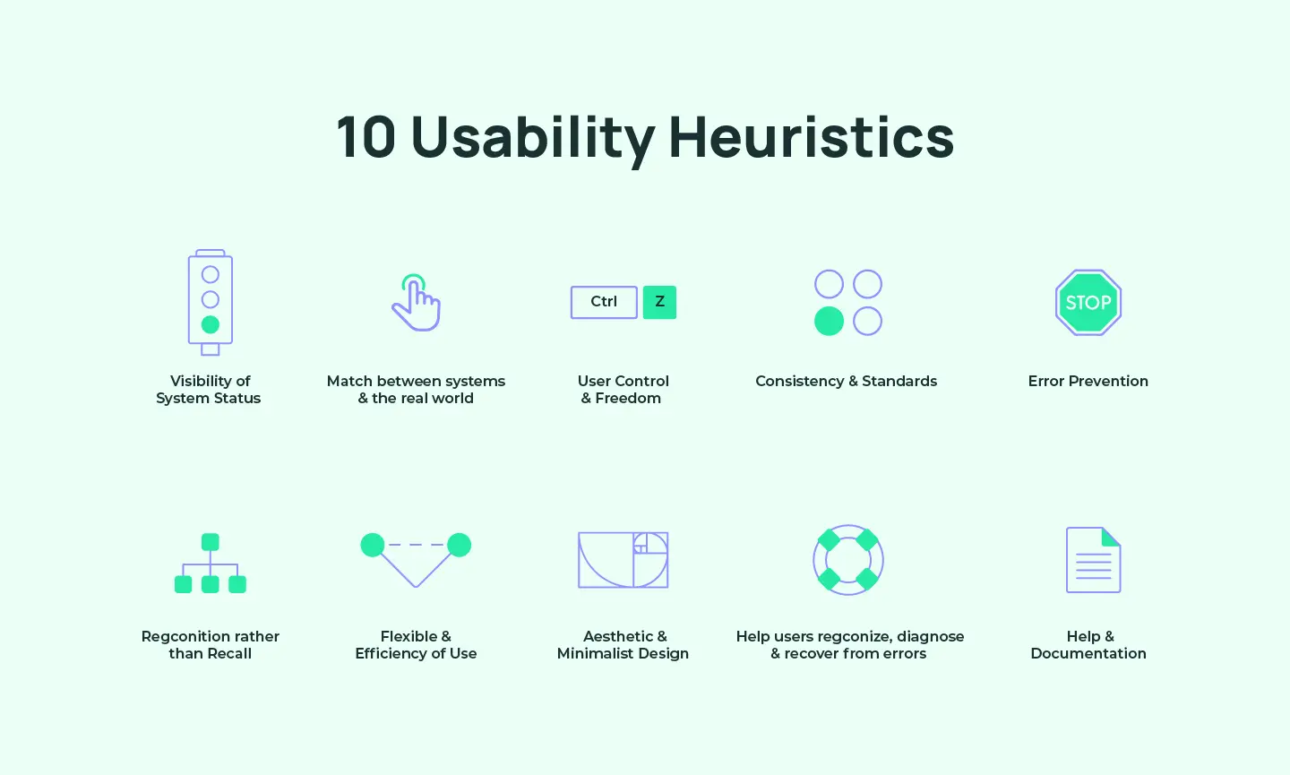
Usability Heuristics (or Heuristic UX Audit) is a set of 10 principles used to evaluate Usability and detect UX errors in user interface design. It was introduced in 1990 by Jakob Nielsen and Rolf Molich, two experts in Website Usability.
Note: A study shows that 43% of UX Issues detected through Usability 10 Heuristics are not real errors. Therefore, designers often combine heuristic evaluations with Usability Testing UX, where they observe real users interacting with the product.
This combined approach helps verify which problems are truly impactful and worth addressing, thereby optimizing resources in the Web / App Redesign process.
Figure out more: The Ultimate Guide to Heuristic Evaluation in UX Design
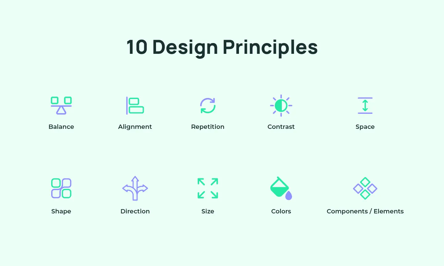
Design principles provide essential guidelines that support designers in crafting visually appealing digital experiences. These principles consider key elements of UI Design, such as color, shape, balance, contrast, etc. They derived from extensive observation and practical expertise within the design field.
However, it’s essential to understand that no single set of design principles is universally applicable to every design challenge. The impact of these principles can vary based on the specific context of each project, requiring designers to remain flexible and adapt solutions to meet the unique needs of each scenario.
Note: Besides Usability Heuristics and Design Principles, you can consider performing competitive audits to evaluate your product’s design against competitors’ products. By comparing your product’s design to that of competitors, you can identify strengths and weaknesses, spot best practices, and uncover missed opportunities to develop your product further.
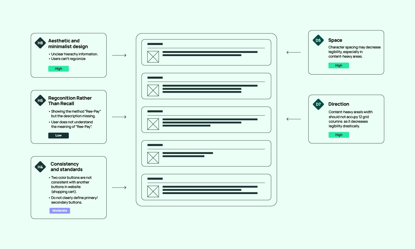
Once the evaluation process is complete, the UX audit team will synthesize their findings and proposed solutions in a detailed UX audit report. This report will document the specific usability issues identified, noting which heuristic principles they violate (e.g. H1, H2, H3, etc.).
The issues will also be classified by their level of impact on the user experience, ranging from “Lowest” to “Critical.” This prioritization helps the designers make improvement recommendations that suit the project’s resources and timeline.
This year-end season, grab your chance to claim your FREE UX audit slot with Lollypop WinAudit 2024. This exclusive campaign allows businesses to gain invaluable insights, refine their UX strategy, and pinpoint areas for improvement, all while enhancing your product’s competitive edge in 2025.
Don’t miss out—this opportunity won’t last long! Register now and take the first step toward elevating your product’s user experience.
While a UX audit may not be a core component of every design process, it is an invaluable investment that helps businesses proactively identify and mitigate potential risks in their digital products. By thoroughly assessing the current state of the user experience, you can make data-driven decisions to optimize your digital product.
So, what is the current state of your product? If you are looking for a reliable UX Audit service provider to health check your website/app, our design experts at Lollypop are ready to provide the meticulous examination of your digital product needs.
Lollypop Design Studio is one of the top UI UX design companies, providing comprehensive UX Audit solutions (such as UX site audit, UX content audit, UX UI Audit, Audit UX Design,…) across digital platforms. Contact us today to discuss the UX audit process tailored to your unique needs and goals!

