

We all know that the user experience of a SaaS product relies heavily on its Navigation Design!
Designing Navigation Menu goes far beyond deciding where links live. It requires understanding user workflows, anticipating decision points, and creating a structure that feels natural and predictable. When navigation is well crafted, users barely notice it. When it isn’t, it becomes a constant source of frustration.
In this guide, we’ll break down the key components of an effective SaaS navigation menu, examine the primary approaches to structuring navigation, and explore how to create a navigation menu effectively.
Let’s get started!
A navigation menu is a core element of any website or application, serving as the visual representation of its Information Architecture. It functions like a roadmap, outlining where key pages, features, and tools live within the product. When designed well, it helps users quickly understand the interface and find what they need without confusion.
In SaaS product design, the navigation menu becomes even more crucial since users often interact with dashboards, data-heavy screens, and multiple functional modules. The menu acts as a consistent anchor that keeps them oriented throughout these complex workflows. It enhances feature discoverability, supports task completion, and ensures users can move smoothly across the product experience.
There are 2 common approaches to designing navigation menus:
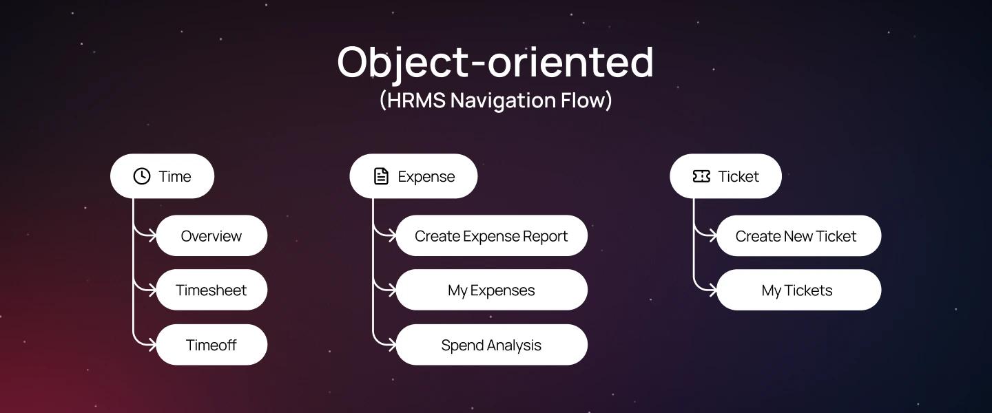
Object-oriented navigation structures the interface around the key “objects” users work with—such as clients, projects, campaigns, or documents. Each object becomes a central entry point, and when users select it, they see all related information and actions.
This approach aligns with how people naturally think about their work. Instead of searching through multiple menus, users can go straight to the object they care about and manage everything from one place.
When to use in SaaS product design:
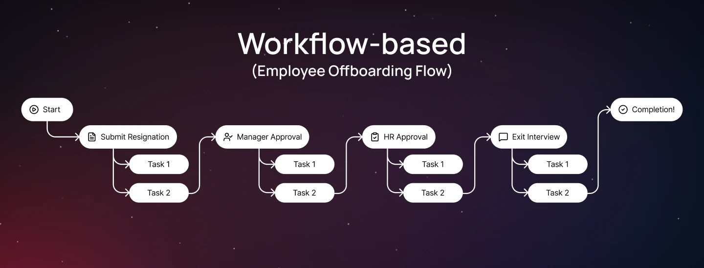
Workflow-based navigation structures the user interface around a step-by-step sequence that users follow to achieve a specific goal.
This approach emphasizes the logical flow of tasks, guiding users from the starting point through each step until completion. It acts as a roadmap, helping users understand what to do next and reducing the risk of errors or skipped steps.
When to use in SaaS product design:
Navigation directly shapes how users discover features, complete tasks, and understand the product’s structure. A well-designed navigation system reduces cognitive load, ensuring users experience the product without confusion or friction.
For SaaS in particular, navigation is essential for several reasons:
Different SaaS products require different navigation patterns depending on their complexity, user roles, and usage behaviors. Here are some of the most common patterns you’ll encounter in modern SaaS ecosystems:
The top navigation bar (Navbar) is placed at the very top of the screen and presents the main sections of a product in a single horizontal row. It’s a familiar pattern for most users and works best for products with a limited number of primary categories (usually 3–6). This layout keeps the interface clean and allows users to scan and access key sections with minimal effort quickly.
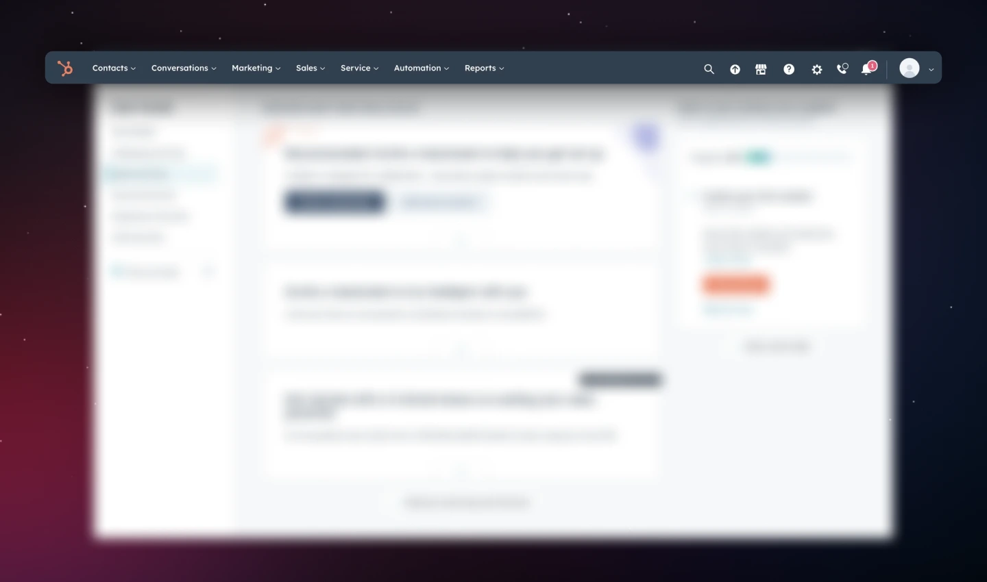
Navigation menu examples: HubSpot uses a top navigation bar to organize its core modules—Contacts, Conversations, Marketing, Sales, etc. Each module has a dropdown menu navigation bar for sub-features, making it easy for users to access all tools without feeling overwhelmed.
Sidebar menus are placed on the left side of the interface. They’re ideal for SaaS products with many sections or complex hierarchies, as they provide more space for labels and nested menus. Side navigation menu can remain visible as users scroll, helping them stay oriented and understand the full range of options available.
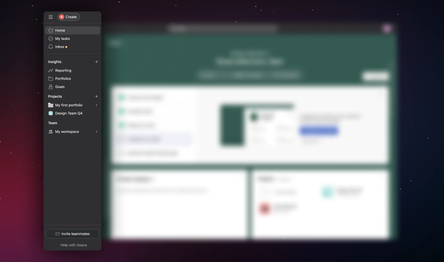
Navigation menu examples: Asana uses a vertical sidebar to organize areas like Home, My Tasks, Inbox, Insights, Projects, and Team. Each section can expand to show additional options, allowing users to navigate deep hierarchies while keeping all main areas easily accessible.
Hamburger menus hide navigation options behind a compact icon, typically represented by 3 stacked lines. This pattern is common in mobile apps or responsive web designs where screen space is limited. While it helps save space, it should be used thoughtfully—hiding essential features can make navigation less discoverable.
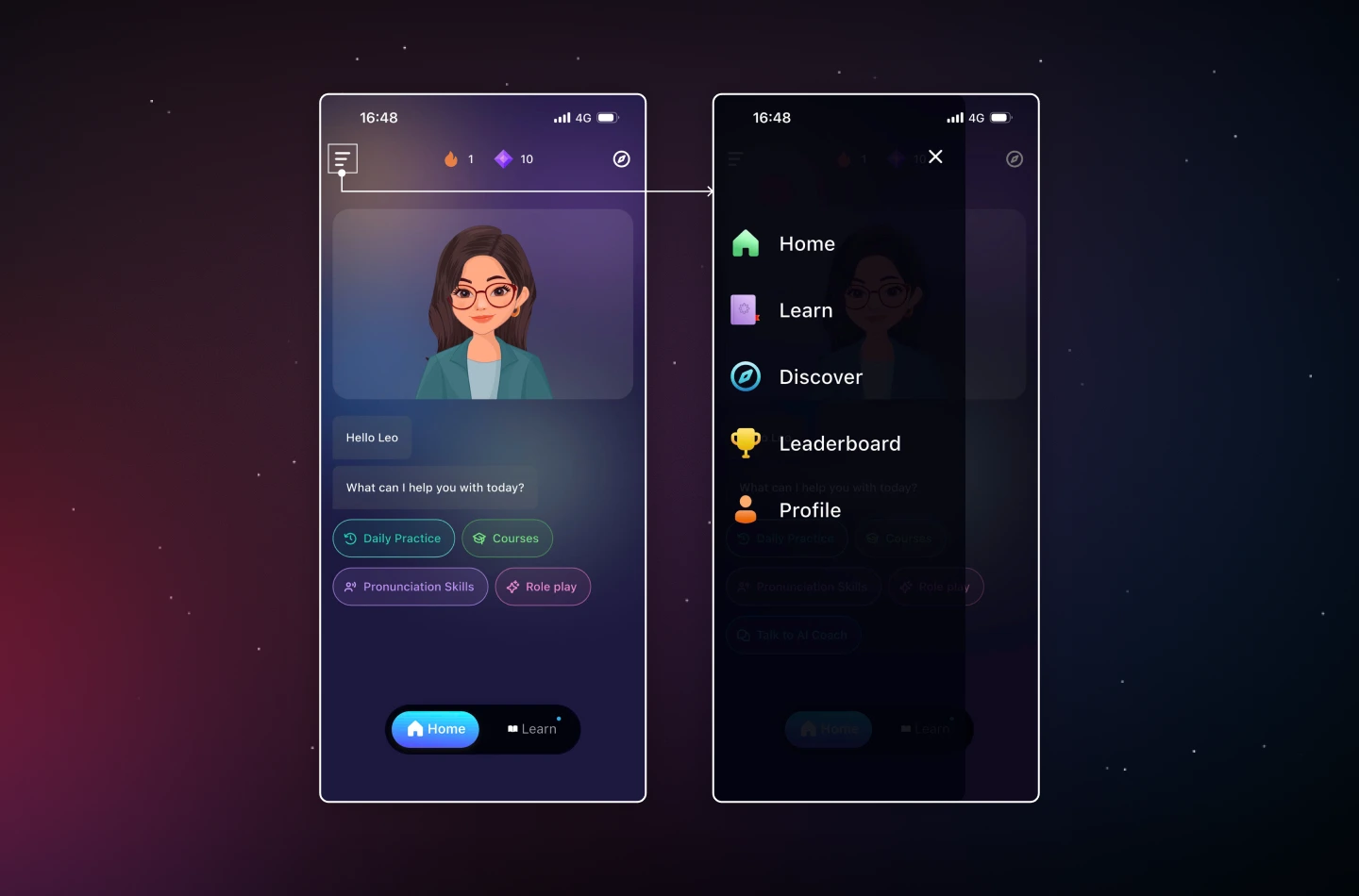
Navigation menu examples: Elsa Speak uses a hamburger menu in its mobile menu navigation. Tapping the icon opens a vertically aligned menu with the app’s main destinations. This keeps the main screen focused on daily practice and AI interactions, while still providing quick access to all navigation options without taking up constant space.
In some SaaS applications, search serves as the primary navigation tool. This pattern is ideal for platforms where users need to access a large volume of content quickly. A prominent search bar allows users to bypass traditional menus and go directly to the feature or data they need, reducing friction and improving efficiency.
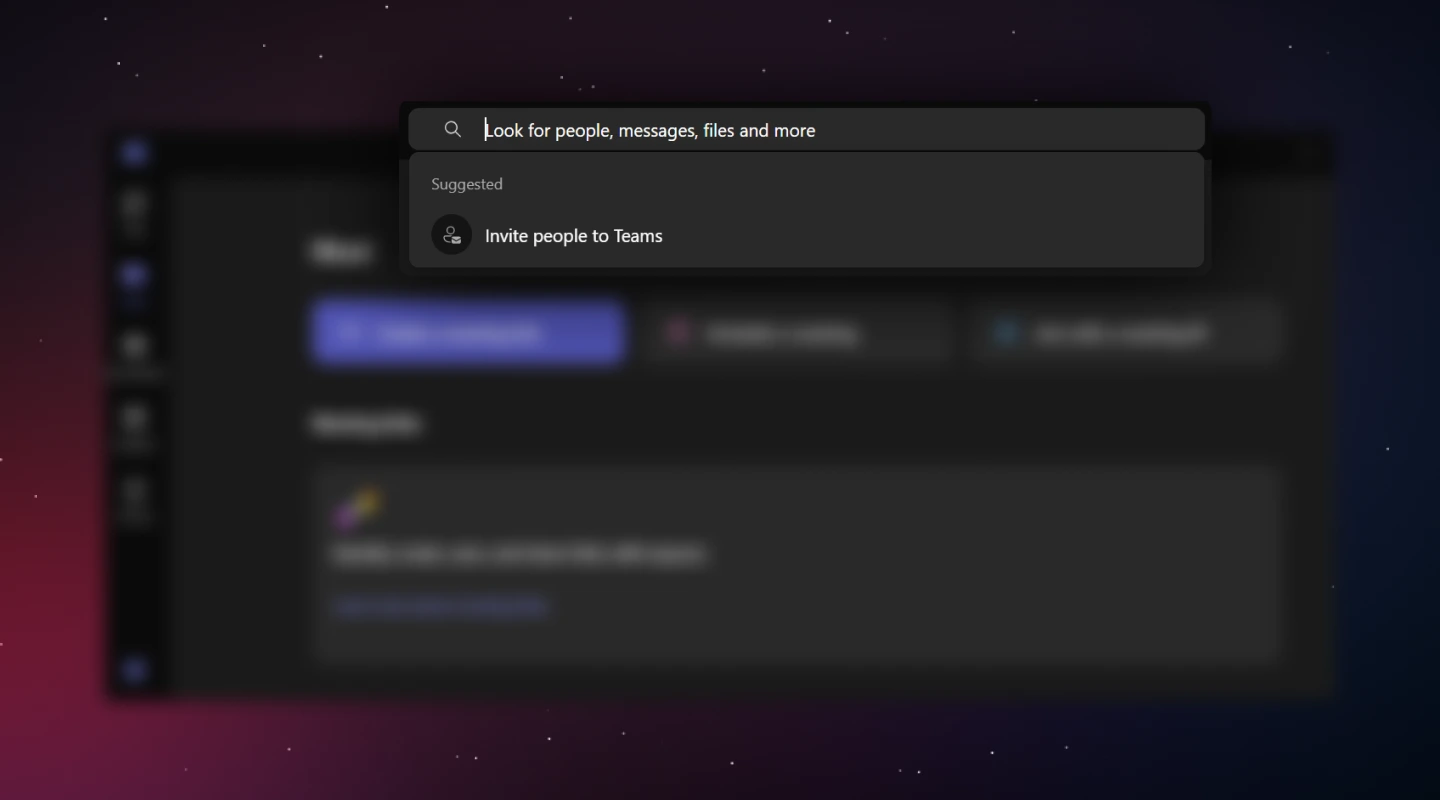
Navigation menu examples: Microsoft Teams clearly showcases a visible search bar that sits at the top of the screen. Acting as a central hub, it lets users instantly find contacts, conversations, files, or suggested actions like “Invite people to Teams,” streamlining navigation and enabling quick access to relevant content.
Breadcrumbs serve as a secondary navigation aid, showing users their current location within a hierarchy. They are particularly useful for SaaS products with deep or complex structures, such as multi-level dashboards or settings menus. Breadcrumbs provide context and allow users to quickly backtrack without repeatedly relying on the browser’s back button.
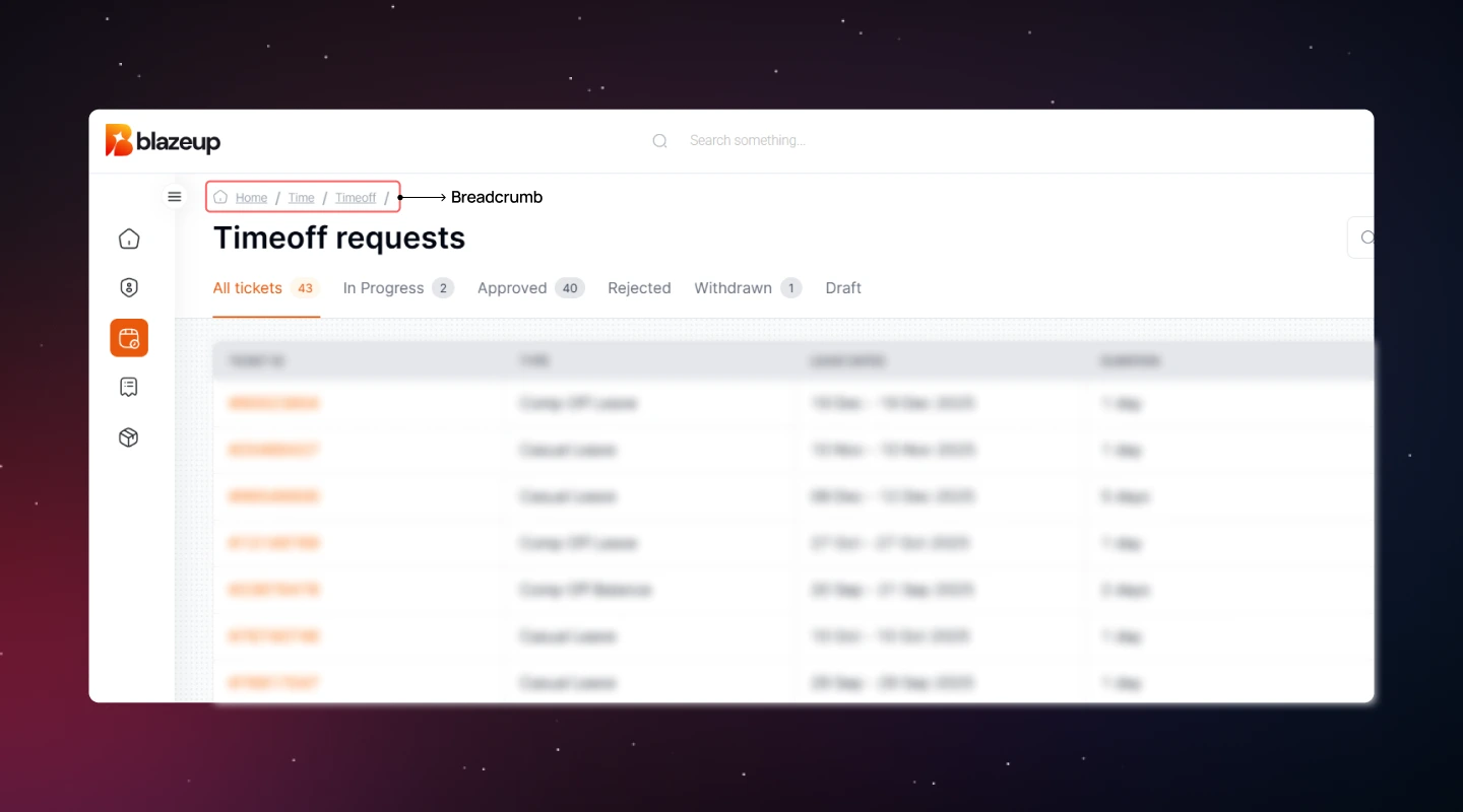
Navigation menu examples: The Blazeup’s breadcrumb trail is displayed above the main content area, showing the path: “Home / Time / Timeoff.” This indicates that the user started at Home, navigated to Time, and is currently viewing Timeoff requests. The visual guide helps users return to higher-level sections without navigating the sidebar or remembering the exact steps taken.
Clear website navigation menus make it easy for users to find what they need and get work done efficiently. A well-designed menu reduces confusion, saves time, and improves the overall user experience.
Here are the key practices to follow when designing SaaS Navigation Menus!
Instead of forcing users to learn the internal structure of your product, the navigation menu design should match their mental model and workflow patterns. This ensures that users spend less time figuring out where to go, helping them accomplish their goals efficiently.
How to do:
Users navigate more efficiently when options are organized and easy to understand. A clear navigation menu structure reduces cognitive load, prevents confusion, and helps users locate the features they need quickly.
How to do:
Navigation menu should make it easy for users to find the most important features quickly, so they can complete tasks efficiently without hunting through menus. Well-prioritized menus reduce frustration and improve overall productivity.
How to do:
Different SaaS products require different navigation menu structures depending on complexity, user roles, and content hierarchy. Supporting multiple navigation patterns ensures users can efficiently access features, whether on desktop, mobile, or within deep workflows.
How to do:
Web navigation menu should make it easy for users to understand the structure, see where they are, and know what actions they can take next. Clear visual cues reduce confusion and increase user confidence when navigating the product.
How to do:
Navigation menu should reflect the access and responsibilities of each user, so users only see the features they need. This prevents confusion, reduces clutter, and supports a role-based workflow.
How to do:
Navigation menu should evolve with your users, product growth, and changing workflows. Regular iteration ensures menus stay usable, efficient, and scalable as new features are added.
How to do:
Read more: The Ultimate Guide to Tab Design – Anatomy, Types, and Tips
In this blog, we’ve highlighted how effective SaaS navigation UX is essential for creating user-friendly SaaS experiences—especially in complex products. When applied effectively in SaaS UX Design, navigation menus can reduce friction, enhance usability, and help users focus on what matters most.
If you’re looking for expert guidance on building a SaaS product that delights users, Lollypop is here to support. As a globally recognized SaaS UX design agency, we specialize in creating user-centered designs that drive business growth.
Reach out to us for a FREE consultation and see how we can elevate your SaaS user experience.
The future of SaaS navigation menus lies in creating smarter user experiences. Innovations such as voice and conversational interfaces will allow users to navigate via voice commands or chatbots, enabling hands-free efficiency. AI-driven personalization will provide dynamic, predictive menus that adapt in real time to individual user behavior. Augmented reality (AR) will offer immersive navigation for platforms tied to physical environments like manufacturing or logistics. Additionally, cross-platform integration will ensure a unified navigation experience across desktop, mobile, and IoT devices.
Common mistakes in navigation menu design include overloading menus with too many options, using unclear or technical labels, failing to prioritize frequently used features, and creating inconsistent structures across pages. Other pitfalls are neglecting mobile responsiveness, hiding critical features behind hamburger menus, ignoring user roles and permissions, and lacking visual hierarchy or feedback, which can confuse users, increase cognitive load, and make it difficult to find key actions or complete tasks efficiently.
To measure the success of intuitive navigation, focus on key performance metrics: track task completion rates to see how efficiently users achieve goals, measure time on task to identify navigation bottlenecks, analyze click paths to determine how many steps users take to reach objectives, gather user feedback through surveys or interviews to uncover pain points, and monitor support requests for navigation-related issues, with decreases indicating improved usability.
The 3-level navigation menu include: (1) primary navigation provides access to the core sections or features of a product and is usually visible at the top or side of the interface; (2) secondary navigation consists of sub-menus within a primary section, helping users explore related pages or features without leaving the main context; (3) tertiary navigation includes optional or contextual menus that offer additional, less frequently used options, often nested within secondary menus or appearing on specific pages.


