SaaS product design isn’t just about making software look good—it’s about building systems that grow, scale, and perform consistently for thousands of users at once. In a SaaS environment, every design decision—from onboarding to dashboard layout—affects how users collaborate, manage data, and achieve their goals efficiently. A single friction point can disrupt workflows, reduce adoption, and impact business value.
That’s why SaaS design principles are more than guidelines—they’re the backbone of sustainable, user-centered product growth. They help designers maintain clarity in complex systems, ensure consistency across modules, and create experiences that balance functionality with simplicity.
In this blog post, Lollypop Design Studio explores the 7 core principles that power great SaaS product design—unpacking how these fundamentals shape scalable, intuitive, and engaging platforms that truly empower users and drive long-term success.
Key Takeaways
- SaaS product design is about creating scalable, user-friendly systems that support long-term growth and efficient workflows.
- User-centric design helps SaaS products solve real user problems through research, empathy, and task-focused experiences.
- Simplicity and consistency improve usability by reducing friction, maintaining clarity, and creating predictable interactions across platforms.
- Efficient SaaS UX focuses on faster time-to-value, streamlined onboarding, personalized experiences, and optimized workflows.
- Feedback, guidance, and accessibility are essential to help users navigate confidently and ensure inclusive experiences for all users.
- Scalable SaaS design relies on modular systems, reusable components, and continuous testing to support future growth without compromising usability.
- Applying strong SaaS design principles helps businesses improve adoption, engagement, retention, and overall product success.
1. User-centricity
User-centricity is the foundation of every successful SaaS UX design. It focuses on understanding user goals, challenges, and behaviors, then shaping the product to fit those needs. This approach ensures your platform solves real problems instead of adding complexity.

Two fundamental components of user-centric design are user empathy and user research. While user empathy helps you see the product from the user’s perspective, user research provides data-driven insights that guide design decisions and deliver a smoother, more meaningful experience.
To create a User-centered SaaS UX Design:
- Target Audience Focus: Understand exactly who your users are and what problem your SaaS solves for them. Keep your design and messaging focused on that one core purpose—avoid distractions or unnecessary features. A clear target audience focus builds trust and helps users instantly see your product’s value.
Example: Mailchimp’s homepage focuses solely on marketing automation, making it instantly clear who it’s built for.
- Task-Driven Workflows: Design around the real tasks users need to complete, not just a list of features. Simplify navigation, reduce steps, and make frequent actions effortless. This helps users achieve their goals faster and keeps them engaged with your product long term.
Example: Notion lets users customize their workspace around key tasks, keeping workflows simple and clutter-free.
- Context-Aware Interfaces: Adapt the interface based on user roles, experience levels, or current actions. Show only what’s relevant—like admin tools for admins or simplified views for new users. This reduces cognitive load and makes the product feel intelligent and responsive.
Example: Slack hides advanced workspace settings from regular users, keeping the interface clean and role-specific.
- Lifecycle-Centered Design: Design for every stage of the user journey—from onboarding to mastery to re-engagement. Offer guidance to beginners, shortcuts for experts, and personalized prompts for returning users. This ensures consistent satisfaction and long-term product adoption.
Example: Figma offers step-by-step onboarding for new users, while advanced users get shortcuts and team collaboration tools.
2. Simplicity
Simplicity is one of the most essential SaaS design principles, ensuring that every interaction is clear and free from unnecessary clutter. A simple SaaS interface keeps users focused on achieving their goals without confusion or distraction.
True simplicity doesn’t just mean minimal visuals or fewer buttons—it means removing friction through thoughtful structure and smart hierarchy. When users can complete key actions quickly and intuitively, your product feels both powerful and effortless to use.
To create a simple SaaS product design:
- Focus on Core Functions: Identify the key actions your users perform most often and prioritize those features. Remove any clutter or redundant elements that distract from these main tasks to make the product feel clean, fast, and effortless to use.
- Create a Clear Information Hierarchy: Use layout, typography, and color strategically to guide attention and make information easy to scan. Place primary actions and key data where users expect to find them, grouping related items logically to reduce cognitive load.
- Intuitive Navigation: Ensure users can find what they need quickly and without confusion. Use clear menu structures, consistent placement, and logical labeling to keep navigation simple and user-friendly, even in feature-rich SaaS products.
- Progressive Disclosure & Adaptive Onboarding: Avoid overwhelming users with too much information at once. Reveal features gradually and provide contextual guidance as users explore the product, tailoring tips based on user behavior or role to create a smooth learning curve.
3. Consistency
The SaaS design principle of “Consistency” is what builds trust and predictability across your product. It’s about maintaining uniform design elements, interaction patterns, and terminology across every screen and workflow.
When users encounter familiar layouts and predictable responses, they navigate more confidently and efficiently. Consistency also strengthens brand identity and user retention, ensuring the experience feels seamless whether users are on desktop, tablet, or mobile.
To create a consistent SaaS product design:
- Establish a Design System: Define and document your product’s core visual and interactive elements—such as color palette, typography, icons, and tone of voice—to ensure every screen and component feels cohesive and aligned with your brand identity.
- Ensure Visual Harmony: Maintain consistent spacing, alignment, and layout across the product to create a balanced, unified interface. Visual harmony helps users focus on tasks without distraction and builds a sense of familiarity with each interaction.
- Build a Responsive SaaS Platform: Design for cross-device coherence so the experience feels seamless across desktops, tablets, and mobile devices. The goal is not identical screens, but consistent logic, navigation, and flow that preserve user confidence and reduce friction as they switch between devices.
4. Efficiency
Efficiency is a SaaS design principle that helps users get things done faster with fewer steps. It’s about optimizing workflows, reducing cognitive load, and ensuring every action delivers value. Efficient interfaces prioritize speed and usability, enabling users to accomplish their goals without unnecessary friction.
By streamlining navigation, automating repetitive tasks, and designing for performance, you create a SaaS experience that drives both productivity and satisfaction.
To create an efficient SaaS UX Design:
- Accelerate Time-to-Value (TTV): Focus on minimizing the time between signup and the user’s first “Aha!” moment — when they clearly see the value of your product. Streamline onboarding, remove unnecessary steps, and guide users visually to core actions that deliver instant results. The faster users find success, the higher your engagement and retention rates.
- Simplify Sign-Up Flow: Reduce friction by asking only for essential information like name and email. Offer quick options such as Google or social logins to lower barriers. Use progress indicators to keep users motivated and request extra details only when relevant during product use. A seamless start builds trust and drives completion.
- Enable Dynamic Sorting: Allow users to filter, sort, and manage data in flexible ways that fit their needs. Provide control over how information is displayed and organized, ensuring workflows remain efficient and adaptive. This flexibility enhances usability and user satisfaction.
- Personalize the Experience: Customize onboarding and in-product experiences based on each user’s role, goals, and behaviors. Use collected data to segment users and deliver relevant guidance, helping them reach value faster and feel supported throughout their journey.
You may want to read more: What is an Accordion UI Design – Tips & Examples
5. Feedback and guidance
Feedback and guidance are vital SaaS design principles that ensure users always know what’s happening and what to do next. Every interaction—whether submitting data, running a report, or saving changes—should provide immediate, clear feedback to confirm success or highlight errors. Equally important is contextual guidance that supports users in real time, helping them make the right choices without confusion.
Without these cues, users can feel lost or uncertain about system responses, leading to frustration and decreased trust in the platform.
To create an effective Feedback and Guidance for SaaS products:
- Deliver Immediate UI Feedback & Micro-Interactions: Add subtle animations, transitions, and visual cues that respond instantly to user actions. These small yet powerful details confirm system responses, reduce waiting frustration, and make the product feel smooth and alive. Thoughtful micro-interactions not only improve usability but also convey quality and attention to detail. Without them, even a strong SaaS UI can feel static and unresponsive.
- Integrate Built-In Support and Guidance: Embed contextual help directly into the product to assist users right when and where they need it. Use tooltips, inline tutorials, and short video demos near complex features. Offer quick access to chat, help docs, or interactive walkthroughs to reduce friction and boost confidence. Proactive, in-app support encourages users to explore, adopt new features, and solve problems independently.
- Implement Secondary Onboarding: Continue guiding users after their initial setup by introducing advanced features and best practices over time. Use checklists, prompts, or mini-tours to highlight updates and help them unlock deeper value. This ongoing guidance keeps users engaged, increases retention, and ensures they grow alongside your product.
6. Accessibility
Accessibility is about designing your SaaS product so it can be used by everyone, regardless of ability or circumstance. This includes users with visual, auditory, motor, or cognitive limitations, as well as those facing temporary barriers like noisy environments or limited device access.
Accessible design improves usability for all users while ensuring inclusivity and compliance with global standards. By integrating features like keyboard navigation, readable contrast, and assistive technology compatibility, you create a SaaS experience that’s open, equitable, and user-friendly for a wider audience.
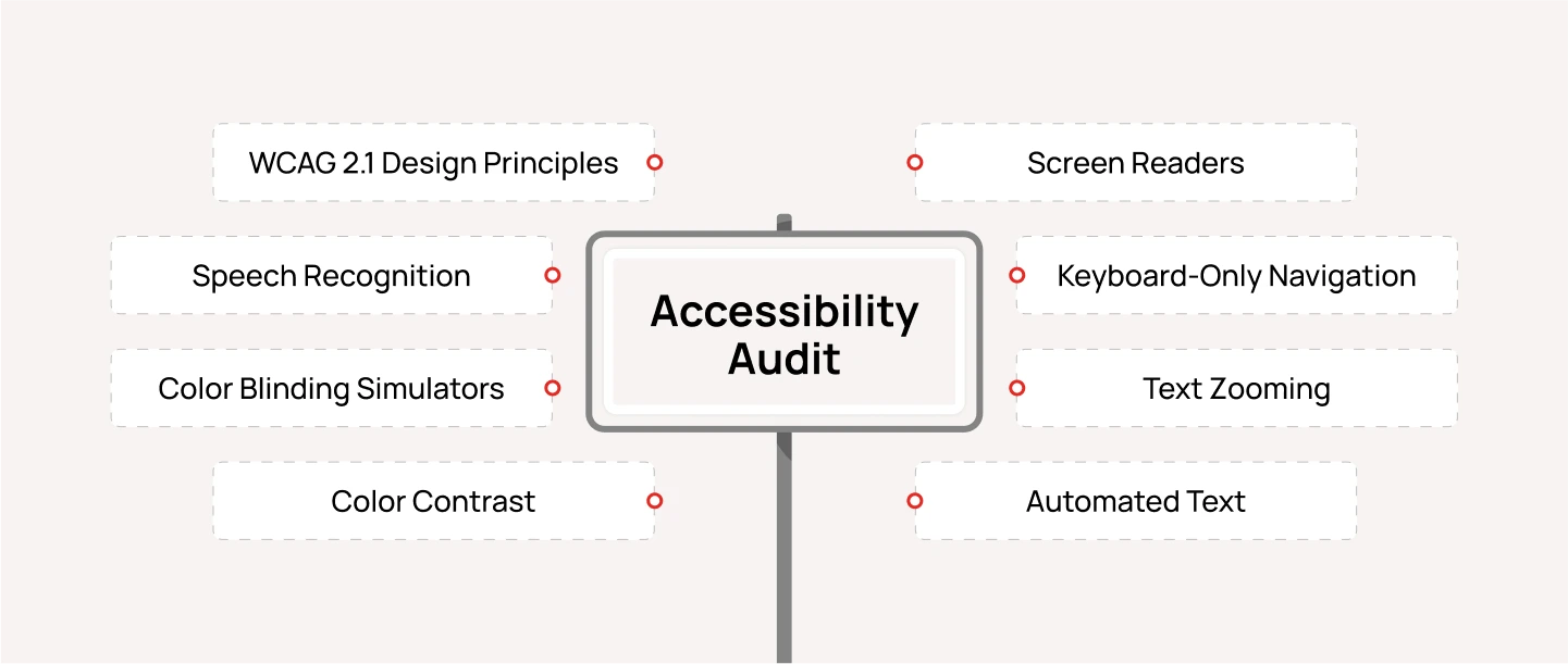
To create an Accessible SaaS UX design, follow the Accessibility Audit checklist below:
- Accessibility of Text: Evaluate the readability and clarity of all text elements — including font size, color contrast, semantic HTML, and plain language — to ensure users can easily read and understand the content.
- Accessibility of Images, Audio, and Video: Ensure that non-text content is inclusive by adding descriptive alt text for images, transcripts or captions for audio, and subtitles or audio descriptions for videos.
- Accessibility of Interactive Content and Transactions: Review the accessibility of all interactive elements, such as buttons, forms, and navigation. Check for proper labeling, clear error messages, smooth keyboard navigation, and visible focus indicators.
- Accessibility of Technology: Verify that the underlying technology supports assistive tools and includes features for error prevention and easy recovery, helping users complete tasks without barriers.
Want to explore this further? Read our Comprehensive Guide to Conducting UX Accessibility Audit.
7. Scalability
Scalability is the ability of a SaaS product’s design and architecture to evolve as the business and user base grow. A scalable interface is built with flexibility in mind, supporting new features, larger datasets, and more complex workflows without needing a full redesign.
This principle emphasizes creating modular systems, reusable components, and adaptive layouts that expand smoothly over time. However, scalability must never compromise usability—new additions should feel natural and cohesive, ensuring the experience remains intuitive and efficient no matter how the product evolves.
To create a scalable SaaS product design on demand:
- Build Modular UI Components & Design System: Design your product with growth in mind by creating reusable UI components that can easily adapt as new features are added. A strong design system ensures visual consistency, speeds up development, and allows teams to scale without sacrificing quality. This modular approach helps your product evolve smoothly instead of requiring major redesigns later.
- Plan for Expansion with Smart Architecture: Structure both the front-end and back-end to handle increasing users, data, and complexity. Organize navigation, information hierarchy, and workflows so they can expand logically as your product grows. A well-architected system supports new features seamlessly without confusing users or slowing performance.
- Test and Iterate: Regularly gather user feedback and run usability tests to spot friction points early. Track performance and engagement metrics to ensure scalability doesn’t compromise experience. Iterating based on insights helps the product stay efficient, adaptable, and aligned with evolving user needs.
You might want to read: The Anatomy of a Effective SaaS Landing Page
Final thought
In this blog, we explored the 7 essential SaaS design principles that shape successful, scalable, and user-focused digital products. By applying these principles, you can avoid common design pitfalls and craft SaaS experiences that feel intuitive, reliable, and built for growth.
As a leading SaaS design agency, Lollypop brings together a team of saas product design experts — designers and developers — who understand the unique challenges of building complex cloud-based platforms. We combine deep UX expertise with data-driven design thinking to help businesses create SaaS products that not only meet user needs, but also drive long-term engagement and retention.
Reach out to Lollypop to schedule a free consultation and discover how we can help refine, optimize, and elevate your SaaS product experience from the ground up.
Frequently Asked Questions (FAQs)
1. What Makes SaaS Product Design Unique?
Product design for SaaS platforms is unique because it must balance scalability, usability, and flexibility across a wide range of users and devices. Unlike traditional software, SaaS products live in the cloud and serve multiple customers simultaneously—each with different workflows and goals. That’s why a strong SaaS design focuses on clarity, modularity, and efficiency. The interface should guide users intuitively, while the underlying design system must support continuous updates without disrupting the user experience.
2. What are Common SaaS Design Mistakes to Avoid?
One of the biggest mistakes in SaaS product experience design is overcomplicating the user experience. Many teams try to pack in too many features at once, which leads to cluttered interfaces and confused users. Another common pitfall is neglecting onboarding—assuming users will just “figure it out” often causes high churn rates. Ignoring responsive design, accessibility, and performance also weakens user trust, especially in B2B settings.
3. What are the Best Practices for designing B2B SaaS platforms?
Designing B2B SaaS platforms requires a deep understanding of complex workflows and collaborative environments. Start with user research to uncover real pain points and map out multi-role journeys—since different stakeholders often interact with the same product in different ways. Prioritize information hierarchy and clean navigation so users can complete tasks efficiently. Use data visualization thoughtfully to turn large datasets into actionable insights. And finally, build scalability into your design system early—so as your clients’ businesses grow, your platform can grow with them.


