

No user enjoys waiting for a website or app to load. Even a short delay of 1–3 seconds can feel annoying, especially when there’s no sign that the product is working.
As a product owner, you know that loading can’t always be avoided when handling large amounts of data or complex content. The key is to show users that something is happening behind the scenes. That’s exactly what a Preloader does. It provides a visual cue during load time, so users stay informed and don’t get frustrated.
In this blog, we’ll dive deep into preloading meaning, why it’s important, and how to create an effective preloader design that enhances the user experience.
A preloader is a visual element that appears on a website or application while the main content is still loading. It typically takes the form of a spinner, animated icon, loading bar, percentage counter, or custom animations aligned with the product’s branding.
By signaling that content is actively being loaded, preloaders reassure users that the system is functioning correctly. Even if the actual load time is short, a preloader helps make the wait feel more manageable and intentional.
Preloaders should be used selectively, only when the loading time is long enough to be noticed. Below are common cases where a preloader can improve clarity and reduce user frustration:
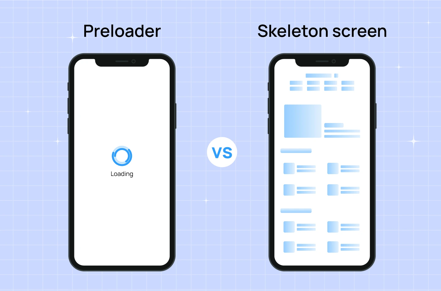
Both preloaders and skeleton screens are used to manage user expectations during loading times, but they differ in how they look, how they work, and the experience they create.
For SaaS businesses, delivering a smooth user experience is essential to keeping users engaged and satisfied. During loading moments—when content or data is still being processed—a preloader helps reassure users that the system is working as intended and encourages them to stay on the page.
Below are some key benefits of using a preloader in your SaaS product:
A well-designed preloader does more than just indicate that something is loading. It can shape how users perceive your product, reinforce your brand, and improve user satisfaction. In SaaS product development, where delays are sometimes unavoidable, thoughtful preloaders help keep users engaged, reduce frustration, and maintain trust.
Below are 5 practical tips for designing effective preloaders, along with preloader examples to show how you can turn wait time into a better experience.
Even if the wait time is the same, users are more patient when they see visible progress. A generic loading spinner that loops endlessly offers no context, which can make users impatient, confused, or even think something is broken.
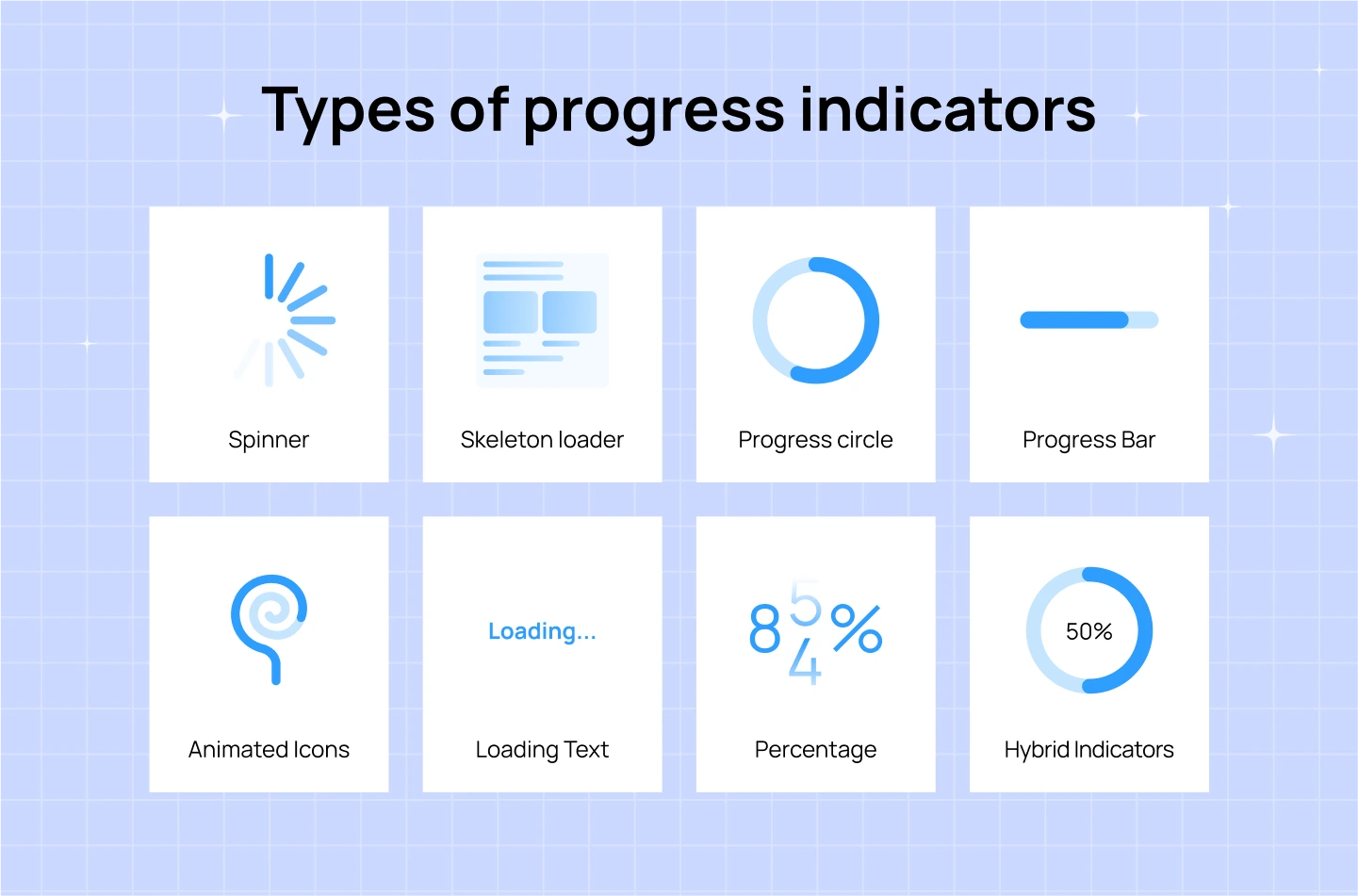
Instead, use clear progress indicators to show that the system is working and moving forward. This could be a loading bar, a percentage counter (e.g., “Loading 68%”), or a step-based indicator (e.g., “Step 2 of 4: Fetching Data”). These visual cues help manage user expectations by showing them the process is moving and approximately how long it will take.
A preloader is a great opportunity to reinforce your visual identity. Instead of using a generic spinner, customize the design with your brand colors, typography, and logo. A branded preloader not only maintains consistency but also adds professionalism and polish to your product. This subtle attention to detail builds trust and keeps the experience feeling cohesive, even during waiting periods.

For example: The loading screen of Lollypop website features an animated “lollipop candy,” which directly ties into the company’s logo and name. It’s a playful yet on-brand touch that reinforces recognition while keeping users engaged.
When possible, tell users what’s happening behind the scenes. Generic messages like “Loading…” don’t explain much and may cause users to feel confused or impatient. A short message like “Generating your report” or “Syncing your data” provides context and shows that the system is doing something purposeful. This makes the wait feel more reasonable and builds trust.

For example: In the image above, ChatGPT displays a message while processing a request: “Lots of people are creating images, so it might take some time…” This kind of explanation reassures users that the delay is due to high demand—not a technical error—and encourages them to wait patiently.
Waiting time doesn’t have to be wasted time. Instead of leaving users staring at a spinner, use that time to give them something useful. You can show quick tips, onboarding advice, product features, or shortcuts they might not know about. This helps users learn more about your product while they wait, and it turns passive waiting into a more productive experience.
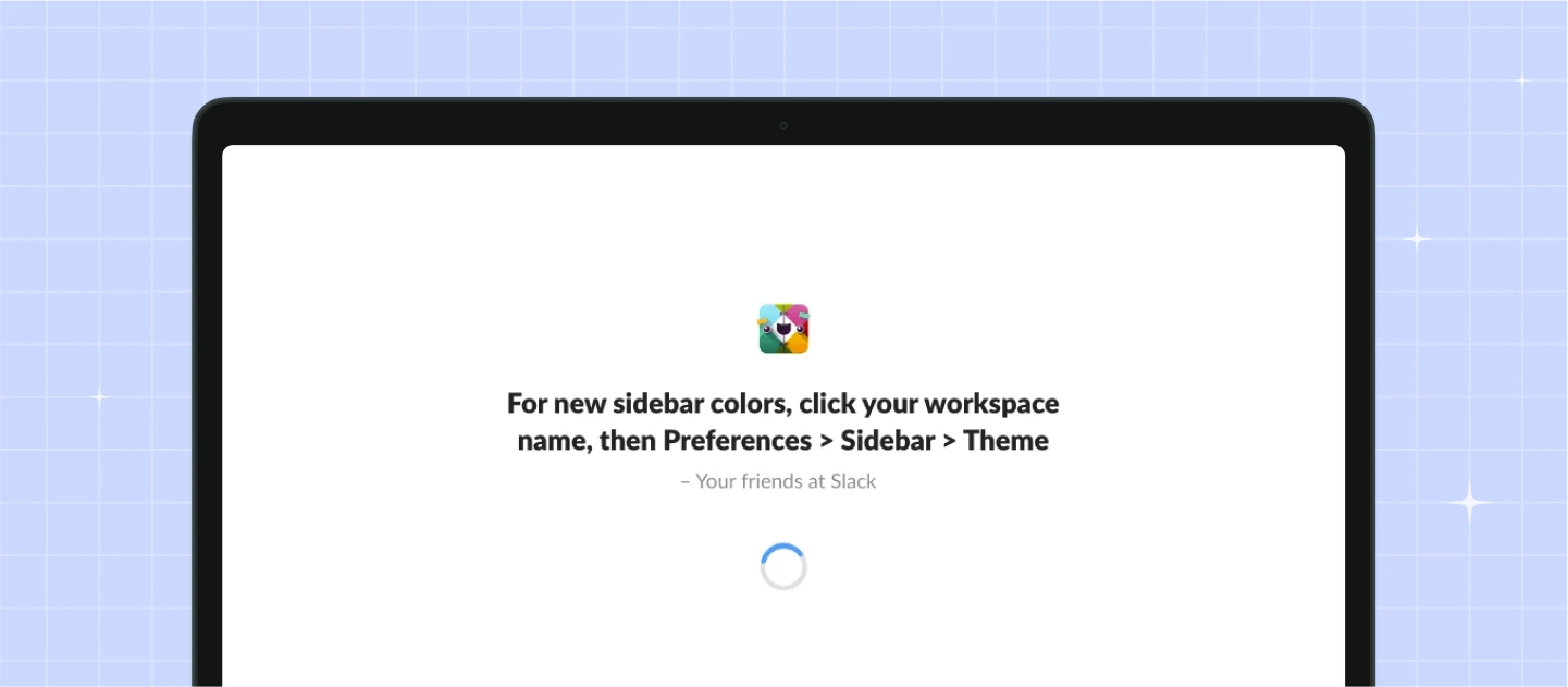
For example: In the image above, Slack’s loading screen includes a tooltip explaining how users can customize their sidebar color. It’s a small detail that turns an idle moment into a chance to learn and personalize the experience.
If your load time gives you a few extra seconds, make it a bit more enjoyable. Consider using playful animations, clever loading messages, quotes, or even rotating facts related to your product or industry. This adds personality and keeps users engaged, especially when they’re waiting often or for longer periods.

For example: Duolingo’s loading screen often displays interesting facts or lighthearted messages to keep users amused while the next lesson loads. It’s a simple way to make waiting feel less like a delay and more like part of the experience.
You may want to read more: Search Bar Design – Essential Tips for an Effortless Searching
Through this blog, you’ve seen how loading page plays a key role in creating smoother, more user-friendly product experiences. When thoughtfully designed and implemented, preloaders do more than fill time—they reinforce brand trust, guide user expectations, and improve overall product perception.
At Lollypop, we believe great SaaS UX design is about the attention to details, and preloaders are one of them. If you’re building or refining a SaaS product and looking for expert support in crafting seamless user flows, we’d love to help.
As a globally recognized SaaS design agency, we combine design thinking with the latest SaaS design trends to craft intuitive, high-performing SaaS software solutions.
Get in touch with us for a FREE consultation and let’s explore how we can elevate your product’s user experience to the next level.


