Financial institutions have always relied on trust. Today, that trust is often formed long before a customer speaks to an advisor, visits a branch, or downloads an app. It begins with the first interaction on your website.
Whether someone is researching investment options, comparing mortgage providers, or opening a new bank account, your website becomes the first proof of credibility. Within seconds, visitors begin assessing whether your business appears secure, transparent, and capable of handling one of their most valuable assets—their money.
Unlike websites in retail or entertainment, financial services websites operate in an environment where every design decision influences confidence. Navigation, typography, page hierarchy, accessibility, content clarity, and even the placement of trust signals can determine whether a visitor continues exploring or leaves for a competitor.
Modern customers also arrive with higher expectations. They compare experiences across banks, fintech platforms, insurance providers, and wealth management firms. They expect information to be easy to understand, products to be transparent, and digital journeys to feel effortless regardless of how complex the underlying financial services may be.
This is why financial services website design has evolved beyond aesthetics. It has become a strategic business asset that supports customer acquisition, strengthens brand credibility, and improves conversion across every stage of the digital journey.
In this guide, we’ll explore what makes financial website design unique, the UX principles behind successful financial experiences, common mistakes that reduce user trust, real-world examples from leading financial brands, and practical recommendations for building websites that inspire confidence while driving measurable business outcomes.
Designing a website for a financial institution isn’t simply about showcasing products or creating an attractive digital experience. It is about helping people make decisions that involve their money, personal information, and long-term financial future.
Unlike e-commerce, where customers often make quick purchasing decisions, financial services require users to slow down, compare options, and carefully evaluate whether a company deserves their trust. Every interaction—from reading product information to submitting an application—carries a higher level of perceived risk.
This is what fundamentally separates financial services website design from most other industries.
Instead of optimizing only for speed or conversion, financial websites must first establish confidence. Before visitors are willing to open an account, apply for a loan, or invest their savings, they need reassurance that they’re making the right decision.
Many businesses think trust is something they earn after acquiring customers.
In reality, trust begins long before the first conversation.
Within the first few seconds of landing on a financial website, users subconsciously evaluate whether the institution appears credible, professional, and capable of protecting their financial interests.
They may not consciously notice typography, spacing, or information hierarchy, but these design decisions directly influence how trustworthy a business feels.
Users immediately ask themselves questions like:
When these questions remain unanswered, uncertainty grows. And uncertainty is one of the biggest barriers to conversion in financial services.
Great financial website design doesn’t force users to trust a brand. It removes the reasons they might hesitate.
Most financial products cannot be understood in a single sentence.
Mortgages involve repayment structures, eligibility criteria, and interest rates. Investment products require explanations of risk, performance, and long-term strategy. Insurance policies include coverage limits, exclusions, deductibles, and legal terms.
The complexity already exists. The role of UX isn’t to eliminate it—it is to help users navigate it with confidence.
Unfortunately, many financial institutions respond to this complexity by adding even more information. Lengthy paragraphs, industry jargon, dense comparison tables, and multiple downloadable PDFs often overwhelm users instead of helping them make informed decisions.
Good financial UX follows a different philosophy. Rather than presenting everything at once, it prioritizes information based on the user’s decision-making process. The most important questions are answered first, while supporting details become available as users explore further.
This approach, often called progressive disclosure, reduces cognitive load without sacrificing transparency.
Financial organizations operate within strict regulatory environments. Privacy requirements, legal disclosures, accessibility standards, and security obligations are essential parts of every digital experience. However, compliance should never become an excuse for poor usability.
One common mistake is presenting legal content before users understand the product itself. Another is interrupting important tasks with lengthy disclaimers that provide little context. Well-designed financial websites integrate compliance naturally into the customer journey.
Additional information appears when users need it. Legal explanations are written in plain language. Regulatory requirements remain visible without overwhelming the primary experience. The result is an interface that feels both trustworthy and easy to navigate.
Although financial products are built around numbers, the decisions behind them are rarely driven by numbers alone.
People don’t simply compare interest rates or investment returns. They think about buying their first home, protecting their family’s future, growing their retirement savings, or securing funding to expand a business. Behind every financial transaction is an emotional outcome.
This changes how designers should think about user experience. A mortgage application isn’t just a form. It’s part of one of the biggest purchases in a person’s life.
An investment dashboard isn’t simply displaying data. It’s helping users feel informed enough to make confident financial decisions.
When designers focus only on functionality, they often overlook the emotional reassurance users need throughout these journeys.
One reason Wealthsimple has become a benchmark for financial website design is that it prioritizes clarity over complexity.
Instead of overwhelming visitors with technical investment terminology, the website begins by explaining outcomes in simple, conversational language. Product pages gradually introduce more detailed information only after users understand the core value proposition.
The interface also reinforces confidence through consistent visual hierarchy, generous whitespace, approachable illustrations, and clear calls to action. Rather than asking visitors to process everything at once, each section answers a single question before introducing the next.
This creates an experience that feels informative rather than intimidating—an important distinction in financial services, where uncertainty often prevents users from taking action.
Key Takeaway: Financial services website design isn’t fundamentally different because of stricter regulations or more complex products. It’s different because users arrive with higher expectations, greater perceived risk, and less willingness to make mistakes. Every design decision should therefore answer one essential question: Does this help users feel more confident about moving forward? When confidence becomes the guiding principle, trust, usability, and conversion naturally follow.
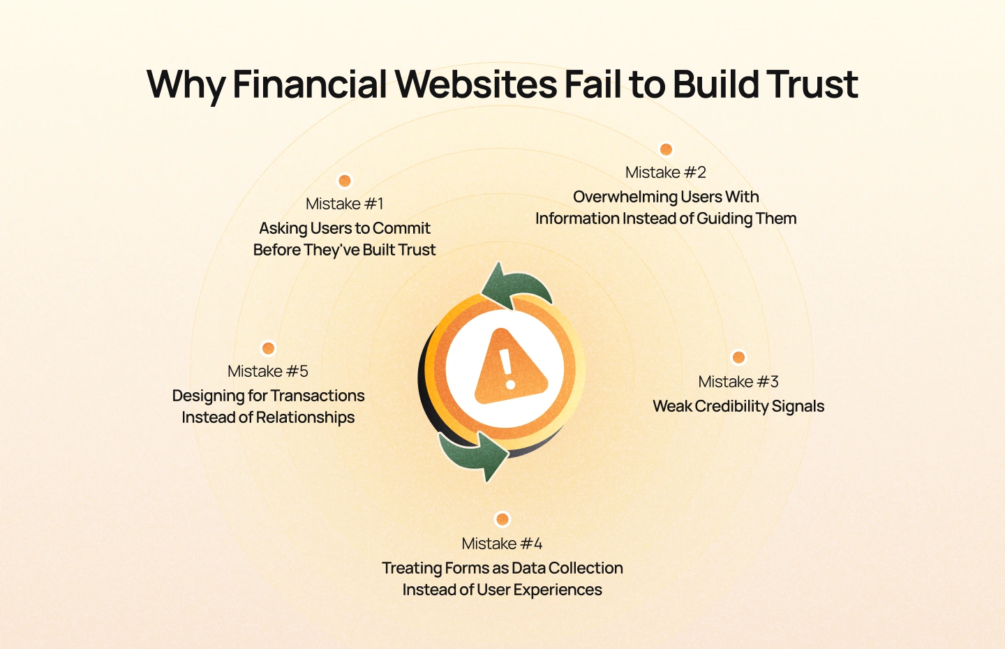
When financial institutions notice declining conversions, abandoned applications, or low engagement, the first instinct is often to review pricing, products, or marketing campaigns.
Yet in many cases, the real problem appears much earlier. Users leave because they lose confidence before they ever reach the point of making a decision. This doesn’t necessarily happen because the website looks outdated or visually unattractive. More often, it’s the accumulation of small moments of uncertainty that gradually erode trust throughout the journey.
A confusing navigation menu. An unexplained fee. An application form that feels too intrusive. A page that answers the wrong questions. Individually, these issues may seem minor. Together, they create hesitation—and hesitation is one of the biggest conversion killers in financial services.
The strongest financial websites don’t simply persuade users to take action. They continuously remove uncertainty at every stage of the experience.
One of the most common UX mistakes is asking visitors to perform a high-commitment action before they’ve received enough reassurance.
Many financial websites display prominent “Apply Now” or “Open an Account” buttons immediately, assuming that a clear call to action will increase conversions.
However, financial decisions aren’t impulse purchases. Before users are willing to share personal information or begin an application, they need answers to fundamental questions:
If these questions remain unanswered, stronger CTAs rarely improve conversion—they simply increase friction.
The most effective financial websites earn the click before asking for it. They establish credibility through clear product explanations, transparent pricing, customer success stories, security assurances, and recognizable trust signals before presenting the primary action.
Financial products naturally require detailed explanations, but more information doesn’t always lead to better understanding.
Many institutions try to build trust by publishing every possible detail upfront. Product pages become filled with technical terminology, legal disclaimers, downloadable PDFs, comparison tables, and lengthy paragraphs. Ironically, this often has the opposite effect.
When users encounter too much information at once, they struggle to identify what matters most. Instead of feeling informed, they feel overwhelmed.
Good UX doesn’t reduce transparency—it improves prioritization.
Users should first understand the product’s value, who it’s designed for, and why it matters. Supporting details, legal information, and advanced documentation can then be introduced progressively as users become more engaged.
The objective isn’t to simplify financial products. It’s to simplify how people learn about them.
Financial websites frequently assume that trust comes from having an established brand. In reality, credibility must be reinforced continuously throughout the experience. Imagine visiting a website that asks you to invest thousands of dollars but provides little evidence of expertise, no leadership information, no regulatory credentials, and no customer stories.
Even if the business is legitimate, uncertainty remains. Strong credibility signals answer users’ concerns before they need to ask. These may include:
These elements don’t simply improve aesthetics—they reduce perceived risk.
And in financial services, reducing perceived risk is often more persuasive than making ambitious marketing claims.
Application forms are often the highest-converting—or highest-abandoning—part of a financial website. Many organizations design forms around internal business requirements rather than user needs.
Asking for excessive information upfront, providing little explanation, showing unclear validation errors, or failing to indicate progress can quickly make users feel uncomfortable.
This is especially problematic when forms involve sensitive financial or personal information. Great financial UX recognizes that every field is a request for trust. Users are far more willing to provide information when they understand why it’s needed, how it will be used, and how much effort remains before completion.
Simple improvements such as progress indicators, contextual guidance, inline validation, and the ability to save progress can significantly reduce abandonment while increasing user confidence.
Perhaps the biggest mistake financial websites make is focusing entirely on completing transactions.
A homepage promotes products. Landing pages promote applications. Forms collect customer data. Everything is optimized for immediate conversion. But financial relationships rarely begin with immediate commitment.
People spend time researching providers, comparing options, reading educational content, and evaluating credibility before taking action. The best financial websites recognize that not every visitor is ready to convert today. Some users need to learn. Some need reassurance. Others simply need confidence that they’ll be making the right decision when they’re ready.
By supporting every stage of the customer journey—not just the final transaction—financial institutions build stronger relationships that naturally lead to higher-quality conversions over time.
Poor financial website experiences rarely fail because of a single design mistake. They fail because uncertainty accumulates throughout the user journey. Every unanswered question, confusing interaction, or missing trust signal quietly increases doubt until users decide not to continue. Great financial UX works differently.
Instead of asking users to trust the brand, it systematically removes the reasons they might hesitate. Because in financial services, confidence isn’t created by one impressive homepage. It’s built through hundreds of thoughtful design decisions that make every step feel clear, transparent, and trustworthy.
Successful financial websites don’t earn trust through beautiful interfaces alone. They earn trust by helping users feel increasingly confident throughout their decision-making journey. This shift in perspective changes how designers approach financial experiences.
Instead of asking, “How do we make this page more attractive?”, a better question is: “What uncertainty is the user experiencing at this moment, and how can design reduce it?”
Every effective financial experience—from a banking website to an investment platform or insurance portal—follows the same principle. Each interaction should reduce uncertainty while increasing confidence.
One of the biggest misconceptions in digital design is that users will trust a brand after they convert. Financial UX works the opposite way. Users convert because they already trust the brand.
This is why the first screen of a financial website should never focus exclusively on driving action. Before encouraging users to apply, schedule a consultation, or open an account, the interface should answer the questions users are already asking:
These answers don’t always come through words. Professional visual design, clear navigation, transparent messaging, security indicators, recognizable partners, customer testimonials, regulatory credentials, and leadership visibility all contribute to the user’s first impression.
Great financial websites understand that trust is cumulative. Every positive interaction adds another layer of confidence before users are asked to make an important decision.
Financial decisions naturally involve uncertainty. Users worry about making the wrong investment, choosing the wrong loan, misunderstanding fees, or exposing sensitive personal information.
Many of these concerns aren’t caused by the product itself. They’re caused by uncertainty surrounding the product. Effective UX addresses this by reducing perceived risk throughout the journey. For example:
Notice that none of these features directly change the financial product. Instead, they reduce the emotional barriers that prevent users from moving forward. When uncertainty decreases, confidence increases—and confident users make better decisions.
Financial products are inherently complex. Trying to remove that complexity entirely can be just as harmful as presenting too much information. The goal isn’t simplification. It’s clarity.
Good financial UX organizes information according to how people naturally learn. Rather than presenting every feature at once, users are guided through a logical sequence:
This approach is known as progressive disclosure. Instead of overwhelming users with every detail immediately, information becomes available as users need it. Design should never hide complexity. It should reveal complexity at the right moment.
Trust isn’t built on a single page. It’s built across hundreds of micro-interactions. Every click, transition, confirmation message, and form field either reinforces confidence or introduces doubt.
Consider a loan application journey. A progress indicator tells users how much remains. Inline validation confirms that information has been entered correctly. Clear error messages explain what went wrong and how to fix it. Confirmation screens reassure users that their application has been successfully submitted. Each interaction reduces uncertainty.
While these details may appear insignificant individually, together they create an experience that feels predictable, supportive, and trustworthy. The best financial experiences don’t simply help users complete tasks. They help users feel confident while completing them.
Financial institutions must comply with regulatory standards that protect both businesses and consumers. However, compliance should never become an obstacle to a good user experience.
Poorly designed financial websites often treat legal requirements as isolated content blocks—long disclaimers placed between users and their goals. A more effective approach is to integrate compliance naturally into the experience.
Important disclosures should appear within the context of relevant decisions. Privacy explanations should use plain language. Terms and conditions should be easy to access without interrupting task completion.
Compliance and usability are not competing priorities. When thoughtfully integrated, they strengthen each other by increasing transparency and reinforcing user trust.
Accessibility is often viewed as a technical requirement or regulatory obligation. In reality, it’s one of the strongest indicators of customer-centric design. Financial services are used by people across different age groups, abilities, languages, and levels of digital literacy.
A website that is difficult to navigate with a keyboard, incompatible with screen readers, or challenging for older adults to read doesn’t simply create usability issues. It excludes potential customers.
Designing for accessibility improves experiences for everyone. Clear typography benefits users reading on mobile devices. Logical navigation helps first-time visitors understand complex products. High color contrast improves readability in different lighting conditions. Well-written labels make forms easier to complete. Accessibility isn’t about designing for a small group of users.It’s about removing unnecessary barriers so that every customer can confidently access financial services.
High-performing financial websites rarely succeed because they have beautiful interfaces or eye-catching animations.
They succeed because every section answers a question users are already asking.
When someone lands on a financial website, they don’t immediately wonder where the “Apply Now” button is. Instead, they begin a silent conversation with the brand.
Can I trust this company?
Do they offer the right solution?
Is this product relevant to me?
What happens if I move forward?
A well-designed financial website anticipates these questions and answers them in the right sequence. Rather than overwhelming visitors with information or pushing for immediate conversion, each section gradually reduces uncertainty until taking action feels like the obvious next step.
Below is a framework for structuring a financial services website that aligns with how users naturally evaluate financial decisions.
The hero section isn’t where you sell your product.
It’s where you earn the right to continue the conversation.
Within just a few seconds, users decide whether they want to keep exploring or leave the website. At this stage, they aren’t looking for every product feature—they’re looking for reassurance.
An effective hero section should clearly communicate:
Instead of writing generic headlines such as “Your Trusted Financial Partner”, focus on communicating tangible value. For example: Banking solutions designed to help growing businesses manage cash flow with confidence.
This immediately tells visitors who the product is for, what outcome it delivers, and establishes relevance.
Supporting visuals should reinforce professionalism rather than distract from it. Authentic photography, product interfaces, or illustrations that explain the service are often more effective than generic stock imagery.
Once users understand what you offer, their next question becomes: “Why should I believe you?” This is where trust signals play an essential role. Effective trust signals include:
The placement of these elements matters just as much as the content itself. Instead of collecting every credibility indicator on a single page, distribute them throughout the experience where they reinforce user decisions. Trust should feel continuous—not like a checklist.
Financial institutions often know their products too well. Customers don’t.
One of the most common UX mistakes is describing products from an internal business perspective rather than a customer’s perspective. Instead of listing features immediately, begin by answering the questions users naturally ask:
Only after these questions have been answered should more detailed information—such as eligibility requirements, fees, interest rates, or technical specifications—be introduced.
A helpful rule is this: Explain the outcome before explaining the mechanism. People care about achieving financial goals before they care about understanding every product detail.
Financial decisions are rarely made by reading static content alone. People want to explore possibilities. This is why interactive tools often outperform lengthy explanations.
Mortgage calculators, retirement planners, investment estimators, loan affordability tools, and savings projections allow users to visualize outcomes based on their own situation. These tools don’t simply improve engagement. They reduce uncertainty by helping users answer an important question: “What does this mean for me?”. The more personalized the experience becomes, the more confident users feel about continuing their journey.
Every financial institution claims to be trustworthy. Few demonstrate it effectively. Rather than relying on promotional copy, use evidence that validates your expertise. Case studies, customer testimonials, client success stories, and expert insights provide independent reassurance that your products and services deliver real value.
Whenever possible, make testimonials specific. Instead of: “Excellent customer service.”
Use: “Our business secured funding within three weeks, and the application process was far simpler than we expected.”
Specific experiences feel more credible because they describe real outcomes rather than broad praise.
Even after users decide they are interested, uncertainty can return before conversion. Questions often appear just before users take action such as:
Addressing these concerns proactively can significantly reduce abandonment. Security commitments, transparent pricing, privacy information, application timelines, and clear next steps should all be visible before users reach the primary call to action. The goal isn’t simply to answer objections. It’s to prevent them from appearing in the first place.
Many financial websites treat the call to action as the most important element on the page. In reality, its effectiveness depends entirely on everything that came before it. A strong CTA doesn’t convince users. It captures the confidence they’ve already built.
By the time visitors reach the final action, they should understand the product, trust the institution, and feel confident about what happens next. Only then does “Open an Account,” “Schedule a Consultation,” or “Apply Now” become a logical next step instead of a leap of faith.
Great financial website design isn’t about arranging sections in the right order. It’s about arranging user confidence in the right order. Every section should answer one question, remove one uncertainty, and prepare users for the next decision. When a website is designed this way, conversion becomes a natural outcome of trust—not the result of aggressive persuasion.
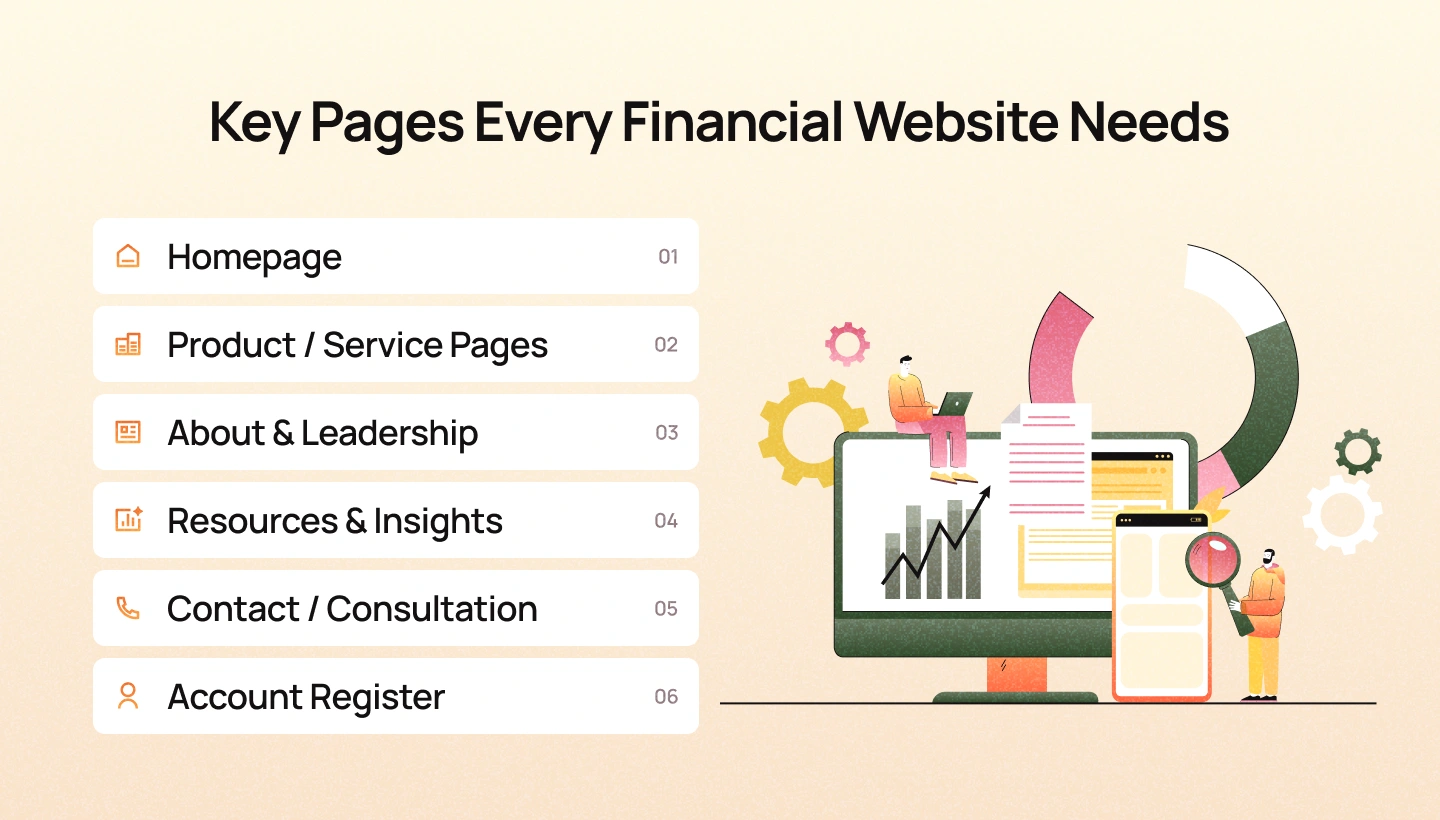
A successful financial website isn’t measured by how many pages it has. It’s measured by whether each page helps users move one step closer to making a confident decision.
One of the most common mistakes we see during UX audits is trying to make every page do everything at once. Homepages become overloaded with product information, About pages read like corporate brochures, and service pages attempt to answer every possible question in a single scroll.
Instead, every page should have a clear purpose within the customer journey. When each page focuses on one primary objective, the overall experience becomes easier to navigate, understand, and trust.
The homepage is rarely where customers make a final decision. Its role is to answer three fundamental questions as quickly as possible:
Rather than trying to showcase every product and service, the homepage should guide users toward the information that is most relevant to them. A strong homepage typically includes:
The goal isn’t to tell the entire story. It’s to give users enough confidence to continue exploring
This is where users begin evaluating whether a financial product fits their needs. Instead of focusing immediately on features or technical specifications, effective product pages answer customer questions in the order they naturally arise. For example:
Breaking information into logical sections makes even complex financial products feel approachable.
Supporting content—such as calculators, FAQs, eligibility requirements, or comparison tables—can then help users make informed decisions without feeling overwhelmed.
Many financial institutions treat the About page as a timeline of corporate milestones. While history has value, visitors are usually trying to answer a different question: “Can I trust the people behind this business?”. An effective About page focuses on credibility rather than chronology.
It should introduce the leadership team, explain the company’s mission, highlight relevant expertise, showcase certifications or industry recognition, and communicate the values that shape customer relationships. Whenever possible, replace generic corporate messaging with tangible proof of experience. Trust grows faster when visitors can clearly see the people, expertise, and principles behind the organization.
Financial decisions often involve extensive research. Before users speak with an advisor or submit an application, they compare providers, explore educational content, and seek answers to questions they may not feel comfortable asking directly.
A well-designed resource center supports this research process. Articles, guides, calculators, market insights, webinars, and FAQs position the organization as a trusted advisor rather than simply a service provider. More importantly, educational content helps users build confidence before they enter the sales journey. The best content doesn’t push products. It helps people make better financial decisions.
Once users decide they’re ready to speak with someone, the experience should feel effortless.
Unfortunately, many contact pages create unnecessary friction by asking for excessive information, providing unclear expectations, or offering limited communication options. An effective consultation page should answer practical questions before users ask them:
Setting clear expectations reduces uncertainty and makes taking the next step feel less intimidating. Whenever appropriate, provide multiple contact options, such as phone, email, live chat, or appointment scheduling, allowing users to choose the interaction method they find most comfortable.
The application journey is where trust is tested. By the time users reach this stage, they have already invested time learning about your products and evaluating your credibility. A complicated or confusing application process can quickly undo that progress. To protect momentum, application experiences should:
Every interaction should reinforce the feeling that users are moving closer to their goal—not navigating an administrative process.
Every page on a financial website has a different responsibility, but they all share the same objective: Help users make confident financial decisions. Rather than designing pages in isolation, think of them as connected stages within a larger customer journey. The homepage builds confidence. Product pages create understanding. Resources deepen trust. Contact pages reduce friction. Applications transform confidence into action. When every page fulfills its unique role, the entire website becomes more intuitive, trustworthy, and effective at guiding users toward meaningful outcomes.
The best financial websites don’t simply look polished. They make complex financial decisions feel simpler, safer, and more understandable. Although every financial institution serves different audiences and offers different products, the strongest digital experiences share one characteristic: every design decision reduces uncertainty.
Let’s examine how several leading financial brands approach trust, clarity, and conversion—and what product teams can learn from them.
Investing has traditionally been associated with complexity. Charts, financial jargon, performance metrics, and risk disclosures can easily intimidate first-time investors.
Wealthsimple takes a different approach. Instead of introducing products through technical investment language, the experience begins with customer outcomes.
The messaging focuses on helping people grow their money, plan for the future, and invest confidently before introducing details about portfolios or investment strategies. The visual design reinforces this positioning. Generous whitespace, conversational copy, simple illustrations, and clean typography create an experience that feels welcoming rather than overwhelming.Complex information is introduced progressively instead of all at once.
Why it works: The website reduces cognitive load before asking users to understand financial products. By making investing feel approachable, Wealthsimple lowers the psychological barrier that often prevents first-time investors from taking action.
Design lesson: Reduce complexity through better communication—not by removing important information.
Revolut offers a wide range of financial products, including banking, international payments, savings, investments, insurance, and cryptocurrency. Presenting all of these services on one website could easily become overwhelming.
Instead, the experience is structured around user goals rather than internal product categories.
Visitors can quickly understand which products are relevant to their needs without navigating through layers of financial terminology.
Navigation remains consistent, product pages follow familiar layouts, and information is presented progressively.
This creates a sense of predictability across the entire experience.
Why it works: Users don’t need to understand the company’s organizational structure. They simply need to understand which solution helps them achieve their goal. Reducing navigation effort also reduces decision fatigue.
Design lesson: Organize information around customer goals—not your internal business structure.
Traditional banks often communicate using corporate language that feels distant and overly formal.
Monzo deliberately adopts a more conversational tone.
Product descriptions use everyday language.
Illustrations add personality without distracting from important information.
Support content explains banking concepts in ways that feel accessible to non-experts.
Combined with a clean mobile-first interface, the experience feels approachable rather than intimidating.
Why it works: Friendly communication lowers emotional barriers. Users feel that the brand understands them instead of talking at them. This emotional connection becomes especially valuable when explaining unfamiliar financial products.
Design lesson: People trust brands that communicate clearly—not brands that sound complicated.
Although these organizations differ in size, audience, and business model, they all follow the same UX principles. They simplify complexity instead of hiding it. They prioritize customer understanding before product promotion. They reinforce trust through consistency, transparency, and thoughtful interaction design. Most importantly, they recognize that users aren’t looking for beautiful interfaces. They’re looking for confidence. That’s the common thread behind every successful financial website. And it’s a principle that organizations of any size can apply to create better digital experiences.
The future of financial website design isn’t being shaped by visual trends alone. It’s being shaped by changing customer expectations.
Today’s users expect financial experiences to be as intuitive as the digital products they use every day. They compare banks with fintech apps, insurance providers with ecommerce platforms, and wealth management portals with consumer-grade mobile experiences.
As these expectations evolve, financial institutions must rethink how they design digital experiences—not simply to look modern, but to remain competitive.
Here are the shifts that are defining the next generation of financial UX.
Personalization has been a buzzword in digital design for years. But in financial services, showing users their first name or recommending products based on previous activity is no longer enough. The next evolution is contextual guidance.
Instead of assuming users already know what they need, websites are beginning to adapt based on where users are in their decision-making journey. For example:
The goal isn’t simply to personalize content. It’s to provide the right level of guidance at the right moment.
Financial decisions are becoming more exploratory. Rather than reading long product pages, users increasingly expect websites to help them evaluate options through interaction.
These tools transform passive reading into active decision-making. Instead of asking users to imagine possible outcomes, they allow users to explore those outcomes themselves. The result is greater understanding, stronger engagement, and increased confidence.
For years, transparency was viewed primarily as a regulatory obligation. Today, it’s becoming a competitive differentiator. Customers increasingly expect financial institutions to communicate pricing, eligibility requirements, timelines, and product limitations openly.
Organizations that make important information easy to understand are rewarded with higher trust and stronger long-term relationships. Transparency is no longer just about compliance. It’s becoming part of the overall customer experience.
Accessibility is gradually shifting from a compliance checklist to a core design principle. As financial services become increasingly digital, organizations must ensure their experiences work for people with different abilities, devices, languages, and levels of digital literacy. Accessible interfaces improve far more than regulatory compliance. They improve readability.
The best financial experiences are designed to be inclusive from the very beginning—not retrofitted later.
Artificial intelligence is changing how customers discover information, compare financial products, and interact with businesses. Yet as digital experiences become increasingly automated, human-centered design becomes even more valuable.
Customers still want reassurance before making important financial decisions. They still look for clear explanations, transparent communication, and opportunities to speak with experts when needed. AI may accelerate information discovery. But trust is still built through thoughtful experience design.
The financial institutions that succeed will be those that combine intelligent automation with experiences that feel genuinely human.
The most important trend isn’t a new technology or interface pattern. It’s a change in expectations.
Customers now expect financial experiences to feel simple without sacrificing transparency, personalized without becoming intrusive, and efficient without losing the human reassurance that financial decisions require.
Organizations that embrace these shifts won’t simply create better websites. They’ll build stronger relationships, increase customer confidence, and create digital experiences that continue to earn trust in an increasingly competitive market.
Designing a great financial website isn’t about checking off a list of UI components.
It’s about evaluating whether every part of the experience helps users feel more informed, more confident, and more comfortable taking the next step.
Use the following checklist as a practical UX audit to identify opportunities for improvement across your website.
Before users explore your products, ask yourself:
If visitors question your credibility within the first few seconds, they’re unlikely to continue exploring your products.
Financial products are naturally complex, but understanding them shouldn’t be. Review whether your website:
Users shouldn’t have to work to understand what you’re offering.
Ask whether users can confidently move through the website without confusion. Consider the following:
Navigation shouldn’t force users to think about where information might be. It should make the next step feel obvious.
The application journey is often where conversions are won or lost. Review whether your forms:
Every additional field represents another request for trust. Make sure users understand the value of providing their information.
Customers are more likely to move forward when expectations are clear. Review whether your website communicates:
Reducing uncertainty at this stage often has a direct impact on conversion rates.
Accessibility should be evaluated as part of the overall customer experience—not as a separate compliance task. Ask yourself:
Accessible experiences improve usability for every customer—not only those with disabilities.
If you answered “No” to several of these questions, your website may not have a design problem. It may have a confidence problem.
Every unanswered question, every unclear interaction, and every unnecessary obstacle adds friction to the customer journey. The most successful financial websites don’t attempt to persuade users through aggressive marketing.
They systematically remove uncertainty until taking the next step feels like the most natural decision. That is the ultimate goal of financial UX.
A successful financial website isn’t built around pages, features, or visual trends. It’s built around confidence. Every interaction should help users understand their options, evaluate risk, and feel comfortable taking the next step. From the first impression on the homepage to the final confirmation after submitting an application, trust is earned through hundreds of thoughtful design decisions—not a single headline or call to action.
Although every financial institution has unique products, customers, and business goals, the underlying challenge remains the same. People don’t choose financial providers because they have the most visually impressive website. They choose the organizations that make complex decisions that feel understandable, transparent, and trustworthy.
That is why financial website design should never be viewed as a branding exercise alone.
It is a strategic investment in customer experience, credibility, and long-term business growth.
At Lollypop, we believe great financial experiences begin with understanding people—not just products. By combining UX research, service design, accessibility, and user-centered design principles, we help financial institutions create digital experiences that simplify complexity, strengthen trust, and deliver measurable business outcomes. Whether you’re redesigning a banking platform, launching a fintech product, or modernizing an insurance website, the objective remains the same: Design experiences that don’t just look credible—but help people feel confident enough to act.
To support your brand in the era of AI-driven search, we have developed Lollypop Spot—a specialized tool designed to audit your brand’s AI visibility. It analyzes how effectively your business is recognized, recommended, and cited across major AI platforms, ensuring your credibility extends far beyond traditional search engines.

Ready to elevate your digital experience and optimize your brand’s presence in the AI landscape? Schedule an appointment with Lollypop today to discover how we can transform your complex challenges into a sustainable, future-ready competitive advantage.
Financial services websites are designed for high-stakes decision-making.
Unlike ecommerce or SaaS products, users aren’t simply evaluating features or pricing. They’re deciding whether to trust an organization with their money, personal information, or long-term financial future.
This means every aspect of the experience—from information architecture and content clarity to accessibility and security messaging—must reduce uncertainty and reinforce confidence.
Good financial UX isn’t about making decisions faster. It’s about helping users make better-informed decisions.
Low conversion rates aren’t always caused by weak marketing or poor products. In many cases, users leave because they don’t feel confident enough to continue. Common issues include:
Improving conversion often means removing friction and uncertainty throughout the customer journey—not simply increasing the visibility of call-to-action buttons.
There isn’t a fixed timeline. Instead of redesigning every few years, organizations should continuously evaluate whether the website still meets evolving customer expectations, regulatory requirements, accessibility standards, and business goals.
Rather than waiting for a complete redesign, many organizations achieve better long-term results through ongoing UX improvements informed by user research, analytics, usability testing, and customer feedback.
A website should evolve alongside the needs of its users.
Compliance and user experience should never be viewed as competing priorities.
The most effective financial websites integrate regulatory requirements into the customer journey without creating unnecessary friction.
Clear language, contextual disclosures, accessible design, and transparent communication help organizations meet compliance obligations while improving usability at the same time.
Well-designed compliance builds trust. Poorly implemented compliance creates confusion.
Financial services are essential for everyone. Customers vary in age, ability, digital literacy, language proficiency, and the devices they use to access online services.
Designing accessible experiences ensures that more people can confidently complete important financial tasks, whether they’re opening an account, applying for a loan, or managing investments.
Accessibility also improves readability, navigation, and usability for all users—not just those who rely on assistive technologies.
Before redesigning the interface or introducing new features, organizations should identify where users lose confidence during the customer journey. Start by asking questions such as:
The answers to these questions often reveal opportunities that have a greater impact than visual redesigns alone. Because ultimately, successful financial websites aren’t defined by how modern they look. They’re defined by how confidently they help people move forward.