
KYC is often treated as a compliance step users simply have to endure: enter personal information, submit an identity document, take a selfie, wait for verification, and continue.
But from the user’s perspective, KYC involves something more sensitive. They are being asked to share personal information, access their camera, and provide identity evidence—often without fully understanding why it is needed or what happens next.
That makes KYC more than a compliance process. It is a trust experience.
Regulation determines what needs to be verified. Product design determines how users experience that requirement. The goal of KYC UX is therefore not to make compliance disappear, but to make the process understandable, predictable, and recoverable.
The real design challenge begins when a system requirement meets a user who does not know what the system expects.
KYC, or Know Your Customer, is the process of establishing and verifying a customer’s identity as part of customer due diligence. Digital identity can support this process when it provides an appropriate level of reliability and assurance for the relevant risks.
From a product perspective, KYC is one layer of a broader onboarding journey. Users experience registration, consent, information collection, document capture, verification, and account activation as one continuous flow.
If the verification stage suddenly feels like a different product—with unfamiliar language, interaction patterns, or unexplained requests—the discontinuity becomes friction.
Regulation determines what must be verified. Product design determines how users encounter it.
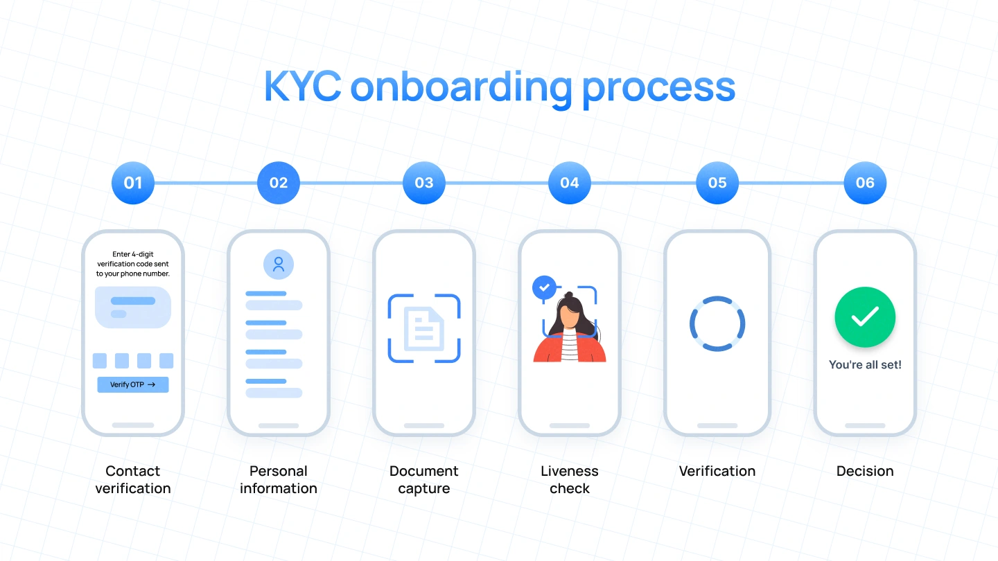
A KYC onboarding process becomes easier to design when the team understands what each stage is asking from both sides of the interaction. The system has a verification requirement. The user has a task to complete. Between the two sits a layer of uncertainty.
That uncertainty is where much of the UX work happens.
OTP verification is familiar, but recovery still matters. Users should know what happens when a code expires, how to request another one, and whether their progress is preserved.
Small moments of uncertainty here can undermine trust before users reach more sensitive verification steps.
KYC may require information such as legal name, date of birth, address, or other identity attributes depending on the product and applicable requirements.
The goal is not simply to reduce fields. It is to make each request easy to understand through clear labels, logical grouping, contextual explanations, and useful validation.
Document capture turns a digital form into a physical-world task. Users have to manage positioning, lighting, glare, distance, and camera quality while meeting requirements they cannot see.
The interface should translate those invisible requirements into visible guidance: move the document, improve lighting, avoid glare, keep it inside the frame, or hold it steady.
The earlier users understand what “good” looks like, the fewer failed attempts they need.
Biometric verification can feel unfamiliar, especially for first-time users. The interface should demonstrate the task before asking users to perform it, then provide clear feedback while they do it.
The technology can be complex. The user’s task should not be.
Additional verification and risk checks may happen behind the scenes. Users do not need to see every check, but they do need to understand the current state.
Instead of an unexplained loading screen, communicate whether verification is still processing, whether the user needs to act, or whether they should simply wait.
Not every KYC journey ends with an instant decision. Some cases require additional information or manual review.
That is not inherently a UX problem. An unexplained review state is.
Tell users what has happened, whether they need to do anything, what happens next, and how they will be informed.

Most KYC friction is really uncertainty. Users can tolerate a necessary step; what is harder to tolerate is a necessary step they do not understand.
Sensitive requests such as identity documents, camera access, or biometric data need enough context for users to understand their purpose.
When the system rejects a document or biometric attempt without useful feedback, users cannot tell what went wrong. Real-time guidance can close that gap.
During verification, silence creates doubt. Processing states should communicate what is happening and whether the user needs to act.
When verification fails, requires review, or needs more information, users need a clear next step—not a generic message.
Users rarely need KYC to feel effortless. They need it to feel understandable.
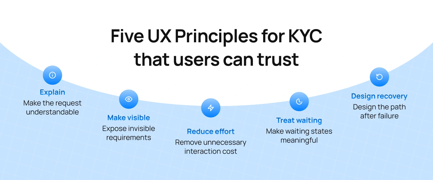
The strongest KYC experiences don’t necessarily collect less information. They make the required interaction easier to understand.
Connect sensitive requests to the user’s goal. A short explanation can make an intrusive-looking step feel like a reasonable part of the journey.
Verification systems operate according to rules users cannot see. The document has to meet certain conditions. The face may need to be positioned in a particular way. The captured evidence may need to meet a particular standard.
Instead of hiding those conditions behind an error message, expose the useful parts through the interface.
A camera frame, live guidance, visual examples, and contextual feedback all serve the same purpose: Translate system logic into human instructions.
Plan for failed documents, expired evidence, liveness failures, technical errors, and additional information requests. The recovery path is part of the experience.
Users need to know whether verification is processing, delayed, or requires action. Reduce uncertainty without exposing unnecessary technical detail.
The goal is not to remove KYC. It is to remove unnecessary cognitive and interaction effort through better grouping, progressive disclosure, defaults, guidance, and recovery.
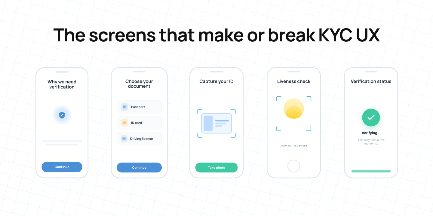
Principles only become useful when they survive contact with the interface. Certain screens deserve particular attention because they carry a disproportionate amount of the user’s uncertainty.
Before asking users to hand over sensitive information, tell them what is about to happen.
A useful introduction can establish why verification is required, what information or documents are needed, and what the journey involves.
This is an opportunity to build trust before asking for it.
It also aligns with the broader principle of transparency found in the UK’s current DVS Trust Framework, which requires relevant providers to make clear how identity and attribute data is used and, in applicable cases, confirm that users understand how their data will be shared or disclosed.
Don’t wait until the camera opens to tell users which documents are supported.
Make the options clear upfront. Where requirements vary by country or product, reflect that in the interface rather than making users discover unsupported options through failed attempts.
A well-designed selection screen prevents a failure before it happens.
This is one of the most interaction-heavy moments in KYC.
The screen may need to communicate document positioning, lighting, glare, distance, document edges, capture readiness, and retry.
The principle is straightforward: If the system can tell that something is wrong, the user should ideally know before submitting the image.
Biometric verification can feel unfamiliar, particularly for someone encountering the product for the first time.
Show what the user needs to do before asking them to do it. Then provide feedback while they do it.
Avoid making the user guess whether they are too close, too far away, moving incorrectly, or outside the camera frame.
The end of verification should not be represented by a generic green tick. Different outcomes require different information.
If the user is approved, tell them what they can do now. If verification is pending, explain what is happening and what they should expect. If additional information is required, explain what needs to be provided. If the system cannot verify the user, explain what options are available.
The outcome screen is part of onboarding because the user’s relationship with the product continues after the verification decision.
A product team can outsource identity-verification technology. It cannot outsource the user’s experience of that technology.
Third-party identity-verification platforms provide SDKs and APIs that can be integrated into web and mobile applications. Entrust, for example, provides Identity Verification SDKs for Web, Android, iOS, React Native, and Flutter, alongside an API for creating and managing verification flows. That choice of KYC technology is partly a design decision.
The first question is not simply: “Does this provider verify identity?”
It is: “How does this verification experience become part of our product?”
Consider the integration method, screen transitions, state handoff, customization, localization, error handling, accessibility, and analytics.
Entrust’s current SDK documentation, for example, includes configuration for UI themes, callbacks for completion and errors, and modules covering document, face, OTP, and other verification tasks.
If users move from a polished financial application into a completely unfamiliar interface, they may interpret that transition as a loss of continuity.
Customization isn’t about forcing every verification screen to look identical to the rest of the product.
It is about maintaining enough continuity that users understand they are still completing the same journey.
The degree of customization depends on the provider and SDK version. Entrust’s current documentation, for example, provides theme configuration, colour controls, dimensions, and font customization for its current SDK framework.
The larger product principle is more important: SDK capabilities become UX constraints.
The verification provider’s capabilities can influence what the final product experience can and cannot become.
Accessibility should also be evaluated at the SDK level rather than assumed to be solved by the host product.
Entrust publishes an accessibility statement for its Identity Verification SDKs and describes evaluation against WCAG 2.2 AA and testing with users with a range of disabilities. These are provider-specific claims, not universal characteristics of KYC software, which is why accessibility should be assessed individually during vendor selection.
The vendor’s error model matters just as much as its success path.
A product team should understand what types of failures can occur, which errors can be surfaced, which can be retried, whether alternative methods are supported, how verification state is maintained, and what information is returned to the host application.
This is why selecting KYC onboarding software should involve product designers as well as engineering, compliance, security, and procurement teams.
You don’t outsource the UX simply because you outsource verification.
One of the persistent assumptions around KYC is that regulation inevitably produces bad UX.
That puts the problem in the wrong place.
A regulated business may need to establish identity, verify evidence, assess risk, or maintain appropriate records. FATF’s Recommendation 10 provides the underlying customer-due-diligence framework for financial institutions, including identification and verification using reliable, independent source documents, data, or information.
Those requirements don’t disappear because the interface is well designed.
The product determines when information is requested, how it is grouped, what context accompanies it, how progress is communicated, how failures are handled, and how users recover.
This is where design has meaningful influence.
The same requirement can feel very different depending on how it is presented.
“Upload your ID” is functionally clear, but it doesn’t explain the reason for the request. A more contextual message can connect the action to the user’s goal and explain what will happen next.
The underlying requirement may be unchanged.
The user’s understanding isn’t.
Not every requirement needs to appear simultaneously.
Where the applicable requirements allow it, information can be introduced when it becomes relevant rather than presented as one large wall of requests.
Progressive disclosure should never be used to hide material information or undermine required consent. Its purpose is to make the journey easier to understand.
Existing customers are not new customers.
If a verified customer needs to update an expired document or confirm changed information, the product already has a relationship and potentially existing information to work with.
Where applicable requirements allow it, the experience can be designed around what actually needs to change rather than making the user feel as though they are starting from zero.
FATF’s standards also recognise that customer due diligence should apply to existing customers on the basis of materiality and risk and should be conducted at appropriate times.
When a request feels intrusive, a short explanation can turn an unexplained interruption into an understandable part of the process.
The important distinction is not compliance versus UX.
It is: Compliance requirements versus unnecessary uncertainty.
A KYC flow can be secure and still exclude legitimate users.
Different devices, documents, languages, accessibility needs, connectivity conditions, and levels of familiarity with biometric interactions can all affect completion.
So completion rate alone is not enough. Teams should ask: Who fails, why do they fail, and can they recover without contacting support?
A robust KYC experience needs to work beyond the ideal user on the ideal device.
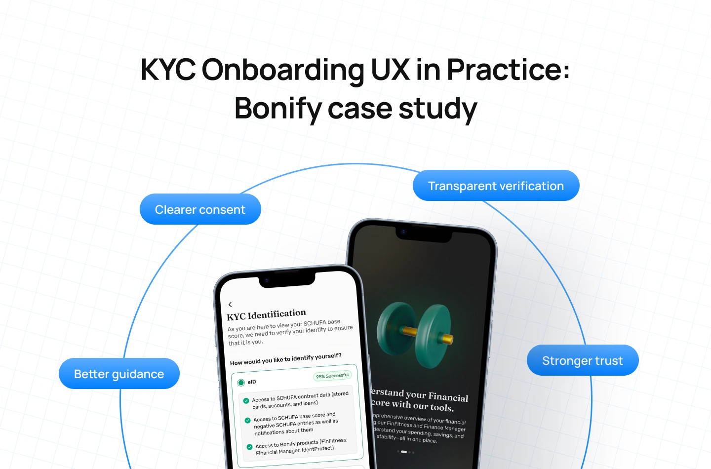
Lollypop encountered many of these tensions while redesigning the experience for Bonify, a German credit score and financial monitoring platform.
The project began with problems that extended beyond visual design. According to Lollypop’s case study, stakeholder workshops and app-store reviews surfaced user frustrations around consent processes, financial data visibility, and trust. Users were confused or suspicious about when and why their data was being accessed, while legal language made consent flows feel overwhelming.
That made onboarding a communication problem as much as an interaction problem.
Lollypop’s redesign focused on simplifying onboarding, improving clarity around financial data and regulatory areas, and increasing the adoption of valuable features. The case study specifically describes a more transparent KYC experience that presented identification methods alongside their success rates and clearly showed the features users could unlock.
The work also reframed consent through clearer microcopy explaining why the step mattered and what users gained from sharing information. Lollypop describes this as turning legal friction into greater clarity and trust.
The important lesson isn’t that every KYC flow should copy Bonify.
It is that compliance becomes easier to accept when the product explains the value and context around it.
A user isn’t only deciding whether they can complete a verification step. They are deciding whether the exchange feels reasonable: You are asking me for this information. Do I understand why? Do I know what happens next? Do I trust the process enough to continue? That is a product-design question.
Before redesigning a KYC flow, audit it through six questions.
Can users explain why they are being asked? If they cannot, you may have a trust problem. Sensitive information requests should have enough context for users to understand their purpose.
Can users tell whether they are doing the task correctly? If they cannot, you may have a feedback problem. Look particularly at document capture and biometric interactions where the system’s requirements are invisible to the user.
Can users recover when something fails? If they cannot, you may have a recovery problem. Review every important error state and ask whether it explains the reason for failure and provides a realistic next action.
Do users understand what is happening while they wait? If they do not, you may have a state-visibility problem. Review processing, pending, and review states as carefully as the active verification screens.
Does the verification layer feel like part of the product? If it does not, you may have an integration problem. Examine the transition between your product and the KYC provider, including visual continuity, language, interaction patterns, and state handoff.
Who is being excluded by the flow? Test different documents, devices, lighting conditions, connectivity conditions, languages, accessibility needs, and verification scenarios. A robust KYC experience should account for more than the ideal user on the ideal device.
Together, these questions shift the audit from: “Does the KYC flow work?” to a more useful question: “Does the KYC experience help the right user understand, complete, and recover from the verification process?”
KYC will remain a necessary part of many financial and regulated digital products.
The opportunity isn’t to pretend that identity verification can become completely frictionless. It is to design the experience so that the necessary parts feel understandable.
Users should know why they are being asked for sensitive information, what good looks like when capturing a document, what is happening while they wait, and what they can do when something fails.
The strongest KYC experiences don’t hide compliance. They translate it.
They turn requirements into understandable interactions, technical constraints into useful guidance, and failure states into recoverable moments.
Because compliance determines what the product must ask. Design determines how that conversation feels.
At Lollypop, we believe these moments are part of the product—not just the compliance layer. If you’re thinking about how to make your fintech or banking experience clearer, more trustworthy, and easier to navigate, let’s have a conversation.
KYC onboarding is the process through which a financial or regulated product establishes and verifies a new customer’s identity as part of its onboarding journey. FATF Recommendation 10 requires financial institutions to identify customers and verify their identities using reliable, independent source documents, data, or information. Digital identity systems can be used within this framework where they provide an appropriate level of reliability and assurance for the relevant risks.
A digital KYC journey may include contact verification, personal information collection, identity-document capture, face or liveness verification, additional identity or risk checks, and an automated or manual decision. The exact process varies according to the organisation, product, jurisdiction, verification technology, and applicable requirements. FATF’s standards do not prescribe one universal technology or KYC interface.
UX can improve KYC by reducing uncertainty around the required steps. Explain why sensitive information is requested, provide useful guidance during document and identity capture, make processing states understandable, and design clear recovery paths for failed or incomplete verification.
The objective is not to remove necessary compliance requirements. It is to remove unnecessary interaction and cognitive effort around them.
KYC software can influence the experience through the verification method, integration model, capture interactions, available states, error handling, and the way the verification layer connects with the host product.
For that reason, choosing verification technology should be treated as a product-design consideration as well as an engineering or procurement decision.
Teams should test both successful and unsuccessful journeys. Useful areas include task comprehension, document-capture behaviour, error understanding, retry behaviour, processing states, review-state comprehension, device and document coverage, accessibility, and alternative verification paths.
The goal is to understand not only whether users can complete KYC, but also where and why they become uncertain or unable to continue.