

SaaS landing pages are essential in any successful lead generation strategy. Among the various types of landing pages, squeeze pages stand out as a highly effective tool designed specifically to capture visitors’ contact information efficiently.
For businesses offering high-value products or services, creating a website squeeze page is often the initial step in building relationships with potential customers and boosting conversion rates.
So, what is the squeeze page definition? How to make a squeeze page?
In this guide, you’ll discover proven techniques and best practices that help create a great squeeze page design, converting visitors into email leads with ease.
Let’s get started.
A squeeze page is a specialized type of landing page designed with one primary goal: to collect visitors’ contact information, usually an email address, in exchange for something valuable. The “something valuable” is known as a lead magnet, which is an incentive that makes the visitor willing to share their email address.
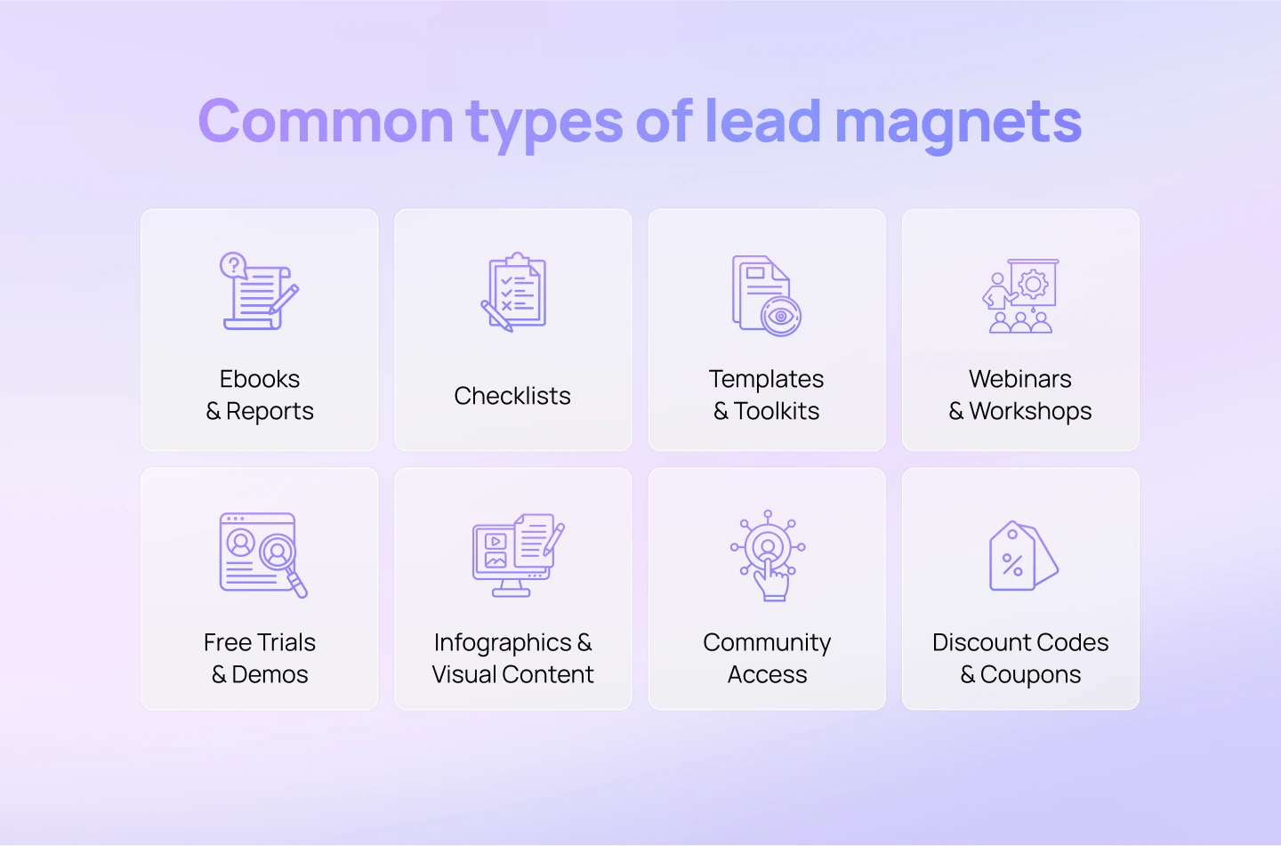
Common lead magnets include:
SaaS companies use squeeze pages because they are a highly effective way to capture potential customers’ contact information.
Here’s why squeeze pages are especially important for SaaS businesses:
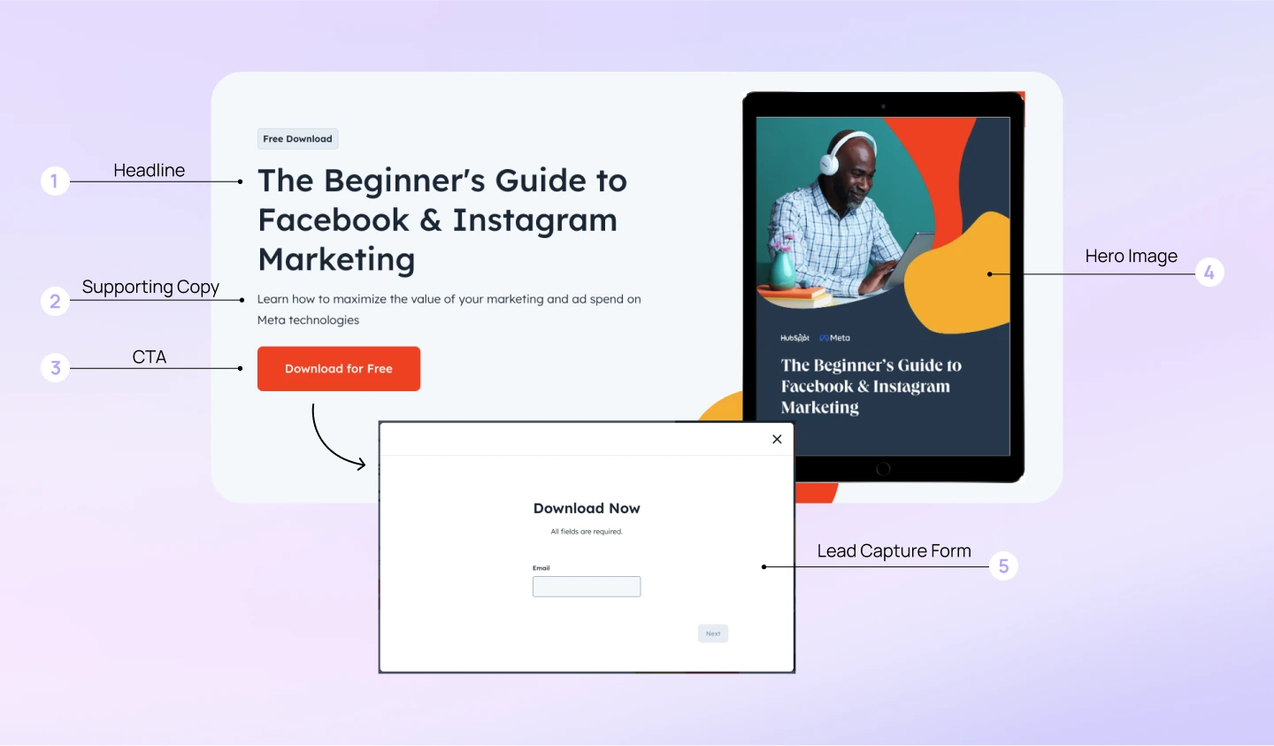
While the format may vary, the most successful squeeze pages tend to follow a proven structure built around clarity, minimal friction, and compelling value. Below, we break down a squeeze page design of Hubspot, which captures visitor emails by offering an exclusive “Guide to Facebook & Instagram Marketing.”
Let’s take a look and dive deeper into these core SaaS squeeze page elements:
The headline is the hook of your squeeze page—it should immediately communicate the main benefit of your offer. A strong headline is clear, benefit-driven, and aligned with the visitor’s intent. It sets the tone for the rest of the page and determines whether the visitor will keep reading.
Beneath the headline, the supporting copy expands on your promise. This section should briefly explain what the user will get and why it’s valuable. Whether it’s a paragraph or a few bullet points, the copy should emphasize outcomes, making a compelling case for why the visitor should share their email.
The CTA is where conversion happens. On a squeeze page, the CTA should be bold, benefit-oriented, and unambiguous—telling the visitor what they’re getting and what to do next. Good examples include: “Download the Free Guide” or “Get Instant Access.” The CTA should stand out visually and appear early on the page.
A compelling hero image enhances the offer and provides visual reinforcement. This could be a digital preview of a downloadable resource, a product screenshot, or an illustration that highlights the transformation your solution enables.
The heart of any squeeze page is the lead capture form. This is where you collect the visitor’s email (and possibly other basic details). Keep the form short—usually just 1–2 fields—to reduce friction.
When it comes to capturing leads effectively, not all squeeze pages are created equal. Different designs serve different purposes and audiences, but all share the same core goal: encouraging visitors to submit their email addresses. Understanding the key types of squeeze pages can help you choose the right approach for your campaign.
This is the most common and straightforward type. It typically includes a clear headline, concise supporting text, a simple lead capture form, and a prominent CTA.
The goal is to reduce distractions and make it as easy as possible for visitors to provide their contact information. These pages often appear as part of a larger website or campaign funnel and usually include minimal design elements to keep the focus on conversion.
The full-page squeeze is often mistaken for a typical SaaS landing page—but it serves a much more focused purpose. Unlike standard landing pages that include multiple sections like product features, testimonials, or navigation menus, this type of squeeze page is designed with a singular goal: capturing leads.
It removes all distractions—no menus, no extra links—so the visitor’s attention stays entirely on the offer. The full screen is dedicated to a compelling headline, concise supporting copy, and a lead capture form, making it a highly effective format for driving conversions through simplicity and focus.
The interactive squeeze adds engagement and personalization through interactive elements like quizzes, surveys, or multi-step forms. Instead of simply asking visitors to enter their email upfront, it encourages them to participate in a brief activity first, making the process feel more dynamic and tailored.
Interactive squeeze pages are especially useful for warming up leads, increasing time spent on the page, and improving conversion rates by offering a more engaging user experience.
Beyond the essential SaaS website design elements, companies need to apply specific strategies and optimizations to maximize the effectiveness of their squeeze pages.
Here are five essential strategies to build the best squeeze pages:
The core of any successful SaaS squeeze page is clearly communicating the offer value to potential customers. Instead of vague promises or generic benefits, highlight specific outcomes or solutions your product provides. This helps visitors quickly understand why they should share their contact information.
How to implement:
With a significant portion of SaaS traffic coming from mobile devices, a squeeze page that isn’t optimized for smaller screens risks losing valuable leads. Users can become easily annoyed by slow loading speeds or a busy design, leading to higher bounce rates. A mobile-friendly squeeze page not only enhances usability, but also boosts conversions by meeting users where they are.
How to implement:
The most effective SaaS squeeze pages are built through continuous testing and data-driven refinements. Even when following best practices, what resonates with one audience may not be effective for another. Continuous testing and refinement are crucial to maximize conversion rates, ensuring your squeeze page consistently generates high-quality leads.
How to implement:
The journey shouldn’t stop once someone submits their email on your squeeze page. Instead of a simple “Thank You” message, redirect them to a page where they can discover more deeply about your SaaS product. This strategic redirection keeps their interest alive and reinforces the value of their action, seamlessly moving them further into your sales funnel.
How to implement:
Collecting an email address through a squeeze page is only the beginning of the conversion journey. The real work of nurturing a lead begins with effective email marketing. Your follow-up emails’ quality and relevance determine whether a new subscriber stays engaged or loses interest. A well-optimized email sequence helps build trust and guide subscribers toward your SaaS solution, turning initial interest into long-term loyalty.
How to implement:
A high-converting squeeze page is one of the most powerful tools in your SaaS marketing strategy. It allows you to capture high-quality leads, build a targeted email list, and kickstart meaningful customer relationships with minimal friction. In the long run, a thoughtfully optimized squeeze page serves as a powerful, consistent driver for your SaaS business’s success.
If you’re looking to create a high converting saas landing page that captures visitor emails and generates leads, Lollypop is here to support you. As a globally recognized SaaS design agency specialized in UX Design, we leverage design thinking to craft user-centric SaaS software solutions that deliver real, measurable results.
Book your FREE consultation today and find out how we can transform your landing page into a high-converting asset that fuels your business growth.
Read more: How to Design an Engaging Splash Page with Practical Examples
A landing page is a standalone web page designed for a specific marketing goal and may include multiple sections and detailed content. A squeeze page is a specialized type of SaaS landing page designed with a single goal in mind: to capture contact info, typically an email. It’s extremely minimal and solely focuses on the opt-in form to maximize conversions.
Both have uses. Standalone squeeze pages are dedicated web pages great for direct traffic campaigns (e.g., ads), offering full control and focus. Pop-up squeeze pages appear dynamically on your site, excellent for converting existing website visitors by interrupting their flow with an offer. Many businesses use a combination, testing what works best for their audience.
Businesses often make critical errors when designing squeeze pages. Key mistakes include adding too many distractions like extra navigation, failing to present a clear value proposition, using overly complex forms, or employing weak calls to action. Overlooking mobile optimization and tolerating slow loading speeds are also frequent mistakes. Crucially, many businesses overlook ongoing optimization by skipping A/B testing, missing out on valuable insights that could significantly boost results.


