
Customer adds a product to the cart, goes to checkout, and inputs delivery details. Then they receive an unforeseen shipping charge, the shipping page redirects without any explanation, or an error on the form requires them to re-enter the information, etc. The customer walks away without making a purchase. The customer walks away without making a purchase.
These issues can cause ecommerce teams to lose orders, even when customers are in the position to make a purchase.
Improving checkout design starts with identifying the specific obstacle preventing customers from completing an order. A good checkout doesn’t have to be minimal. It needs to show customers what to do, what they’ll pay, and how to recover if something goes wrong.
| Quick Answer: Effective checkout design helps customers complete purchases by making costs transparent, reducing unnecessary form fields, supporting guest checkout, simplifying mobile interactions, and providing clear payment recovery. Ecommerce teams should identify where buyers abandon checkout, fix the highest-friction steps, and validate every change using checkout completion data and usability testing. |
Good checkout design helps customers understand what they are buying, what they must do next, how much they will pay, and what happens after they submit an order.
Focus on three things: clarity, effort, and recovery.
No customers should be left guessing if delivery is an extra cost, if a field is required, or if clicking a payment button will take them to a different site.
Display the customer the final amount, delivery details, payment terms, and related policies before the customer agrees to the deal.
For instance, a D2C skin care company ought to show the subtotal, shipping and delivery charge, relevant taxes, and discount items in a straightforward order summary. If a delivery date is at the discretion of the customer’s postcode, state when this information will be provided.
Every additional field, decision and repeated action creates work for the customer.
Remove fields that do not serve order fulfilment, fraud prevention, payment processing or another justified business requirement. Use browser autofill, sensible defaults and clearly grouped inputs to reduce manual entry.
Research from Baymard Institute reports that the average checkout in its 2024 analysis contained 11.3 form fields, compared with 11.8 in 2021 and 12.7 in 2019. The number of fields matters, but so does what each field asks customers to do. Remove unnecessary inputs instead of reducing fields just to hit a number. Source: Baymard Institute.
Customers may mistype an email address, encounter a bank authentication issue or switch apps during payment. A robust checkout lets them recover without losing their progress.
Use specific error messages, preserve entered information where safe, and distinguish between successful, failed, and pending transactions.
These principles apply across ecommerce website design, but checkout needs special attention: even customers who want to buy can drop off when the final steps become confusing.
To understand ecommerce checkout ux, identify where customers stop progressing, compare behaviour across devices and payment methods, and investigate the reasons through usability testing.
A low purchase-completion rate does not automatically mean the checkout interface is the problem. Product availability, delivery restrictions, payment failures, unexpected costs, and traffic quality can all influence the outcome.
Map the complete purchase journey:
Track the events that correspond to your actual checkout implementation. Some businesses combine these stages; others use different sequences. Use the steps that match your actual checkout, then find where the largest drop-off occurs.
Segment the results by:
For instance, healthy checkout start numbers and low to under-proportional mobile payment confirmations: check the conversion of checkout to mobile payments before redesigning the entire storefront.
Follow a uniform definition of events and date range. Avoid ordering the same orders again and again, and differentiate between a payment attempt and a placed order.
Analytics reveals the location of a problem. Here’s why, aided by usability testing.
Watch as some of the participants try out real-life scenarios like buying a product with a discount code or a transaction through a mobile wallet. Ensure that you have the right permissions, don’t collect unnecessary personal data, and use test payment environments if possible.
Look for evidence such as:
For each issue, note where it occurs, how often users encounter it, and what you could change to fix it. Start with problems that block purchases, not minor visual preferences.
Need help identifying friction in your checkout? Discuss a UX audit.
The following checkout ux design checklist connects each observable problem to a practical design change and a way to validate it. Prioritise checks that match your funnel evidence instead of implementing all 12 indiscriminately.
Symptom: New customers encounter a prominent sign-in screen and assume that creating an account is compulsory.
Fix: Offer a clearly labelled guest checkout option near the beginning of the flow. Explain the benefits of creating an account separately, and consider offering account creation after the purchase.
Test: Compare checkout-start-to-purchase completion for eligible new customers. Check whether guest checkout is visible without scrolling or dismissing unnecessary prompts.
Some transactions require an account. If yours does, explain why before customers begin filling out the form.
Symptom: Customers discover delivery charges, taxes, or other applicable fees only at the final payment step.
Fix: Display the subtotal and known charges in the cart. Explain conditional costs and update the order summary as the customer selects delivery options or applies a discount.
Test: Measure progression between checkout stages and investigate exits around cost disclosure. Check whether customers understand how the displayed total is calculated.
Do not hide mandatory fees behind expandable sections or reveal a materially different total at the last moment.
Symptom: Customers cannot tell when an order will arrive, whether express delivery is available, or why a delivery option costs more.
Fix: Describe options using meaningful details such as estimated delivery dates, charges, serviceability, and collection availability. Show the conditions that affect the estimate.
Test: Observe whether customers select the intended option without assistance. Review errors, repeated changes, and exits during delivery selection.
Instead of showing only ‘Standard delivery’, give customers an estimated arrival date or date range. Don’t promise a delivery date your fulfilment team can’t guarantee.
Symptom: Placeholder text disappears when customers begin typing, leaving them unsure what information belongs in a field.
Fix: Keep labels visible above or beside their inputs. Mark required and optional fields clearly, and provide short explanations for less familiar information.
Test: Ask participants to complete the form without guidance. Record incorrect entries, clarification requests, and completion time.
Labels such as “Phone number” should remain visible after the customer enters a number. Instructions should not depend on placeholder text alone.
Symptom: Customers must complete several fields that do not contribute to delivery, payment, or another legitimate transaction requirement.
Fix: Audit every field. Remove unjustified inputs, combine information where appropriate, and reveal optional fields only when needed.
For example, a billing address that matches the delivery address can use a clearly labelled default, with an option to enter a different address.
Test: Measure field-level errors, time to complete the form, and progression to the next checkout stage. Confirm that removing a field does not compromise fulfilment, compliance, or fraud controls.
Keep only the fields needed to complete the order reliably. Removing a necessary field isn’t an improvement if it creates problems later.
Symptom: Returning customers or mobile shoppers repeatedly type names, addresses, email addresses, and payment details.
Fix: Use appropriate HTML autocomplete attributes and compatible input patterns. Support browser autofill and authorised saved-payment options where available.
Ensure that address fields map correctly to the underlying data model. Autofilled information must remain editable, and customers should be able to correct outdated details.
Test: Complete checkout using supported browsers and devices with autofill enabled. Check for misplaced values, overwritten information, and validation failures.
Browser autofill can still put information in the wrong fields. Test it on supported devices and fix any mapping or validation issues.
Symptom: The wrong keyboard opens, fields are difficult to tap, or typing causes the next action to disappear below the screen.
Fix: Use suitable input types for email addresses, telephone numbers, and numeric information. Support copy-and-paste, appropriate autocomplete, and adequately sized controls.
Keep field spacing and focus behaviour predictable. Ensure that the primary action remains easy to find, even when the keyboard is open.
Test: Run the full purchase journey on representative mobile devices, browsers and screen sizes. Record input errors, keyboard-related obstructions, and time spent completing forms.
Effective mobile checkout ux requires testing real device behaviour, not merely shrinking a desktop layout to fit a smaller screen.
Symptom: Customers cannot find their preferred payment method or must navigate through irrelevant options before proceeding.
Fix: Present supported payment methods clearly and in an order informed by customer behaviour, market requirements and business constraints.
The available options for an Indian D2C store could be UPI, cards, net banking, digital wallets, cash on delivery, etc., depending on how the merchant is set up and the merchant’s eligibility. The mix might be different for a store that focuses on the USA.
Test: Compare payment initiation and confirmed completion by method. Monitor failure rates, cancellations, and changes in payment selection.
Offer payment methods your customers use, and your checkout can support reliably. Make any eligibility or location restrictions clear before customers select a method.
Symptom: Customers click a payment button and suddenly land on a bank, wallet, or payment-provider screen without understanding the transition.
Fix: Name the destination or action in the button label where appropriate. For example, “Continue to your bank” communicates a different interaction from “Pay now”.
Maintain consistent order details and provide a clear return path. Explain any required authentication before the customer leaves the checkout interface.
Test: Observe whether participants understand the transition. Measure successful returns from the payment provider and investigate sessions that become stuck or terminate unexpectedly.
The exact interaction depends on the provider. Avoid assuming that all payment methods use the same redirect or return mechanism.
Symptom: Customers see messages such as “Something went wrong” without knowing whether to retry, change a payment method, or wait.
Fix: Explain the problem in plain language and provide a safe next step. Preserve entered information where appropriate, prevent accidental duplicate submissions, and distinguish a declined payment from an uncertain transaction status.
Test: Use controlled test scenarios for declined payments, network interruptions, validation errors, and timeouts. Confirm that the customer can recover without repeating unrelated steps.
For example, a message could say: “Your bank did not approve this payment. Try another payment method or contact your bank.”
Do not tell customers to retry immediately when the transaction status is unknown. First establish whether the original payment succeeded.
Symptom: Customers discover an error in their delivery address or order summary but lose completed information when navigating to a previous step.
Fix: Let customers edit relevant details from the review screen. Preserve valid inputs when moving between steps, and clearly indicate when a change affects the total or delivery estimate.
Test: Ask participants to change an address, update a quantity, and return to payment. Check whether information persists and whether dependent values update correctly.
A multistep checkout is fine if customers can move between steps without losing their details. Let them edit earlier answers and update the total when those changes affect the order.
Symptom: After clicking the final button, customers see a spinner or return to the storefront without knowing whether the order was placed.
Fix: Display a confirmation page only after the order state supports it. Include the order reference, purchased items, amount, delivery information, and the next expected communication.
If confirmation is delayed, explain that the order is being verified and provide a safe way to check its status. Avoid displaying a success message based solely on a button click.
Test: Compare confirmed orders with the confirmation events recorded by analytics. Check duplicate submissions, delayed responses, refresh behaviour, and customers returning from payment providers.
A clear confirmation completes the purchase journey and gives customers a reliable reference if they need support.
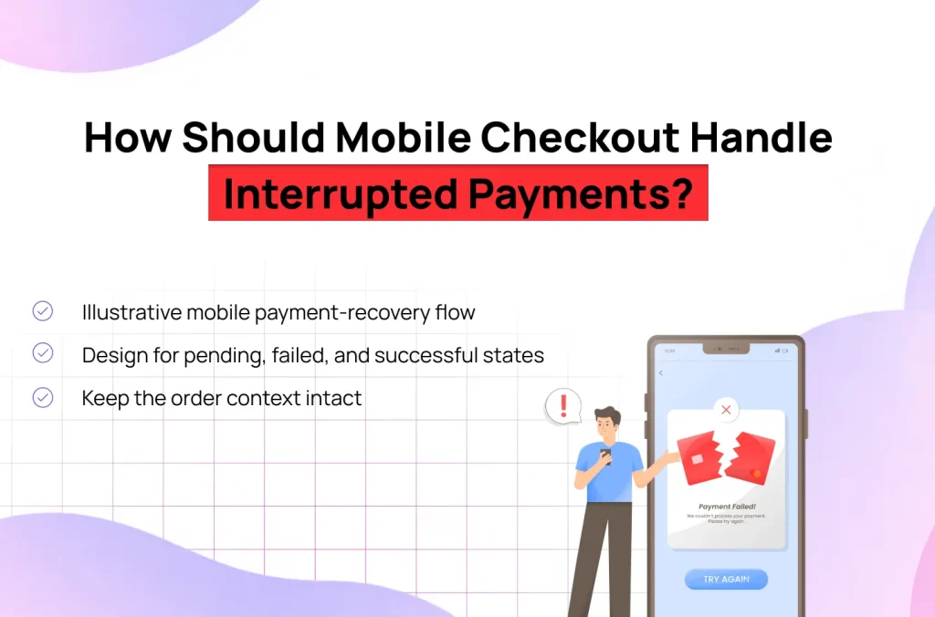
Good mobile checkout ux must account for customers switching between the store, payment provider, bank authentication screen, and other apps. The interface should preserve the transaction context and accurately communicate its current state.
Map what happens when a customer starts a payment, leaves the checkout, and returns. Include what the interface should show if the status takes time to arrive.
The following is a conceptual flow for a checkout that uses an external payment or UPI app. Actual behaviour depends on the payment provider, integration, and transaction-status mechanism.
Figure 1. Proposed mobile checkout flow
Cart review → Customer and delivery details → Payment selection → External payment or authentication → Return to checkout → Verify transaction status → Confirmation or recovery
The following table describes the key states.
| State | What the customer sees | Required behaviour |
| Payment initiated | A clear indication that payment is being processed | Prevent accidental duplicate submissions. |
| External app opened | An explanation of the transition where the integration supports it | Preserve the order context and provide a return path. |
| Payment pending | “We’re checking your payment status” | Verify the transaction rather than assume failure. |
| Payment confirmed | Order confirmation and reference | Record the successful order and prevent duplicate fulfilment. |
| Payment failed | A specific explanation and available next steps | Offer a safe retry or another supported method. |
| Status unknown | An honest status message and a way to check again | Avoid charging twice or falsely confirming the order. |
Pending: A timeout or missing callback does not necessarily mean the payment failed. Check the transaction through the provider’s supported status mechanism before offering a retry.
Failed: Explain the available recovery options. Where safe, retain delivery details and the order summary so the customer does not have to start again.
Successful: Confirm the order using the authoritative order and payment state. Make sure analytics events, confirmation screens, and fulfilment processes do not create duplicate orders.
Test UPI and other external payment flows on the devices you support. Some payments take longer to confirm or don’t return users to the same screen, so make sure the checkout handles both cases.
When a customer returns from a wallet or bank app, preserve the relevant order reference, selected delivery method, and other valid checkout information.
If the session expires, explain what needs to be restored. Never display a payment-success screen simply because the customer returned to the website.
For a practical starting point, consult Stripe’s checkout screen best practices and Shopify’s checkout UX guidance. Apply platform-specific requirements to your actual implementation rather than assuming every ecommerce platform exposes the same controls.
How Do You Validate and Prioritize Checkout Changes?
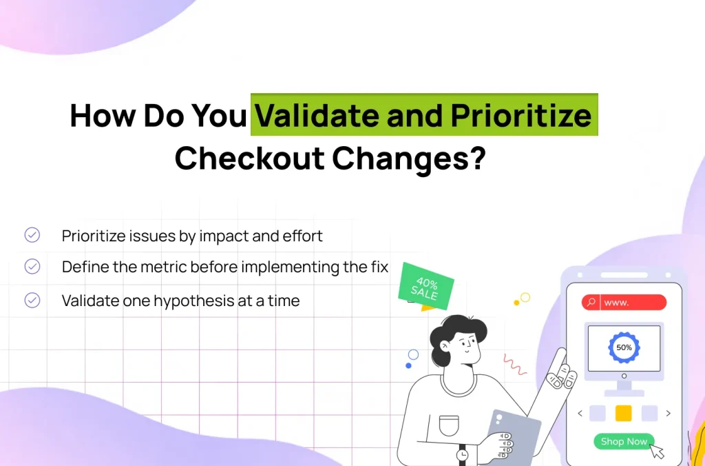
A checkout ux audit should show what’s going wrong, what you plan to change, and how you’ll measure the result. This helps teams agree on which fixes deserve attention first.
Use the following illustrative matrix to organise findings. Use this matrix to organise the work, not to predict conversion gains.
| Priority | Example issue | Suggested action |
| High impact, low effort | Guest checkout is difficult to find | Improve its prominence and validate the change. |
| High impact, high effort | Payment return handling loses transaction state | Investigate the integration and design a recovery workflow. |
| Low impact, low effort | A minor label is unclear but rarely causes errors | Fix alongside higher-priority work. |
| Low impact, high effort | A visual redesign has no demonstrated usability problem | Gather evidence before committing resources. |
Evaluate impact based on funnel data, failures on tasks, customer feedback, and importance of transactions. Approximate effort based on engineering dependencies, platform constraints, design scale, and testing needs.
A seemingly minor change to the interface can involve a lot of work in the back end. On the other hand, a complex redesign might be of minimal value if the problem is an inconsistent payment integration system.
Start with a clear checkout completion metric:
| Checkout completion rate = Purchasers ÷ Checkout starters × 100 |
Apply a consistent definition of “checkout starter” and “purchaser” in the numerator, denominator, reporting period, and relevant segments. For instance, consider whether the denominator contains customers who come into the checkout or just those who go to the payment step.
Track supporting metrics where relevant:
Do not treat payment attempts, button clicks, or confirmation-page views as equivalent to confirmed purchases.
Before making a change, write down the problem, your proposed fix, what you expect users to do differently, and which metric will tell you whether it worked.
For example:
Observation: New mobile customers frequently leave at the account-creation screen.
Hypothesis: Making guest checkout more prominent will help eligible customers proceed without creating an account.
Change: Move the guest option into the primary checkout entry area while retaining account sign-in as an alternative.
Primary metric: Checkout completion among eligible new mobile customers.
Guardrails: Payment failure rate, order quality, support contacts, and data integrity.
When traffic, implementation, and conditions of the experiments are favorable for a reliable comparison, use an A/B test. Otherwise, use before-and-after monitoring and moderated usability testing, task studies, and qualitative feedback. Take into account other releases during the same season or marketing changes as well.
Whatever interface modification is implemented should not be attributed to a conversion improvement until there is evidence to support that.
A focused checkout ux audit can include:
Lollypop’s published UX audit process provides a relevant next step for teams that need a structured evaluation of their user experience.
The Cloudhop Bakeshop ecommerce project is also relevant to ecommerce experience design. Its published case study describes research, wireframing, product discovery, visual design, and mobile optimisation. It does not establish a quantified checkout conversion uplift, so it should not be used to claim one.
An audit should tell the team what to fix and why. Every recommendation should identify the problem, the work involved, and how you’ll check whether the fix helped.
Effective checkout design starts with finding out why customers leave. Fix the problems your data and user testing reveal, then measure whether more shoppers complete their orders.
Start with one checkout flow, establish a baseline, and document how you will validate the improvement. Expand the work only when the evidence supports doing so.
Talk to Lollypop about improving your ecommerce experience: Discuss your project.
Guest checkout is a handy default feature for many online businesses that lets customers who are not eligible to sign in buy without having to create an account. Present it with pride if the user doesn’t need to create an account for the transaction. Where applicable, explain the need for registration for a legitimate business or compliance purpose and try to keep the effort to a minimum.
Not universally. A one-page flow may give the entire process visibility, and a multi-step flow may break down complex delivery, billing, and payment tasks into manageable steps. Don’t just select based on the number of pages; there’s evidence of usability, mobile behaviour, and checkout completion.
Include the problem very clearly, keep valid information if possible, and give a relevant next step. Before attempting a retry, check if payment is successful or not if unsure. The interface should be differentiated between failed transactions, pending transactions, and successful transactions so that there is no chance of duplicate charges and incorrect confirmations.
Repair issues that are likely to prevent a purchase. Look for problems at the checkout counter, and identify if the checkout process is difficult, if items are charged incorrectly, if there are long forms, or if there are payment mistakes; then order the fixes based on your data, user testing, and the investment of time needed for implementation.