A customer discovers a fashion brand on Instagram. They see a campaign, notice the styling, save a look, and eventually click through to the website. For a few seconds, the brand has their attention.
Then the website opens.
The imagery is there, but the feeling is gone. The homepage looks familiar. Products sit in a standard grid. The navigation feels like an inventory system. The campaign that made the customer curious has little connection to the shopping experience that follows.
This is a common problem in fashion brand website design: the brand creates desire beautifully everywhere except at the moment when that desire needs to become a digital experience.
That moment matters. Fashion e-commerce websites recorded a 54% year-over-year increase in visits and a 64% increase in unique visitors in Q1 2026, according to Sensor Tower. As more fashion discovery and shopping journeys move through the web, the website is becoming more than a transaction layer. It is increasingly part of how customers encounter, evaluate, and remember a brand.
The challenge, then, is not simply to build a website that looks good. A fashion website has to carry the brand’s visual language into navigation, merchandising, product discovery, and checkout without making the experience feel overly commercial.
The strongest fashion websites do not treat brand and commerce as competing priorities. They design commerce to feel like part of the brand.
Most e-commerce websites are designed around a relatively straightforward journey: help people find a product, understand its value, and buy it. Fashion websites have to do all of that while also communicating something less tangible. A garment can represent taste, identity, aspiration, belonging, or a particular way of seeing the world. The website therefore influences not only whether someone buys the product, but also what that product feels worth.
That changes the role of design.
A campaign image is not simply decoration around a product. It establishes context. Typography is not merely a way to make content readable. It contributes to the personality of the brand. Navigation is not only an information architecture problem. It determines how customers understand the collection. Even the way products are ordered on a category page becomes a form of visual merchandising.
This is why a clothing brand website cannot simply take a conventional e-commerce template and add stronger photography on top. The visual identity and the shopping experience have to be designed as one system.
The customer should be able to move from inspiration to discovery, from discovery to evaluation, and from evaluation to purchase without feeling that they have entered a completely different experience halfway through.
That is the real design challenge: how do you make commerce feel native to the brand rather than attached to it?
The first responsibility of a fashion website is not always to show a product. Sometimes it is to establish a reason to care about the product.
Consider the difference between arriving at a homepage that immediately says “Shop 36 New Arrivals” and arriving at one that introduces a collection through imagery, styling, movement, and a clear editorial idea before inviting you to explore it. Both can eventually lead to the same product page. But the second experience gives the customer a reason to see the product as part of something larger.
This is where editorial thinking becomes useful in fashion web design. The homepage can function like the opening page of a magazine or the first scene of a campaign. It establishes the mood, introduces the collection, and gives customers a way into the brand’s current point of view.
That does not mean commerce should be hidden. A fashion website still needs clear paths to products, collections, search, and checkout. The difference is the order in which meaning and transaction are introduced.
The product grid tells customers what you sell. The brand world tells them why they should care.
Strong fashion brand website design knows when to do both.
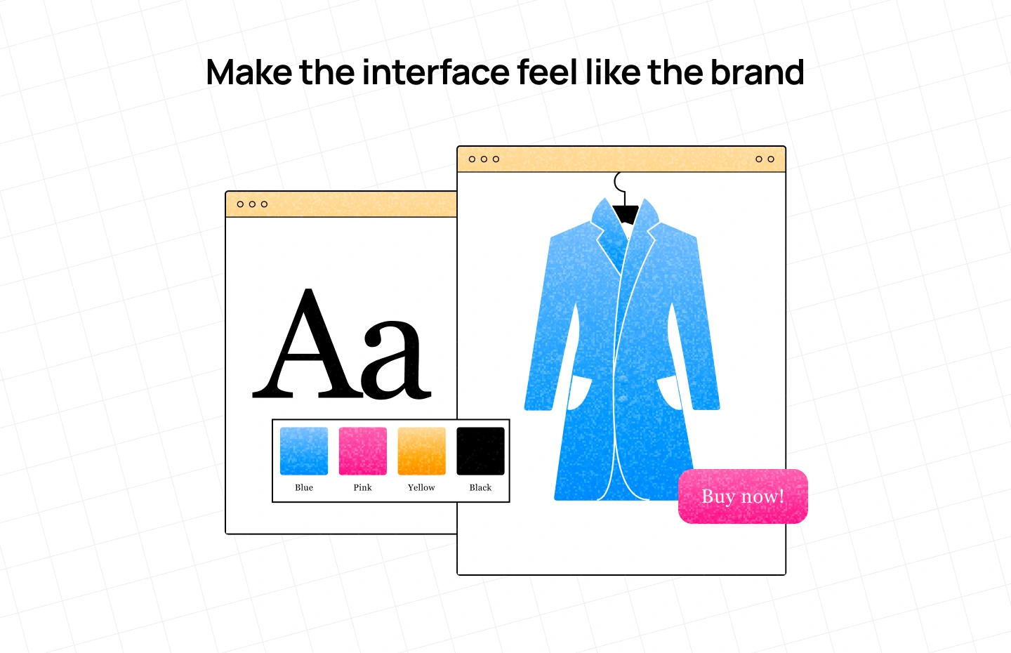
Fashion brands spend enormous effort developing their visual identity: photography direction, color, typography, packaging, campaign art direction, store environments, social content, and seasonal collections. The website should not become the place where those decisions suddenly disappear.
Typography is particularly important because it can change the perceived character of an interface before a customer has read a word. A restrained serif can suggest heritage or refinement. A geometric sans can make the same brand feel more contemporary. Oversized type, unconventional alignment, animation, or dramatic scale can introduce a sense of experimentation.
But the goal is not to make typography expressive for its own sake.
The real question is whether the visual system consistently communicates the brand’s positioning. A luxury label, an independent streetwear brand, and a performance-focused DTC company may all use bold typography, but they should not necessarily use it in the same way.
The same applies to imagery. A product photographed against a white background answers one question: what does the product look like? A campaign image answers another: what kind of life, attitude, or world does this product belong to?
The strongest websites understand that both are necessary. One creates desire; the other supports evaluation.

Fashion websites can become surprisingly difficult to navigate. Once a brand has multiple collections, genders, product categories, colors, sizes, materials, collaborations, and seasonal drops, the temptation is to expose everything in the navigation.
That usually creates a problem of hierarchy rather than a problem of information.
Customers do not always arrive knowing the exact product category they want. They may be looking for something for an occasion, a new collection, a particular silhouette, a certain activity, or simply something that feels like the brand they already like.
The navigation therefore has to reflect meaningful shopping behaviors rather than simply reproduce the company’s internal inventory structure.
Dior is a useful example at the scale of a global luxury house. Its current fashion architecture covers ready-to-wear, dresses, skirts, pants, jackets, bags, small leather goods, accessories, jewelry, shoes, and numerous subcategories. The challenge is not a lack of information; it is organizing a very large assortment into a structure that remains understandable.
Smaller brands face the same problem in a different form.
The answer is not necessarily fewer categories. It is better hierarchy.
A customer should be able to understand where they are, what they can explore next, and how the current collection relates to the wider brand without having to decode the company’s organizational structure.
Good navigation reduces the amount of thinking required to browse without reducing the richness of the collection.
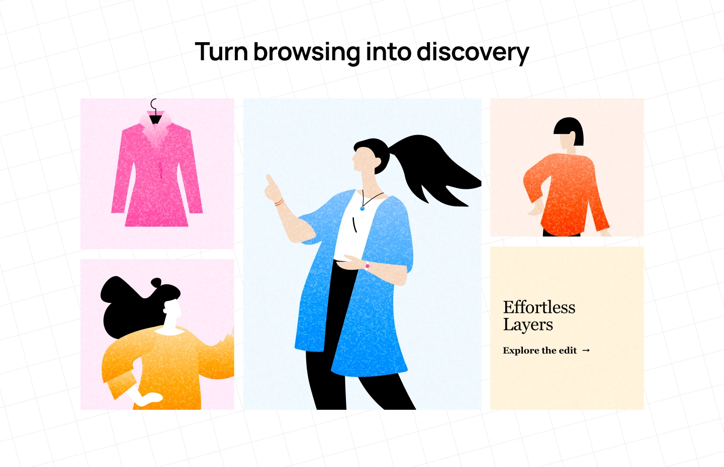
A collection page is often treated as a technical requirement: show a group of products, provide filters, and let people click into the one they want.
For fashion, that is too narrow a definition.
The order of products matters. The image used as the primary thumbnail matters. The relationship between products matters. The way a collection is introduced can influence whether customers see it as a coherent story or simply a pile of inventory.
This is why collection pages are one of the places where fashion brand website design overlaps most directly with visual merchandising.
Gymshark’s current all-products experience demonstrates the functional side of this problem particularly clearly. Its catalog can be filtered by product type, size, gender, features, fit, rise, activity, collection, color, pattern, discount, and price. The system is designed around the many different ways a customer might narrow a large assortment.
The lesson is not that every fashion brand needs dozens of filters.
It is that filtering should reflect how customers actually evaluate fashion products.
For one brand, material may matter most. For another, fit is the critical decision. A performance brand may organize discovery around activity, while a luxury brand may place greater emphasis on collection or product line.
The best collection page does not simply help customers find a product faster.
It helps them understand the collection better.
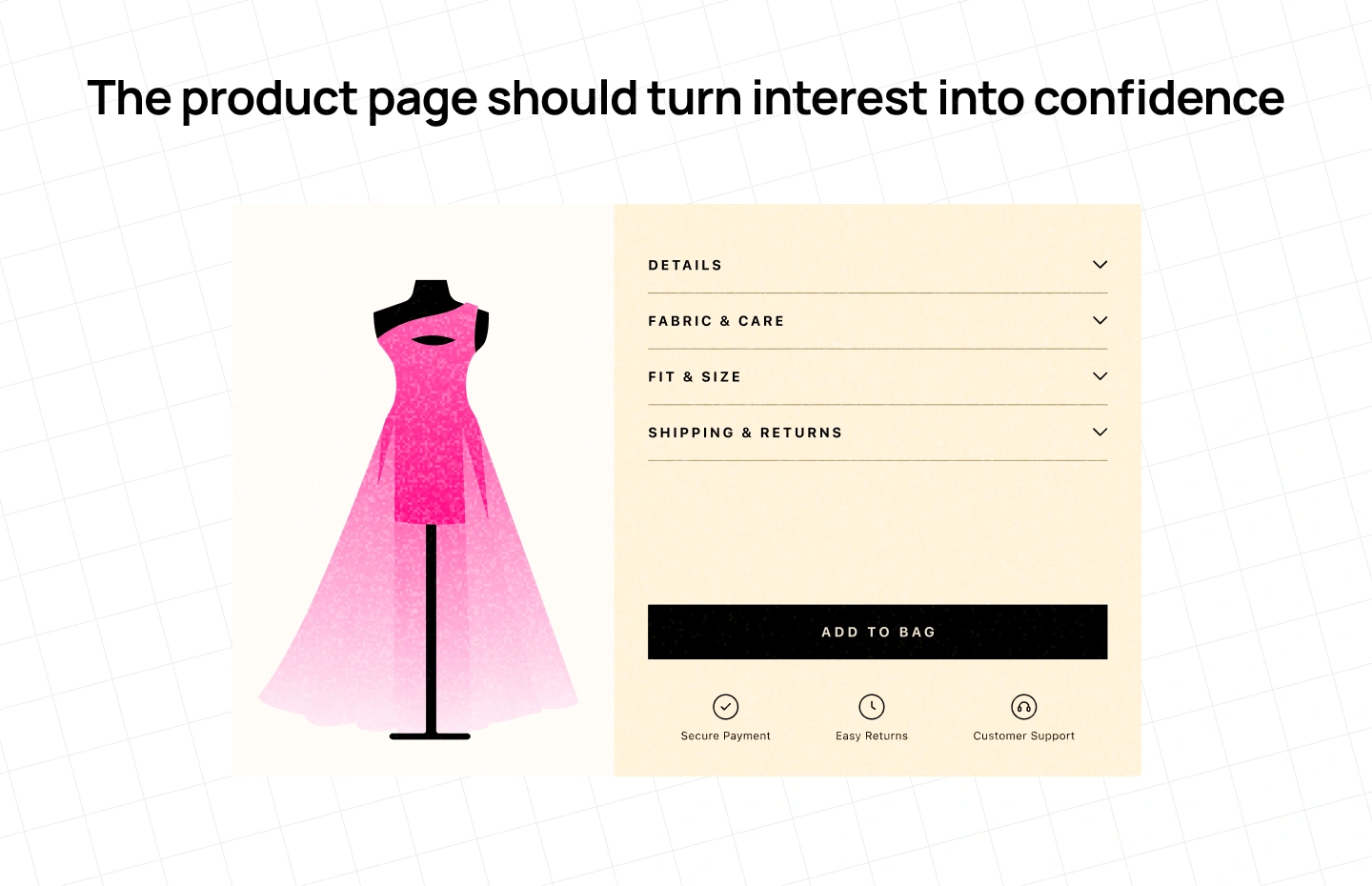
The homepage creates desire. The product page has a different responsibility: it has to make that desire feel safe enough to act on.
This is where many visually sophisticated fashion websites fall short. The campaign photography is exceptional, but the product page leaves too many practical questions unanswered.
A customer buying clothes online cannot touch the fabric, try on the garment, check the construction in person, or ask a sales associate whether the fit runs small. The interface has to compensate for that absence.
That means product photography needs to do more than show the front of a garment. Different angles reveal construction. On-model imagery provides fit context. Detail shots communicate material and finish. Video can show movement when still images cannot. Size information can turn uncertainty into confidence.
The written information matters just as much. A product page should make it easy to understand fit, model measurements, available sizes, material, care, shipping, and returns. Social proof can provide another layer of reassurance when the brand and product category benefit from it.
The principle is simple: the product page should answer the questions that stand between wanting the product and feeling confident enough to buy it.
That is why product-page design is not simply a conversion exercise. It is where the promise created by the brand has to survive contact with reality.
A fashion website becomes stronger when each page is designed around a specific customer need rather than forced into one universal template.
The homepage establishes the brand world. The collection page helps people discover the assortment. The product page resolves uncertainty. The About page gives the customer a reason to believe in the brand. The lookbook creates aspiration and context.
That distinction is important because the wrong page structure can create friction even when every individual component looks polished.
A homepage overloaded with product categories can feel like a catalog before the customer has developed any interest. A collection page made entirely of editorial imagery can look beautiful but make shopping difficult. A product page designed primarily for aesthetics can leave customers searching for basic information. An About page written like a corporate profile can miss the emotional reasons people choose independent or founder-led brands.
Good fashion UX begins by asking a simple question for every page:
What does the customer need this page to help them understand, feel, or decide?
The homepage is often asked to do too much.
New arrivals, best sellers, seasonal collections, sale products, editorial content, social feeds, store locations, newsletters, and every other business priority compete for attention.
The result may be comprehensive, but it rarely feels distinctive.
A stronger homepage starts with a point of view. It might introduce a seasonal campaign, a new collection, a designer’s perspective, or a particular visual world. From there, the interface can direct customers toward the products or categories that matter most.
The first viewport does not need to explain the entire business. It needs to establish enough context for the customer to understand where they are and why they should continue.
That is why a strong fashion homepage is closer to an editorial opening than a sitemap.
For established fashion houses, heritage can already be part of the brand’s perceived value. For newer DTC and independent labels, the website often has to build that belief from scratch.
The About page is an opportunity to explain what sits behind the products: why the brand was founded, what it believes, how it works, what it values, and what makes its approach different.
The mistake is turning this into a company biography. A stronger story connects origin to purpose, purpose to product, and product to proof. If craftsmanship matters, show the craft. If sourcing matters, explain the sourcing. If the founder’s perspective shaped the collection, let the customer understand that perspective.
The About page should not exist simply because every website has one.
It should answer the question: Why should I believe this brand is worth choosing?
Lookbooks are one of fashion’s strongest digital storytelling formats because they show products in context.
Instead of presenting a shirt, trousers, and jacket as three independent products, a lookbook can demonstrate how they work together. It can show the setting, styling, movement, and attitude around the collection.
But there is a common UX problem: the lookbook inspires without providing a clear next step.
If a customer sees something they want, they should be able to move from the image to the relevant product without having to restart their search.
That makes shoppable editorial particularly powerful.
The lookbook becomes more than content. It becomes a bridge between brand storytelling and product discovery.
The best editorial experiences do not interrupt commerce. They give commerce context.
One of the easiest mistakes to make when redesigning a fashion website is looking for a visual style to copy.
The better approach is to start with positioning.
A luxury house needs to communicate a different value proposition from a streetwear label. A premium DTC company has a different relationship with convenience than a high-volume retailer. A sustainability-led brand may need to make evidence and transparency more visible than a brand whose differentiation is primarily aesthetic.
That means the same UX pattern can be effective for one brand and damaging for another.
Luxury can benefit from restraint because restraint can communicate exclusivity. A high-volume retailer may need dense navigation and powerful filtering because discovery and efficiency are central to the shopping experience. Streetwear can use urgency and community because drops and cultural relevance may be part of the brand proposition.
The design should therefore signal the right positioning before the customer has consciously analyzed it.
A website can be beautifully designed and still be wrong for the brand.
Luxury websites have a particular challenge: they need to make products easy enough to discover and purchase without making the experience feel like a discount marketplace.
Visual restraint can help create that perception. Generous spacing, controlled motion, strong photography, carefully considered typography, and limited promotional noise can make the interface feel closer to a digital showroom than a conventional e-commerce catalog.
But minimalism alone does not create luxury.
If customers cannot find sizing, delivery information, product details, or checkout actions, the experience is not premium. It is simply inconvenient.
The goal is subtle commerce, not hidden commerce.
Premium DTC brands have a different problem. They need enough editorial identity to differentiate themselves while competing with much larger retailers on convenience.
That makes balance particularly important.
The homepage may need strong campaign storytelling, but collection pages need to be efficient. Product pages need to feel polished, but they also need to answer practical questions. The brand may want a distinctive checkout experience, but customers still expect familiar payment and delivery patterns.
The strongest premium DTC websites therefore make the transition from brand discovery to purchase feel almost invisible.
The interface changes function, but it does not suddenly change personality.
Streetwear brands often sell more than clothing. They sell participation in a culture.
That can change the role of the website.
Drops, collaborations, limited releases, creators, events, music, community, and cultural references can become part of the discovery journey.
The visual language can therefore be more expressive and immediate. Navigation may be organized around drops or collaborations rather than conventional categories. Product pages may emphasize scarcity, community, or cultural context alongside practical information.
The important thing is that the UX supports the reason people care about the brand in the first place.
If sustainability is central to a brand’s positioning, it should not exist only as a paragraph on an About page.
Everlane provides an interesting example. Its current sustainability experience includes information about materials, factories, climate commitments, social responsibility, certifications, and product-level sustainability indicators. The brand says it created ten sustainability icons and placed them on relevant pages so customers can follow the efforts behind its products.
The useful lesson is broader than sustainability.
When a brand’s value proposition depends on a particular claim, the website should make the evidence discoverable close to the decision that claim is supposed to influence.
Brand values become more credible when the UX helps customers see how those values show up in the product.
Looking at benchmark websites is useful, but “best fashion websites” is not a very useful category by itself.
The better question is: What specific design problem does this brand solve well?
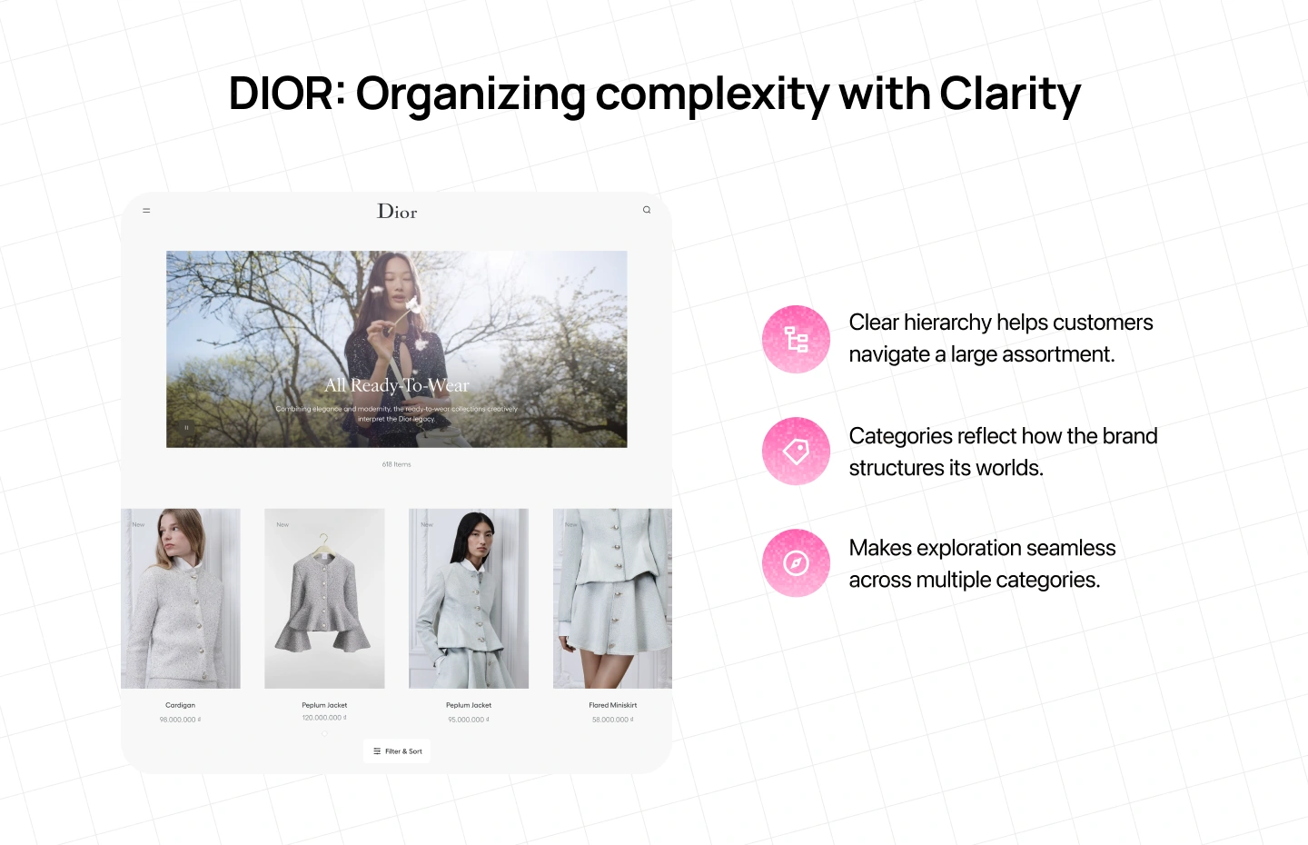
Dior is useful for studying information hierarchy at scale. Its current fashion architecture covers a broad assortment across ready-to-wear, bags, accessories, jewelry, shoes, and numerous subcategories.
The interesting part is not that Dior has beautiful photography or a premium visual system. Most major luxury houses do.
The more useful lesson is how a huge assortment can remain structured without forcing the customer to confront the entire catalog at once.
For smaller brands, that same principle applies at a different scale: organize around meaningful ways of browsing, not around everything the business happens to sell.
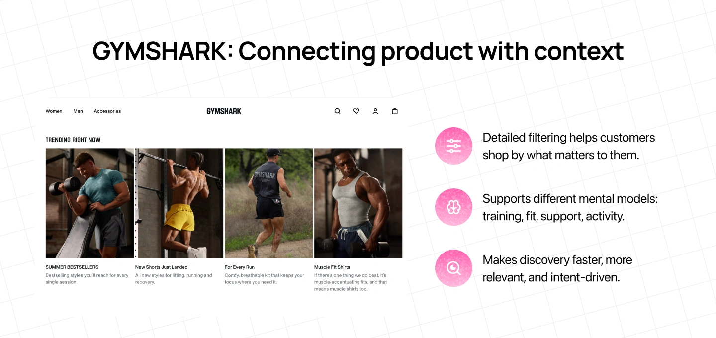
Gymshark offers a different lesson.
Its current catalog supports a large assortment through detailed filtering across product type, size, fit, activity, collection, features, and other attributes.
That makes the site useful for understanding how product discovery can reflect the customer’s intent.
A shopper looking for gym clothing may not think only in terms of “tops” or “bottoms.” They may think about training, fit, support, activity, or performance.
The website accommodates those mental models.
That is a powerful principle for any fashion brand:
Good filtering reflects the customer’s vocabulary, not the database’s vocabulary.
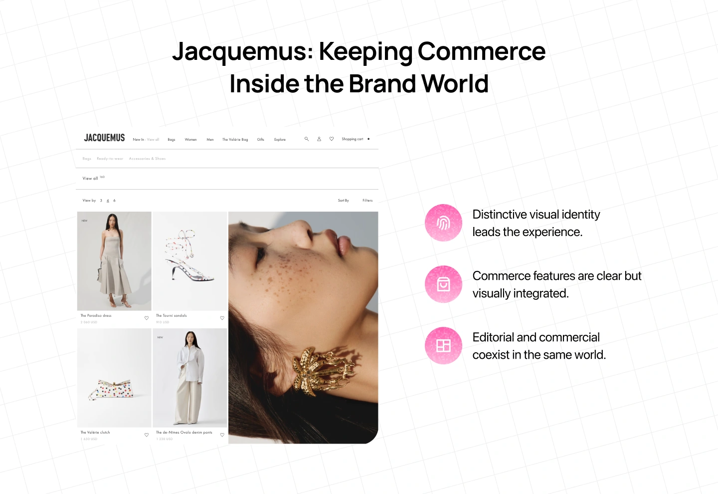
Jacquemus demonstrates a different challenge: how to maintain a distinctive visual identity while still operating a full e-commerce experience.
Its current site combines new arrivals and category navigation with product imagery, pricing, color variations, and conventional shopping functions.
The interesting part is the coexistence of those layers.
The website does not need to choose between being editorial and being commercial.
It can be both, as long as the commerce layer feels like it belongs to the same brand world.
Fashion browsing is highly visual, which makes mobile particularly demanding.
On desktop, a customer can scan multiple products at once, compare images side by side, hover over product cards, and move easily between navigation levels. On mobile, much of that context disappears.
The result is that mobile fashion UX cannot simply shrink the desktop layout.
Product imagery becomes more important because it often occupies most of the screen. Product galleries need to feel natural to swipe. Filters need to be accessible without taking over the browsing experience. Size selection needs to be easy to understand. Cart and search need to remain reachable without forcing the customer to repeatedly move through the navigation.
Checkout deserves the same attention.
Once a customer has decided to buy, the interface should stop making them work. Delivery information should be clear, payment should be familiar, and unnecessary steps should be removed.
Performance matters here too. Large fashion imagery can create a beautiful desktop experience while becoming a serious burden on a mobile connection.
That makes performance part of the mobile design system rather than something left to development at the end.
Fashion websites are moving into a period where product discovery is no longer limited to the traditional website journey. AI-powered shopping, personalization, social content and richer commerce experiences are changing how customers find products and make decisions.
Nike’s 2026 announcement is a useful example of where this is heading. The company said consumers in the U.S. would be able to discover and purchase Nike products through Gemini and Google’s AI Mode, reducing the number of steps between product discovery and checkout. Google has also announced broader Universal Commerce Protocol capabilities intended to make shopping more agentic across Search, Gemini and Maps.
This is where AI discoverability starts to become relevant to fashion e-commerce. Being visible is no longer only about ranking for a keyword. It is also about whether AI systems can find the brand, understand its business, connect it with the right context, and surface it when a customer asks for a recommendation.
That creates a new layer of responsibility for the website. Product information needs to be structured and consistent. Brand information needs to exist beyond isolated marketing claims. Important entities, categories, products and relationships need to be understandable across the site. Technical signals such as structured data, performance, security and crawlability also become part of how easily a digital presence can be interpreted.
This is one of the areas where Lollypop Spot can add a useful layer to the traditional fashion website audit. Instead of looking only at whether a website works for human visitors, Spot evaluates how prepared a business is to be discovered, understood and cited by AI-driven search and recommendation systems. Its AI Visibility assessment looks across areas such as content presence, structured data, brand authority, security health, web performance and schema coverage.
The distinction matters because a beautifully designed website can still have a discoverability problem. A customer may understand the brand perfectly once they arrive, while an AI system may struggle to determine what the company actually does, which products or services it offers, or whether the information is authoritative enough to cite.
For fashion brands, this means AI readiness should not be treated as a separate technical exercise that happens after the website is designed. The same content architecture that helps a customer understand the brand can also help machines understand it.
Personalization creates another opportunity, but the principle remains the same. Recommendations should make a large assortment easier to navigate without turning the experience into an anonymous product feed. User-generated content can add context that polished campaign imagery cannot, while structured product information can help both customers and machines understand what makes one product different from another.
The same applies to expressive typography, immersive interfaces, AI shopping and experimental layouts. A trend is useful when it strengthens the brand, improves discovery, reduces uncertainty, or makes the experience easier to understand. If it does none of those things, it may simply be decoration.
The question for fashion brands is no longer just “What should our website look like?” It is also “Can the people — and the AI systems — discovering us understand why we are worth choosing?”
That is where fashion website design and AI discoverability begin to converge.

The most useful starting point for a website redesign is not a moodboard.
It is a set of decisions about the role the website needs to play.
Start with positioning. What should customers understand about the brand within the first few seconds? Who is the brand for? What does its price point imply? What makes it different? What should the experience feel like compared with its competitors?
Then define the presentation. How do photography, typography, motion, color, layout, and content hierarchy translate that positioning into a digital environment? The purpose of the visual system is not simply to look consistent. It is to make the brand recognizable through interaction.
Next comes merchandising. How should customers discover the collection? Which categories matter? What filters reflect their decision-making process? Where does editorial content help? Which products should be grouped, and which stories deserve to lead the customer into the catalog?
Then comes reassurance. Where are customers likely to hesitate? Fit, material, price, sizing, delivery, returns, quality, and social proof can all become barriers. Product-page design should address those uncertainties before the customer has to leave the experience to find an answer.
Finally, design the conversion layer. Once the customer has made the decision, the interface should make the final step feel obvious rather than introducing new friction.
It is a more reliable starting point than asking what the homepage should look like.
A fashion website can be visually impressive and still fail its job.
It can have beautiful photography but confusing navigation. It can have sophisticated typography but weak product information. It can create an incredible campaign experience but make checkout frustrating. It can look premium while loading too slowly on mobile.
These problems happen when brand, UX, content, and technology are designed as separate disciplines.
The customer does not experience them separately. They experience one website.
That is why the most successful fashion brand website design is less about choosing the right visual trend and more about creating alignment between what the brand promises and what the interface delivers.
The campaign says the product is desirable. The website should make that desire tangible. The collection should make discovery easy. The product page should remove doubt. The checkout should make action effortless.
Every part of the experience should reinforce the same perception of the brand.
That is also where digital design becomes more strategic than decoration. The website is not simply presenting a fashion brand online. It is actively shaping how that brand is perceived, understood, and chosen.
A fashion website should not feel like the place where the campaign ends and shopping begins. The campaign may be what first creates interest, but the website has to carry that interest forward — giving the collection context, making discovery intuitive, and helping customers feel confident enough to buy. When those stages are designed as one experience, the transition from inspiration to purchase feels natural rather than transactional.
That is ultimately what fashion brand website design should accomplish. The goal is not simply to create a visually impressive storefront, but to translate the brand’s point of view into every part of the digital experience: the way products are presented, the way collections are organized, the information customers see when they make a decision, and the interactions that take them through checkout. When those details work together, the website stops feeling like a commerce layer attached to the brand and starts becoming part of the brand itself.
This is the kind of challenge Lollypop works with fashion and e-commerce brands to solve — bringing together brand strategy, UX, visual design and technology to create digital experiences that are distinctive, intuitive and built around how people actually discover and shop. Our work with experiences such as eShakti reflects the same principle: when the product, customer needs and business goals are understood together, design can make even a complex shopping journey feel more natural. Explore Lollypop’s fashion and e-commerce work
If you’re working on a new fashion e-commerce experience, rethinking an existing storefront, or trying to solve a specific challenge around discovery, product UX or conversion, book a session with the Lollypop team and let’s talk through the problem.
A good fashion brand website balances brand expression with usability. It should communicate the brand’s visual and emotional identity quickly while giving customers a clear path to discover products, understand fit and quality, resolve purchase concerns, and complete checkout. The strongest experiences make those activities feel connected rather than separating “brand” and “shopping” into different layers.
There is no single best fashion website because different brands solve different problems. Dior is useful for studying large-scale assortment and information hierarchy, Gymshark for product discovery and filtering, Jacquemus for balancing editorial identity with commerce, and Everlane for integrating brand values into the shopping experience. The most useful benchmarking approach is to identify the design problem each site solves rather than copying its visual style.
A clothing line website typically needs a brand-led homepage, clear collection and category structures, useful search and filtering, detailed product pages, sizing and fit information, shipping and returns information, and a mobile-friendly checkout. Depending on the brand, editorial content, lookbooks, customer-generated content, and sustainability information can also play an important role in discovery and purchase decisions.
Fashion websites have to sell both the product and the context around the product. Visual merchandising, photography, typography, editorial storytelling, and brand consistency therefore have a larger role than they might in more functional e-commerce categories. The website has to help customers purchase while also communicating why the brand and its products are worth choosing.
Start with brand positioning rather than visual trends. Define your audience, price point, personality, competitive difference, and the role you want the website to play in the customer journey. Then choose the visual and UX language that reinforces those decisions. A design can be aesthetically impressive and still be wrong if it communicates a different level of value, attitude, or customer experience from the brand you are building.