


Nowadays, business decisions are guided by data more than ever! From assessing product performance to optimizing user experiences, data has become a core foundation of how SaaS companies operate and grow.
However, when data is not presented in a clear and structured format, it can quickly become overwhelming. Teams may be faced with dense dashboards filled with numbers, struggling to identify key insights — what to prioritize, what’s performing well, and where improvements are needed.
This challenge highlights the importance of data visualization in product development. Instead of forcing teams to interpret insights from raw tables or scattered metrics, effective visualizations organize complex datasets into charts or graphs that are easy to read, compare, and act on. This reduces friction, accelerates understanding, and enables faster decision making across the business.
In this guide, we’ll cover the data visualization definition, explore its core benefits, highlight common chart types, and showcase best practices for data visualization from real-world SaaS scenarios.
Data visualization refers to the process of transforming complex data sets into visual formats such as charts, graphs, or plots to improve clarity and facilitate interpretation. The goal is to convert raw data into visuals that highlight critical patterns, trends, and relationships, so product teams can more easily make sense of complex data and move toward faster, better-informed decisions.
In SaaS platforms, effective data visualization plays a vital role in increasing user engagement, improving real-time monitoring of key metrics, and streamlining operational workflows. It helps product teams quickly identify issues, optimize features, and deliver better user experiences.
Data visualization design offers several benefits, which are valuable for SaaS businesses in dealing with complex datasets.
SaaS platforms often generate large volumes of data across user behavior, system performance, and business metrics. Without thoughtful design, this data can become overwhelming and hard to interpret.
Good data visualization relies on visual hierarchy, logical layout, and clear design signals to turn complex datasets into insights that are easy to understand and act on. This approach enables product teams to effortlessly detect patterns, understand connections, and quickly grasp essential insights.
When data is visualized effectively, trends, correlations, and anomalies become easier to recognize. Users can spot performance shifts, behavioral changes, or emerging risks without needing to calculate or compare rows of data manually. This not only accelerates the decision-making process but also improves the accuracy and confidence of business choices.
A well-designed data visualization tells a story. Whether it is used internally by teams or externally in customer-facing dashboards, well-crafted visuals make complex insights easier to grasp, more memorable, and far more impactful than raw text or data alone. It strengthens user involvement and supports stakeholder buy-in by clearly highlighting the significance of the information.
Effective visualizations should also encourage users to interact. When visuals are intuitive and thoughtfully designed, users are more likely to dig deeper, ask questions, and explore underlying insights. This helps build a data-driven culture where teams actively engage with insights instead of passively consuming information.
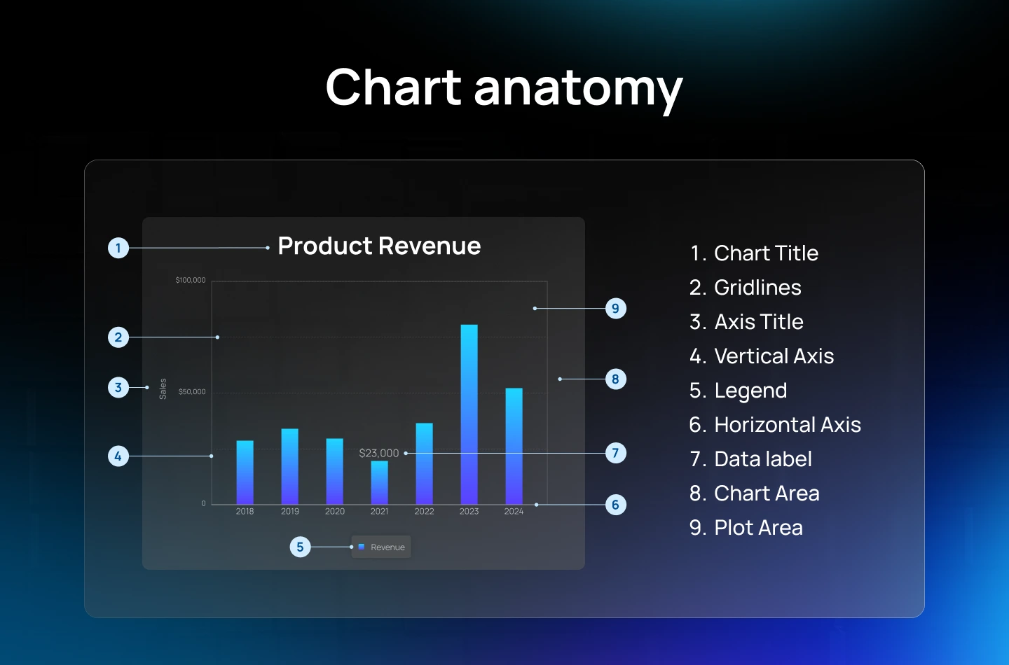
To help you choose the right visual for your product, here are some of the most common Data Visualization types used in SaaS platform design.
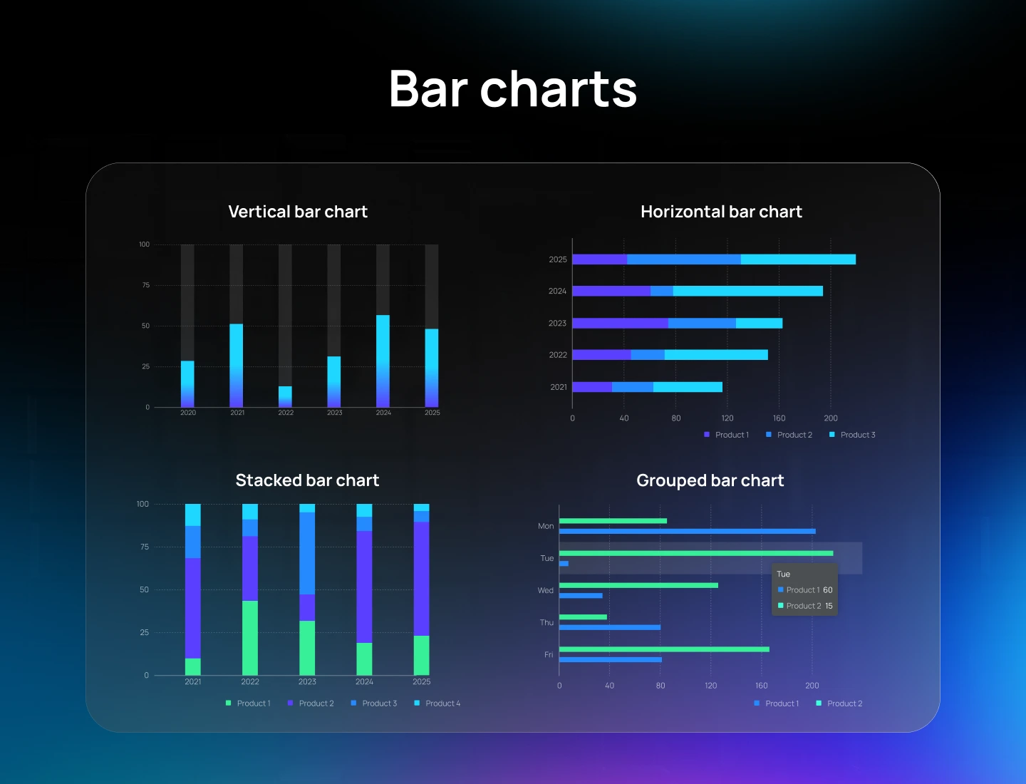
Bar charts use rectangular bars of varying lengths to represent values, making them one of the most common and effective tools for visual comparison. They are best used for comparing quantities across distinct categories, especially when the data is discrete. In SaaS platforms, bar charts are often used to show metrics such as sales by region, user signups by channel, or revenue by pricing tier.
Bar chart variations include:
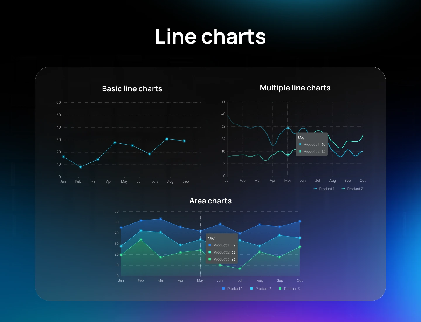
Line charts connect individual data points with straight lines, making them ideal for illustrating trends and changes over time. They clearly show upward or downward movements, recurring patterns, and fluctuations in continuous datasets. This type of chart is especially useful in SaaS platforms for tracking continuous metrics such as daily active users, monthly recurring revenue, or server uptime.
Line chart variations include:
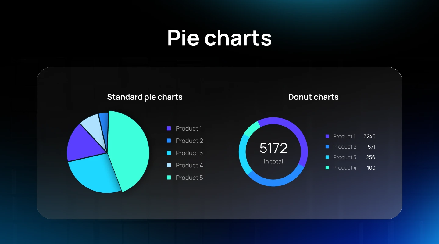
Pie charts are circular graphs divided into slices that represent proportions of a whole. They are best used for showing how individual parts contribute to a single total. In SaaS platforms, pie charts are often used to visualize categorical breakdowns, such as user segments, revenue sources, or feature usage distribution.
Pie chart variations include:
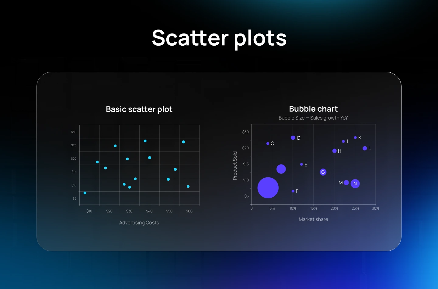
Scatter plots are useful for visualizing relationships across two data dimensions. Each point represents a data entry positioned based on its values along the X and Y axes. In SaaS platforms, scatter plots are often used to explore how user behavior, engagement, or performance SaaS metrics relate to one another.
Scatter plot variations include:
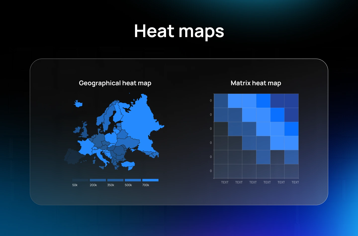
Heat maps apply color gradients to highlight data density and patterns, helping users quickly spot trends, outliers, and key areas. They are especially useful in SaaS platforms for analyzing behavior over time, monitoring system activity, or highlighting user engagement levels across multiple dimensions.
Heat map variations include:
To help you avoid common data design mistakes and improve how your product communicates information, here is a list of best practices for designing effective data visualization for SaaS.
One of the most important steps in designing effective data visualizations is choosing the right chart. A dataset can tell completely different stories depending on how it’s presented. Understanding the characteristics of different chart types and matching them to the purpose of your message will help ensure your visuals are both clear and meaningful.
Tips to choose the right chart type:
Clutter can take many forms: excessive gridlines, repetitive labels, unnecessary decorative elements, or colors that compete rather than clarify. When a chart is overloaded with too many visual elements, it becomes harder for the product team to see what matters. Removing clutter and guiding attention to the key insights help users stay focused and improve comprehension.
Tips to eliminate clutter and draw attention to relevant data:
Labels play a key role in making data visualizations easy to interpret. A chart that lacks clear labeling may lead to misunderstanding, regardless of how well it is designed.
Good labeling includes thoughtful text, logical placement, and visual clarity. Whether you’re addressing general audiences or data-savvy users, the goal is the same: help the viewer make sense of the information quickly and accurately.
Tips to label chart modules appropriately:
Scaling decisions affect how people perceive differences and patterns in your data. Whether you’re visualizing small fluctuations or massive value ranges, choosing the right scale helps users grasp the real story behind the numbers.
Tips to choose appropriate data scaling:
Read more: Understanding the Core Principles of Effective SaaS UI/UX Design
Nathan Yau, a data visualization expert, once said: “A good visual is a representation of data that helps you see what you would otherwise have been blind to if you looked only at the naked source.”
This level of clarity is especially crucial in SaaS products, where success often hinges on making data-driven decisions. By applying the best practices outlined above, you’ll be well on your way to unlocking deeper insights and making the most of your data.
Need expert guidance on designing an intuitive SaaS dashboard with great data visualization? At Lollypop Design Studio, our data visualization designers combine deep UX research with thoughtful SaaS UI/UX design to build digital products that align with specific businesses.
Contact us today for a FREE consultation and discover how great design can unlock the full potential of your platform.


