Visualizing Data and User insights (Both quantitative and qualitative) can be described as one of the major chunks of the research process. It helps in contextualizing isolated data points, storytelling, and in turn helps create empathy for users, for all parties involved in the design process.
In my experience, visualizing data is a step often taken towards the end of a project, when assembling our respective presentations, for the eyes of the client, which can make the process appear daunting, less creative and intuitive to engage in as a researcher.
💡 Thinking visually early on leads to better research outcomes. Let’s explore how.
However, I have found benefits to thinking visually, or even thinking visually in ‘systems’ from the very beginning of a project, which not only helps me gather insights about the domain and context I am researching about, but alleviates the pressure of creating deliverables, and makes the research process more creative, than it might appear to be on the surface.
How do I approach it, when do I approach it, and why do I approach it this particular way?
What I will be promoting time and time again throughout this article, will be the idea of thinking visually, or thinking on paper, and thinking in terms of interconnected systems.
📌 Explore more on our UX Research Services
📈 Internal Resource: Human-Centered UX Design Principles
Working in a design studio where the pace of the projects are very fast, and the domains and business verticals very broad; can be very daunting as a researcher. One may be on-boarded on a very short notice, one may have tight deadlines to manage, and the vertical you may be working in, added with the inherent challenges, may be something you are absolutely unfamiliar with.
You will be dealing with clients, who have worked in their industry for years and are experts, and will question the credibility of the contributions you will be able to make the end of the research and design exercise overall.
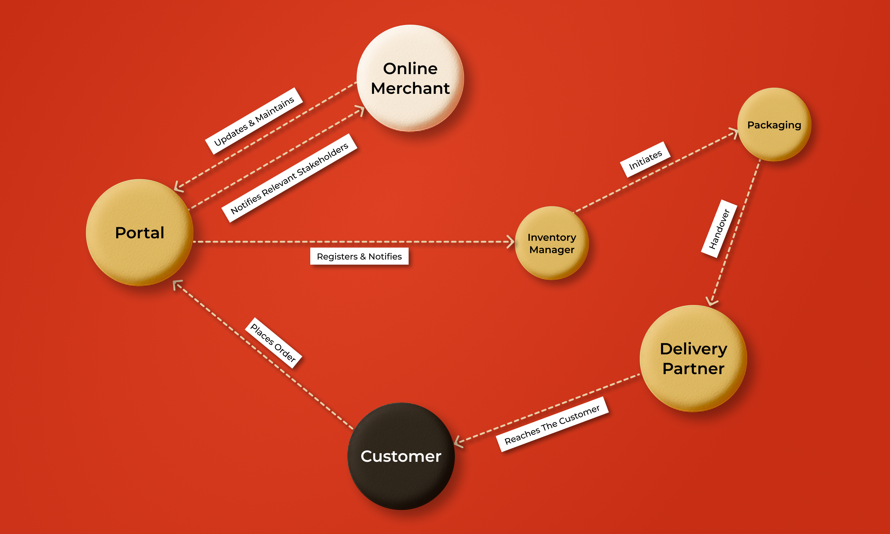
The core of this insight comes from understanding that every business can be broken down, into stakeholders, teams, hierarchies, roles and responsibilities. Essentially, the bottom line is, that every domain you may work in, functions as a system, which operates across a span of time, and none of parts of the system make up the whole. They are all interconnected, and feed into each other.
Various tools, like a stakeholder map, or a value exchange map, or even a user journey map (the bread and butter of our industry) help in breaking down these abstract systems into something visual and tangible. It helps materialize and categorize all the abstract insights we receive when being onboarded on a project.
Data visualization in UX research at this stage, helps materialize the insights as something tangible, and exposes our own gaps in understanding the system as it is, and might in turn expose the clients gaps in understanding the same. It helps look at the system as a cohesive whole rather than an isolated piece, which we cant judge the importance of.
How will this help? The most obvious benefits that I have reaped off of this, is it exposes potential AOI’s (Areas of investigation) which I may be inclined to pursue or even my design my research according to moving forward.
🧭Use stakeholder mapping to simplify domain onboarding. Read our design strategy case studies.
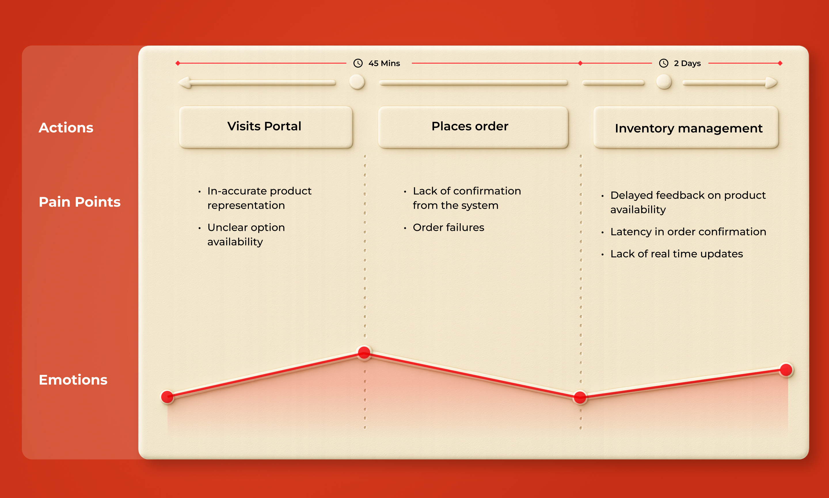
Before we begin interacting with our cohorts users, we have to prepare various styles of discussion guides, and mediums to capture data. Not only are they isolated pieces, but they tie in directly to how we will eventually analyze what we have captured.
On a very human level, at this point a researcher has a flood of questions they may want to ask, or investigate once field operations kick off. How do we ensure that we have covered all our grounds.
Leveraging our understanding of user flows and journeys, we can break down a users interaction with their environment or even a product down to various steps, starting from the very base of our psyche in terms of user needs, to tangible and measurable interactions with a product or an interface.
Segregating our inquiries sequentially, helps the user also follow the discussion easily, helps us ensure, we are covering our inquiry from a very broad and deep lens. In my experience, the data this generates, is easy for design teams to consume and and take forward into building their own user flows.
Designing our capture guides, according to how we might visualize a system, may in turn, shorten the amount of time it takes to assimilate and segregate user insights, and reduce analysis times and improve efficiency overall.
🧰 Learn how UX Designers can turn insights into flows
This insight comes from what I have observed other and more experienced researchers than myself engage in live while conducting research.
The standard that I have observed as researchers in practise, we often tend to wait to wrap up all our interviews before we start visualizing what we are learning. There merits in terms of avoiding bias, and double work in favour of the same.
However I have observed some benefits to starting the visualizing process in the very early stages of field itself. First and foremost this is the first visual draft of the system which you will be creating on the basis of user interviews, not secondary research or the insights you might have received from your clients, that in itself can be quite exciting. On the other hand it is also the first time you will be enabled to compare your understanding of the system before you started research and that based on the insights acquired from your initial interviews.
This further enables you as an individual to be fast and be up to date with a business vertical or domain, in what is already a very fast and agile way of conducting research.
Lastly it can allow you to pivot or deepen your inquiry realistically, to be able to capture deep insights, as this process will already deepen and nourish the quality of the probes you may have for future respondents.
This ties into the aforementioned steps. Assuming we have been engaging in this practise, we would have already developed a solid body of work and and be thoroughly up to date with what the system is, and where the inefficiencies might be.
Additionally, if we have designed our capture guides in accordance with this process, we may already have a de facto service blueprint or user journey at hand.
An indirect benefit of the same is that it can educate us about how we might cluster otherwise abstract data points into meaningful clusters with a strong affinity for a common insight. Not to say that, this is not something we dont do already, but it is something which can allow us to be more educated researchers when doing the analysis itself, which in some cases also has the indirect benefit of boosting efficiency during this step.
Who are our consumers? The clients of course, but more than the clients the our consumers are designers, who will be working hands on to build modules in the future, for a very specific user need, set in a very specific context.
The data we generate can be vast. It is Human centered design after all, which create a lot of data which to us researchers are important to create empathy for the contexts of our users, but the same can be overlooked by our consumers in the interest of time.
Visualization in systems becomes crucial at this stage as it becomes a common rally point to describe the system as it is today, it provides a holistic understanding of the interconnectedness of all stakeholders, which can easily be missed if looked at in isolation, and furthermore it provides a birds eye view of the context which creates pain points for our users, helping us empathize for the same.
Visualizing at this stage, becomes a rally point for design strategy as we start moving from something abstract to helping it become material and tangible. I for one have observed how preparing a cohesive piece in the end which contextualizes all our key insights, helps designers, plan very realistically, which modules they should build, it helps clients and designers brainstorm, about what interventions are most suitable for the problem at hand, and how will the same interact with all parallel systems and stakeholders and not exist in isolation, which is one of the most common failures in design interventions.
Furthermore it helps challenge and redefine our understanding of the system, which we entered the research with at the very beginning. And lastly it not only documents what the system is as of today, but provides a semi-long term design strategy roadmap to chart out and brainstorm interventions for interested stakeholders. (Client or otherwise)
Visualizing systems early in the UX research process not only enhances clarity and empathy but also creates a strong foundation for design strategy and stakeholder alignment. It transforms abstract data into actionable insights and allows researchers to confidently collaborate, adapt, and deliver meaningful outcomes.
🚀 Ready to make your research more impactful? Let’s co-create your next product experience.
Data visualization in UX research is the practice of converting complex user data into visual formats like stakeholder maps, journey maps, and system diagrams to help teams understand user behavior, needs, and system inefficiencies.
Systems thinking helps researchers and designers see the interconnected elements of a product or experience. It fosters empathy, improves communication, and leads to more strategic design interventions.
Ideally, you should start visualizing data and systems from the very beginning. Early visualization reduces research analysis time and exposes gaps or opportunities early on.
It offers a shared visual language that aligns teams, highlights user pain points, and provides a clear picture of the current and desired system states—helping stakeholders make better decisions.
Absolutely. These tools help designers build modules grounded in user needs and system context, ensuring their work is not just functional but relevant and sustainable.
Are you looking to build meaningful, human-centered digital products that are informed by deep research and systems thinking? Partner with our UX research experts to discover how our visual-driven design strategy can help you make informed and impactful decisions.
Stay updated with more insights on our blog and follow us on LinkedIn for updates and UX trends.