

We live in a world that is surrounded by products and services of all shapes and forms. Digitally speaking, there is an application for most human functions that we perform in daily life and the larger part of these applications have only come into existence in the last decade.
In order to build products that capture hearts and precious screen space, you must give the utmost importance to user experience design. The primary determinant of any software product is the metric for repeat use or ‘stickiness’. A ‘sticky’ product is generally one with exceptional user experience design that works so seamlessly that most users won’t even notice it. This article enlists some fundamental user experience principles that are crucial for beginners creating their first product.
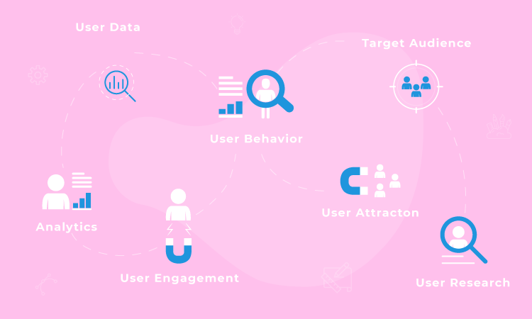
According to the first design principles, you as a product designer must understand user behavior in such depth that you can predict their behavior. An in-depth understanding of the user’s workflow will assist in the ideation and execution of a seamless UI/UX design that the user will not even know exists!
The functionality should flow logically without any kinks such that each step of the user experience gratifies the user with what they are looking for. While designing the user experience, we must aim to reduce the clutter and strategize the site navigation such that the user is able to get to what they want in the most efficient manner possible. There are various UX Research approaches that can be used based on the scope and goals of the projects, you can read about them here.

Every Product designer worth their salt is trying to build applications that can reduce the user’s cognitive load. But what does this term even mean? A lot of highly functional, well-meaning websites and applications try to offer users everything all at the same time. This means that when they are visiting your website, they are likely to be pulled in all directions, unsure of where the information they are looking for lies, unclear calls to action, unrelated trivia, et cetera. User Experience design principles dictate that we simplify the task at hand and design for the core action that the user is trying to perform. Provide a clear road map, outline a clear call-to-action and provide a cleaner, sleeker user experience.

Let’s think about this with an example. Think about any e-commerce website that you love and use often. Think about the product that you’re looking to purchase and how many different actions you need to perform from the time you’ve reached the website’s landing page to that of making a purchase. Chances are, these tasks can be achieved in three simple clicks or lesser. This is the hallmark difference between good user experience and a not-so-great one. Always think about the site functionalities as a process and attempt to help users achieve their objectives in fewer than 3 clicks.

Probably the best design element of any well functional website is the ability to go back and re-work a choice made by the user. Undo is a very powerful tool and helps users go back a step in the process without having to start from scratch. The ability to go back a step helps users retain their chain of thought, save changes and move forward in the direction that they deliberately want to engage in.

Website and applications are used to perform highly sophisticated as well as the most rudimentary of tasks in modern life. Hence, using terminology that does not clarify what task it fulfills will leave users confused thereby increasing the bounce rate of your website. Narrow down the options when asking users to make a decision on the application and provide context so that there is lesser room for guesswork. For example, when we’re submitting an application online ‘Save for later’ is less ambiguous to ‘Come back to this later?’

While dabbling in product design you must ensure that you are accommodating users with different skill-levels that are accessing your website. This will include those who are accustomed to the site as well as first-time users. To enable this, the user experience must only include relevant information. Over-supply of content on a website has the tendency to clutter and reduce the visibility of relevant matters. You can enable short-cuts for more experienced users, however, the site must be just as intuitive for a first time user.
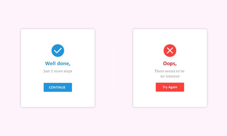
System errors are part and parcel of any digital experience. However, the function of good design is to manage errors effectively without miffing current users. Error messages should be crisp and to the point couple with information on how to navigate out of the error. If this is not handled well, users can abandon your application in frustration. On the flip side, a relevant error message can lead to delightful user experience and retention of the user. These are the small things which often gets neglected during the design; here are the major 7 UX mistakes that we do as designers.


