

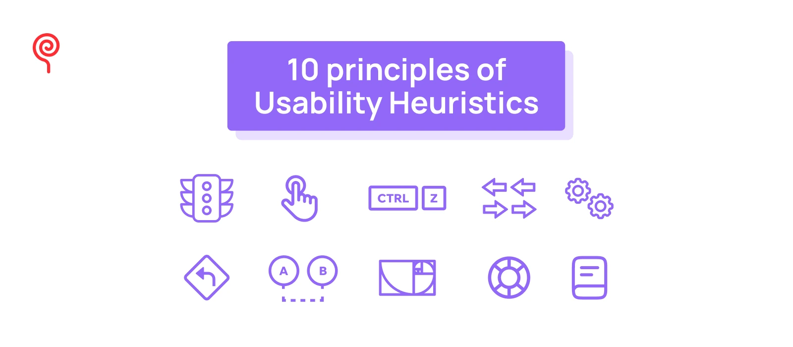
Heuristic evaluation is one of the most effective methods for identifying usability gaps in a digital product. This is conducted by evaluators assessing the user interface (UI) against established usability principles—known as “heuristics”—evaluators can uncover areas for improvement.
When delving into heuristic evaluation, you’ll encounter various frameworks, but Nielsen’s 10 Usability Heuristics (1994) remains the most renowned set of principles in UI design. These principles provide a comprehensive foundation for evaluating and enhancing the usability of digital products.
In this article, Lollypop Design Studio will explore Nielsen’s 10 Usability Heuristics in detail, offering practical examples to help you understand and apply each principle effectively.
Ready to dive in? Let’s get started!
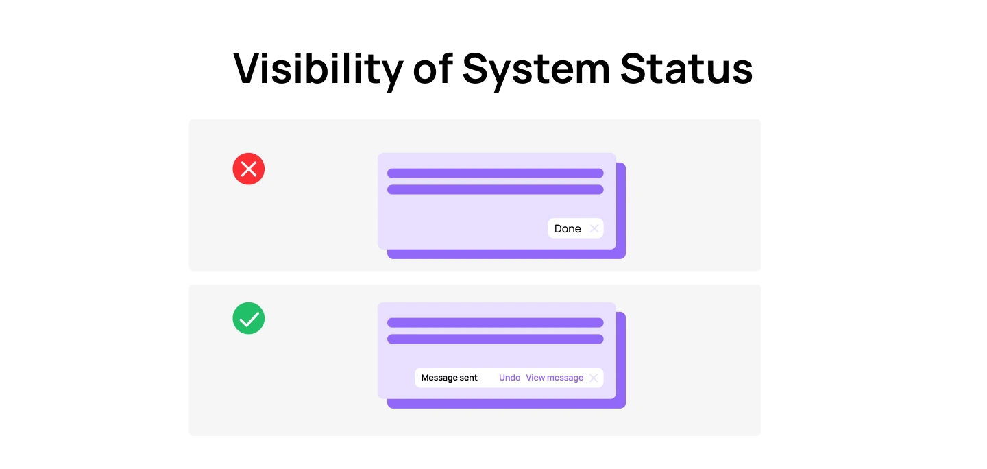
The first principle states that a well-designed interface should always keep users informed about what is happening, through appropriate feedback within a reasonable amount of time.
Clear feedback gives users control over the situation, which ensures whether their actions, like clicking a button, have been acknowledged and processed or not. Without it, users may feel uncertain or frustrated, questioning, “Did my click go through? Is my file uploading, or has something gone wrong?”
Examples:

Matching between the system and the real world refers to designing interfaces that align with the language, concepts, and conventions familiar to users. This principle ensures that systems communicate using terms, icons, and workflows that reflect how users think and behave in their everyday lives.
By mirroring real-world conventions, users can interact with the system more intuitively, minimizing the learning curve and potential confusion. This helps enhance a seamless experience for users.
For example:
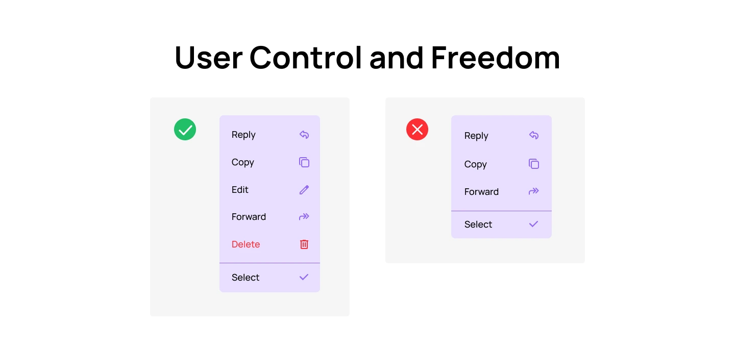
The “User Control and Freedom” principle focuses on empowering users to easily navigate, undo, or correct their actions, ensuring they never feel trapped by the system. By making it simple to back out of a process or undo an action, users gain a sense of confidence and freedom, preventing them from feeling stuck or frustrated .
Examples:

Following the “Consistency and Standards” principle, users should not have to guess how different elements or actions work within a system. Consistency ensures that similar functions and components behave predictably across the interface, while adherence to established standards aligns the design with user expectations based on familiar conventions.
In general, there are 5 types of Consistency that Product Designers need to consider:
You may want to read more: 8 Golden Rules of Interface Design & Best Practices
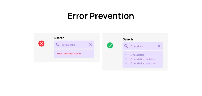
Error Prevention refers to designing a system in a way that minimizes the chances of users making mistakes. By anticipating potential user errors and preventing them from occurring, the interface helps users complete tasks successfully without confusion or frustration.
Generally, there are two types of errors users make:
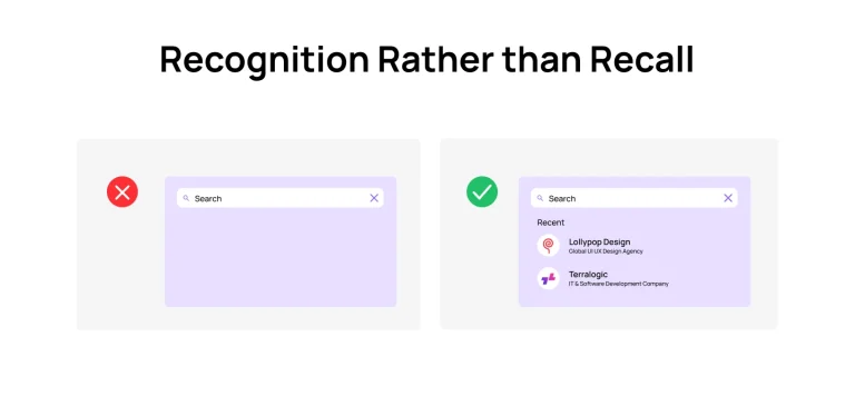
Recognition rather than Recall emphasizes minimizing the user’s memory load by keeping elements, actions, and options visible. Users should not have to remember information from one part of the interface to another. Instead, essential information, such as field labels or menu items, should be readily visible or easily accessible when needed.
Examples:

Flexibility and Efficiency of Use highlights the importance of designing for both novice and expert users by offering flexibility in how tasks can be performed. While new users benefit from straightforward and guided interactions, experienced users should have the option to speed up their tasks through shortcuts or advanced features.
Designs should accommodate different user needs and preferences, allowing for customization or the use of shortcuts to increase efficiency without compromising usability.
Examples:
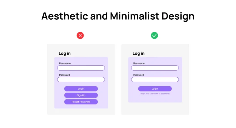
This principle emphasizes that designs should be visually appealing, while avoiding cluttered UI elements. Aesthetic design enhances user experience by creating a visually pleasing environment, but it should not overwhelm users with excessive information or controls. Only essential elements should be included, allowing users to focus on the task at hand without distractions.
Examples:

This principle focuses on designing systems that help users understand and resolve errors quickly. When an error occurs, users should be presented with clear messages that explain what went wrong and offer solutions for recovery. Error messages should avoid technical jargon and instead guide users toward fixing the issue in a way that feels intuitive and supportive.
Examples:

The “Help and Documentation” principle emphasizes that while designs should be intuitive to minimize the need for assistance, it’s important to provide when users encounter challenges. Documentation should be concise, understandable and easy to find, offering step-by-step guidance, troubleshooting tips, and examples to help users resolve issues efficiently.
Examples:
In this blog, Lollypop has shared the 10 Usability Heuristics principles, as well as usability heuristics examples to help you identify and resolve usability issues in UI design. Adopting these principles will help enhance the product’s user experience, making it more intuitive and user-friendly.
Looking for a trusted design agency to do Heuristics Evaluation for your digital product? Our usability experts at Lollypop Design Studio are here to support. As a leading UI/UX design company, we specialize in providing tailored UX audit solutions, leveraging “heuristics designs” to elevate user experiences across all digital platforms.
Contact us today to explore a customized UX audit process designed to meet your specific goals and needs.

