Did you know that nearly 1.7 new apps are launched every minute? Yet, most users actively use only 10–15 out of the 30 apps they install each month. With such intense competition, the only way to survive in this crowded digital market is by ensuring retention and re-engagement.
Creating an app that stands out isn’t easy—it requires careful planning, focus, and collaboration from both designers and stakeholders. In this guide, we’ll share 5 essential tips we always follow in our mobile app design projects that keep users coming back.
Key Takeaways
- Focus on Retention, Not Just Downloads: With 1.7 apps launching every minute but users only active on 10–15 apps monthly, design must prioritize retention and re-engagement to survive.
- The “One Task, One Screen” Rule: To avoid clutter and confusion on small screens, every screen should focus on one clear primary action (e.g., Uber’s drop-off location input).
- Prioritize Thumb-Friendly Design: Since 75% of mobile interactions are thumb-driven, critical controls should be placed in the “easy-to-reach” zone, while risky actions (like delete) should be kept in hard-to-reach areas.
- Master Affordances and Signifiers: Effective UI uses visual clues (shadows for buttons, magnifying glasses for search) to tell users how to interact with elements intuitively without needing a manual.
- Adhere to Core Principles: High-quality apps are built on the foundations of clarity, consistency, and familiarity—using patterns users already understand (like standard payment gateways) rather than trying to reinvent the wheel.
Tip 1: Taking Care of Basics
When it comes to design mobile app interface, the priority is to get the basics right to ensure a smooth, intuitive, and user-friendly experience. A well-structured foundation sets the stage for seamless navigation, clear interactions, and optimal usability across different devices.
Below are key points that help create a solid interface design.
- Simplify Onboarding: A seamless onboarding experience helps users quickly familiarize themselves with the app. Instead of lengthy tutorials, use progressive onboarding, tooltips, and interactive walkthroughs that introduce features naturally. Offering options like social logins and the ability to skip onboarding can further improve the first-time user experience.
- Clear Navigation & Placement: Identify which modules should be easily accessible and which can be hidden. Navigation should be obvious (using clear labels and familiar UI elements) and consistent (keeping menus in the same location across screens).
- Optimize for Different Screen Sizes: With diverse screen sizes across devices, responsive design is essential. A mobile-first approach ensures the app functions well on smaller screens before scaling up for larger ones. Use fluid layouts, scalable elements, and properly sized touch targets (at least 48px) to provide a smooth and accessible experience.
- Provide User Feedback: Keeping users informed about actions—whether in progress, successful, or failed—is crucial for a smooth experience. Utilize micro-interactions like loading indicators, confirmation messages, and error alerts to provide clarity and reassurance.
- Use Animations Wisely: Animations can enhance engagement, but excessive or slow-loading transitions can disrupt the user experience. Keep animations subtle and under 300 milliseconds to ensure they add value without causing delays. Smooth page transitions and subtle hover effects help guide users effectively.
- Plan a Notification Strategy: Notifications are essential for user engagement, but too many can feel intrusive. Ensure notifications are timely, relevant, and provide real value. Giving users control over their notification preferences and focusing on meaningful updates—such as order confirmations or personalized suggestions—keeps engagement high without annoyance.
- Create a personalization design: A personalized experience makes the app more relevant and engaging for users. Customizing content, recommendations, and settings based on user preferences creates a more tailored interaction. Features like AI-driven suggestions, recently accessed content, and adaptable UI themes contribute to a user-centric design that fosters retention and satisfaction.
Tip 2: One Task, One Screen

Smartphone screens are small, so if you try to add too much information or too many actions, the design becomes cluttered and confusing. Instead, each screen should focus on one main action to make the experience simple and easy to follow.
When users only have one task per screen, they can quickly understand what to do next without distractions. This also makes the interface more user-friendly and helps them complete actions faster.
For example: The main screen of the Uber app has one clear purpose – helping users book a ride. Instead of showing too many options, it simply asks for the drop-off location so users can get a ride quickly.
Tip 3: Design for Touch
1. Rule of Thumb

Mobile users often navigate with just one hand, mainly using their thumb. Research by Steven Hoober found that 49% of people use their phone this way, and Josh Clark further noted that 75% of mobile interactions are thumb-driven. Because of this, UI design should make it easy for the thumb to reach important controls.
To improve usability, follow these thumb-friendly design rules while you design mobile app:
- Place commonly used buttons and controls where the thumb can easily reach.
- Move less important or risky actions (like “Delete”) to hard-to-reach areas to avoid accidental taps.
- Make buttons large enough for comfortable tapping, since fingers are less precise than a mouse.
- Test if users can complete key tasks one-handed in under 60 seconds.
2. Gesture UI
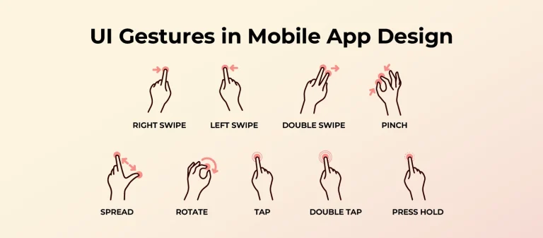
Gesture-based interactions allow users to swipe, tap, pinch, and tilt to navigate apps naturally. This makes interfaces feel faster, more fluid, and more engaging. However, gestures should be designed intuitively to prevent confusion.
To design effective gesture-based UI:
- Use familiar gestures (e.g., swipe left to delete, pinch to zoom) so users instantly understand how to interact.
- Limit the number of gestures—introducing too many can overwhelm users and make navigation harder to learn.
- Provide visual feedback (e.g., a button that slightly moves when swiped) so users know their gesture was registered.
- Test gestures with real users to ensure they feel natural and function as expected across different screen sizes.
Tip 4: Design with Affordances & Signifiers
In UI design, affordances define what an element can do, while signifiers provide clues about how to interact with it. A well-designed interface uses both to make navigation effortless and intuitive. Without clear affordances and signifiers, users might struggle to understand how to interact with different UI elements, leading to frustration and poor user experience.
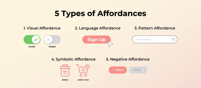
Here are 5 main types of affordances in UI design, along with how signifiers support them:
- Visual Affordance: The way an element looks suggests how to use it. Example: A button with a shadow looks like it can be clicked, while a toggle switch appears as something you can slide left or right.
- Language Affordance: Words tell users what to do. Example: A button labeled “Sign Up” makes it clear that clicking it will start the registration process, while “Swipe left to delete” explains a hidden action.
- Pattern Affordance: Users recognize common UI patterns from past experiences. Example: A magnifying glass icon always means search, and a back arrow helps users return to the previous page.
- Symbolic Affordance: Icons represent real-world objects or actions. Example: A trash bin icon means “delete,” and a heart icon usually represents “like” or “favorite.”
- Negative Affordance: Some elements show they can’t be used yet. Example: A greyed-out “Next” button tells users they must complete all required fields before continuing.
By using affordances with the right signifiers, designers create interfaces that are easy to understand and use, helping users navigate smoothly without extra effort.
Tip 5: Stick to core UI Principles
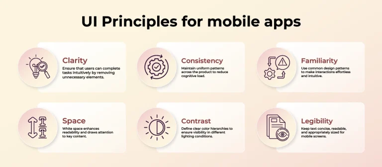
Design principles should always be at the center of your design as they bring you close to designing an excellent, functional mobile app interface. With limited space and large amounts of data, it’s easy to lose focus, but these core principles will keep you on track.
- Clarity: Designs should always help users complete the given task intuitively at the earliest possible time. Keep questioning your designs from a first-time user’s perspective. Do you understand everything in the first few seconds? If the answer is yes, you are heading in the right direction. Clarity leads to removing the unnecessary and making your design simpler.
- Consistency: Maintaining consistency across your application will reduce the need to rethink and remember; what we should aim at is associating users with a pattern, and they would reckon what needs to be done easily.
- Familiarity: Not everything needs to be out of the box. We as beings love familiar things and are comfortable with them. You need a ground-breaking app, not a maze of puzzles for users, so make use of subconscious behaviours and conditioned patterns. For example, don’t innovate a payment gateway!
- Space: White space around elements is important to draw users’ attention to the content and arm users with greater readability and clean UI. While designing a mobile app, this serves as a very active element that improves usability.
- Contrast: Always define the primary, secondary, and tertiary colors for the app to increase visibility. Since users may be outdoors with varying lighting conditions, ensuring strong contrast improves usability in different environments.
- Legibility: Mobile devices have limited space, so keep text concise and readable. Use a minimum font size of 11 points for clear visibility without zooming. Also, you should use white space generously and play around with the type to help users with greater readability.
Final thoughts
Multiple factors should be considered while designing an app, and it is impossible to sum up everything in mere five points. But, the above suggestions would ensure that your design ends up in a usable and feasible design. However, to add that wow factor, you will have to dig way deeper.
Need expert guidance on mobile application design for your business? Our design experts at Lollypop Design Studio are here to support you. As a leading UI/UX design company, we go beyond aesthetics —we focus on UX research to uncover real user pain points, apply UI UX Design principles, and consider technical aspects in product design. This not only creates a product that enhances user experience but is also feasible with the development status.
Contact us today for a FREE consultation and discover mobile app design & development solutions tailored to your business needs!


