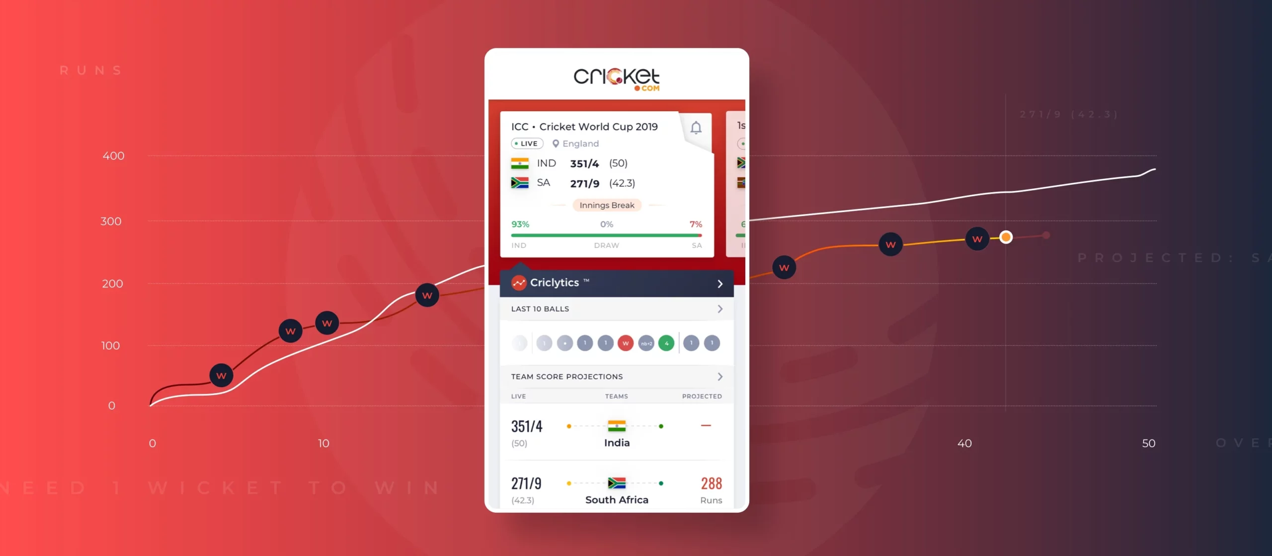

A data driven platform that provides live cricket scorecard updates, match schedules, predictions, analysis and all the latest news for all international, domestic and T20 matches.

Cricket in India is not just a game. It is a religion, an emotion that unites the Nation in an unimaginable way. So, we would say the biggest challenge was to be able to live up to these expectations of cricket fans whilst identifying the correct pain points that would deliver an everlasting experience.
The second challenge was to be able to cut through the strong competition and have a larger user base to shift to cricket.com over the other platforms. Our innovation couldn’t stem from an unfamiliar design system as we wanted to keep the learning curve of our users to a minimum. It had to come from reinventing the user journey from the existing behavioral pattern of the users in this domain. The experiences designed should act as a subconscious guide to our users.
The final challenge that we would like to highlight is ensuring that at every given point in time, there was zero cognitive load for our users. Being an informative and a data-heavy site with modules such as news,media, match stats and prediction engine, it was critical for us to create a logical information structure and data grouping to ease understanding.
Cricket.com is a state of the art sports platform that is powered by data-driven insights, AI-based performance predictions, and smart fan features. It aims to reimagine and reinvent the cricket experience for cricket lovers.
The USP of Cricket.com is its ‘Cryclytics Feature’. They have the various prediction engines that are based on advanced algorithms; these engines consider various data sets and turn them into insightful information; they are also able to predict the future probabilities based on the current and past data sets.

It was extremely critical for us to do on-ground user research and understand the real emotions, motivations, pain points and triggers of our users. Being a mass application, the logical question was a grouping of the users; hence, after intensive research, the team came up with a logical grouping based on the interests that users took into cricket. Research also showed that users had higher player eccentricity.
Second, here we had to be very strategic in terms of taking a progressive web app (PWA) first approach because we wanted users to experience the app before having to install it. There are more limitations in designing the PWA compared to a mobile app
Next, we worked on the user journey and flow of the cricket fan on the app. What was really important was to consider that we do not overload the data to users and at the same time serve each user group at every given touchpoint. Hence, we followed the ‘Inverted Pyramid’ principle and the ‘Five-Second Rule’ while designing the user journey. We’ve tried to capture the attention of every user group within the first five seconds by providing relevant information in the first scroll of the app for each user group.

We have opted for a card-based layout to provide a clear understanding of different types of information. Also, since it’s a data-heavy website with different stats and matches, it’s easier to guide users with a card-based layout. Also, the size of the cards used by us is comparatively bigger than the competitors.
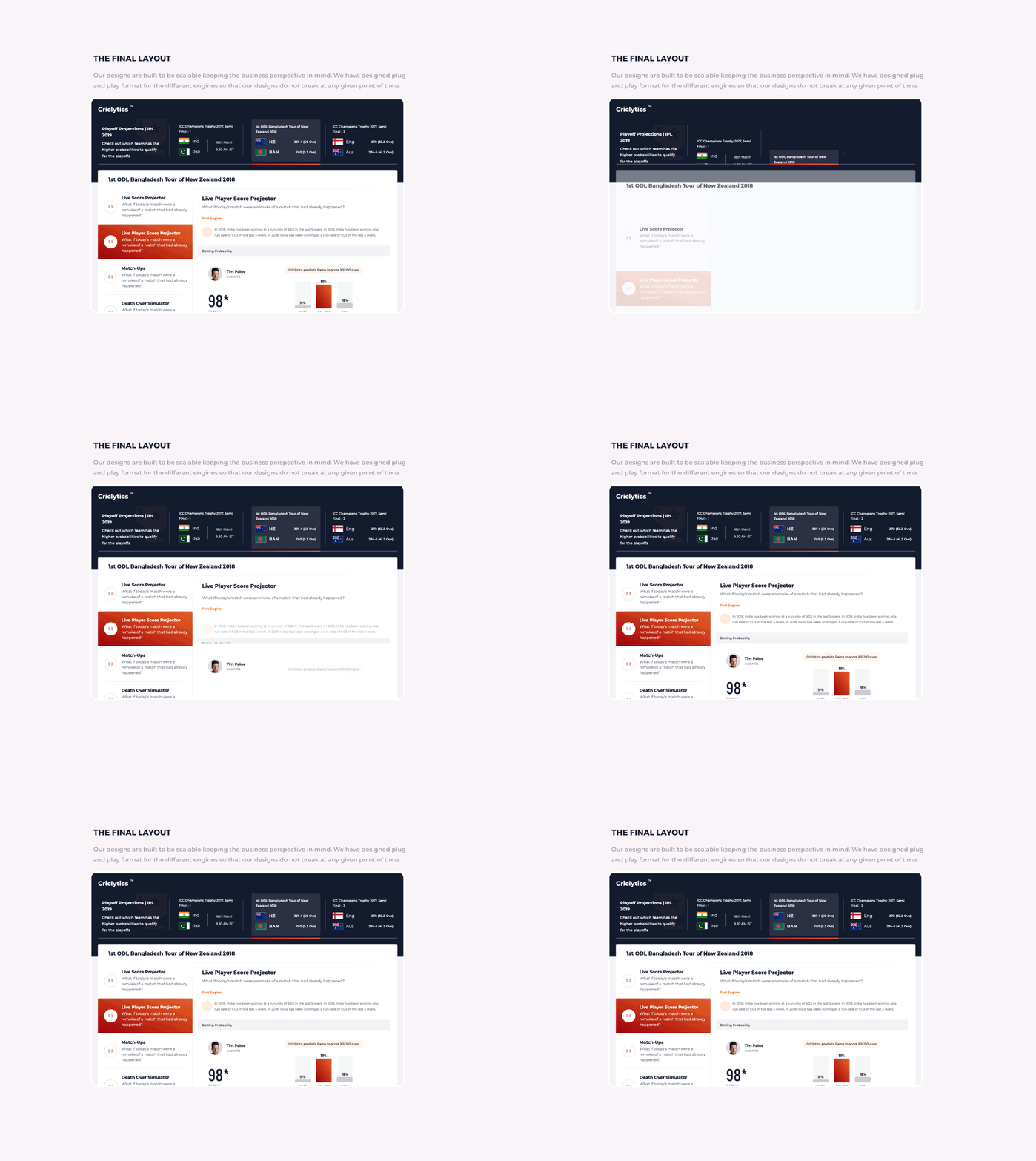
To ensure the scalable design, we have maintained strict grid lines across the mobile and web app version. Basically, this has helped us to reduce the development time and allows the team to plug and play the cards across the platforms while maintaining design consistency. This approach also allows cricket.com to scale their data sets in the future without being dependent on an external design agency.
We’ve used Oswald font for numbers as it has greater readability and being a google font it loads really fast. Montserrat has been used for the text as it is a sans serif font and really shines for short pieces of all caps and the geometric simplicity of the letters. Because of its geometric curve, it compliments Oswald well.


When you have a domain like cricket.com, you want to have the best design partners that are out there and this is when we ran into the team Lollypop. We spent a lot of time understanding users and discovered there were many small things and multiple pain points that were not catered to. Team Lollypop, helped transform those pain points into features and we have received a lot of appreciation and positive feedback.
Gautham Varma
Product Manager
