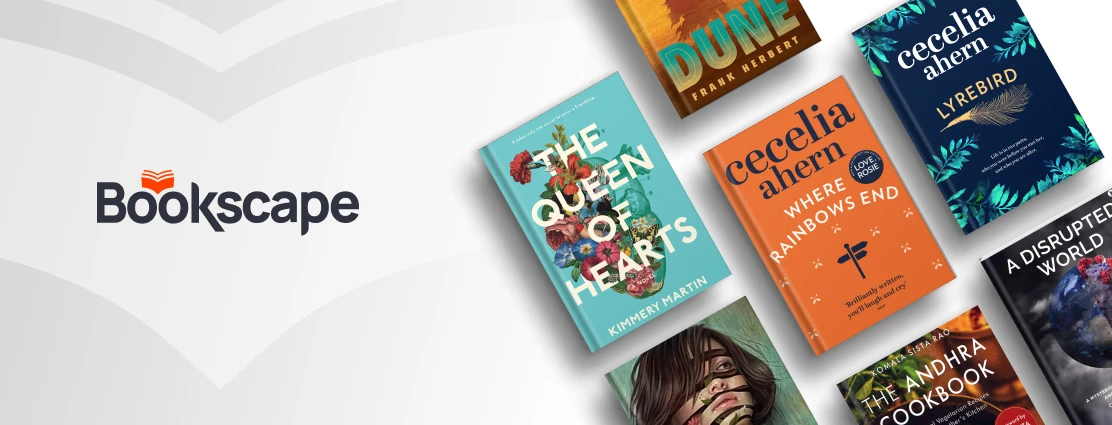
Bookscape is created for the love of books, the book community – authors, publishers and readers. We understand that every reader is different and believe in suggesting your next favorite book. Our consumers aren’t looking for just a common product; they’re searching for a genuine experience that harkens back to the touch and smell of an old bookshop from a former time. To get our users the right book at the right time with the power of Print on Demand (POD)
Given that Bookscape is a novel entrant in the market, our primary objectives revolved around several key pillars. Our foremost aim was to establish a distinct and recognizable brand identity. We recognized the significance of crafting a product that is inherently user-friendly, ensuring a seamless and enjoyable experience for our users. The integration of personalized experiences through our designs was paramount, enhancing the sense of connection and engagement for each individual.Aligned with these goals, our mission extended to a larger scope. We envisioned a platform that not only resolves existing challenges but also elevates the act of purchasing books into an experience that surpasses conventional norms. Our ambition was to redefine the process, infusing it with intrigue and excitement. This journey encompassed more than just commerce; it aimed to foster a sense of community among fellow book enthusiasts. Our aspiration was to provide a virtual haven where readers could connect, share stories, and forge meaningful connections, transforming the act of reading into a communal adventure.


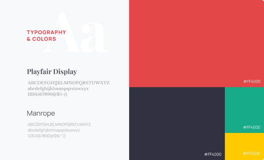
ABCDEFGHIJKLMNOPQRSTUVWXYZ
abcdefghijklmnopqrstuwxyz
1234567890@$%^()
ABCDEFGHIJKLMNOPQRSTUVWXYZ
abcdefghijklmnopqrstuwxyz
1234567890@$%^()
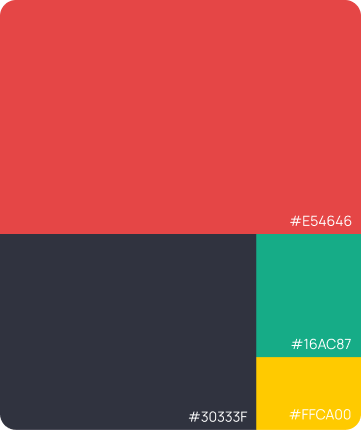
While designing the visuals of the app, we also created common symbols and icons which referred to workout related terminologies, and quickens the adoption and familiarity of the app.


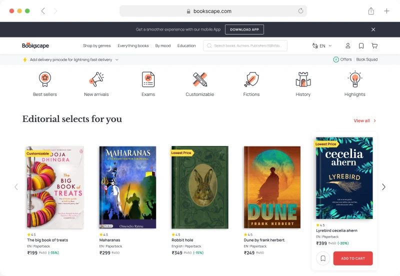
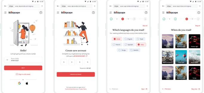
While designing the visuals of the app, we also created common symbols and icons which referred to workout related terminologies, and quickens the adoption and familiarity of the app.
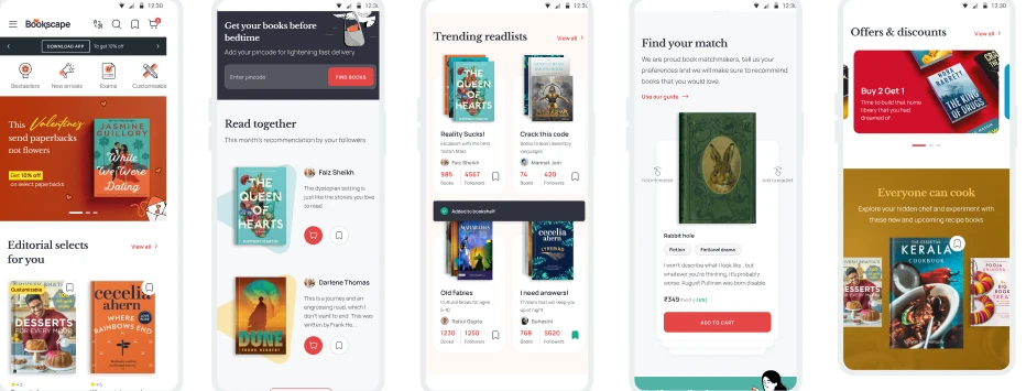
While designing the visuals of the app, we also created common symbols and icons which referred to workout related terminologies, and quickens the adoption and familiarity of the app.
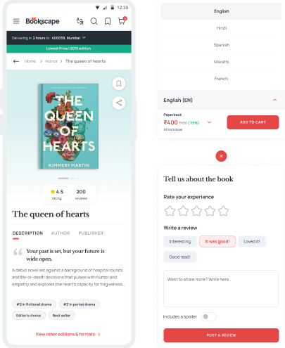
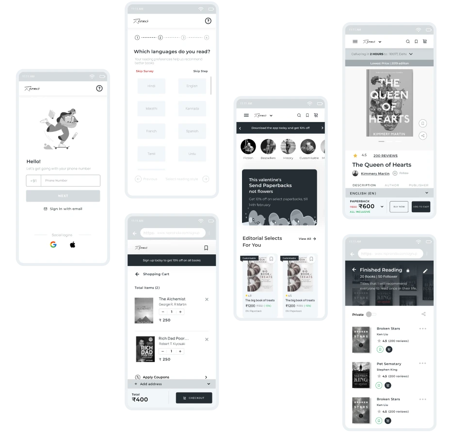
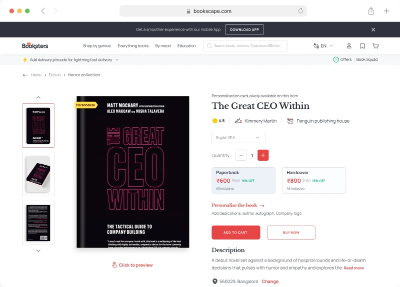
By adding language, book type, and prices to the sticky call-to-action (CTA), users can now make informed decisions without excessive scrolling. Additionally, the incorporation of book recommendations and reviews adds credibility, influencing users' buying behaviour.
By adding language, book type, and prices to the sticky call-to-action (CTA), users can now make informed decisions without excessive scrolling. Additionally, the incorporation of book recommendations and reviews adds credibility, influencing users' buying behaviour.
While designing the visuals of the app, we also created common symbols and icons which referred to workout related terminologies, and quickens the adoption and familiarity of the app.
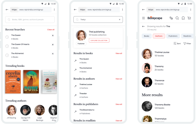
While designing the visuals of the app, we also created common symbols and icons which referred to workout related terminologies, and quickens the adoption and familiarity of the app.
We created the first of its kind print on demand ecosystem that felt familiar to users despite being a new concept. The app was loved by book lovers as a alternative to traditional bookstores, where the discovery process was joyful and immersive.