






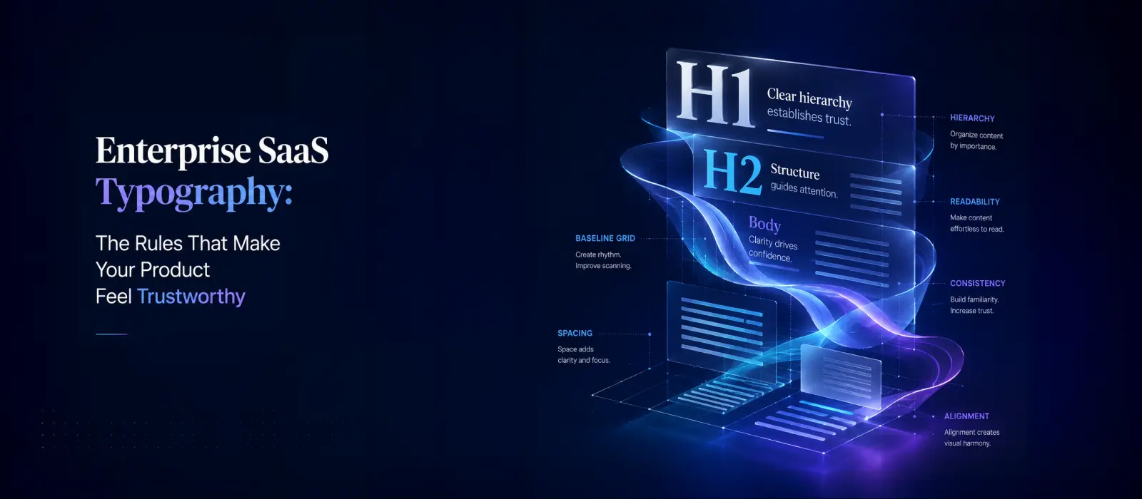

TL;DR: Key Takeaways for SaaS Typography
- Type Scale: Rely on disciplined mathematical ratios (like Major Second 1.125) rather than ad hoc font sizes.
- Font Pairing: Combine a humanist sans-serif for UI with a monospace font for data and numbers.
- Hierarchy: Use size for importance, weight for type, and color for state to guide time-constrained enterprise users.
- Accessibility: Always adhere to WCAG 2.1 AA (4.5:1 contrast) to satisfy enterprise procurement requirements.
Why Typography Is a Trust Signal, Not Just an Aesthetic Choice
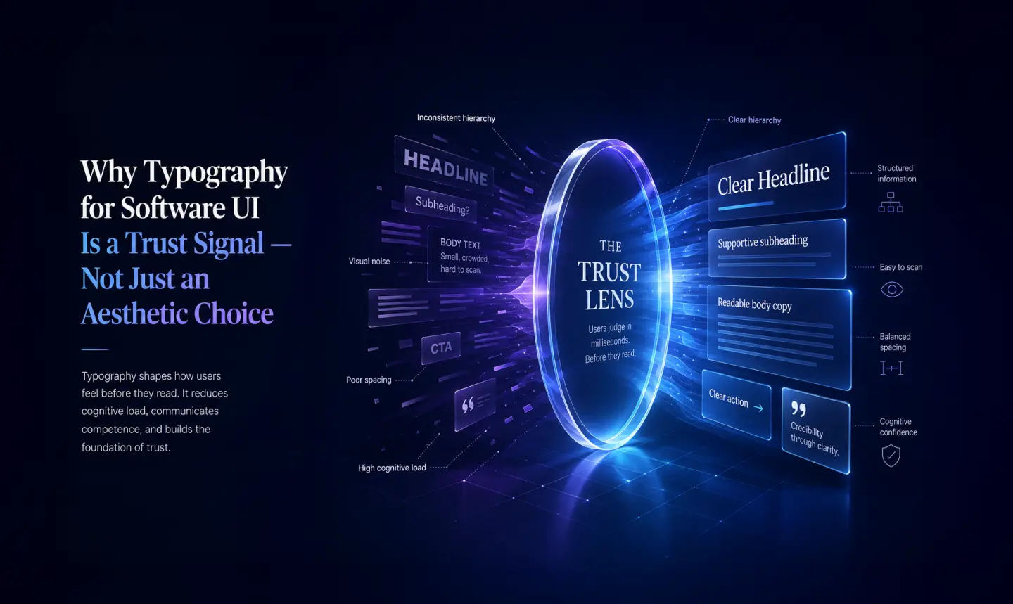
When we talk about how typography affects trust in B2B software, we’re talking about something that operates well below the conscious level. According to Nielsen Norman Group’s research on readability and visual hierarchy, text presentation directly shapes how users perceive a product and how credible the product feels.
For enterprise buyers, this is especially acute. Decision-makers are constantly pattern-matching against their mental model of ‘what professional tools look like.’ A font that feels too playful signals immaturity. A type scale that’s too dense signals poor UX thinking. Inconsistency signals that nobody was minding the details.
Brand trust begins at the typographic layer. Get it right, and it’s invisible. Get it wrong, and users feel something is off.
Build a Disciplined Type Scale System for Your SaaS Product
What is a SaaS type scale? A type scale is a set of predetermined font sizes built on a mathematical ratio that creates a predictable, readable visual rhythm across a digital interface.
The single most common typography mistake in SaaS products is an ad hoc type scale, with font sizes chosen by feel, case by case, until the product has 11 different sizes with no underlying logic. A disciplined front-scale SaaS system solves this.
A type scale is a set of predetermined font sizes built on a mathematical ratio. For enterprise interfaces, two ratios work particularly well: the Major Second (1.125) and Minor Third (1.2). When applied consistently, these create a visual rhythm that users internalize without realizing it. Jumping between sizes on the scale feels natural. Violating the scale feels wrong.
For most enterprise dashboards, a seven-step scale covers everything: a caption size, a base body size (typically 14–16px), and five display sizes for headings and data labels. The discipline is simple but non-negotiable. Once the scale is defined, every typographic element lives on it. No exceptions. Type hierarchy in UI depends on this consistency above everything else.
Is your SaaS dashboard suffering from UI inconsistency?
Typography is just the beginning. Our enterprise design team can audit your platform to reduce user friction and elevate your product’s credibility.
B2B SaaS Font Selection: Choose for Neutrality, Not Personality
Choosing a typeface for dashboard design isn’t about expressing your studio’s aesthetic. It’s about serving the data, the user, and the brand’s professional positioning. The goal is a professional UI typeface that carries enough character to feel intentional without imposing personality onto it.
The properties that matter most for a SaaS font selection guide: high legibility at small sizes, neutrality that doesn’t compete with content, and broad Unicode coverage for international deployments. Humanist and geometric sans serifs with strong hinting consistently outperform other categories here.
Fonts that perform exceptionally well across enterprise contexts for exactly these reasons include:
- IBM Plex Sans
- DM Sans
- Figtree
- Sora
A serif can work in marketing-facing areas: onboarding flows, empty states, and landing pages, but it rarely belongs in core dashboard interfaces, where density and precision take priority.
Weight range matters more than most designers realize. Enterprise products need fine-grained typographic control: a 300 weight for secondary data, 400 for body, 500 for interactive elements, and 600–700 for headings and emphasis. A two or three-weight family is almost always insufficient.
When Two Typefaces Are Better Than One: The Enterprise Font Pairing Guide
Single-font systems are the safe choice. Dual-font systems, done well, are more powerful. The most effective enterprise font pairing approach combines a humanist sans-serif for UI text with a monospace font for data, code snippets, and numerical values.
The reasoning is functional: numbers need fixed-width characters to align predictably in tables. When data cells mix proportional and monospaced type carelessly, dashboards feel visually unstable. A dedicated monospace font, such as JetBrains Mono, Roboto Mono, or IBM Plex Mono, creates instant visual clarity in numeric contexts and reinforces the sense of precision that enterprise users expect from B2B UI text design.
A secondary use case for font pairing is distinguishing marketing layers from product layers within the same platform. Some enterprise products use a more expressive display typeface during onboarding, then transition to a strictly functional sans-serif inside the core product. This isn’t inconsistency; it’s intentional visual language for enterprise software, signaling a shift from ‘selling’ mode to ‘working’ mode.
Font Hierarchy Rules for Enterprise Software UI
Font hierarchy in enterprise software is about making information scannable under pressure. Enterprise users are often time-constrained, multitasking, or processing large volumes of data. They scan before they read.
Effective font hierarchy rules for enterprise software UI follow a clear logic: size communicates importance, weight communicates type, and color communicates state. Combine these three levers deliberately, and your hierarchy becomes a navigation system users can operate without thinking about it.
A reliable hierarchy system for SaaS dashboards looks something like this:
| Element | Size | Weight | Use Case | Color |
|---|---|---|---|---|
| H1 | 24–32px | 600 | Page titles | Primary |
| H2 | 18–20px | 600 | Section headers | Primary |
| H3 | 15–16px | 500 | Card/widget labels | Primary |
| Body | 14px | 400 | Descriptions, instructions | Primary |
| Caption | 12px | 400 | Secondary / metadata | Muted |
| Data values | Larger than label | 600+ | KPIs, metrics | Accent or primary |
Data values deserve special treatment, sized up relative to their labels and weighted more heavily, often in a monospace face. This is what distinguishes a true visual language for enterprise software from a collection of ad hoc styling decisions.
Typography for Data-Heavy SaaS Dashboards
Data-heavy dashboards are the most demanding typographic environment in enterprise software. Tables, charts, KPI cards, logs, and filters compete for attention simultaneously. Without a coherent dashboard typography system, these screens become overwhelming fast.
Line Height and Spacing
Body text in dense tables needs a minimum 1.4 line height. Data labels in chart axes can be compressed to 1.2, but never lower. Tight line heights in paragraph contexts are one of the fastest ways to hurt readability in software design and are the most commonly overlooked.
Label-to-Value Contrast
Labels (the text that names a metric) and values (the number or status they describe) must be typographically distinct, different weights, different sizes, and sometimes different colors. When label and value look identical, users are forced to read rather than scan. That’s friction you never want in an enterprise product.
Systematic Truncation
In data-dense interfaces, text will overflow. Teams that handle truncation inconsistently, sometimes truncating, sometimes wrapping, sometimes neither, create visual instability. Define the rule. Apply it everywhere. The perception of quality in a SaaS UI is dramatically affected by this kind of consistency.
Accessible Typography for SaaS
Accessibility standards for SaaS typography aren’t optional; they’re baseline. WCAG 2.1 AA requires a minimum 4.5:1 contrast ratio for body text and 3:1 for large text. Beyond contrast, accessible typography for SaaS means never relying on font weight or style alone to convey meaning. Color and size changes need to be paired with structural cues. Getting this right also improves usability for all users, not just those with visual impairments.
Download the Enterprise UI Typography Checklist
Get the exact 20-point checklist our designers use before shipping any B2B SaaS dashboard.
What This Looks Like in Practice: The Trukkin Project
When we redesigned Trukkin’s logistics platform, the product had to work across geographies, handle high-density data tables (driver assignments, shipment statuses, and pricing tiers), and read as professional to both operators and enterprise procurement teams simultaneously.
The typography decisions were foundational. We built a Minor Third type scale and chose IBM Plex Sans as the primary face, neutral enough for professional contexts with enough character to feel considered. For numerical data across tables and KPI cards, we paired it with IBM Plex Mono, which created immediate visual separation between labels and values without any other styling change. Kerning and leading were set explicitly for table contexts: 1.4 line height across data rows and 1.2 for axis labels in charts.
The result was a dashboard that enterprise buyers who were evaluating Trukkin against incumbents described as ‘clean and credible.’ The redesign contributed to Trukkin’s ability to scale into new markets and attract investment. That’s what font legibility and type scale systems, applied with discipline, actually produce in the real world.
Trustworthy UI Typography Is Infrastructure
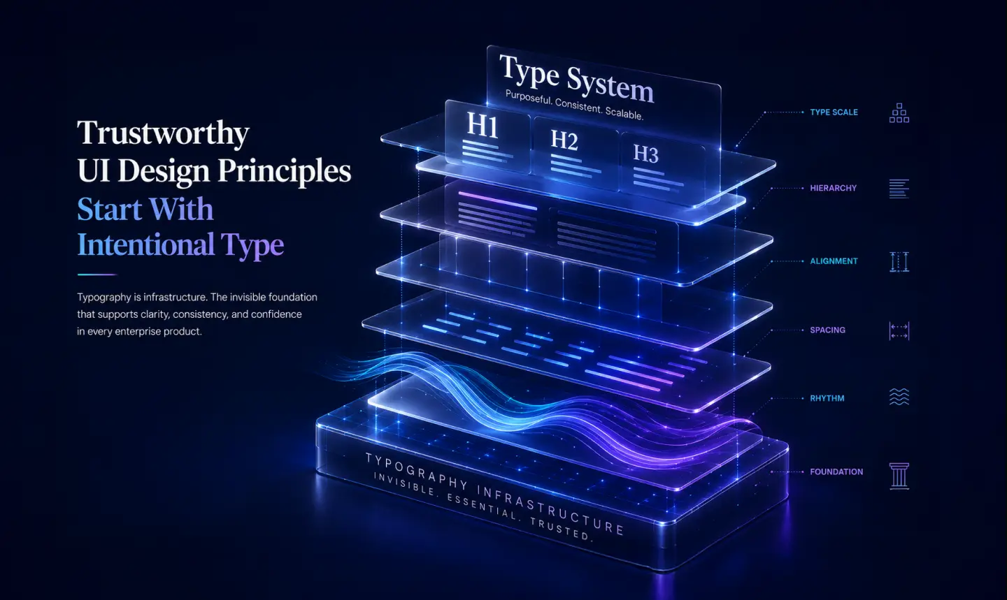
Typography is infrastructure. Like a well-engineered API or a stable database schema, it does its best work invisibly, enabling everything built on top of it to function clearly and confidently. When enterprise SaaS typography is treated as an afterthought, the whole product suffers. Interfaces feel cluttered, data feels hard to parse, and users feel uncertain about what they’re looking at.
The teams that get this right have built a font strategy for SaaS that extends well beyond picking a typeface. They’ve established a scale. They’ve defined hierarchy rules. They’ve specified how type behaves in dense data environments. And they’ve applied all of it with the consistency that quietly communicates: we thought about this.
If your product’s typography hasn’t had this level of attention, a focused audit, reviewing scale, hierarchy, font selection, and data-context rules is often the fastest path to a measurably more professional-feeling interface. Small typographic commitments, made carefully and kept consistently, are what build the trust that keeps enterprise users coming back.
Need a partner for this level of craft? Our UI/UX design services cover typography systems and data-dense dashboard design – like the IT operations dashboards we built for VuNet.
Ready to upgrade your enterprise product’s design?
Lollypop Design Studio specializes in crafting intuitive, scalable, and trustworthy interfaces for complex B2B platforms. Let’s talk about your next big update.
Frequently Asked Questions About SaaS Typography
What is the best font for an enterprise SaaS dashboard?
There is no single “best” font, but humanist and geometric sans-serifs like IBM Plex Sans, DM Sans, Figtree, and Inter perform exceptionally well. They offer high legibility at small sizes, neutral aesthetics, and support for diverse weights—making them ideal for data-dense B2B environments.
Why should I use a monospace font in enterprise UI?
Monospace fonts feature characters of equal width. This is crucial in enterprise UI for aligning numerical data, tables, and code snippets predictably. It allows users to quickly scan vertical columns of numbers (like pricing or inventory data) without visual friction.
What is a UI type scale?
A UI type scale is a predefined set of font sizes calculated using a mathematical ratio (such as 1.125 Major Second or 1.2 Minor Third). Implementing a strict type scale ensures visual harmony and a clear hierarchy, preventing interfaces from looking chaotic or inconsistent.
How does typography affect trust in B2B software?
Enterprise buyers subconsciously associate clean, consistent design with software reliability. Poor typography—such as inconsistent font sizes, lack of hierarchy, or unreadable tables—signals a lack of attention to detail, leading users to question the stability and security of the broader platform.
What are the typography accessibility standards for SaaS?
For a SaaS product to be accessible (meeting WCAG 2.1 AA standards), typography must maintain a minimum contrast ratio of 4.5:1 for standard text and 3:1 for large text. Furthermore, you should never rely solely on font weight or color to convey essential UI information.
