


Quick Summary: When Should a Product Undergo a B2B SaaS Product Redesign?
A product requires a comprehensive B2B SaaS product redesign framework when it suffers from severe UX debt, technical fragmentation, or rigid information architecture. The decision hinges on whether the interface intentionally supports modern workflows or has simply accumulated inconsistencies over time, directly lowering product adoption and user retention metrics.
There is a term in architecture called “sedimentation.” It refers to what happens when a building is modified so many times across different eras, by different hands, with different intentions, that it no longer has a coherent structural logic. The walls know too much history. The load-bearing columns are somewhere nobody documented. Any renovation risks a collapse somewhere unexpected.
Most B2B SaaS products, if they’ve been around long enough, are sedimented buildings.
The question of when to commit to a full B2B SaaS product redesign is rarely as clean as founders want it to be. A dashboard metric or a Net Promoter Score does not answer it. It is answered by something more uncomfortable: “How much of your product’s present form was designed, versus how much of it simply accumulated.”
This accumulation is simply the presence of too much feeling: loyalty to decisions that once made sense, optimism about incremental fixes, the reasonable fear of disrupting users who have adapted to the product as it is.
The Weight of Small Decisions in SaaS Architecture
There is a particular kind of rot that afflicts software products, and it arrives in the form of a series of reasonable compromises.
This is UX debt, and like its financial counterpart, it is deceptively cheap at origination and punishing at maturity. Each decision, taken alone, was defensible. Together, they produce a product that subtly resists its own users. For an objective look at this phenomenon, you can read the foundational framework on UX Debt definition by Nielsen Norman Group.
Four Signals That Your B2B SaaS Product Redesign Reckoning Has Arrived
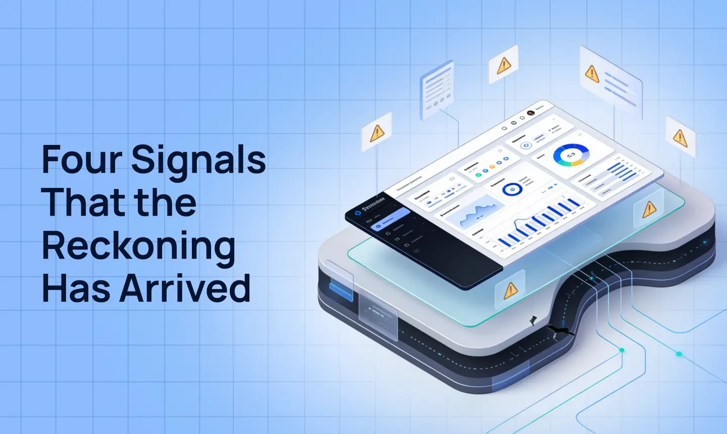
Not every ailing product requires a full redesign. But certain conditions move the question from “should we?” to “how soon?” Here is what consistently surfaces in the specialized product design audit that precedes every enterprise engagement.
1. Users Are Leaving Before They Arrive (High Churn vs. Short Time-to-Value)
Consider this user flow: the user who signs up, locates the product’s central capability, and leaves without ever experiencing the value that justified the acquisition. It looks like a marketing problem. It feels like a sales problem. It is almost always a design problem. A rigorous SaaS UI redesign strategy begins by mapping every step between sign-up and the exact moment the user perceives the true value offered by the platform.
2. Your Design System Is More Folklore Than Foundation
If your product was built before a design system existed, or if one exists on paper but isn’t followed in practice, you’re carrying fragmentation debt that gets more expensive every sprint. Inconsistent components, duplicated UI patterns, and misaligned tokens between Figma styles and engineering production are all classic symptoms.
3. New Features Come With a Heated Debate About Where They Belong
When a product’s application architecture is unable to seamlessly absorb what the software is becoming, the symptom is a recurring negotiation: “Where does this menu go?” No amount of incremental feature work will resolve a structural insufficiency once the core platform scaling logic breaks.
4. Your Competitors Look Like They Were Designed This Decade
Enterprise software buyers have developed highly sophisticated aesthetic tastes, and the market has not been forgiving to legacy platforms that mistake familiarity for adequacy. Comprehensive software UX modernization has moved rapidly from an optional differentiating investment to a baseline business expectation, and products that have not kept pace with this global shift are actively losing deals during procurement.
Is Your Platform Carrying Invisible UX Debt?
Stop guessing where users stumble. Uncover hidden interface friction, design system fragmentation, and architectural bottlenecks with an expert product evaluation.
SaaS Application Modernization: Two Projects, Two Different Problems
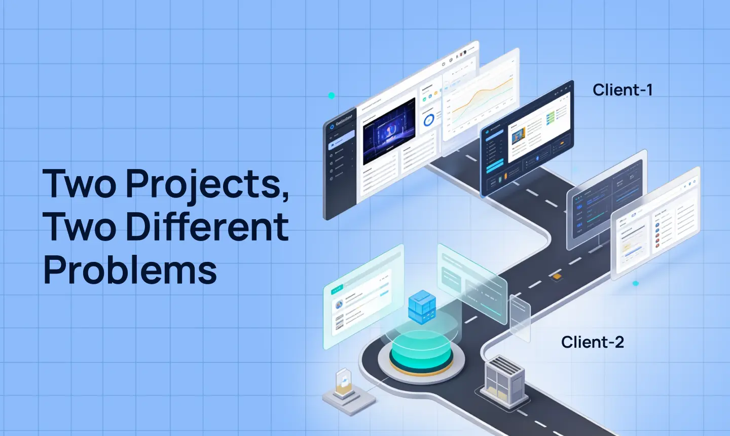
Solargraf
The Fault Line: Stagnant Power
Solargraf, an all-in-one B2B SaaS platform for solar professionals, possessed immense underlying horsepower, anchoring complex workflows across roof modeling, proposal generation, and permit planning for over a thousand enterprise customers. Yet, its ability to communicate this power was severely crippled by visual inertia. The original interface relied entirely on static visuals and flat layouts that demanded unsustainable cognitive heavy-lifting from users attempting to grasp its vast capabilities. This created a critical awareness gap, trapping a sophisticated product in a passive, monolithic environment that failed to reflect the velocity and depth of the product itself. This is symptom one, if it sounds familiar.
The Intervention: Forging Core Architectural Pillars
To bridge this gap, the design strategy demanded a complete departure from static monotony toward a fluid, modular system. Rather than treating video components and guided tutorials as mere aesthetic appendages, they were engineered as core architectural pillars embedded directly into the interface’s fabric. This transformed the experience into a dynamic environment where each section visually shifts to match the unique cadence of the feature it showcases, allowing the platform to autonomously and iteratively explain its own value as the user moves through its narrative.
The Yield: Velocity and Immediate Comprehension
The result of this architectural overhaul is a high-fidelity experience that no longer sits passively, but actively moves at the speed of the solar industry itself. The redesign effectively converted cognitive friction into immediate comprehension, ensuring that the platform’s surface finally matched the profound power of its underlying engineering.
Zinnov
The Fault Line: A Repository Without a Map
Zinnov, a global strategy consulting firm, faced the inversion of Solargraf’s dilemma: their challenge was not a product with an incoherent experience, but an immense reservoir of proprietary expertise that needed to become a product independent of human intervention. While Platform 1.0 was rich with valuable content, it completely lacked the underlying structural architecture required to make that content actionable. It functioned as a dense, overwhelming repository rather than a navigable software application, meaning users still required a consultant in the room to extract actual value from the firm’s intellectual inheritance.
The Intervention: Shifting Archive to Ecosystem
The intervention required reconceiving how knowledge is discovered and consumed, shifting the platform from a static archive to an intelligent ecosystem. The rebuilt experience positioned search as an AI-powered gateway and introduced a system of layered content discovery, ensuring that informational depth became an inviting pathway rather than an intimidating barrier. This structural foundation was then augmented with role-based personalization, an integrated peer-learning community layer, and actionable benchmarking tools designed to guide users systematically through complex data.
The Yield: Scalable, Productized Autonomy
By giving this intellectual inheritance a rigorous digital architecture, the platform successfully achieved autonomy, eliminating the necessity for a Zinnov consultant to be physically present in the room. Content was transformed into a scalable, high-engagement B2B SaaS product that users could navigate effortlessly on their own terms. Ultimately, the redesign bridged the critical distance between the firm’s vast institutional knowledge and the users’ immediate capacity to leverage it, delivering a profound return on design investment.
Our Structural Framework: How Lollypop Works
Every engagement begins the same way: with an honest accounting of what is actually broken before any decision is made about what to build. This diagnostic phase is a comprehensive UX evaluation. It maps heuristic failures, UX debt, design system health, and friction across every core workflow, ensuring the foundational information architecture is completely rebuilt before a single screen is designed, because a new surface on an incoherent structure solves nothing.
Running in parallel, a systematic design system migration ensures the redesign does not begin accumulating its next debt from day one, leading into a phased rollout with transition support calibrated precisely to the moments that matter most. The ambition, in every case, is to deliver a product that finally becomes what it always intended to be based on core SaaS UX design principles.
The Strategic Choice Facing Product Leaders
Behind every B2B SaaS metric is an enterprise user trying to get through their workday. They don’t care about your UX debt or your historical engineering constraints; they care about the friction that slows them down. Ultimately, a redesign is an act of respect for your users’ time and cognitive energy. When you clear away the sediment and rebuild the design around their actual workflows, you are essentially changing their daily relationship with their work.
Solargraf and Zinnov approached the “reckoning to redesign” from different directions. One needed the surface of their product to reflect the richness of its interior. The other needed an intellectual inheritance to be given a structure through which it could travel without its original carriers. In both cases, the design work was not the finishing touch applied after the real work was done. It was “the work.”
If the moment described at the beginning of this piece is familiar, the signal is already there.
Frequently Asked Questions
1. What is UX debt in B2B SaaS products?
UX debt is the cumulative score of design misalignment, legacy patterns, and shortcut interface decisions made for speed of delivery over scalability. Over time, it creates friction that actively resists the user, lengthening onboarding times and accelerating user churn.
2. How does a product design audit prevent product failure?
A product design audit acts as an objective, heuristic diagnostic evaluation tool. It identifies deep structural friction points across key workflows, measures design system performance gap discrepancies, and uncovers why users might be dropping out prior to realizing your product’s true value proposition.
3. What is the primary indicator that software requires modernization?
The most prominent indicator is when the current information architecture cannot absorb new features without extensive structural debates or complex UI updates that break existing user mental models.
4. How do you measure the ROI of a B2B SaaS UX redesign?
The return on investment (ROI) of a comprehensive redesign is measured by an increase in product adoption rates, a drop in customer churn, lowered product training costs, and a significant reduction in customer support tickets related to complex application workflows.
5. When should a company avoid a full software product redesign?
A full redesign should be avoided if you do not have a well-defined design system strategy or if the friction is strictly technical rather than structural. In those cases, running targeted, incremental usability optimizations is safer than rebuilding the foundational architecture from scratch.
