How long will users really wait for loading before abandoning your product? And can loading indicators make that wait feel more tolerable?
A study by Fiona Fui-Hoon Nah explored these exact questions. Participants were split into two groups:
- Group 1: Users who saw a progress bar while waiting.
- Group 2: Users who had no visibility of progress at all.
The results were striking! Participants in Group 1 had a median waiting time of 22.6 seconds, more than twice the 9 seconds of Group 2. This clearly demonstrates that providing visual feedback during waiting can greatly improve user patience and keep them engaged.
In this article, we’ll explore progress indicators in depth—covering common types, variations, and best practices for applying them effectively.
Let’s get started!
Key Takeaways
- Progress indicators help users understand loading status, reduce uncertainty, and improve perceived performance.
- Research shows users are willing to wait significantly longer when visual loading feedback is provided.
- There are two main types of progress indicators:
- Determinate: Shows measurable progress (e.g., progress bars, percentages)
- Indeterminate: Used when loading time is unknown (e.g., spinners, looping animations)
- Common progress indicator variations include spinners, skeleton loaders, progress bars, progress circles, percentage indicators, and hybrid loaders.
- Effective progress indicators should:
- Communicate system activity clearly
- Reduce perceived waiting time
- Maintain usability during loading
- Use looped animations for short waits (2–9 seconds) and percentage-based indicators for longer processes (10+ seconds).
- Avoid showing loaders for actions under 1 second, as they can create unnecessary friction instead of improving UX.
- Well-designed loading experiences build trust, improve engagement, and create smoother SaaS product interactions.
What is Progress Indicator?
A progress indicator ux is a UI element that shows users their current progress in a process and how much remains to be completed. By giving users a clear view of the process, it helps manage expectations and reduces uncertainty.
Types of Progress Indicator & Variations
1. Types of Progress Indicator
In general, progress indicators fall into 2 main categories—determinate and indeterminate—each serving a different purpose depending on the system’s ability to measure progress.
- Determinate indicators: Used when the system can accurately estimate how long a task will take or how much of it has been completed. These indicators display measurable progress—such as a bar moving from 0% to 100%—giving users a clear sense of where they are and how much time remains.
- Indeterminate indicators: Used when the system cannot predict the task duration or measure progress. They typically take the form of continuous animations like spinning wheels, looping bars, or pulsating elements. While they don’t show exact progress, they reassure users that the system is actively working.
2. 8 Variations of UI Progress Indicator
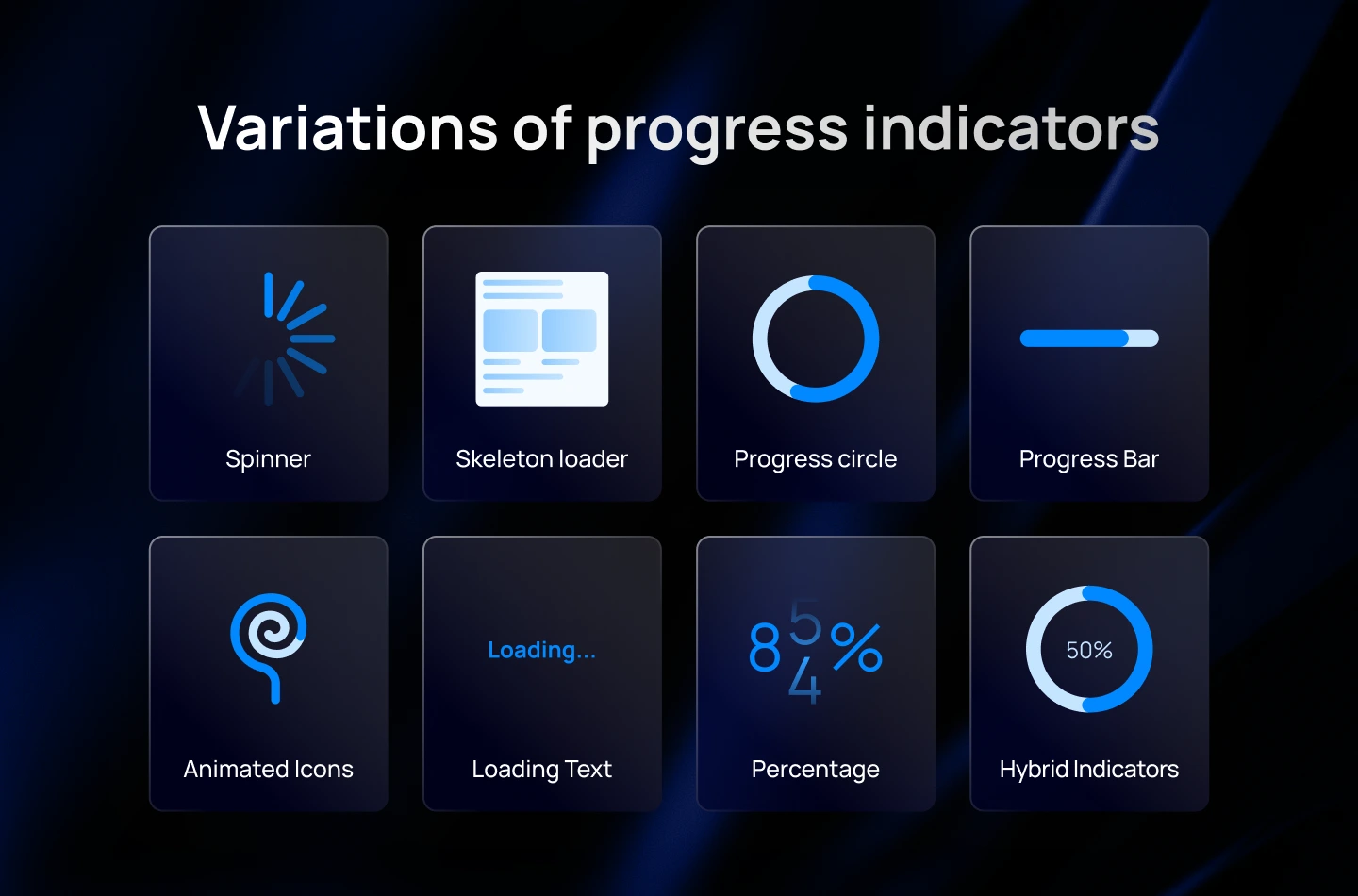
- Loading Spinner: A spinner is a simple animated icon that spins continuously to indicate that the system is processing or loading content. It is widely recognized and used in many applications and websites.
- Skeleton Loader: Skeleton screens are placeholder structures that mimic the expected layout of the content being loaded. They provide a rough visual outline of the page or interface while the actual content is loading.
- Progress Bar: A progress bar visually represents the progress of a task or loading process through a horizontal bar that fills up gradually. Users can see the percentage of completion or the remaining time.
- Progress Circle: Similar to a progress bar, a progress circle represents the completion of a task or loading process using a circular shape that fills up gradually.
- Animated Icons or Illustrations: Engaging animations or icons can be used to entertain users during the loading process. They add visual interest and make the waiting experience more enjoyable.
- Loading Text or Message: Displaying a text message, such as “Loading…” or “Please wait,” can provide clear feedback to users that the system is actively working on their request.
- Percentage Indicator: This type of indicator displays the progress as a percentage, allowing users to track the completion of the loading process numerically.
- Hybrid Indicators: Combining different types of loading indicators can create unique and engaging experiences. For example, using a spinner along with a progress bar or incorporating animations within a progress circle.
You may want to read more about: How to Choose the Right Preloader for Your SaaS UX Design
Best Practices for Progress Indicator Design
Designing effective ux progress indicators involves several key considerations. In this section, we’ll break it down into 3 aspects, each with practical tips to help you create optimized progress indicators for your product.
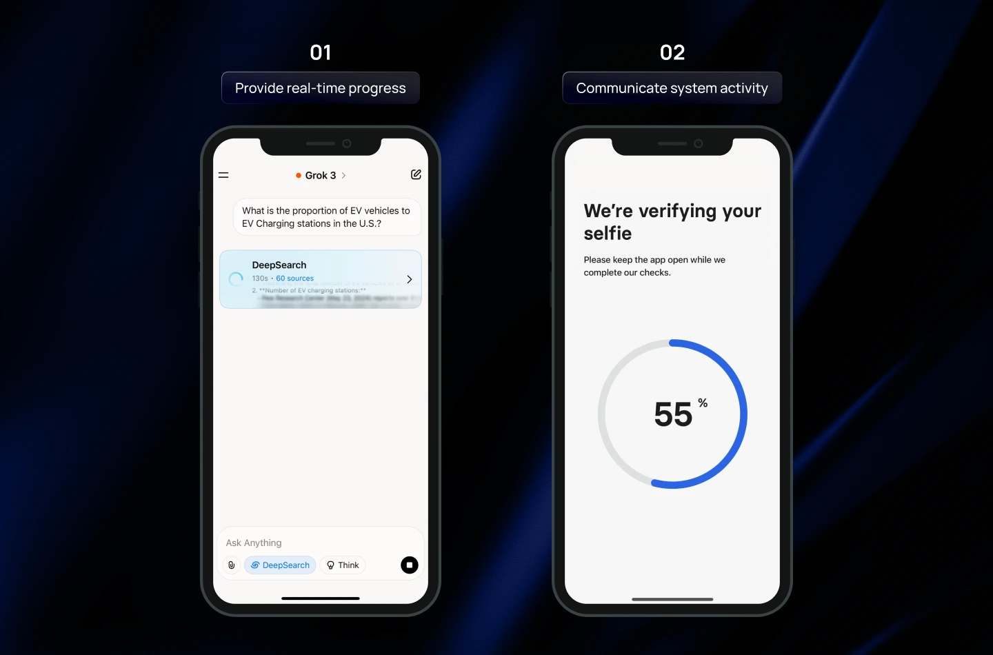
1. To Manage User Expectations & Reduce Uncertainty
When users wait, their biggest concerns are: Is something happening? How long will this take? Did the app freeze? Clear communication reduces anxiety and keeps the experience predictable. Progress indicators play a crucial role in making the system feel trustworthy and transparent.
What to do:
- Provide real-time progress updates: Show percentages or estimated completion times to keep users informed about the process status.
- Communicate system activity clearly: Use subtle animations, progress bars, or color changes to reassure users that the system is responsive.
- Position indicators strategically: Place loaders near the action that initiated the process or in prominent areas where users expect feedback.
Note: You should start the animation slowly and accelerate toward completion to avoid setting unrealistic speed expectations.
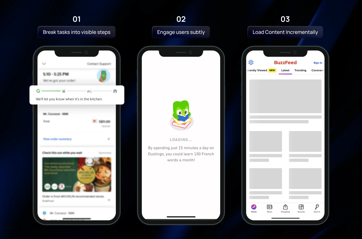
2. To Improve Perceived Performance (Make Waiting Feel Shorter)
Even when actual loading time cannot be reduced, design choices can significantly improve the perceived loading speed. These techniques help the interface feel more responsive, smooth, and considerate of the user’s time.
What to do:
- Animate progress meaningfully: Use spinners, progress bars, or micro-animations that visually indicate ongoing progress.
- Break tasks into visible steps: Show milestones, stages, or incremental content to give users a sense of advancement and control.
- Engage users subtly: Add small interactive elements, tooltips, or playful placeholders keeps users engaged during waiting periods.
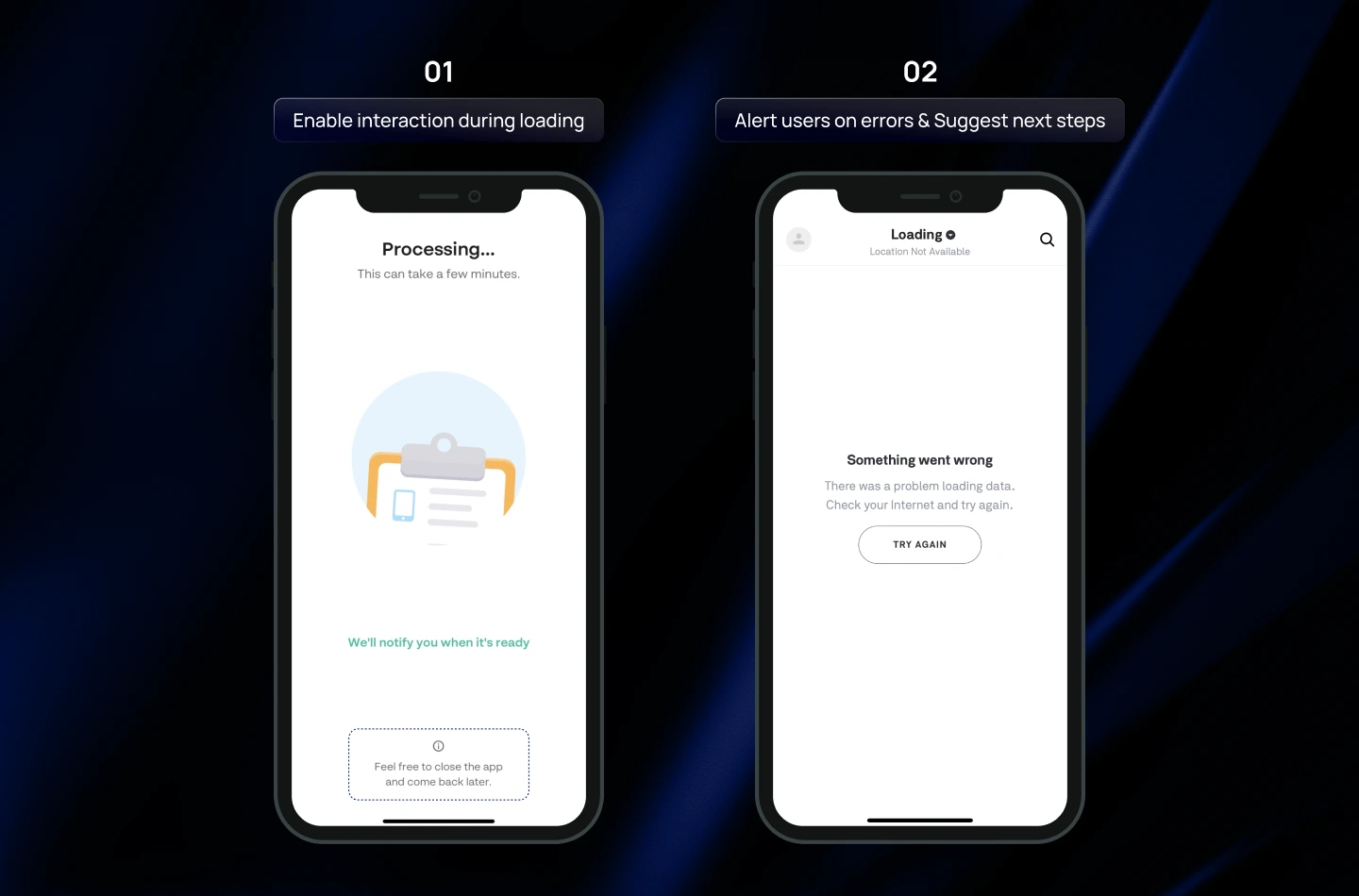
3. To Ensure Efficiency & Usability
Loading states shouldn’t interrupt users or prevent them from getting things done. Well-designed progress indicators maintain usability, reduce friction, and help users stay in control—even during long operations.
What to do:
- Allow interaction during loading: Ensure users can continue other tasks while content is loading.
- Avoid duplicate indicators: Display only one progress indicator UI per process to reduce confusion and visual clutter.
- Integrate with UI context: Align progress indicators with surrounding elements so they feel like a natural part of the interface.
Things to consider when designing a Progress Indicator
1. Avoid indicators for actions under 1 second
For fast actions—like switching tabs, opening a small modal, or toggling a setting—showing a loader can be more harmful than helpful. Users cannot visually process a flash of animation that lasts less than a second, which can create confusion or unnecessary anxiety. In these cases, it’s better to let the system respond immediately without any visible progress indicator.
2. Only use looped animations for short actions (2–9 seconds)
Looped or continuous animations, such as spinning icons or bouncing dots, indicate that the system is actively processing a task. However, they do not provide information about how long the wait will take. Use these for actions that are slightly longer than 2 seconds but not long enough to justify a detailed progress bar.
Note: During the loading, you should pair with a brief text message, such as “Loading your data…” to reassure users.
3. Use Percentage Indicator for longer actions (10+ seconds)
Percentage indicators (whether circular or linear process indicators) offer the most transparent feedback for longer wait times. By clearly showing how much progress has been made and how much remains, they reduce uncertainty, boost user confidence, and make the waiting experience feel shorter and more manageable.
Read more: The Essential Guide to Onboarding UX Design for SaaS Products
Final thought
Throughout this blog, you’ve seen how progress indicators play a crucial role in shaping smoother loading experiences to users. When designed with intention, they do far more than fill empty wait time—they build trust, set the right expectations, and strengthen the way users perceive your product.
At Lollypop, we believe that exceptional SaaS UX design comes from focusing on the smallest details—and optimizing loading experience is one of those details that make a big difference. If you’re creating a SaaS product and need expert guidance in creating not only fancy progress indicators, but also intuitive user journeys, we’re here to support you!
As a globally recognized SaaS design agency, we blend design thinking with modern SaaS UX trends to deliver thoughtful, high-performing software experiences.
Reach out for a FREE consultation, and let’s explore how we can elevate your product’s user experience together.


