

Branding in UI/UX design goes beyond aesthetics—it’s the heartbeat of digital experiences. From color psychology to tone of voice, branding shapes how users perceive, feel, and remember your product. In this complete guide, discover how UI/UX design, powered by strategic branding, builds emotional connections, increases loyalty, and turns users into brand advocates.
Branding in UI/UX design is far more than just logos and colour schemes; it’s the emotional and psychological relationship a user develops with a product or company. At its core, branding helps define the soul of the experience you’re designing: What does your product stand for? How should users feel when interacting with it? What lasting impression should it leave?
In UI/UX, branding is not just visual identity; it’s how users perceive and experience your product, emotionally and functionally. The better the branding aligns with the experience, the stronger and more memorable the user connection.
Branding and UX share a common goal: creating trust and emotional resonance. A brand without a clear user experience feels hollow. Likewise, a product with strong UX but no branding lacks personality and fails to differentiate.
Here’s why branding in UI UX design is crucial to UX:
It sets emotional expectations. Visuals, tone, and messaging form the first impression before a user interacts with any feature.
It increases user loyalty. Strong branding builds recognition and fosters trust across touchpoints.
It drives design consistency. Branding creates a seamless experience across web, app, email, and support channels.
It humanizes the interface. Branding gives a product a voice, attitude, and intention that users connect with.
🚀 Explore our UI/UX design services tailored to your brand →
Colour and typography are foundational elements of visual branding that strongly influence emotion and perception.
The psychology behind colours must align with the brand’s personality. For example, Spotify’s use of vibrant green and black reflects energy and modernity, perfectly matching its identity as a dynamic, youth-centric music platform.
For instance, a friendly ed-tech platform might choose rounded fonts to appear approachable, while a legal services site would prefer something structured and authoritative.
A logo is often the most immediate visual representation of a brand. But how it’s presented within an interface matters just as much as the logo itself.
Design consistency fosters trust, trust keeps users engaged.
Microcopy is where your brand storytelling and personality come alive. Every word on a button, error message, or success screen is an opportunity to build trust and show users who you are.
Tone Variations: Is your brand professional and direct (like IBM)? Or casual and witty (like Slack)? The tone of voice must be consistent across the product, from empty states to onboarding screens.
Messaging Clarity: Beyond tone, your messaging should reinforce the brand promise. Messaging during errors, confirmations, and tutorials should reassure and guide the user in a voice that feels uniquely yours.
Example: Instead of a robotic “404 Not Found”, a playful brand might say, “Oops! You’ve taken a wrong turn in the pixel universe.”
📐 See how we infuse brand tone and consistency in every screen →
At Lollypop, we believe branding is not an add-on—it’s the foundation of every digital experience. From the first sketch to final pixel, we infuse brand DNA across every interaction. Our UX process starts with deep discovery to understand your values, voice, and audience. From there, we build a narrative that flows through color, type, icons, motion, and microcopy.
We don’t just design screens—we create cohesive, on-brand experiences that feel unmistakably you.
🌟 Want a UX that breathes your brand identity? Let’s build it together →
Here’s how you can strategically integrate branding into your UX process:
Start with brand values. Before wireframing, ask, What are the core values of the brand? How should users feel at every step?
Collaborate across teams. Work closely with brand, marketing, and content teams to ensure alignment.
Use design systems. A central design system that reflects brand storytelling, voice, and visuals ensures scalable consistency.
Validate through testing. Test different brand expressions (colors psychology, tone, icons) with real users to measure emotional impact and usability.
Remember, branding isn’t a layer you add at the end; it’s the lens through which you view every design decision from the beginning. This highlights the importance of branding in digital design.
Airbnb’s branding and UX design are seamlessly aligned. Its friendly typography, soft colour palette, and warm microcopy make users feel welcome and secure, which is essential for a platform that’s built on trust between strangers.
Duolingo uses a fun, gamified UX with a bold brand voice that feels like a cheeky friend cheering you on. From its mascot to its push notifications, every interaction is true to the brand.
Notion blends minimalism with flexibility. Its UI is neutral and spacious, letting users shape it however they wish, perfectly matching its branding as a “tool for thinking”.
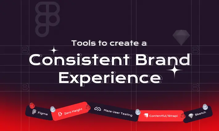
Here are tools that help integrate branding into UI/UX design processes:
Figma/Sketch: For building brand-aligned UI components.
Zeroheight: To document and share brand guidelines with all teams.
LottieFiles: For brand-aligned animations and microinteractions.
Contentful/Strapi: For managing and maintaining a consistent tone across content.
Maze/UserTesting: To test how branding impacts user experience in prototypes.
Branding in UI/UX design is more than aesthetics; it’s about crafting an experience that resonates emotionally, builds trust, and leaves a lasting impression. From color psychology and typography to tone of voice and logo consistency, branding gives life and soul to your product design.
When branding and UX align, users don’t just use your product; they connect with it, remember it, and return to it.
So next time you’re working on a screen, ask yourself, “Does this feel like our brand?” If not, step back, reflect, and bring the brand identity into the conversation from the start.
✅ Ready to align your brand with your user experience? Book a free branding audit →
Visual design is a component of branding, but branding is much broader; it includes tone of voice, messaging, emotional intent, and even user behavior. Branding is how people perceive your product; visual design is how you visually communicate that perception.
A strong brand experience builds emotional trust and recognition. When users feel connected to your brand, they are more likely to return, engage, and advocate for your product.
Microcopy is where branding comes alive. It humanizes digital interactions, reinforces tone of voice, and can turn even a mundane action (like form validation) into a moment of delight.
Absolutely. You don’t need a big budget to build a meaningful brand. Even simple elements—consistent tone, thoughtful colours, and friendly messaging – can create a memorable user experience.
Use a centralized design system and brand guidelines. Document every visual and content decision. Tools like Figma libraries and shared copy decks ensure everyone stays on-brand.


