


You might have noticed the fierce competition in the world of retail. So, it’s a real challenge for the brand to find a way to stand out from the crowd. The technology and trends were used in the pursuit of methods vigorously to fix the presence of the brand and connect with the audience.
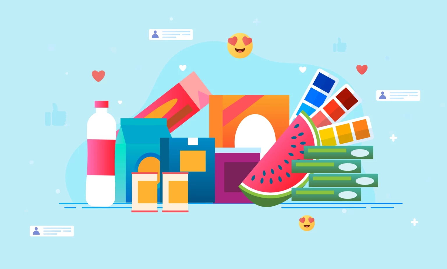
However, despite all other diverse and upcoming trends rising, color plays a crucial role in UI UX design in the retail industry, embracing the overall shopping experience. The strategic use of color has an impact on the user behavior. It has a significant role in influencing emotions and driving them to take action. But do you know how it creates an impact on the decision-making of the target audiences? Here, we dive into color psychology and its importance in retail design services.
Colors can evoke specific emotions and moods, making them invaluable tools for retailers to create atmospheres that resonate with their target audience. For instance:
Color always has a hidden potential to evoke or change emotions and moods such as delight, sorrow, etc. Due to this reason, color is said to be a vitally significant tool for retailers to make it visually impressive and relatable to the target audiences. Here are some examples of how color sets the tone for the audience.
Giving a cool vibe, the colors evoke a tone of calmness, serenity, and especially trust. So, these colors poured into the areas where focus and relaxation are expected. It might include technology stores and spas.
In contrast to the first set of hues, these colors set a warm tone that conveys energy, excitement, and urgency. These colors are usually implemented in food-associated businesses because these colors are said to be raising the appetite.
These colors are said to be neutral colors that are used to promote elegance and simplicity. Due to its versatile tone, these colors are implemented to stay unique and stand out from the competition.
So, While combining colors and creating the realm for retailers, it is necessary to tailor it to the brand identity and user needs. So, that it will evoke the expected emotions in the audience.
Have you ever noticed the color palette poured over the walls and displays of the retail shop? Colors are the best way to navigate the target audiences to the store. With a consistent and relevant color scheme for purposes such as directions, signage, and more, retailers guide the customers on their way to the products. Retailers can use eye-catching colors to highlight the areas or promotional content. Whereas, the different color shades are used to distinguish the product categories or departments.
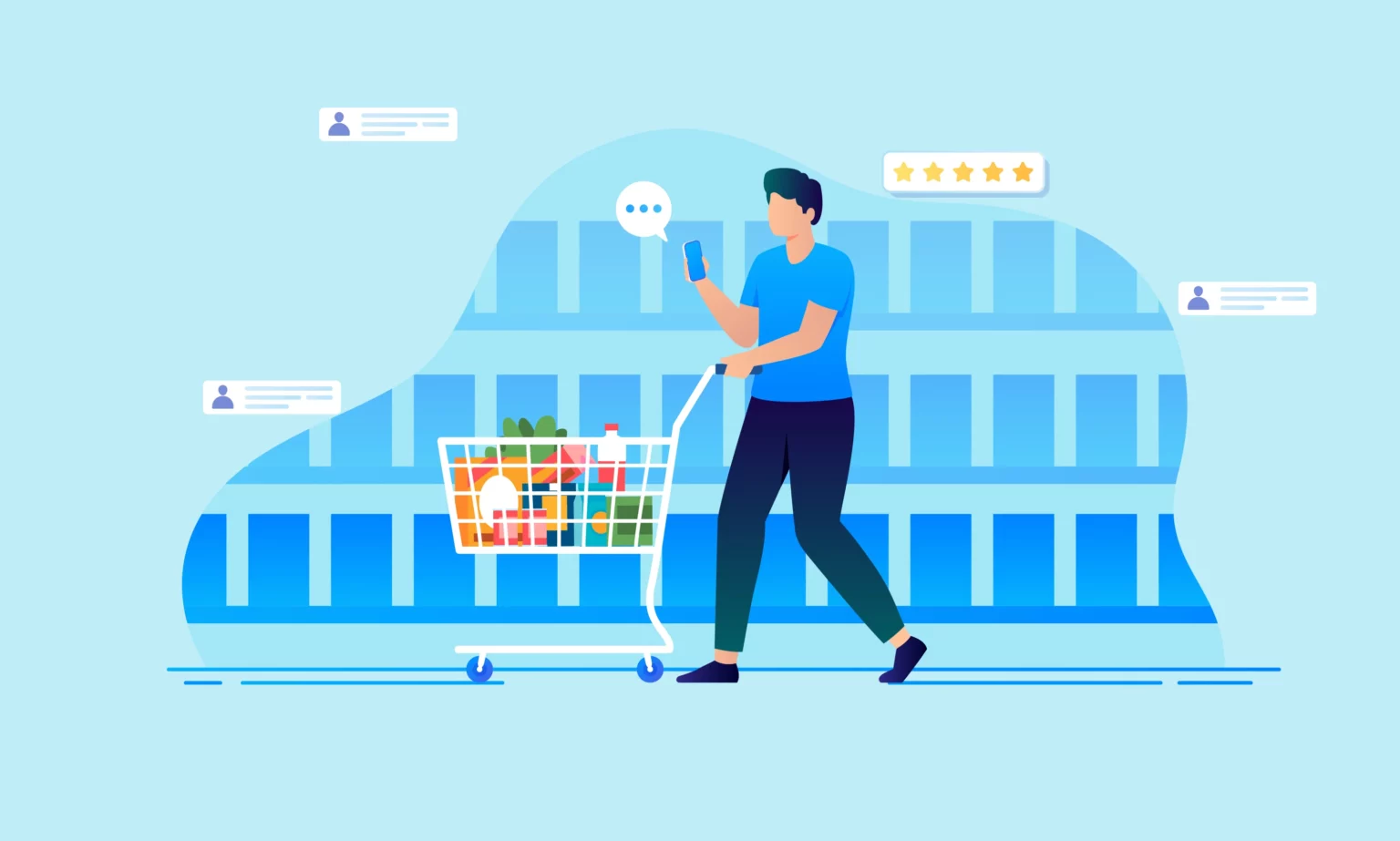
As you know, first impression always matters in every field. In such cases, color plays a key role in making the brand distinguishable from the competition. It contributes a crucial part to stimulating great shopping experiences. When an individual steps into the store, you can effortlessly convey your message about the product, promotions, or brand identity through an eye-catching color scheme relating to your brand or products.
Along with navigation, color has an incredible role in crafting a visual hierarchy. Differentiating the colors based on saturation and intensity enhances the audience’s interaction with the product displays or other guides. It eventually navigates the customers to walk through their area of interest through the store.
The color cues used in retail shops can be considered great seamen to help the customers navigate the space effortlessly. You can use a consistent set of colors for the visual guides or anchors to emphasize intuitive navigation.
The standardized and consistent visually impressive colors have a key role in drawing the attention of the audiences toward the promotional and product displays. Brands use bright colors like red, yellow, etc., to showcase discounts special offers, limited deals, and more.
In the diverse realm of retailers, it is necessary to have impeccable design that goes beyond aesthetics. It’s all about creating experiences that encourage visitors to become lifetime customers. Colors can impact customer behavior and inculcate emotions with the right information.
Retailers or retail design services can effortlessly craft an atmosphere that captures the audience’s attention and makes them find their way to their area of interest. Even though the color has a great power to impress customers, sometimes people forget to appreciate it as an invaluable tool to modify the shopping experience.


