
A disruptive concept for an immersive experience of the financial markets making trading accessible and seamless for everyday user.
TradingLeagues started with a mission to empower all users who still find hassle in stock trading. However, with a diverse mix of experienced investors, day traders, and also inexperienced users, the level of engagement per user has become complicated. Aiming to be the one-stop destination for everyone who looking to participate with the financial markets, TradingLeagues will optimize stock trading activities and create an immersive experience for all users.
Stock market trading is becoming increasingly popular across the world, particularly in India. Millennials and the younger generations are turning to the stock market to supplement their income from daily jobs, due to increased stock market awareness and simple access to low-cost trading services. As a result, we began our research by conducting workshops and communicating with our stakeholders to better understand our core customers, their workflows, pain points, technical constraints, product goals and their expectations.


India, a country with a population of 1.38 billion, with more than 90% of people who don’t comprehend fintech. We intended to attract people who are interested in trading but are intimidated by the platform’s complexity using this app. We worked closely with the TradingLeagues team, and understood that the mission was clear: to leverage the power of gamification and redefine how an average user interacts with financial markets, push financial inclusion to the stock markets, and help move the needle with investor participation rates.
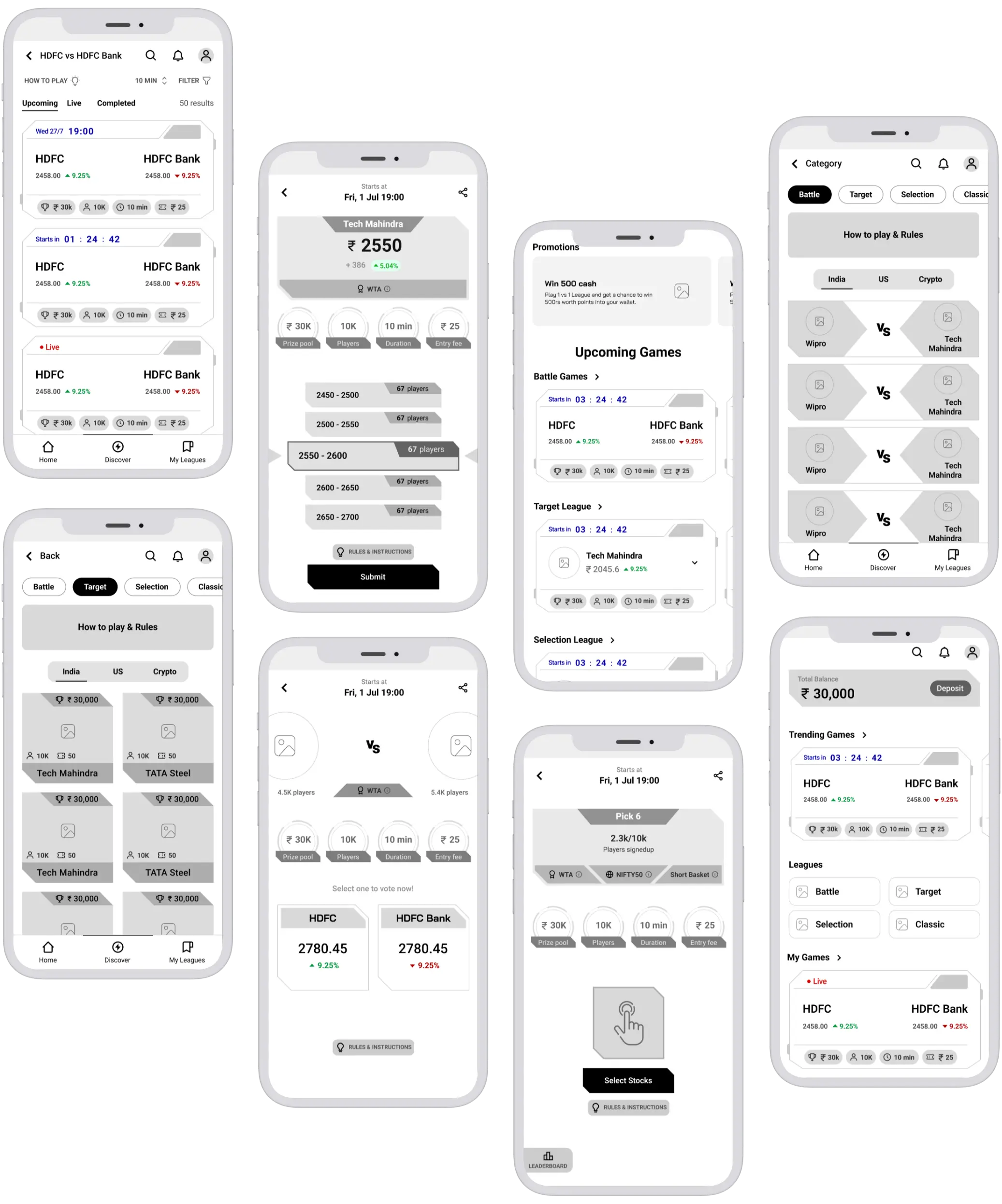
Our focus was on breaking the complexity of each game in an easy-to-understand manner. We segregated each game with its own landing pages, which allows users to go through one game at a time. Providing a ‘how to play’ page, was a big help for the first-time user. Through our wireframes, we provided the customers with in-depth information about the product, the games, rules, and policies which in turn built trust in the consumers’ minds.

We wanted to come up with something fun, distinct, and memorable to showcase such complex trading patterns by bringing in the gamification aspect and making it seamless even for the rookie trader to engage with the app. Thus our inspiration comes from the ‘Monopoly’ game which most people might have played once in childhood. We captured the texture of cards, and vibrant colors and applied the essence to the digital assets of the app making it playable and effortless.

Typography played a big role in the concept. Each game had a unique personality which needed to be expressed with different fonts to make them stand out from each other.
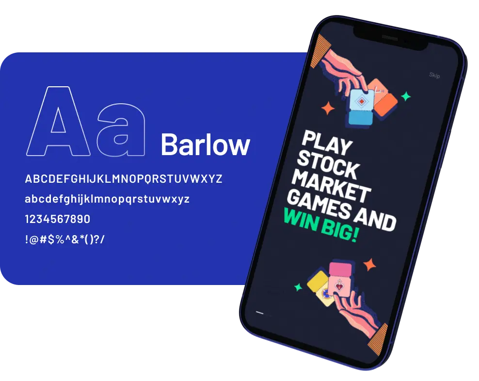
Our illustrators custom-created title fonts by combining fonts that exist and adding a touch of depth, shadows, and perspectives. For the interface to make all the copy readable, legible, and scalable to the audience we choose Barlow, a google font that is tried and tested for all devices and easy to load.

In order to do justice to the concept, we choose colors that are vibrant and eye-catchy even from afar. Typography being the governing material in design, colors become the life-giver, we can also say that it’s an aesthetic amalgamation. Since colors communicate emotions we used them as a powerful tool to empower content across the app.
Great data visualization goes beyond aesthetics, it helps the user view patterns and draws complex insights making big data less overwhelming. We wanted to come up with something fun, distinct, and memorable to showcase such complex trading games and patterns. We evaluated our designs internally and externally with proven practices to measure their effectiveness in regard to credibility and usability. The concept got a lot of attention and was marked as a disruptive design in the fintech domain.

What we learnt from this project?
