Image
Miko Parent App

Stay Connected with your child, anytime and anywhere

Miko 3, plays, engages, and entertains kids aged 5-12 through playful, conversational learning

Miko Usage Tracking App UX research, UX & UI design for mobile app
Image
Brief

Equipped with deep learning artificial intelligence, Miko 3 is a robot that understands and responds to the child’s world and instills feelings of companionship and social connection to help build confidence. Previously the functionality of the parent application was to pair a mobile phone to Miko. Our aim was to re-design the Miko parent application, by enhancing its engagement and personalisation to ensure parents stay connected to their children’s daily activities.

Discover

We facilitated remote discovery workshop with the stakeholders to gather and understand their challenges of parents using the existing app. Workshop helped us map and document the insights.
Some objectives we derived from the workshop insights were:

  • Parents were not able track the the skills that the child is learning through Miko.
  • Provide a seamless login experience for multiple users, such as parents and grandparents
  • To help parents set goals / tasks and instil habits in their children and gamify the whole experience.
  • Simplify navigation throughout the app .
DEFINE

After gaining a deeper understanding of the users and business requirements, we started by identifying the personas and mapping out the existing information architecture of the app. We identified the issues and restructured the information architecture keeping the personas in mind for ease of navigation throughout the app. After finalising the information architecture and user journeys with the stakeholders, we began creating the wireframes.

Image
ImageImage

Structuring the information

logo

Wireframes

Using the information architecture as reference, we started created wireframes. Throughout the design process, we kept the personas in mind, ensuring that their objectives and challenges were taken into account. Once the wireframes were completed, we presented them to the client for feedback and ensured that we were aligned before proceeding with the visual design phase.

logo
logo

Colors

The combination is inherently aesthetically playful with red’s representation of life and energy, and blue’s representation of trust and calmness. The vibrant usage of secondary colours act as a support in accentuating the content of the application. While Dark green and black can be standard for text usage throughout the app.

logo

Iconography

Keeping in mind the target users, we used Iconography to visually simplify the content of the App, making it instantly accessible to users. Elegant & simple icons have the power to attract attention and keep users engaged. We created meaningful icons that help in reducing content and used it suitably to enhance usability.

logo

UI Design

We adhered to the design language that was consistent with Miko’s brand guidelines. We wanted the app to look bold, fun, playful and evoke a premium feel. We curated an intuitive and lively interface that helped users achieve their goals faster.

ImageImage

Conclusion

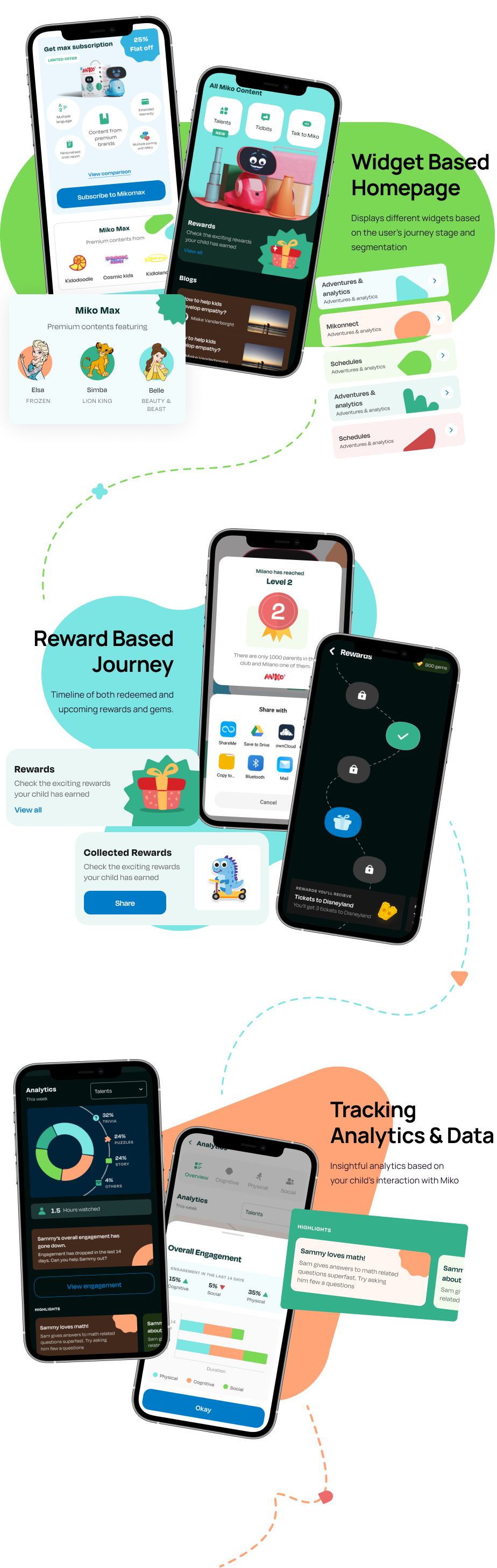
What did we achieve from this project?

  • Improved navigation with proper visual hierarchy throughout the app for parents.
  • Structured simple layouts that are aesthetically pleasing and at the same time reduces the cognitive load for users.
  • Designed progress reports based on the skills learned by the child through Miko that are easy to comprehend and understand for parents
  • Assigning goals for children were gamified by awarding badges and recognizing streaks on successful mission completion.
Image