

Have you ever wondered: “Why are so many digital products created in countless different sizes, but when surfing websites, the interfaces are still compatible with each screen? Does the business behind these websites have a strong design & dev team to craft unique interfaces for every screen size?”
The answer is definitely NO! There are many ways to make a website work well on different devices. Among them, the most popular is Responsive Web Design, allowing developers to only need to write a single set of code that can be used for all screen sizes.
So, what exactly is responsive web design definition? What makes Responsive Websites so popular? How to design a responsive website? Find out with Lollypop Vietnam through the following article!”
Responsive Web Design (RWD) is a design approach that helps websites display well on many devices and screen sizes (phones, laptops, desktops, etc.) to ensure usability and user satisfaction.
Responsive Web Design was created by Ethan Marcotte in May 2010 in the context of the rapidly increasing number of web users on mobile devices. At that time, WAP Design (Wireless Application Protocol) was the choice for mobile design, but faced many limitations. To provide the best mobile web experience, businesses needed to optimize a new version for each device type. Of course, with the development of mobile devices in many different sizes, this was impossible!
The Responsive website, with only 1 set of code and 1 unique domain name, provides the optimal user experience on all devices, successfully solving all the problems of WAP Design.
Responsive designs bring great economic benefits to businesses. Its ability to adapt to different screen sizes eliminates the cost of developing multiple versions. In addition, businesses also save budget and time for each product maintenance.
Responsive designs enable developers to use only 1 domain name and 1 set of code for all devices, which helps Google Bot scan and index the Website more easily. This helps to design a more SEO-friendly website, thereby increasing organic traffic for businesses. In 2018, Google confirmed that Responsiveness is one of the top criteria that affects SEO rankings on Google Search.
The compatibility of Responsive design with various screen sizes enhances the user experience, particularly on mobile devices. Users no longer need to excessively zoom in to read website content. Moreover, buttons and links automatically adjust to the appropriate size and spacing, enabling seamless interactions.
Furthermore, Responsive design UX helps improve the website’s loading speed. This is because Responsive Web utilizes a single URL and provides the same HTML and CSS code for all devices. As a result, users do not have to navigate through the process of redirecting or separating URLs for mobile devices. The website also reduces the amount of data transmitted, leading to faster page loading speeds and a lower bounce rate.
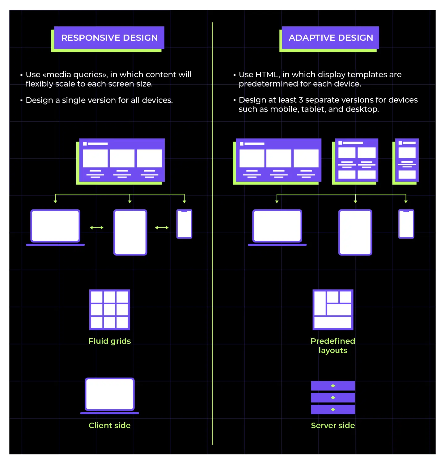
In contrast to Responsive Design, where a single website version can be adjusted to adapt to all devices, Adaptive Design involves creating multiple fixed layouts to optimize the display across different screen sizes.
Responsive Design is often preferred for websites with a simple structure, where the designer can create one layout version using the grid system in frameworks like Bootstrap. However, for more complex websites, Responsive Design can lead to issues in the scaling process for each device. This is why many businesses opt for Adaptive Websites to ensure a seamless user experience across all device sizes.
When designing an Adaptive Website, designers typically create three distinct layouts: one for mobile, one for tablets, and one for desktops. Upon accessing the website, the device’s screen size is detected, and the most suitable layout is selected to provide an optimized user experience. Research suggests that the page loading speed of Adaptive Websites can be 2-3 times faster than Responsive designs.
However, the need to optimize for each screen size makes Adaptive Design a more resource-intensive and time-consuming approach. Despite this, the economic benefits of Responsive Design often make it the preferred choice for businesses today.
Read more: Inclusive Design: Design Approach for All Users
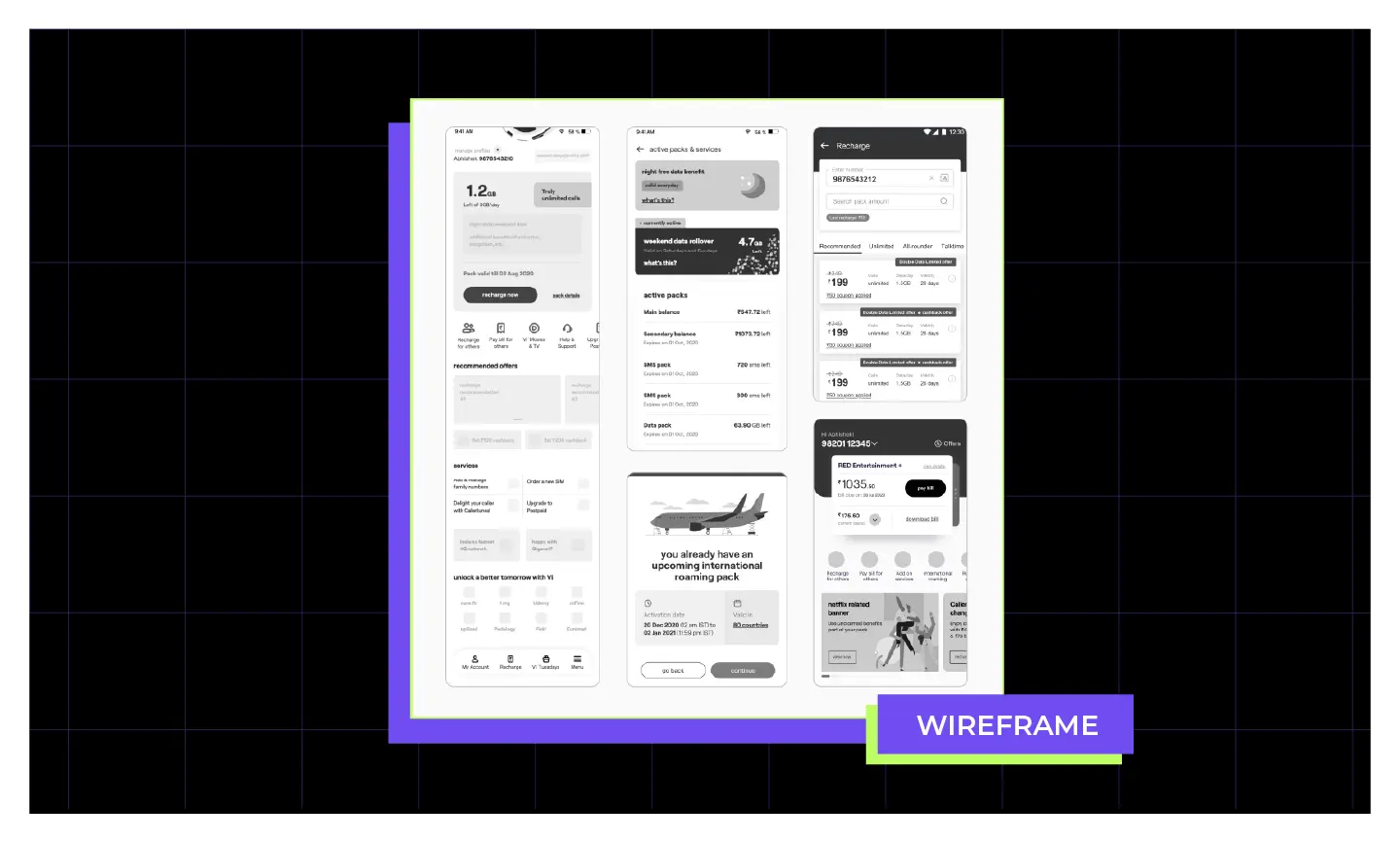
Wireframes are layout sketches of Website/app interfaces in the form of Box Holders to represent main components such as button positions, text, images,…
When creating your Wireframes, you need to keep the design very simple at this stage. The reason for this is that the Wireframe phase is all about testing different layout solutions to find the one that best suits your target audience. You don’t want to waste time optimizing each Wireframe design pixel-perfect. Instead, focus solely on the functionality and information structure of the different layout options.
You may want to read more about: Top 5 UX Metrics Frameworks to measure your design performance
Breakpoints are the screen width limits where your website will adjust its layout to fit the user’s device. These breakpoints are determined using CSS media queries.
Media queries are a feature of CSS that allow you to define and apply responsive CSS rules based on certain device or display environment conditions. Within these media queries, you’ll include the breakpoint conditions to determine when specific CSS rules should be applied.
The developer will typically rely on the wireframe designs of responsive designers to determine the appropriate breakpoint values for a project. There is no single standard for selecting breakpoint limits, as it depends on the specific design and content of each website.
However, there are 3 common breakpoint ranges that are widely used today:
When designing a responsive user interface, you should prioritize designing the mobile version first, before refining the content for larger viewports. This is called a “mobile-first” design approach. The reason is that mobile-first design forces you to focus on the truly essential content and functionality that your users need, rather than getting caught up in adding unnecessary elements.
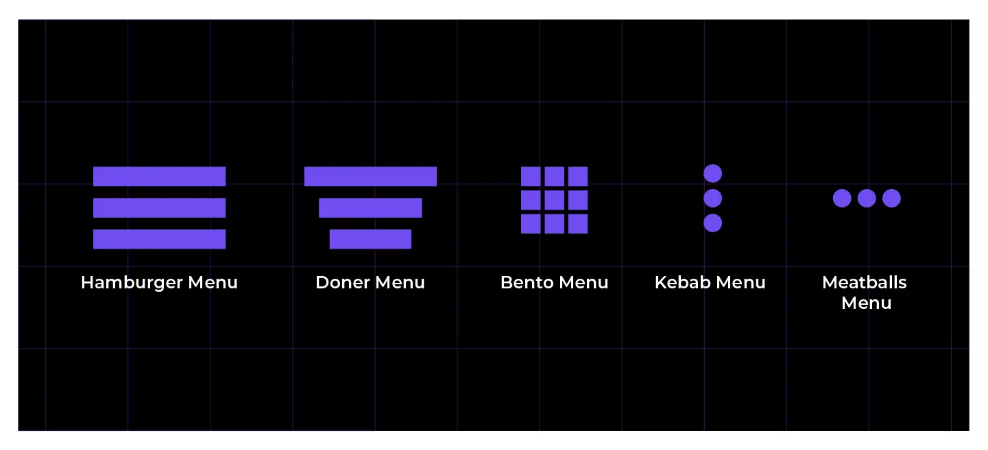
While building a mobile responsive website, you should also consider hiding some content to optimize the responsive page layout and space for smaller screens. A common example of this is using a “hamburger menu“ on the navigation, which hides the full menu behind an expandable icon on mobile.
In addition, interactive elements should be designed to accommodate touchscreen usability on mobile devices. You can use CSS media queries like orientation and aspect-ratio to detect the user’s device type and adjust the design accordingly.

Fluid Grid is a flexible grid system that divides the total page width into proportional columns, allowing content to automatically adapt to different screen sizes.
Essentially, a Fluid Grid defines a maximum layout width, then splits the interface into a set number of columns with widths calculated using relative units (%, vw, or fr). This enables layout elements to expand or contract fluidly when users switch between devices or adjust screen resolutions.
Today, there are two main approaches to designing website layouts:
Image quality plays a major role in shaping the user experience (UX). A website with sharp, well-scaled images leaves a positive impression on visitors. However, when screen sizes vary, some images may appear blurry or distorted — leading to a less satisfying experience.
To improve this, you need to resize the image by:
Just like images, typography quality directly impacts how users perceive your brand and content on a website. A poorly designed type system can make text hard to read, cause eye strain, and even make users question the brand’s professionalism.
To optimize readability and maintain visual harmony across all devices, you should:
Below is an example of a code for font size in rem:
html { font-size:100%; }
@media (min-width: 768px) { body {font-size:1rem;} }
@media (min-width: 1024px) { body {font-size:1.5rem;} }
Read more: SaaS UX Design – Exploring Best Practices with Insights from Mavic’s Case Study
With both economic and business efficiency benefits, it is no surprise that Responsive Websites have become a popular choice for businesses today. However, the responsive design process requires close collaboration between UI/UX designers and developers to ensure optimal technical factors and deliver the best user experience across all devices.
If you are in need of a responsive website and looking for a reliable service design partner, don’t hesitate to contact us! Lollypop Design Studio is a leading UI UX design company on a global scale. We own a team of experienced Designers and Developers, providing comprehensive solutions from Research, UX Design solutions ( including UX audit, UX content,…) and UI Design to Product Development on digital platforms.
Connect with Lollypop today to schedule a free consultation on how to optimize the user experience for your business!
A frequent mistake in responsive design is adopting a desktop-first mindset — designing for large screens first and then simply shrinking the layout for mobile. This approach often leads to distorted layouts, hard-to-read content, and awkward interactions on smaller devices. Additionally, a lack of multi-device testing and poor image optimization can slow down loading times, negatively affecting the overall user experience.
Shopify is a great example of modern responsive design — featuring a flexible grid system, clean typography, and a consistent experience across both desktop and mobile. The Boston Globe is a classic case study, where responsive grids, media queries, and optimized animations ensure that content always appears balanced and readable. These examples show that responsive design isn’t just about scaling interfaces — it’s about designing seamless experiences that adapt naturally to users’ real-world contexts.
A responsive design team typically includes: Product Designers (or UI/UX Designers) who shape the product experience and ensure visual consistency across breakpoints. Front-end Developers who bring the design to life using HTML/CSS and optimize performance across multiple devices. In larger projects, a Product Owner or Project Manager also plays a key role in coordinating efforts — balancing user needs, technical feasibility, and business goals.


