

Have you ever listened to Podcasts on Spotify or read subtitles when watching foreign language films?
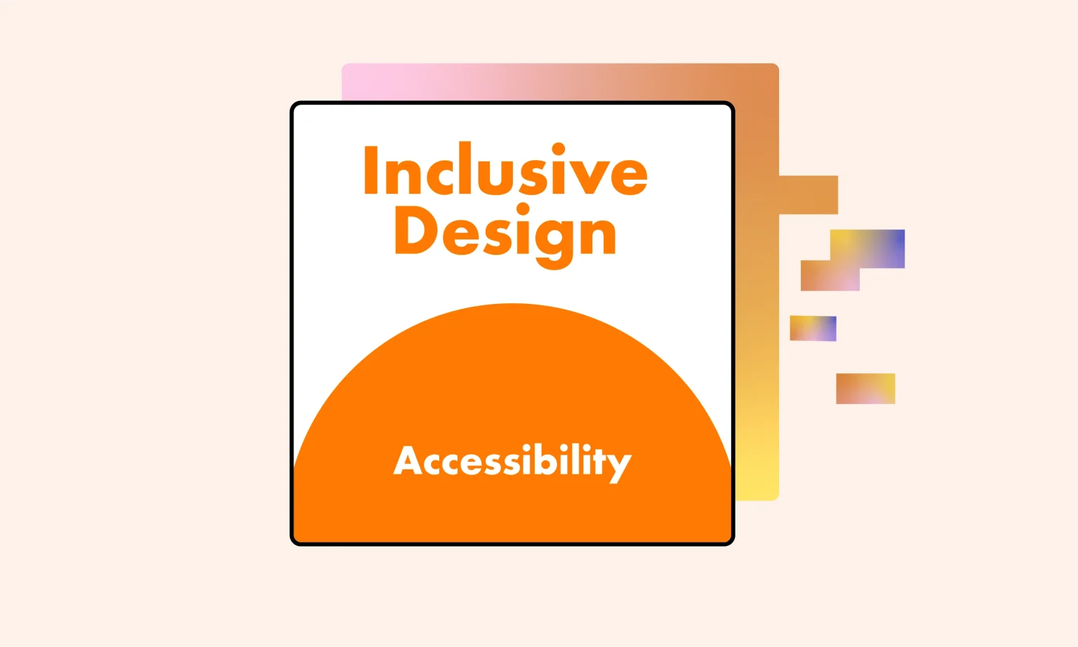
You might not be familiar with the concept of Inclusive Design, however, the examples above are common applications of Inclusive Design in our everyday lives!
In this article, we’ll dive deeper into understanding the definition of Inclusive Design, its benefits, and the principles of Inclusive Design as outlined by Microsoft.
Note: While Inclusive Design can be applied to optimize most products in life, the examples that Lollypop will provide in this article will focus on its applications in digital products such as Websites and Apps.
Inclusive Design is an human-centered design approach that aims to create products, services, and experiences catering to the needs of a wide range of user groups, beyond the ideal personas. Typically, inclusiveness in Website/App design is often manifested by considering all user groups, regardless of their gender, geographic location, language, culture, or physical abilities.
To demonstrate the benefits of Inclusive Design, the Centre for Inclusive Design collaborated with Adobe and Microsoft to conduct a study in Australia on the topic: “The Benefits of Designing for Everyone Report“.
The results showed that up to 5 million Australians were unable to access certain products/services. This group includes people with disabilities, the elderly, or those excluded due to their geographic location, gender, or financial status. However, they have a total disposable income of more than $40 billion per year, which could provide a significant revenue source for businesses (if the products/services are better optimized for inclusivity).
According to the same study, when Education, Finance, or Retail products/services in Australia are optimized for Inclusive Design, they can:
You may want to read about: Understanding the role of culture in website and app localization
The terms “Accessibility Design” and “Inclusive Design” are often used interchangeably, but in reality, Accessibility is just one of the elements that make up Inclusive Design.
Accessibility Design is an approach that design for disabled people, aiming to minimize barriers so that features and content can be easily accessed and used by people with hearing, mobility, vision, speech, or cognitive impairments.
Inclusive Design, on the other hand, has a much broader scope! In addition to creating accessible products for people with disabilities, Inclusive Design also considers factors such as age, culture, economic status, education, gender, weight, geographic location, language, and ethnicity to ensure that the design can meet the needs of everyone.
A product is designed with accessibility in mind can still cause some problems such as:
Microsoft consistently places a strong emphasis on the importance of Inclusive Design in its product development. According to the company, the reason why design solutions often lack comprehensiveness is that designers are typically influenced by their own inherent biases.
In 2016, Microsoft published a document called the “Inclusive 101 GuideBook” that outlines 3 key principles of Inclusive Design to raise awareness and promote inclusiveness in product design.

The first principle of Microsoft Inclusive Design states that to create a truly inclusive design, designers must first acknowledge their own biases and recognize the groups of people who are excluded as a result of those biases.
Most products on the market today are designed primarily with the “ideal” user and usage scenario in mind. This approach inadvertently excludes not just people with permanent disabilities like visual, hearing, or speech impairments, but also users who are using the product in different or challenging circumstances, such as: Driving a car, Having one arm in a cast, Watching a video in a noisy environment,…
The second principle highlights the importance of being aware of exclusion during user observation or interviews, allowing designers to create solutions that truly address real-world needs. For example, designers can perform simulation exercises such as “blindfolding” or “covering their ears” to better understand the challenges that people with disabilities experience when interacting with their surroundings.
However, it’s essential to understand that these simulations only offer a limited perspective of the user experience. In reality, numerous factors — such as abilities, experiences, emotions, and cultural contexts — influence how people interact with a product.
Examples of specific user groups:
The third principle advocates for focusing on solving the usability challenges of a specific user group, often those with disabilities or other significant barriers, as the path to enhancing the experience for a much broader range of users. In our everyday lives, we encounter countless examples that illustrate the power of this approach:
This principle also applies to a wide variety of features and devices, including remote controls, automatic doors, audiobooks, and more. By focusing on solving the specific usability challenges faced by “extreme” users, designers can often unlock solutions that end up greatly improving the experience for the masses.
Figure out more: 7 UI UX Design Principles for Mobile App Development
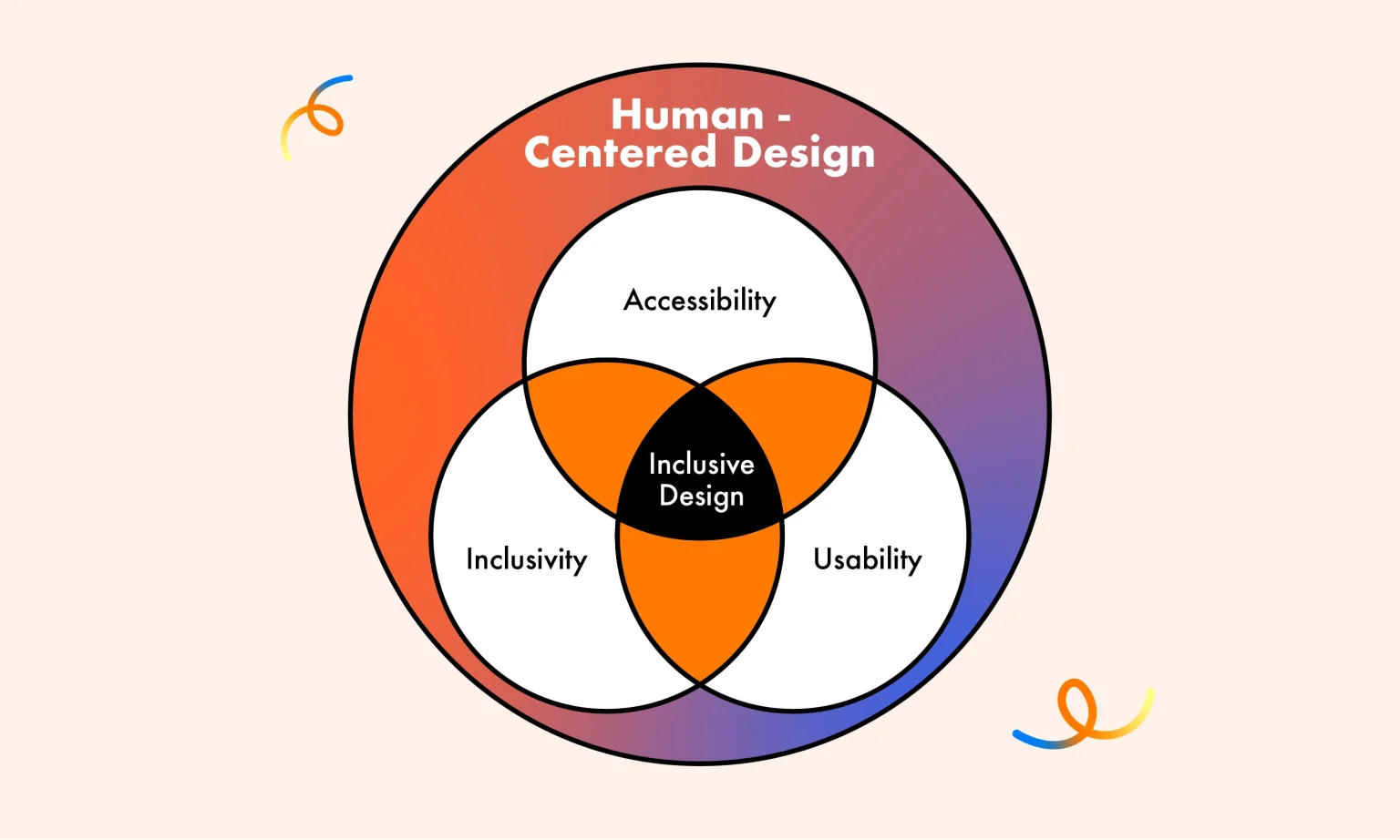
Inclusive Design is a holistic approach that encompasses three essential elements: Accessibility, Usability, and Inclusivity. According to the Interaction Design Foundation, these three pillars work together to create products and experiences that cater to the diverse needs of all users. Let’s dive into each of these elements:
First, when evaluating Accessibility, you can assess how user-friendly and inclusive your website or app is based on the following aspects:
Additionally, you can refer to the WCAG (Web Content Accessibility Guidelines) — a framework that includes 13 guidelines and corresponding success criteria, helping designers systematically evaluate and improve accessibility throughout the design process.
Learn more about: How to optimize Mobile-first Responsive Design
Next, to assess the usability of your product, you can conduct a UX Audit using two common methods:
Note: Research has shown that about 43% of issues identified through Usability Heuristics are not actual usability problems. Therefore, designers typically combine this method with Usability Testing to ensure a more accurate evaluation.
Finally, to enhance your product’s inclusivity, you can refer to the Inclusive Language Standards created by the Atlassian Design System.
Here are some improvement suggestions highlighted in the system:
Talking about language, you may not want to miss: How we localize UX content in Asia Pacific Region
This overview from Lollypop has provided a comprehensive understanding of Inclusive Design. It’s important to remember that creating a truly inclusive design for every single user in the world is an immensely challenging, if not impossible, goal.
The key is to identify your target audience, set realistic Inclusive UX goals, and establish milestones for each stage of the design process. This strategic approach will be the most effective way to create an inclusive product that caters to the diverse needs of your users.
Keep in mind: Designing for inclusivity is an ongoing journey, not a one-time effort. It requires continuous testing, evaluation, and product refinement to ensure that the design remains accessible, usable, and inclusive over time.
By embracing this iterative mindset and focusing on the specific needs of your target audience, you can make meaningful progress toward crafting products and experiences that empower and engage a wide range of users.
Inclusive Design is crucial in ensuring that products and services can be effectively used by everyone, regardless of their gender, location, language, culture, or physical abilities. By prioritizing inclusivity, we can create a more equitable and respectful digital landscape that empowers all users to engage and participate fully.
To create inclusive design products, we need to follow a clear and structured process. First of all, we need to identify the following factors:
Some examples of Inclusive Design in practice include features such as Speech-to-Text or Audiobooks to support people with visual impairments, High-contrast colors for people with color blindness, Customizable language/font size features to support users in different geographical areas as well as those with vision problems,…
Inclusive Design aims to create “one-size-fits-one” solutions – personalized for each individual with differences in ability, culture, gender, age, understanding,… Universal Design aims to design “one-size-fits-all” solutions – i.e. creating products and services that everyone can use without the need for special adjustment or adaptation.
The main difference between Inclusive Design and Accessibility Design lies in the scope and design goals. While inclusive design solutions aim to create flexibility and personalization for each individual with differences in ability, culture, gender, age, and understanding,… Accessibility Design aims to “Design for Disability” which focuses on ensuring that products and services can be used by people with disabilities, meeting accessibility standards and regulations, such as the Web Content Accessibility Guidelines (WCAG) principles.


