
Patients use healthcare portals for specific reasons: booking appointments, checking test results, accessing medical records, or contacting their care team. Yet these tasks can become frustrating when portals have complicated navigation, unfamiliar medical terminology, or confusing account-access processes.
The challenge in patient portal design is not simply bringing healthcare services online. It is making essential patient tasks easier to find, understand and complete while protecting sensitive health information.
A patient should not need to understand how a hospital organizes its departments to book an appointment or find a laboratory report.
Quick Answer: What Makes Effective Patient Portal Design?Effective patient portal design organizes healthcare services around patient needs. It combines simple navigation, accessible interfaces, secure account access, understandable medical information and practical workflows for appointments, test results, messaging and caregiver access. |
A patient portal is a digital platform that allows people to access health information and manage interactions with healthcare providers. Depending on the organization, it may include medical records, appointment scheduling, prescriptions, billing, secure messaging and telemedicine.
Unlike a conventional business dashboard, a patient portal serves people who may be managing illness, navigating unfamiliar medical information or completing tasks under stress. Its interface must make essential actions clear without overwhelming users with clinical information.
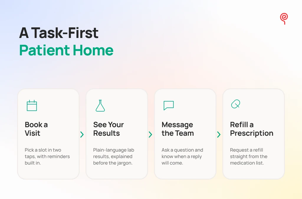
Patients generally log in with a specific task in mind. They want to book an appointment, view a report, refill medication or send a message, not navigate hospital departments and internal systems.
A patient-centric interface replaces clinical terminology with familiar language and organizes information around common tasks.
| System-centric portal | Patient-centric portal |
| Ambulatory Scheduling Department | Book an appointment |
| Encounter Lab Panel Diagnostics | View my results |
| Clinical Messaging Intake | Send a message |
| Pharmacy Encounter Re-order | Refill medication |
A clear dashboard should prioritize upcoming appointments, recent results, unread messages, outstanding forms and frequently used actions. The layout should reflect what patients need to do next, rather than displaying every available feature with equal importance.
A portal may serve several user groups, but they do not need identical access or interfaces.
Separating these roles helps avoid unnecessary complexity and protects sensitive information.
The importance of understanding these differences is supported by a systematic review of 42 studies examining patient and caregiver suggestions for improving portals. The review identified information, features and functionality, and usability as major areas for improvement. Read the patient and caregiver portal review.
For a broader understanding of portal UX design principles, teams should consider information architecture, role-based experiences and recurring user tasks together.
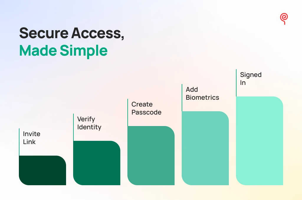
Account activation and login are the first usability challenges patients encounter. If patients struggle to register or regain access, even a well-designed portal becomes difficult to use.
An effective registration journey should explain each step without assuming that users are comfortable with digital processes.
Include clear invitation instructions, understandable identity-verification steps, visible progress and straightforward password requirements. Explain why a verification code is needed and what users should do when it expires.
Avoid asking patients to repeat information the healthcare organization already has, unless verification requires it.
Healthcare portals must balance accessibility with the protection of sensitive information. Depending on the security architecture and applicable requirements, useful controls may include multi-factor authentication (MFA), biometric access, passwordless options and clear account-recovery processes.
A common design problem occurs when a patient changes their phone number and can no longer receive verification codes. Password reset alone does not solve this problem. The portal needs an alternative, secure recovery route.
Account recovery should explain what information is required, how identity will be verified and where the patient can get assistance.
Patients may spend considerable time completing medical-history forms, intake questionnaires or insurance information.
An abrupt session timeout can erase their progress and force them to start again.
Use visible timeout warnings, clear options to continue and automatic progress preservation where the system’s security requirements allow it. When a session expires, explain what happened and whether the user’s saved information is available.
Appointments, test results and communication are among the most important patient-facing workflows. Their design should help people complete tasks without unnecessary navigation or uncertainty.
A good appointment-scheduling experience helps patients find the right provider, understand available options and confirm a suitable time.
Useful design elements include:
A straightforward journey might look like this:
Find a specialist → Choose a location → Select a time → Confirm the appointment → Receive a reminder.
Show any requirements, such as referral information or pre-visit forms, before the final confirmation. This prevents patients from discovering important conditions after they have selected a time.
Displaying laboratory results as a grid of numbers is not enough. Patients need to understand what information they are looking at and where to find appropriate explanations.
A well-structured results interface should include:
Visual indicators can make results easier to scan, but colour should never be the only way to communicate status. Pair labels and icons with clear text.
Medical explanations should also be reviewed by qualified healthcare professionals. A portal should not turn a reference range into an automated diagnosis or imply that a result is harmless simply because it falls within a displayed range.
Patients need access to both the original clinical information and understandable explanations. They should be able to explore the details without having to interpret complex terminology on their own.
Secure messaging gives patients a digital channel to contact the appropriate healthcare team for non-emergency matters.
The interface should make it clear who will receive a message, what type of query is appropriate and when the patient can reasonably expect a response, where that information is available.
Useful messaging patterns include:
Do not position portal messaging as an emergency service. Patients should be directed to the appropriate urgent-care channel when necessary.
A telemedicine feature should support the entire appointment journey, not just the video call.
Patients need to find their scheduled consultation, complete pre-visit forms, check their device and connectivity, and understand how to join the appointment.
The interface should also provide guidance when a connection fails. After the consultation, relevant follow-up instructions and available records should be easy to locate.
Healthcare portals serve people with different abilities, levels of digital confidence and access requirements. Inclusive design must account for these differences from the beginning.
Caregivers may help patients manage appointments, review information or coordinate care. However, caregiver access must be appropriately authorized and clearly distinguished from the patient’s own account.
Design for:
Do not encourage shared login credentials as a substitute for authorized access. In the United States, HIPAA rules concerning personal representatives depend on the applicable circumstances and authority. HHS guidance on personal representatives provides further context.
A usable healthcare portal design should support people with visual, physical and cognitive accessibility needs.
| Design dimension | Recommended approach |
| Typography | Readable text and a clear heading hierarchy |
| Contrast | Sufficient contrast between text and backgrounds |
| Navigation | Consistent menus and understandable labels |
| Keyboard access | Logical focus order and visible focus indicators |
| Screen readers | Meaningful form labels and status announcements |
| Interactive controls | Clear labels and adequately sized targets |
| Error handling | Specific instructions for correcting mistakes |
| Responsive layout | Usable experiences across mobile, tablet and desktop |
Use plain language, avoid relying on colour alone and provide clear feedback when users complete forms or encounter errors.
The W3C Web Content Accessibility Guidelines provide a framework for evaluating digital accessibility. WCAG 2.2 is the latest W3C-recommended version. However, applicable legal requirements vary by jurisdiction and organization. For example, ADA Title II web-accessibility requirements in the United States apply to state and local government entities, not automatically to every private healthcare provider.
Security and privacy also need to be designed into the experience. For organizations covered by HIPAA, the Security Rule requires appropriate administrative, physical and technical safeguards to protect electronic protected health information. It does not prescribe one fixed interface or technology checklist. Encryption, for example, is an addressable implementation specification that must be assessed as part of the organization’s risk management approach.
See the HHS HIPAA Security Rule guidance and its explanation of encryption requirements.
A portal redesign should be evaluated by whether patients can complete important tasks, not simply whether the new interface looks cleaner.
Create realistic usability scenarios to test whether patients can:
Include participants with different accessibility needs and levels of digital confidence.
| Metric | What it measures |
| Account activation rate | Whether invited users complete registration |
| Login success rate | Whether users can access their accounts |
| Task completion rate | Whether patients finish essential tasks |
| Appointment completion rate | Whether patients successfully manage bookings |
| Form abandonment rate | Where users stop during forms |
| Support requests | Which workflows create confusion |
| Portal task frequency | Whether patients use available functions |
Track invitation, activation and meaningful portal use separately. A high registration rate does not prove that patients can book appointments or find their medical information successfully.
Teams should prioritize improvements according to task importance, frequency and observed friction. For example, fixing a confusing test-result journey may create more value than redesigning a section that few patients use.
Effective patient portal UX design is not about adding more features. It is about making essential tasks easier, presenting health information responsibly and helping people access the right support.
Start with one high-priority patient journey, test it with real users and improve the experience using measurable evidence.
Lollypop works across healthcare digital experiences, from e-patient records to telehealth interfaces. Explore our healthcare UX design capabilities. For a related digital-wellness example, see the Tattva Health website and branding project, which focused on simplifying complex wellness concepts and improving website navigation. It is a related healthcare-adjacent digital experience, not a patient portal case study.
Discuss your project with Lollypop.
Important features include account access, appointment scheduling, medical records, test results, secure messaging and relevant follow-up actions. The exact feature set should reflect patient needs and the services provided by the healthcare organization.
A patient portal is easier to use when it has task-oriented navigation, plain-language labels, accessible forms, readable medical information, responsive layouts and clear feedback at every step.
They should provide authorized access through separate identities, clearly defined roles and appropriate controls over the information caregivers can view or manage.
Use task-based usability testing and track account activation, task completion, appointment management, form abandonment, support requests and feedback from different patient groups. These measures help teams identify where patients still encounter friction.