WWF-India is one of the country’s leading conservation organisations, working across wildlife, climate, freshwater, forests, sustainable business, environmental education and community-led conservation. While the organisation enjoys strong credibility, its digital presence no longer reflected the scale and diversity of its work.
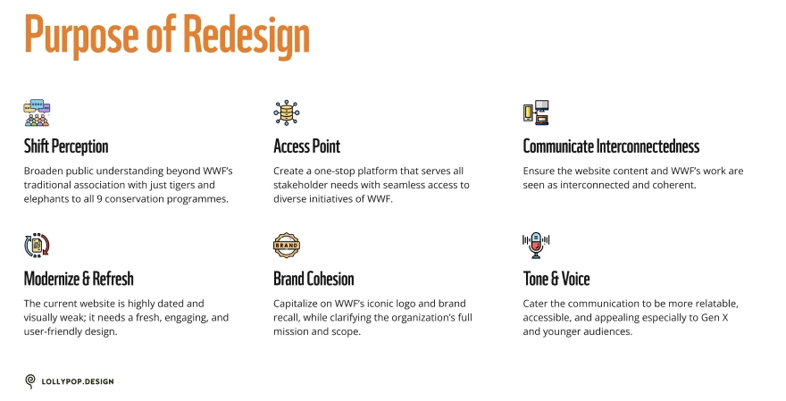
The redesign set out to transform the website into a modern, accessible and storytelling-driven platform that better connects people with WWF-India’s mission.
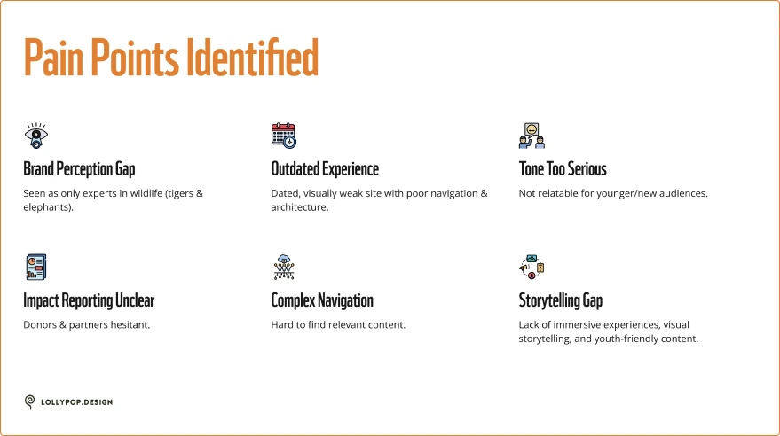
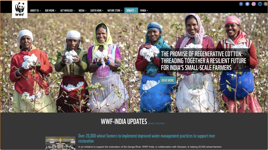
The existing website suffered from an outdated visual language, fragmented navigation and limited storytelling. Visitors largely associated WWF with tigers and elephants, while many of its other conservation programmes remained difficult to discover. Donors found impact reporting unclear, younger audiences found the tone overly formal, and key user journeys — exploring programmes, reading stories, contributing — required unnecessary effort.
The project began with stakeholder workshops to understand organisational goals, audience expectations and content challenges. Discovery focused on identifying key user groups, defining success metrics and restructuring the content ecosystem before visual design commenced.
Primary audiences: Public · Government & Policy Influencers · CSR & Network Partners · Philanthropists · Youth & Educators · Retail Donors · Think Tanks & Research Organisations.
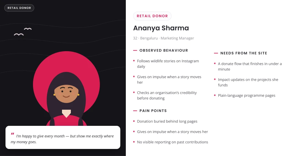
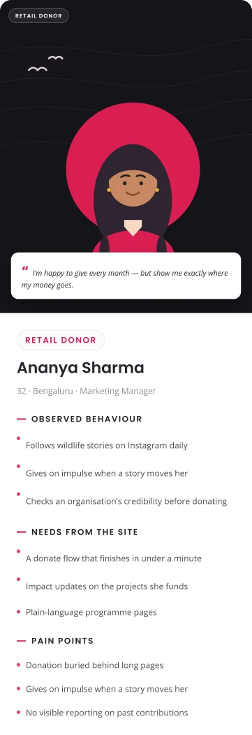
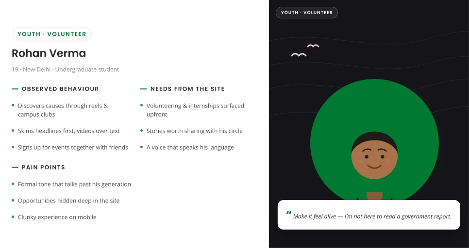
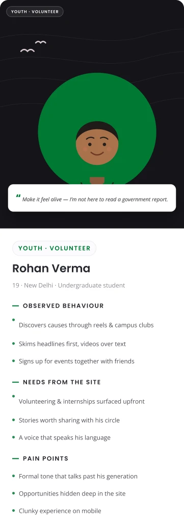
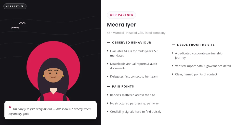
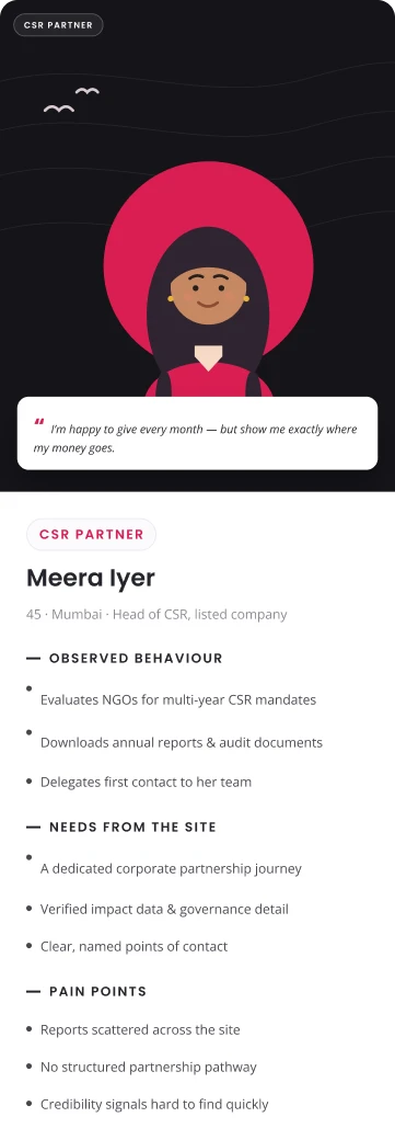
The design strategy centred on three principles: Clarity First, Guided Navigation and Immersive Storytelling. Long-form conservation content was restructured into digestible sections using visual hierarchy, photography, video, interactive modules and contextual calls-to-action. Navigation was simplified around user intent while preserving WWF’s credibility and depth.
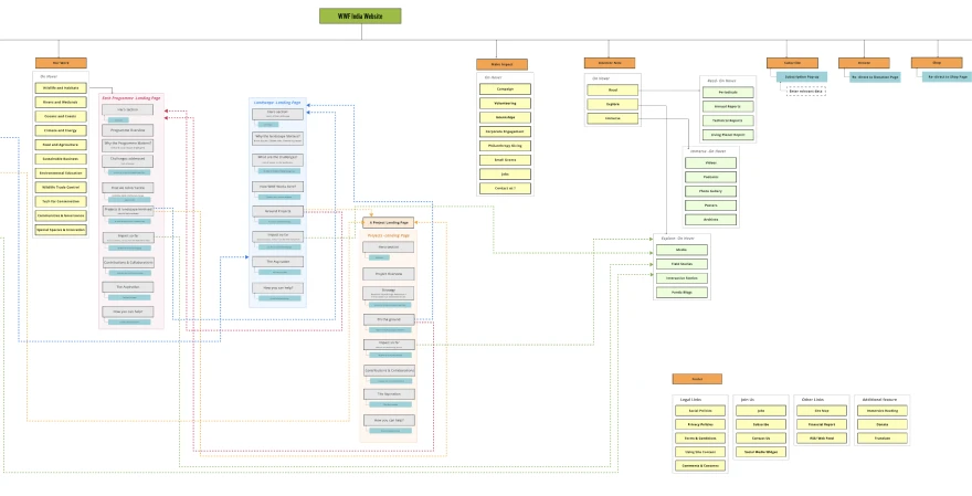
A new information architecture connects Programmes, Landscapes, Projects, Stories, Publications, Campaigns and Ways to Engage into one cohesive ecosystem. Cross-linking encourages deeper exploration while reducing content silos; the navigation is mobile-first and built to scale.
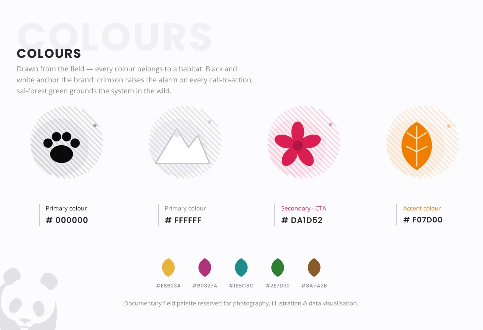
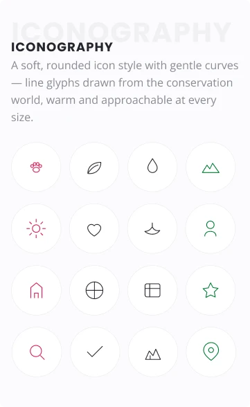
The visual system stays true to WWF’s global identity the mono panda, black and white discipline, photography-first storytelling while introducing a localized accent, a warmer icon language and a scalable component system built for a living conservation archive.
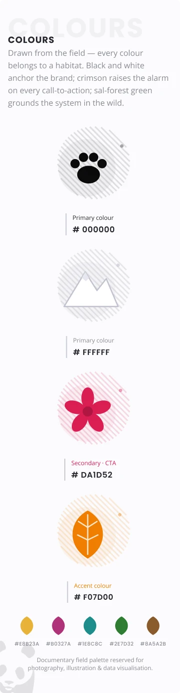
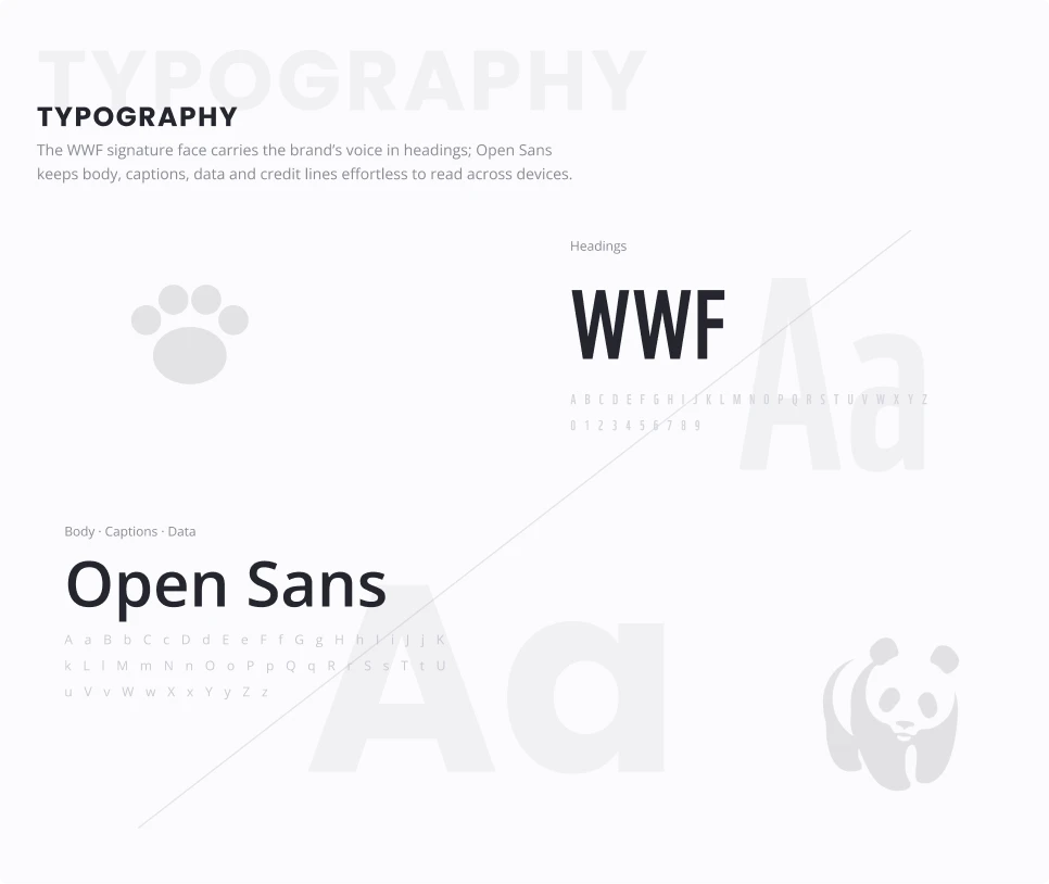
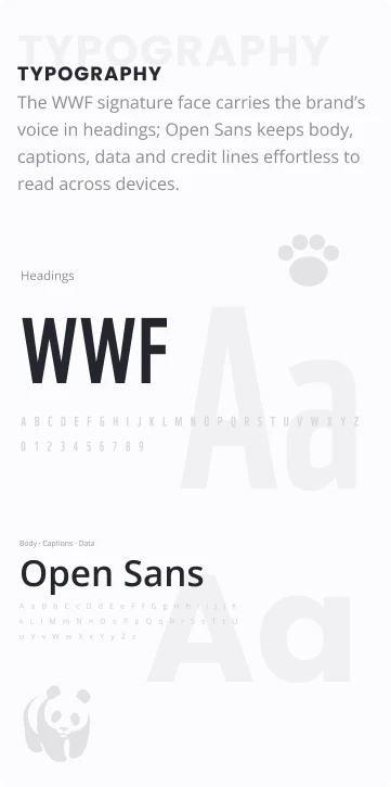
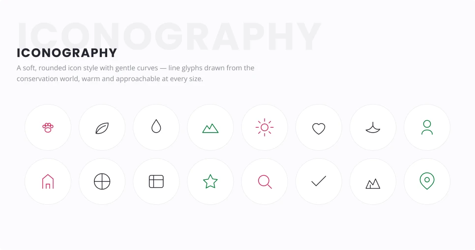
Structure before skin. Every template was drafted, annotated and pressure-tested against the new architecture long-form conservation content broken into modules that scale from a two-line update to a multi-chapter landscape story.
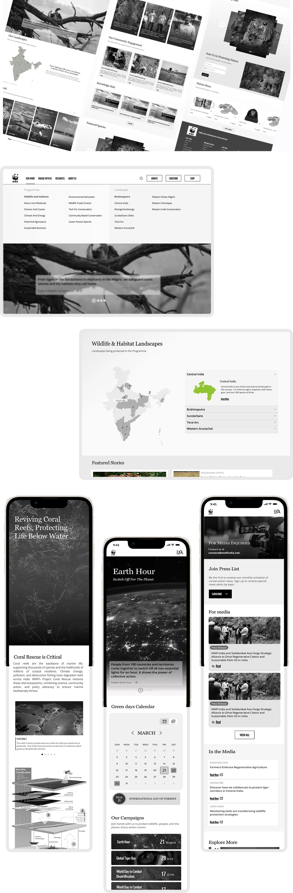
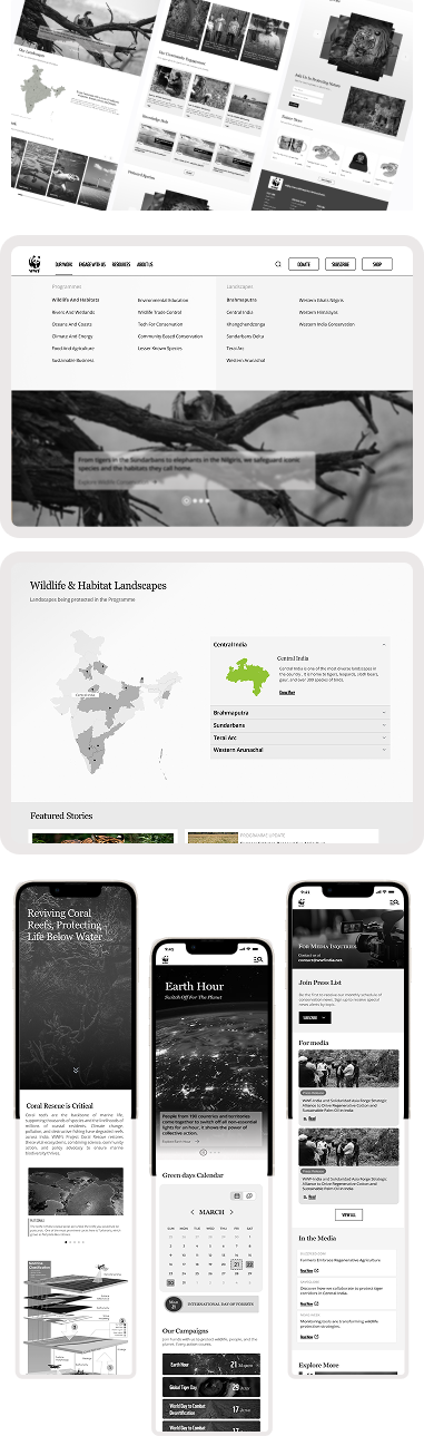
The redesigned website combines immersive conservation storytelling with a clean, responsive interface. Large visual banners, modular content sections, improved readability and stronger calls-to-action guide users naturally through WWF’s work with dedicated landing pages for Programmes, Landscapes and Projects creating consistency and discoverability.
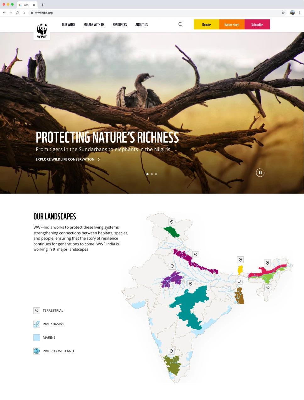
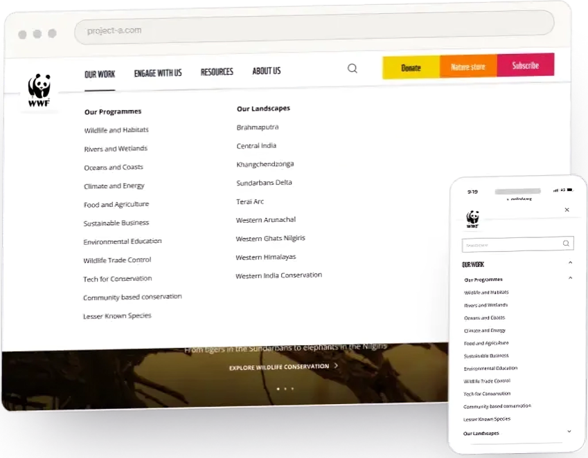
Intent-led mega menu that exposes every programme at one level.
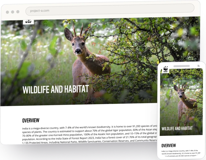
A consistent landing template across all conservation programmes.
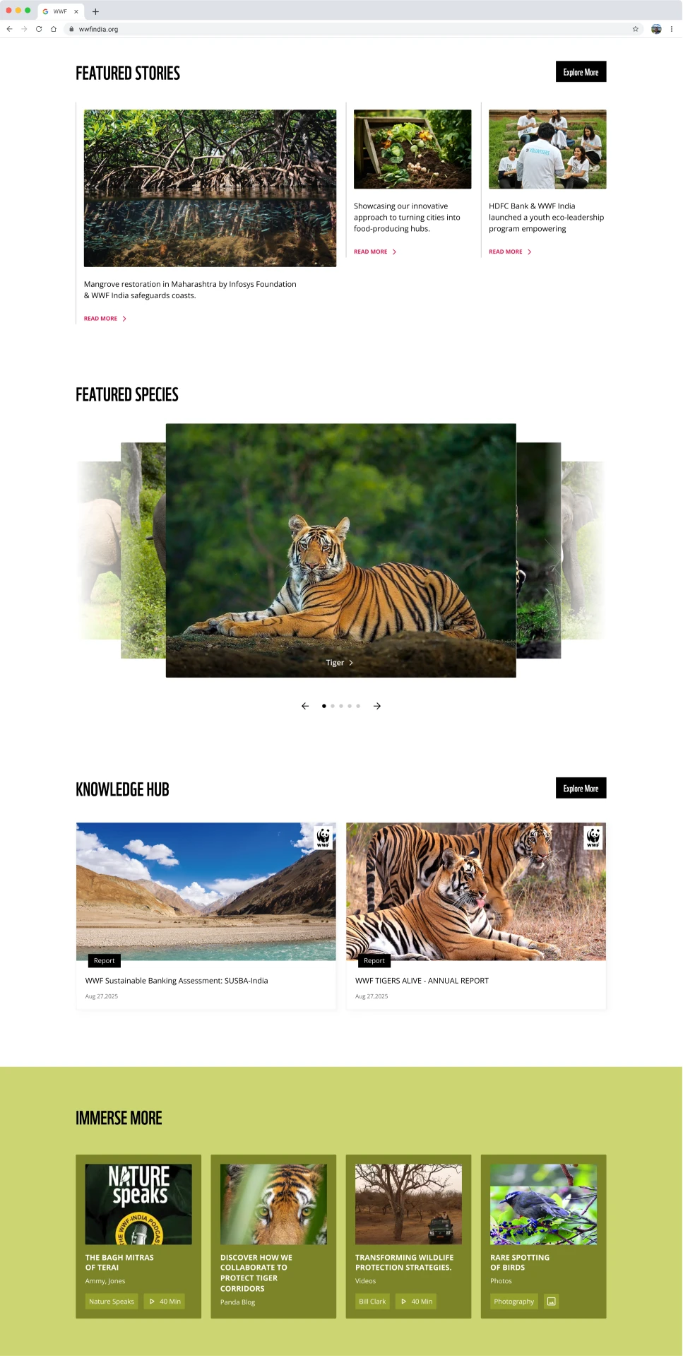
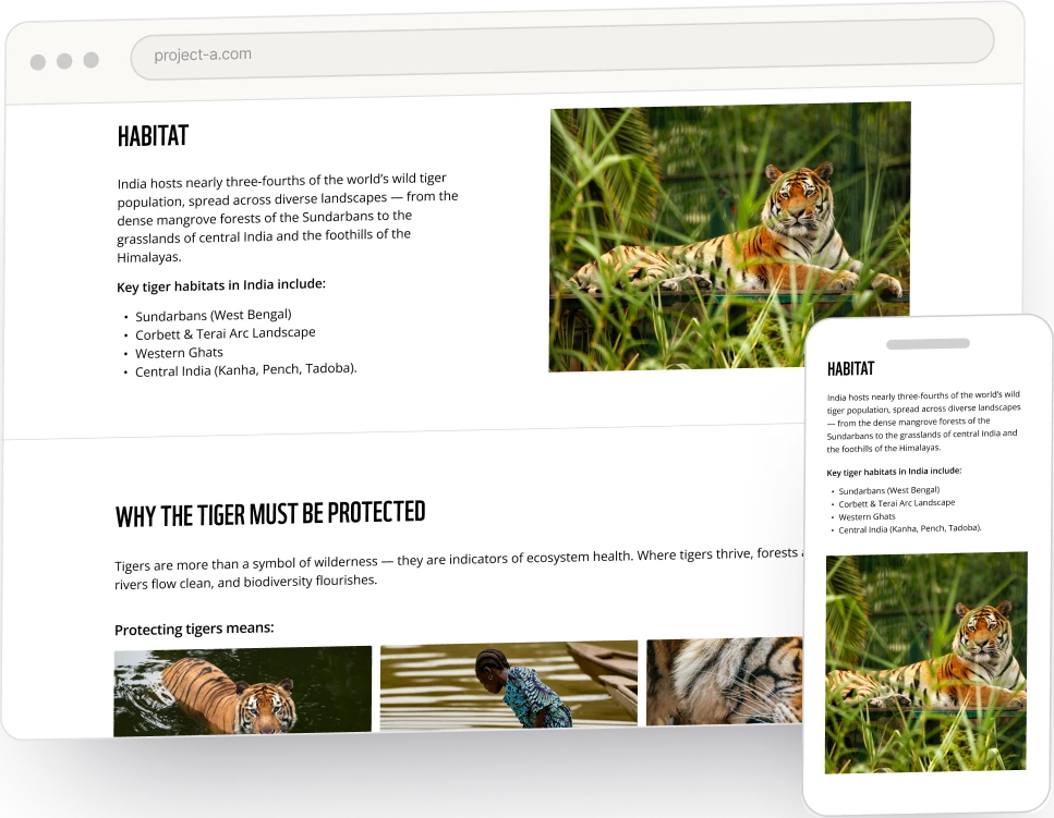
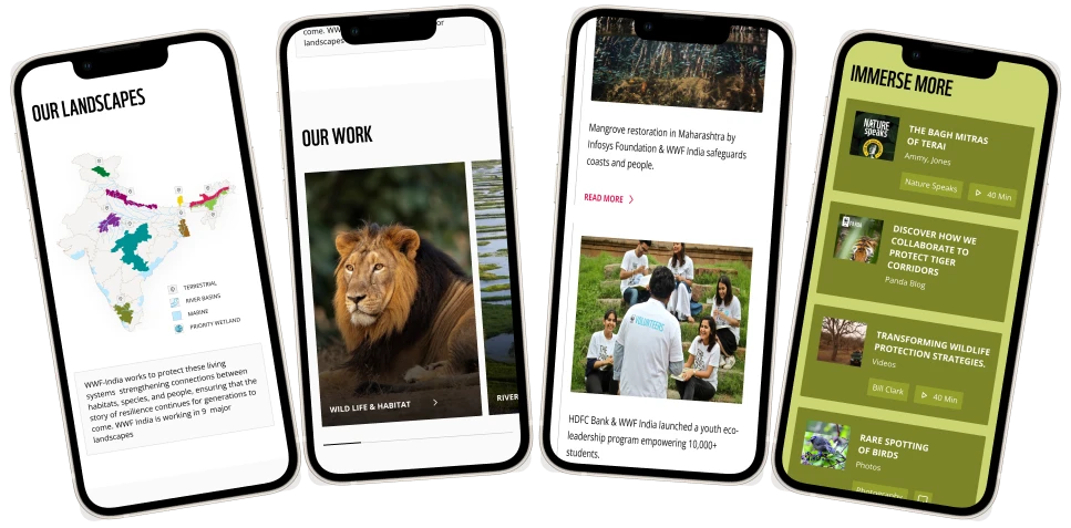
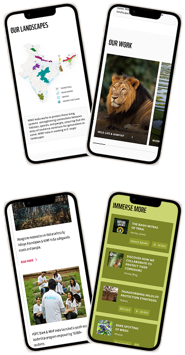
The redesign surfaced every conservation programme rather than just the flagship species, connecting Programmes, Landscapes, Projects and Stories into a single explorable ecosystem. Alongside this, it established a clear and consistent action hierarchy across the website, and delivered a scalable design system ready for future expansion.