
Insurance is moving into the same digital spaces where people now manage their money, health, travel, and everyday services. Customers can get a quote from their phones, compare coverage, manage policies, make payments, and file claims without ever speaking to an agent. On paper, the shift makes insurance more accessible. In practice, putting an insurance journey on a screen does not automatically make it easier to understand.
The challenge is that insurance is fundamentally different from many of the digital products people use every day. It is often purchased for something that may not happen for months or years. Its language can be difficult to interpret, its terms are rarely intuitive, and the value of the product is often invisible until something goes wrong. A customer may spend only a few minutes choosing a policy, then rely on that decision years later when they are dealing with an accident, a medical event, or another unexpected situation.
That creates a unique challenge for product and UX designers. The interface has to convey enough information for people to make informed decisions without overwhelming them with the product’s complexity. It needs to help customers understand what they have, what their coverage means, what requires their attention, and what happens next. And when the stakes are high, it needs to do all of this while reducing the stress and uncertainty that already exist outside the screen.
This is why designing an insurance app is not simply about digitizing existing insurance processes or adding more features to a mobile interface. A successful digital experience needs to rethink how people interact with the product throughout the entire customer journey: before they buy a policy, when they compare options, after they become a policyholder, and especially when they need to make a claim.
The real challenge in insurance app design isn’t simplifying the insurance product. It’s simplifying the user’s relationship with it.
That distinction changes how the entire experience should be designed. Instead of asking only which features an insurance app needs, product teams need to ask a more fundamental question: What does the customer need to understand, decide, or do at each moment of the journey?
This article explores that question from both a product and UX perspective. It looks at why insurance experiences are uniquely difficult to design, the features that matter most, how those features should work together, and the design principles that can turn a complex insurance product into an experience people can actually understand and trust.
The difficulty of insurance UX does not come from the interface alone. It comes from the nature of the product itself. Unlike many digital services where users can immediately see the value of what they are buying, insurance is built around a promise about something that may happen in the future. Customers pay today for protection they hope they will never need, which makes the product difficult to evaluate and the experience difficult to design.
For product teams, this creates a fundamental tension. The business needs to communicate enough information for customers to make an informed decision, while the experience needs to remain simple enough for them to move forward with confidence. Remove too much information, and users may make decisions without understanding the consequences. Show everything at once, and the experience becomes overwhelming. Good insurance UX sits between these two extremes: it makes complexity accessible without pretending that complexity does not exist.
Most digital products are designed around frequent interaction. People open a banking app to check their balance, a food delivery app to place an order, or an e-commerce app to make a purchase. Insurance works differently. A customer might spend considerable time choosing a policy, then barely interact with the product for months. The next meaningful interaction may only happen when they need to renew their policy, update their information, or file a claim.
This creates a unique UX challenge: the experience has to remain understandable even when users have forgotten how it works. A policyholder should not have to relearn the product every time they open the app. The interface needs to provide enough context to answer basic questions quickly: What coverage do I have? When does it expire? What am I paying for? Is there anything I need to do? Where can I find the information I need?
This is why an insurance app should not be designed only for the moment of purchase. The relationship continues long after the initial transaction, and the product needs to support users across that entire lifecycle. A good experience helps people understand the policy when they choose it, remember what they own after they purchase it, and navigate the product confidently when they eventually need to use it.
Insurance products are often built around terminology that makes perfect sense to industry professionals but feels abstract to everyday customers. Premiums, deductibles, coverage limits, exclusions, riders, beneficiaries, and policy terms can all influence a user’s decision, yet understanding these concepts often requires knowledge that the user does not have.
The problem is not simply that the words are unfamiliar. It is that these terms describe trade-offs that can have real financial consequences. A lower premium may come with a higher deductible. A policy with broader coverage may cost more. An exclusion that seems minor during the purchase process could become extremely important when a customer files a claim. When the interface presents these details without enough context, it effectively asks users to make decisions before they fully understand what those decisions mean.
Good insurance UX therefore needs to translate rather than simplify. The goal is not to remove important terminology or replace every technical concept with vague language. It is to explain complex terms in the context where users need to make a decision. A deductible should be understandable when someone is comparing plans. A coverage limitation should be visible before a customer commits to a policy. An exclusion should not become a surprise discovered only after something goes wrong.
The best experiences recognize that users do not necessarily need less information. They need information that is easier to interpret, compare, and act on.
Insurance becomes most valuable when something unexpected happens, but those are also the moments when users have the least patience and cognitive capacity. Someone reporting a car accident may be standing on the side of a road. Someone filing a health insurance claim may already be dealing with a difficult medical situation. Someone reporting property damage may be trying to understand what happened while managing the consequences.
In these situations, a product that is technically functional can still fail its users. A long form, unclear instructions, or an ambiguous claim status can turn an already stressful situation into an even more difficult one. The user does not simply need access to a feature. They need the experience to tell them what matters, what to do now, and what will happen after they take that action.
This is where context becomes a critical part of insurance UX. The same interface that works well during a calm policy management task may be completely inappropriate during an emergency. Important actions may need to be surfaced immediately. Explanations may need to become more concise. Support may need to be easier to reach. The product should adapt to the user’s situation rather than expecting the user to adapt to the product.
Designing for these moments means thinking beyond usability in the traditional sense. The question is not only whether a user can complete a task. It is whether they can complete it with enough clarity and confidence when the circumstances around them are already difficult.
Insurance is fundamentally built on trust. Customers are paying a company to protect them against an uncertain future, often without knowing exactly when or whether they will need that protection. That relationship depends on more than brand reputation or visual credibility. Users need to trust that the product is telling them the truth, that their information is being handled responsibly, and that the company will communicate clearly when something changes.
Every interaction contributes to that perception. A policy that is difficult to understand can create doubt before a customer even purchases it. A hidden exclusion can damage trust when the customer discovers it later. An unclear claim status can make users feel that their situation has disappeared into a system they cannot see. Even a small delay can become frustrating when there is no explanation for what is happening.
This is why trust should be treated as a product behavior rather than a visual outcome. A trustworthy insurance experience makes information transparent, communicates limitations honestly, and gives users visibility into processes that would otherwise feel invisible. It does not promise certainty where certainty does not exist. Instead, it helps users understand what is known, what is still being reviewed, and what they can expect next.
These challenges may appear different on the surface, but they share the same underlying problem. Users are uncertain about what they are buying, uncertain about what their policy covers, uncertain about what they need to do, and often most uncertain about what happens after they file a claim.
That is why the central challenge in insurance UX is not simply complexity. It is uncertainty.
A well-designed insurance app cannot eliminate every unknown. A claim may still require investigation. A decision may still take time. A policy may still contain conditions and exclusions. What design can do is make those uncertainties visible and manageable. It can explain what is happening, provide context when decisions need to be made, show progress when users are waiting, and make human support available when the digital experience reaches its limits.
The goal, then, is not to make insurance feel artificially simple. It is to make the user’s relationship with complexity more manageable.
When users understand what they have, why it matters, what they need to do, and what happens next, uncertainty becomes easier to navigate. And that is where good insurance UX begins.
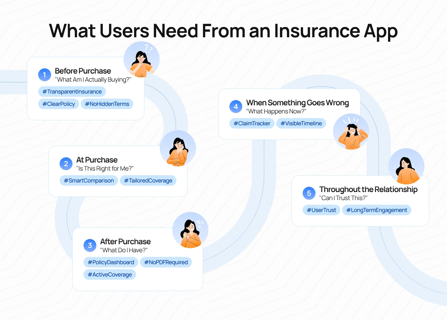
Once the core UX challenge is understood as uncertainty, the next question is where that uncertainty appears. The answer is different at every stage of the insurance journey. Someone researching coverage has a different need from someone comparing plans. A policyholder managing an existing policy needs a different kind of information from someone filing a claim after an accident. Treating all of these interactions as one continuous product experience can lead to an app that technically contains everything but helps users with very little.
This is why insurance app design should start with the moments that matter rather than a list of features. The goal is to understand what users are trying to accomplish at each stage, what information they need to make progress, and what could prevent them from moving forward. Once those needs are clear, features become a means to support the journey rather than an end in themselves.
Before someone becomes a policyholder, the primary challenge is understanding. Insurance is difficult to evaluate because its value is often expressed through conditions, coverage limits, exclusions, and future scenarios that may be difficult for users to imagine. At this stage, the experience should help people understand what they are protecting, what different policies cover, and where the important trade-offs are.
This is where quote tools, coverage explanations, educational content, and comparison features become valuable. But their effectiveness depends on how they are presented. A quote that gives users a price without explaining what that price includes does little to improve decision-making. Similarly, a comparison table that places dozens of policy attributes side by side may technically provide transparency while making the decision harder.
The better approach is to help users build understanding progressively. Start with the questions that matter most, introduce relevant information as the user moves forward, and make important trade-offs visible before the final decision. The experience should help users answer a simple question: Do I understand what I am paying for and what protection I am getting in return?
Once users understand the basic product, the challenge shifts from education to decision-making. Insurance is rarely about finding one objectively “best” option. It is about finding the right balance between cost, coverage, risk, and personal circumstances. Two users can look at the same policies and make different decisions because their priorities are different.
This is where personalization and comparison become more meaningful than simply displaying more choices. Instead of asking users to evaluate every possible policy attribute themselves, the experience can help them identify what matters most. Someone may prioritize a lower monthly premium, while another person may prefer broader coverage or a lower out-of-pocket cost when something goes wrong.
The UX opportunity is to make these trade-offs understandable without making the decision for the user. A good experience can recommend or highlight relevant options, but it should still make the reasoning behind those options clear. Users should be able to understand not only which plan is being presented, but why it may be appropriate for their situation and what they are giving up by choosing it.
The relationship between a customer and an insurance company does not end when a policy is purchased. In many ways, this is where the product experience begins. Yet many insurance apps are still designed primarily around acquisition, with policy management treated as a secondary function hidden behind documents, menus, and account settings.
A policyholder should not have to remember the details of a purchase they made months ago just to understand their current coverage. The app should make it easy to see what policies are active, what they cover, when they renew, how much the customer is paying, and whether anything requires attention. Important documents should be accessible, but the experience should not force users to open a PDF simply to answer a basic question about their policy.
The key shift is from document management to relationship management. Users are not opening the app because they want to browse their insurance company’s database. They are opening it because they need to understand something about their coverage or take a specific action. The experience should therefore surface information according to the user’s situation, not according to the internal structure of the insurance organization.
This is the moment when insurance moves from an abstract promise to a real service. When a customer files a claim, the experience is no longer about browsing or managing information. It is about navigating an uncertain process at a time when the outcome may have a direct impact on their life.
The first priority is to make the next step clear. Users need to know how to start a claim, what information they need to provide, and whether they have completed everything required. Once the claim is submitted, they need visibility into what happens next. Has the claim been received? Are the documents complete? Is someone reviewing the case? Does the customer need to do anything else?
A strong claims experience does not necessarily make the underlying process faster. What it can do is make the process more understandable. A visible timeline, meaningful status updates, realistic expectations, and clear access to support can turn an opaque process into one that users can navigate with greater confidence.
This is also where the design needs to recognize the limits of self-service. Not every claim can be resolved through a standardized digital flow, and not every customer situation fits neatly into predefined options. When the case becomes complex, the product should make it easier to reach the right person rather than forcing users to continue navigating an experience that no longer matches their needs.
Trust is not created by one feature or one interaction. It is built across the entire relationship. A customer may form an initial impression while comparing policies, reinforce it while managing their account, and ultimately test it when they need to make a claim.
This means trust needs to be designed into every stage of the journey. Pricing should be transparent. Coverage should be understandable. Important limitations should not be buried. Data requests should have clear reasons. Claims should be trackable. Delays should be communicated. And when the digital experience cannot provide the right answer, users should have a clear path to human support.
The strongest insurance products recognize that these moments are connected. A confusing purchase experience can make policy management feel more difficult. Poor visibility during a claim can undermine years of brand building. On the other hand, a product that consistently gives users clarity and control can strengthen the relationship over time, even when the outcome of a particular interaction is not what the customer hoped for.
Looking at insurance through these moments changes the way product teams should approach feature planning. A quote calculator, policy dashboard, claims tracker, or support channel can each be useful on its own, but none of them exists in isolation. Their value comes from how well they support the larger journey.
The question, then, is not simply whether an insurance app has the right features. It is whether those features appear at the right moments and work together to help users move forward. Someone comparing policies needs clarity. Someone managing coverage needs context. Someone filing a claim needs visibility and control. Someone facing an emergency needs speed and direct access to help.
This gives product teams a more useful way to think about insurance app design: start with the user’s situation, identify the uncertainty they are facing, and then design the feature that helps resolve it.
That approach also creates a natural bridge between UX strategy and product decisions. Once the key moments in the journey are clear, the next step is to identify which capabilities the product actually needs to support them — and which features are simply adding complexity without solving a meaningful user problem.
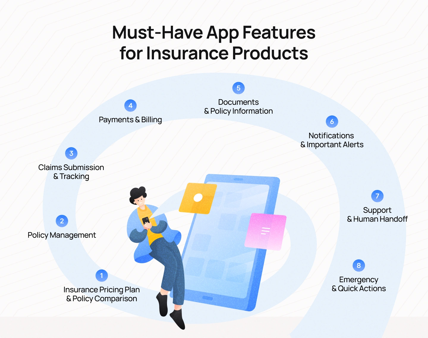
Once the insurance journey is understood through the moments that matter, the role of product features becomes much clearer. An insurance app does not need to replicate every function of an insurance company, nor does it need to turn every internal process into a digital workflow. Its job is to help customers understand their coverage, make informed decisions, manage their policies, and get the right support when they need it.
The most effective feature set is therefore not the longest one. It is the one that addresses the most important customer needs with the least unnecessary friction. A quote tool should help people make sense of their options. A policy dashboard should help them understand what they already have. A claims experience should make an uncertain process easier to navigate. And when the situation becomes urgent, the app should make the next action obvious.
The first major challenge an insurance app needs to address is decision-making. Before purchasing a policy, users need to understand not only how much they will pay but also what they are getting in return. Quote generation and policy comparison are therefore essential features for products that allow customers to research and purchase insurance digitally.
A basic quote experience may calculate a premium based on the user’s information, but calculation alone is not enough. Users also need to understand the factors behind the price and how different coverage options affect their decision. If one plan costs less because it comes with a higher deductible, that trade-off should be visible. If another plan offers broader protection at a higher premium, users should be able to understand why the difference matters.
This is where comparison becomes a design problem rather than simply a data problem. Showing more policy attributes does not necessarily help users make better decisions. A well-designed comparison experience prioritizes the information that influences the decision most, explains unfamiliar terms in context, and makes meaningful differences between plans easy to identify.
The goal is not to help users compare everything. It is to help them understand the trade-offs that matter.
Once a customer has purchased insurance, the product needs to shift from helping them choose to helping them manage what they already own. Policy management should make it easy to access active policies, understand coverage, check renewal dates, update relevant information, and manage changes to the policy.
The challenge is that policy information is often structured around the insurer’s internal systems rather than the user’s questions. A customer rarely thinks, “I need to access my policy record.” They are more likely to think, “Am I covered for this?” or “When does my policy renew?” or “How much am I paying each month?”
The app should therefore translate policy data into useful context. Instead of presenting a long list of technical details as the primary experience, it can surface the information most relevant to the user’s current situation while keeping the full policy details accessible when needed.
The principle is simple: make the policy understandable after purchase, not just sellable before purchase.
Claims are arguably the most important feature area in an insurance product because they represent the moment when customers actually need the protection they have been paying for. A digital claims experience should make the process easier to start, easier to understand, and easier to track.
At a minimum, users should be able to initiate a claim, provide relevant information, upload supporting documents or photos, and check the status of their case. But the quality of the experience depends on what happens between those actions. After submitting a claim, users should know whether everything required has been received, whether additional information is needed, and what stage the claim is currently in.
A status such as “Processing” may accurately describe the internal system, but it tells the customer very little. A more useful experience might explain that the claim has been received, documents have been verified, an assessment is underway, or a decision is expected within a particular timeframe. The more meaningful the status, the less uncertainty the user has to carry.
A good claims experience should never feel like a black box. Even when the insurer cannot provide an immediate outcome, the product can still provide visibility into the process.
Insurance is also an ongoing financial relationship, which makes payment and billing capabilities another essential part of the digital experience. Customers should be able to see how much they are paying, when their next payment is due, how previous payments were processed, and whether automatic payments are enabled.
The key is to provide enough context to prevent avoidable surprises. A simple notification that says “Payment due” is less useful than one that clearly communicates the amount, due date, and payment method. If an automatic payment fails, the user should understand what happened and what action they need to take before their coverage is affected.
This is a small but important example of how insurance UX can reduce uncertainty. The feature itself is straightforward. The design challenge lies in making the financial consequences of each action clear before the user has to discover them the hard way.
Insurance generates a significant amount of documentation, from policy contracts and certificates to payment receipts and claim-related files. A digital app should make these documents easy to access, download, and share when necessary.
But simply creating a digital document library does not solve the underlying UX problem. Users often do not want to browse through a collection of PDFs. They want to find a specific answer. They may want to know whether a particular situation is covered, where their policy number is located, or whether a document is still valid.
This creates an opportunity to move from document storage toward contextual information access. The app can surface relevant policy details directly within the journey while still giving users access to the complete documentation for reference.
Users don’t want a document library. They want the answer contained in the document.
That distinction can have a significant impact on information architecture. The full policy document still matters, particularly for legal and regulatory reasons, but it should not be the only way customers can understand what their policy means.
Insurance apps often rely heavily on notifications because many important events happen outside the moment when a user is actively using the product. A payment may be due, a policy may be approaching renewal, a claim may have been updated, or additional documents may be required.
The challenge is to ensure that notifications are actionable rather than simply informative. A useful notification should answer three questions: What happened? Why does it matter? What should I do next?
For example, “Your policy is expiring soon” creates awareness but leaves the user to figure out what happens next. A more useful message could explain when the policy expires, whether renewal is automatic, and where the user can review their coverage before making a decision.
The notification itself should also lead naturally to the relevant action. If a claim requires additional documentation, the user should be able to move directly from the notification to the upload flow. If a policy is approaching renewal, the user should be able to review the policy without navigating through several layers of the app.
Good notifications do not simply interrupt users. They provide the right context at the right time.
Self-service can make insurance more convenient, but not every customer problem should be solved through automation. Some situations are too complex, too personal, or too high-stakes to fit into a standardized digital flow.
An insurance app should therefore provide clear access to support through channels such as live chat, secure messaging, phone calls, or specialist assistance. More importantly, the experience should recognize when a user needs to move from self-service to human support.
A common failure in digital insurance experiences is forcing users to remain inside automation even after it becomes clear that the automated flow cannot resolve their situation. Repeating the same questions, returning irrelevant help articles, or responding with generic error messages can create more frustration than the original problem.
The better principle is simple: good automation knows when to stop.
The goal of digital self-service is not to eliminate human interaction at all costs. It is to make routine tasks easier while ensuring that people can reach the right human when the situation requires judgment, empathy, or specialist knowledge.
Some insurance products are used during moments when speed matters more than exploration. A driver involved in an accident may need roadside assistance. A health insurance customer may need to find a covered provider or access their insurance card. A homeowner dealing with property damage may need to report an incident immediately.
These situations require a different approach to feature design. The most important actions should be easy to find, easy to understand, and accessible without unnecessary navigation. Users should not have to remember the internal structure of the app to find help when they are already under pressure.
This is where context-sensitive quick actions become particularly valuable. The app can surface relevant actions based on the user’s policy, location, or current situation, such as reporting an accident, calling roadside assistance, finding a nearby provider, or starting an emergency claim.
The principle is broader than convenience: the moment users need an insurance app most may be the moment they have the least time and attention to use it.
Designing for these moments means treating speed and clarity as part of the product’s core value, not as secondary enhancements.
Taken together, these features cover the core responsibilities of an insurance app: helping users choose, manage, understand, pay for, and ultimately use their insurance. But the presence of these features alone does not guarantee a good experience.
The real question is how they work together. A quote experience should connect naturally to policy management. A policy dashboard should lead users toward relevant documents and actions. A claim should connect status updates with support. A notification should take users directly to the task that requires their attention.
This is why feature planning should begin with user needs rather than a checklist of expected functionality. The best insurance products do not win because they have the most features. They win because the right features appear at the right moment, with the right amount of context.
The next challenge, then, is prioritization. Not every feature deserves the same level of visibility, and not every capability needs to be available at every moment. The strongest insurance experiences understand that what a user needs right now matters more than everything the product is capable of doing.
An insurance app can contain dozens of useful capabilities, but usefulness alone is not enough to determine priority. A feature can be valuable in theory and still create a poor experience if it is surfaced at the wrong time, buried beneath more important actions, or added simply because competitors have it.
This is particularly important in insurance because users do not interact with every part of the product with the same frequency or urgency. Checking a policy may be a relatively calm task. Filing a claim may happen during a stressful event. Renewing coverage may require careful consideration, while calling for roadside assistance may require immediate action. Treating these interactions as equally important creates an experience that is technically comprehensive but strategically unfocused.
Instead of asking, “What features should our insurance app have?” product teams should ask a more useful question: “Which moments require the most help, and what does the user need at that moment?”
From that perspective, insurance app features can be grouped into four levels: core, contextual, supportive, and critical.
Core features are the capabilities that support the fundamental relationship between a customer and their insurance provider. These are the functions users expect to access reliably, whether they are interacting with the app regularly or returning after several months.
Policy management, payments, documents, and claims typically sit within this category. These features should be easy to find and consistently accessible because they represent the basic tasks users need to complete throughout the policy lifecycle.
The priority here is reliability and clarity. Users should not have to search for their active policy, wonder whether a payment has gone through, or navigate multiple layers to understand their coverage. Core features form the foundation of the experience, and any friction within them can affect how users perceive the insurer as a whole.
However, being a core feature does not mean every function needs to occupy the same amount of screen space. A policy document may be essential but rarely accessed, while an upcoming renewal may require immediate attention. The product should distinguish between what users need access to and what users need to see right now.
Contextual features respond to the user’s current situation rather than remaining permanently visible. They become more valuable because of timing.
Consider a policyholder whose renewal date is approaching. Under normal circumstances, renewal information may not need to occupy any prominent space in the app. But two weeks before the policy expires, it becomes highly relevant. The same is true for a claim that requires additional documentation or a payment that has failed.
Instead of making users actively search for these situations, the product can bring the relevant action forward when it matters. A dashboard might surface an upcoming renewal. A notification might link directly to a missing document. A claim page might highlight the exact action required to move the process forward.
This approach creates a more adaptive experience without necessarily adding more features. The product becomes more useful because it understands context.
The principle is straightforward: not everything needs to be visible all the time. It needs to be visible when it becomes important.
Some features do not directly complete an insurance task. Instead, they help users understand the task well enough to make a decision or take the next step.
These include contextual explanations, FAQs, educational content, coverage guides, calculators, and in-product assistance. Their role is particularly important when users encounter terminology or decisions they may not understand.
For example, a policy comparison experience may introduce the concept of a deductible. A short contextual explanation can help the user understand what it means and how it affects their decision without forcing them to leave the journey and search elsewhere.
The same principle applies during claims. If a user is asked to provide a particular document, the product should explain what the document is, why it is required, and where they can obtain it if they do not already have it.
Supportive features should therefore be designed around moments of uncertainty. They should appear when users are likely to need help and disappear when that help is no longer relevant.
The goal is not to add more content. It is to reduce the amount of interpretation users have to do on their own.
Some insurance interactions are fundamentally different because the cost of delay can be significant. Accident reporting, emergency assistance, urgent claims, and access to medical information may require immediate action.
These critical features should be evaluated differently from everyday product functionality. The priority is not discovery, exploration, or personalization. It is speed, visibility, and confidence.
A driver who has just been involved in an accident should not have to navigate through a complex account structure to find roadside assistance. A health insurance customer who needs urgent care should not have to search through multiple pages to find their insurance card or locate an in-network provider.
In these situations, the interface should reduce cognitive load as much as possible. Important actions should be prominent, instructions should be concise, and the path to human assistance should be clear.
The design question becomes less about “What can the user do?” and more about “What does the user need to do immediately?”
This distinction matters because an insurance app can be perfectly usable under normal circumstances and still fail when users need it most. Critical moments require a different level of design consideration.
A useful way to prioritize insurance app features is to evaluate them against three dimensions: consequence, frequency, and urgency.
Frequency asks how often users perform a task. Consequence asks what happens if the task is misunderstood or completed incorrectly. Urgency asks how quickly the user needs to act.
These dimensions reveal why a feature’s importance cannot be measured by usage alone. A policy document may be accessed only a few times a year but become extremely important when a customer needs to verify coverage. An emergency claim flow may have low overall usage but require an exceptional experience because the consequences of friction are much higher.
A feature that is high in frequency but low in consequence may need to be efficient. A feature that is low in frequency but high in consequence may need stronger guidance and visibility. A feature that is high in urgency needs to minimize the distance between the user and the action they need to take.
This gives product teams a more meaningful framework for prioritization than simply counting clicks or comparing feature lists with competitors.
The most important shift is to stop thinking of features as static components of an app. A feature has different value depending on when and why a user encounters it.
A claims tracker is useful after a claim is submitted but irrelevant to someone comparing insurance plans. A renewal reminder is helpful when a policy is about to expire but unnecessary for someone who has just purchased coverage. An emergency contact should be highly visible when a critical event occurs but should not dominate the everyday experience.
The same capability can therefore move between different levels of priority depending on context.
This is why the best insurance apps do not simply provide users with more functionality. They create a hierarchy of attention. They make essential tasks easy to access, bring relevant information forward when it matters, provide guidance when uncertainty appears, and remove unnecessary distractions when users are under pressure.
In other words, feature prioritization is really attention prioritization.
The product should help users focus on the one thing that matters most in the moment rather than asking them to navigate everything the insurer has built.
The strongest insurance products are not defined by the number of capabilities they offer. They are defined by how effectively those capabilities work together across the customer journey.
Core features create a reliable foundation. Contextual features make the experience responsive. Supportive features reduce uncertainty. Critical features protect users during high-stakes moments.
Together, these four layers create a more intentional product architecture. Instead of designing an app as a collection of screens and functions, product teams can design it as a system that responds to changing user needs.
This leads to a more useful product question: What should the user see, understand, and be able to do at this exact moment?
Once that question becomes the foundation of feature prioritization, the next challenge is designing the experience itself. The right features can still fail if information is presented all at once, important terms are left unexplained, or users are forced to navigate invisible processes without context.
The next step is therefore not adding more functionality. It is learning how to design the functionality that already matters in a way that makes complexity easier to understand.
Having the right features is only the beginning. An insurance app can offer policy management, claims tracking, payment tools, and customer support and still leave users feeling confused. The difference lies in how these capabilities are presented, how information is structured, and how the product responds to the user’s situation.
Insurance UX needs to do more than make tasks technically possible. It needs to help people understand what they are doing while they are doing it. That means reducing unnecessary cognitive load, providing context when decisions matter, making invisible processes visible, and recognizing when users need more than a digital workflow can provide.
The following principles can help product teams design insurance experiences that are not only functional, but easier to navigate and trust.
Insurance products contain a significant amount of information, but users rarely need all of it at the same time. Showing every available detail upfront may create the appearance of transparency while making the experience harder to understand.
Progressive disclosure offers a more effective approach. The experience introduces essential information first, then allows users to access deeper details when they need them. During policy selection, for example, the interface might first present the key differences between plans before allowing users to explore detailed coverage conditions, exclusions, and policy documents.
The principle is not to hide complexity. It is to sequence it.
A user comparing two plans may first need to understand the premium, coverage level, and major trade-offs. They may then want to explore deductibles or exclusions before making a decision. The product should support both levels of understanding without forcing every user to process every detail at once.
This is especially important in insurance because transparency and simplicity can appear to conflict. The answer is not to choose one over the other. It is to create an information hierarchy where important details are visible, relevant information is introduced at the right moment, and deeper information remains accessible.
Good progressive disclosure does not make complexity disappear. It makes complexity easier to approach.
Insurance terminology becomes most confusing when users encounter it without a clear reason for why it matters. A definition in a glossary may technically explain a term, but it does not necessarily help someone make a decision.
Consider a deductible. A user may understand that it is the amount they pay before insurance coverage applies, but that definition alone may not help them decide between two policies. The more useful explanation connects the term to the choice they are making.
For example, when comparing plans, the interface might explain that a lower monthly premium may come with a higher deductible, while a higher premium may reduce the amount the user pays out of pocket when making a claim. The explanation becomes part of the decision rather than a separate piece of educational content.
This principle can apply throughout the insurance journey. If the user is asked to upload a document, explain why it is required. If a coverage limitation appears, explain when it becomes relevant. If a claim is delayed, explain what is being reviewed.
The goal is to answer the user’s question before they have to ask it.
Insurance products generate large amounts of data, but users rarely want data for its own sake. They want to make decisions.
A policy comparison screen might contain dozens of attributes, but the user’s real question is usually simpler: Which option makes the most sense for me?
This distinction is critical. A data-heavy interface can appear comprehensive while leaving users to do all the interpretation themselves. A better experience identifies the decisions users are trying to make and organizes information around those decisions.
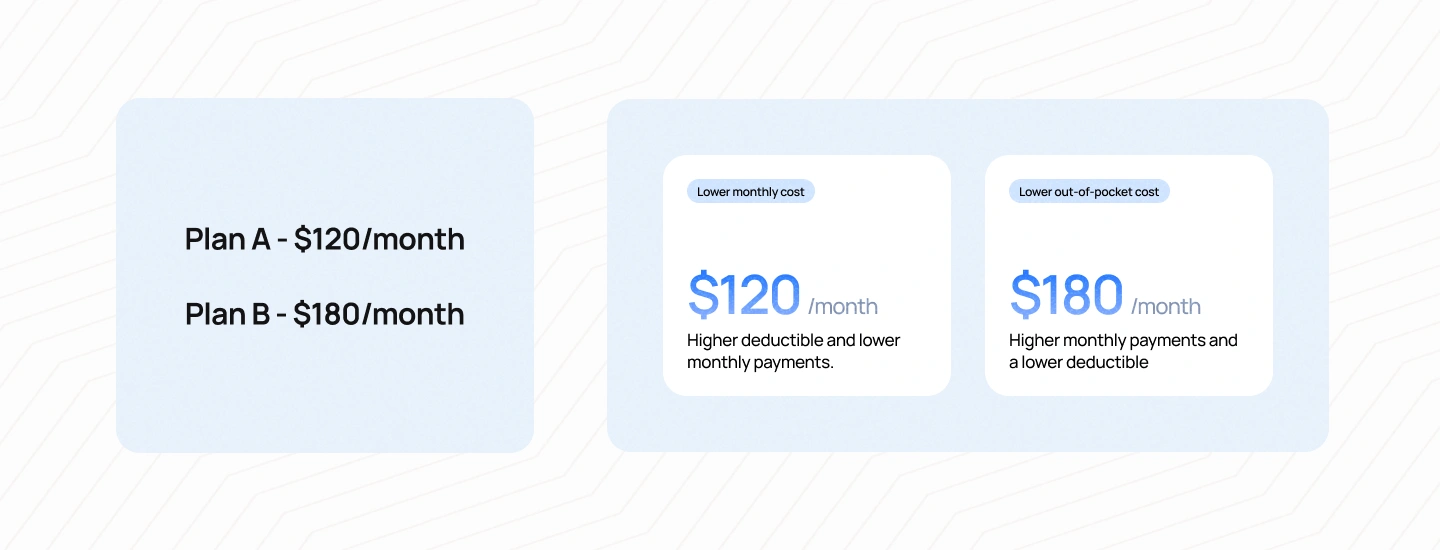
For example, instead of simply showing:
Plan A — $120/month
Plan B — $180/month
The experience can make the trade-off explicit:
Lower monthly cost
$120/month
Higher deductible and lower monthly payments.
Lower out-of-pocket cost
$180/month
Higher monthly payments and a lower deductible.
The point is not to tell users which plan to choose. It is to help them understand what the choice means.
This principle extends beyond policy comparison. A claims dashboard should not simply display an internal status code. A payment screen should not only show a transaction number. A policy dashboard should not merely list documents.
Design should help users interpret information, not just access it.
Many of the most frustrating insurance experiences happen during periods when users are waiting. A claim has been submitted, but the decision has not been made. Documents have been uploaded, but the user does not know whether they were accepted. A payment has been processed, but the policy status has not yet changed.
From the insurer’s perspective, these may be normal operational processes. From the user’s perspective, they can feel like silence.
The solution is not always to make the process faster. Sometimes the more immediate opportunity is to make the process visible.
A claims experience could show:
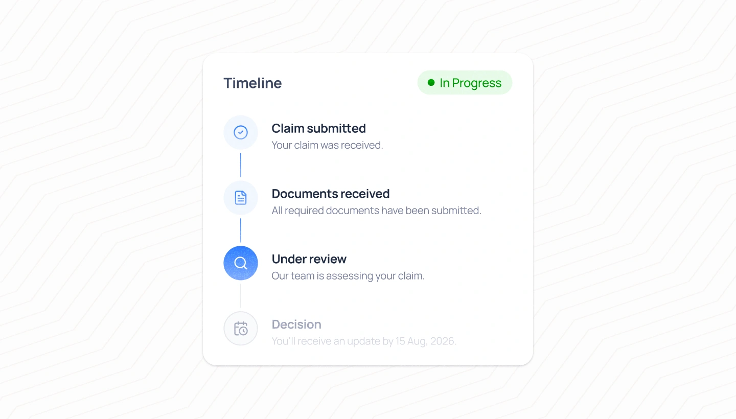
This type of progress indicator does more than show a status. It gives users a mental model of what is happening behind the interface.
The difference between “Processing” and “Under review — no action is needed from you” may seem small, but the second communicates much more. It tells the user where the process stands, what is happening, and whether they need to do anything.
When users cannot see the process, they fill the gap with assumptions. Good UX gives them something better: context.
Waiting is an unavoidable part of insurance. Claims may require investigation. Documents may need to be verified. Payments may take time to process. Some decisions cannot be automated or accelerated simply because the user wants an immediate answer.
That means waiting should be treated as part of the product experience rather than as space between two features.
A good waiting experience answers three questions: What is happening now? What happens next? When can I expect an update?
The exact answer may vary depending on the situation. Sometimes the product can provide a clear timeframe. Sometimes it can only provide the next milestone. But even limited information can be more reassuring than silence.
This is particularly important for claims. A user may not expect an immediate decision, but they do expect to know whether their claim has been received, whether anything is missing, and whether someone is working on it.
The goal is not to create false certainty. It is to replace unnecessary uncertainty with honest visibility.
Digital self-service can remove friction from routine insurance tasks, but there will always be situations that require human judgment. The mistake is not using automation. The mistake is assuming that automation should handle everything.
An insurance app should make it clear when a user can solve a problem independently and when a specialist can provide better support. If a chatbot cannot answer a question, the user should not be forced to repeat the same request in slightly different words. If a claim becomes unusually complex, the experience should offer a clear path to someone who can review the situation.
A good handoff should also preserve context. If a user has already entered information into a digital flow, they should not have to start the entire conversation from scratch when they reach a human agent.
This creates a more connected experience between digital and human channels. The user does not feel like they are leaving one system and entering another. They are simply moving to the next appropriate level of support.
Good automation does not try to replace every human interaction. It knows when human support creates more value.
Insurance apps handle sensitive personal, financial, and sometimes medical information. Security is therefore a fundamental part of the product experience, but it should not become a source of unnecessary friction.
Users need to understand that their information is protected and that important actions are secure. At the same time, security measures should be designed around the user’s context. Biometric authentication, secure document access, two-factor authentication, and clear privacy controls can provide protection without forcing users through excessive steps for routine actions.
Accessibility requires the same level of consideration. An insurance app should be usable by people with different abilities, levels of digital confidence, and circumstances. Clear typography, sufficient contrast, predictable navigation, meaningful labels, and support for assistive technologies are important foundations.
But accessibility in insurance goes beyond technical compliance. Consider the user who is older and unfamiliar with digital services. Consider someone trying to file a claim while stressed. Consider someone who has limited time, poor connectivity, or difficulty understanding industry terminology.
A product can technically meet accessibility standards and still be difficult to understand.
The broader principle is that an insurance experience should remain usable when users are not at their best.
Traditional UX metrics often focus on whether users can complete a task. In insurance, completion is only part of the story.
A user can successfully purchase a policy without understanding what they bought. They can submit a claim without knowing what happens next. They can download a document without finding the answer they were looking for.
In each case, the task is technically complete, but the experience has not necessarily succeeded.
The more meaningful question is whether the user finishes the interaction with greater clarity than when they started.
This is where the earlier principles come together. Progressive disclosure reduces cognitive overload. Contextual explanations improve understanding. Decision-oriented design makes trade-offs clearer. Visible progress reduces uncertainty. Human handoffs provide support when self-service reaches its limits.
Together, these principles create something more valuable than task completion: confidence.
The strongest insurance experiences are not necessarily the ones with the shortest flows or the fewest screens. They are the ones that make the right information available at the right moment and help users understand what that information means.
They recognize that complexity is part of the product and design around it rather than hiding it. They understand that a user comparing policies needs a different experience from someone waiting for a claim. They make important processes visible, explain decisions in context, and provide human support when technology alone is not enough.
Ultimately, good insurance UX should leave users feeling that they know where they are, what they are doing, and what happens next.
That is the real measure of simplicity in insurance: not how much complexity the product removes, but how much uncertainty it helps the user navigate.
The next step is to move these principles from theory into practice. Because the difference between a good principle and a good product is often found in the small interface decisions that users encounter every day — how a policy is compared, how a claim is tracked, how a notification is written, or how a dashboard decides what deserves attention first.
Looking at established insurance products can reveal an important truth about digital insurance design: there is no single interface pattern that works for every customer or every type of insurance. A health insurance app has different priorities from a car insurance app. A customer managing an existing policy has different needs from someone filing an urgent claim. The strongest products recognize these differences and design their experiences around the moments that matter most.
The goal is not to copy a competitor’s interface or replicate a particular feature. It is to understand the product decisions behind the experience: what information is prioritized, how complexity is communicated, and how the digital journey supports customers when they need it most.
Lemonade is often recognized for taking a different approach to the traditional insurance experience. Its digital-first model places simplicity and conversational interactions at the center of the customer journey, particularly during onboarding and policy purchase.
The broader lesson is not that every insurance company should use a chatbot or adopt the same visual style. It is that insurance products can rethink how customers interact with complex processes. Instead of asking users to understand the insurance system first, the experience can guide them through a sequence of questions that feels closer to a conversation.
This approach is particularly effective when users do not know which information is relevant to their situation. Rather than presenting a long form with dozens of fields, the product can progressively ask for information as it becomes necessary.
The design lesson is clear: when the product is complex, the interface should carry more of the cognitive burden.
However, conversational simplicity should not come at the expense of transparency. Users still need access to meaningful policy details, exclusions, and conditions before committing to a product. The best version of this approach combines a simple primary journey with deeper information available when users need to investigate further.
Progressive demonstrates another important direction in insurance UX: moving beyond the idea of an insurance app as a digital filing cabinet.
For customers managing auto insurance, the digital experience can extend into everyday needs such as accessing policy information, getting roadside assistance, managing payments, and handling claims. These functions become more valuable when they are connected to the situations in which customers actually need them.
The broader product lesson is that an insurance app should not only represent the policy. It should help customers use the value of that policy.
This distinction matters because customers do not necessarily think about insurance as a standalone product. They think about the things insurance enables them to do. A driver may not care about opening their policy document, but they care about getting help after an accident. A customer may not want to “manage their coverage,” but they may need to quickly confirm whether a particular service is covered.
The design opportunity is to move from policy-centric navigation to need-centric navigation.
Instead of asking users to start with the question, “Which insurance feature do you need?”, the product can start with, “What are you trying to accomplish?”
That shift can make the experience feel more useful even when the underlying capabilities remain largely the same.
GEICO offers another useful lesson in feature prioritization. For a large number of policyholders, the most common interactions are relatively straightforward: checking policy information, making payments, accessing documents, managing vehicles, or requesting assistance.
These tasks should not compete for attention with less frequently used functionality. A well-structured insurance app should identify the actions that customers return to most often and make them easy to reach without requiring users to navigate through unnecessary layers.
This is a useful reminder that good UX is not always about creating a highly personalized or visually sophisticated interface. Sometimes the most valuable improvement is simply reducing the number of steps between a user and a task they perform regularly.
The product lesson is simple: prioritize based on actual customer behavior, not feature importance from an internal business perspective.
An insurer may consider dozens of capabilities strategically important, but that does not mean all of them deserve equal visibility in the interface.
Health insurance introduces another layer of complexity because customers may need to understand not only their coverage but also how to navigate healthcare services.
UnitedHealthcare illustrates the importance of connecting insurance information with the actions users need to take in the real world. Finding care, understanding benefits, accessing health information, and managing insurance are closely related tasks from the customer’s perspective.
The lesson for product teams is that the digital experience should reflect the user’s mental model rather than the organization’s internal boundaries.
A customer looking for a doctor may not think, “I need to access my provider network.” They think, “I need to find a doctor near me who accepts my insurance.”
That difference may appear semantic, but it has a significant impact on UX. The first approach organizes the experience around insurance terminology. The second organizes it around the customer’s goal.
This principle applies across insurance categories. The product should translate internal processes into the language of customer outcomes.
These products take different approaches because they solve different problems. Yet several common patterns emerge.
First, the strongest insurance experiences do not force users to understand the insurer’s internal structure before they can complete a task. The interface translates complex systems into actions that make sense from the customer’s perspective.
Second, they recognize that insurance is not one continuous use case. The experience changes depending on whether someone is shopping for coverage, managing a policy, dealing with an emergency, or waiting for a claim.
Third, they prioritize context. Information becomes more useful when users understand why they are seeing it and what they should do with it.
Finally, they treat digital as part of a broader service ecosystem rather than a replacement for every other channel. The best experiences know when self-service is appropriate and when users need access to human support.
The biggest mistake product teams can make when studying insurance apps is copying visible features without understanding the product problem behind them.
A chatbot may work well for one customer journey and create frustration in another. A highly personalized dashboard may be valuable for a complex policyholder but unnecessary for someone who only needs to make a payment. A sophisticated claims tracker may improve transparency, but only if the status information behind it is meaningful.
The more valuable question is not, “Does our competitor have this feature?”
It is: What uncertainty is this feature reducing?
If the answer is unclear, the feature may not deserve to exist in the first place.
This mindset helps product teams move away from feature parity and toward experience quality. Instead of building what other insurance companies already have, teams can identify the moments where their own customers struggle most and design specifically for those situations.
That is ultimately where the most meaningful opportunities in insurance UX lie. Not in adding another feature to an already crowded app, but in finding the moments where customers still feel confused, uncertain, or unsupported — and designing the experience to change that.
Insurance products rarely fail because they lack features. More often, they fail because the experience makes users work too hard to understand those features.
A product may offer online quotes, digital policy documents, automated claims, payment management, and 24/7 support, yet still leave customers frustrated. The problem is usually not the absence of functionality. It is the way that functionality is organized, explained, and delivered across the customer journey.
The following mistakes are especially common in insurance app design because they create friction at exactly the moments when users need clarity the most.
Insurance organizations are complex. Different teams manage underwriting, claims, payments, customer service, and policy administration. It is tempting to reflect this structure directly in the product.
The result is often an app where users have to navigate according to the company’s internal logic.
They may see separate sections for policies, documents, claims, payments, and support. From an organizational perspective, this structure makes sense. From the customer’s perspective, it can create unnecessary questions.
A customer who has just been in an accident does not necessarily think, “I need to access the claims department.” They think, “I had an accident. What do I do now?”
That difference is fundamental.
The best insurance experiences translate internal systems into customer-oriented journeys. They allow users to begin with their goal or situation and then guide them toward the appropriate process.
The mistake: Organizing the product around departments and internal systems.
The better approach: Organize the experience around customer needs and real-world situations.
Insurance UX often falls into the trap of trying to make everything “simple” by hiding information.
The interface may reduce the number of visible fields, shorten explanations, or place important policy details behind multiple layers of navigation. The result can look cleaner, but the experience may become less transparent.
This is particularly risky when users are making financial decisions.
A customer should not have to sacrifice understanding in exchange for a faster purchase flow. Important exclusions, coverage limitations, deductibles, and conditions should remain accessible before the user commits to a policy.
The answer is not to show everything at once. It is to create a clear hierarchy.
Show users what they need to know first. Make the most important trade-offs visible. Provide additional detail when they want to explore further. Keep the full policy information available without making it the only way to understand the product.
The mistake: Hiding complexity in the name of simplicity.
The better approach: Structure complexity so users can understand it progressively.
Terms such as premium, deductible, beneficiary, exclusion, and coverage limit may be familiar to insurance professionals, but they are not necessarily intuitive to customers.
Simply replacing technical terms with simpler words does not always solve the problem either. Users need to understand not only what a term means, but why it matters to the decision they are making.
For example, defining a deductible as “the amount you pay before your insurance coverage begins” provides a basic explanation. But when someone is comparing two policies, they may also need to understand how the deductible affects the relationship between their monthly premium and potential out-of-pocket costs.
This is why explanations work best when they appear in context.
The product should answer the question behind the question:
“What does this mean for me?”
The mistake: Explaining terminology as isolated definitions.
The better approach: Explain concepts at the moment they affect a user’s decision.
Many insurance apps open with a dashboard filled with cards, shortcuts, metrics, and account information. The dashboard may look polished, but visual organization does not automatically create usefulness.
The problem is that dashboards often become collections of everything the business wants users to see.
The result can be a screen containing policy information, promotional banners, payment reminders, document shortcuts, claims, educational content, and support options — all competing for attention.
A better approach is to ask what the user needs from the product today.
If nothing requires attention, the dashboard can provide a simple overview of active coverage and important information. If a policy is about to expire, renewal becomes more prominent. If a claim requires action, that claim should take priority.
The interface should change its hierarchy according to context.
The mistake: Treating the dashboard as a permanent collection of every feature.
The better approach: Use the dashboard to prioritize what matters most right now.
Insurance companies often invest heavily in making claims easy to submit. That is important, but submission is only the beginning of the claims journey.
The period after submission can be just as important.
Users may spend days or weeks waiting for a decision, and during that time they may have very little visibility into what is happening. If the product only confirms that the claim has been submitted, it leaves customers with the most important question unanswered:
“What happens now?”
This is where claims tracking becomes more than a status feature. It becomes a trust mechanism.
The product should communicate what stage the claim is in, whether the customer needs to do anything, what is being reviewed, and when they can expect another update.
The mistake: Optimizing the beginning of the claim journey while treating everything after submission as an operational process.
The better approach: Design the entire claims experience, including the waiting period.
Automation can make insurance more efficient, but efficiency for the business does not always translate into a better experience for the customer.
A chatbot that handles simple policy questions may be useful. The same chatbot can become frustrating when a customer is dealing with a complex claim that requires judgment.
The problem is not automation itself. It is the assumption that automation should always be the default.
A good digital product should recognize when a situation falls outside the boundaries of a standardized flow. At that point, the experience should make it easy to connect with a person who can help.
The transition should also be seamless. Customers should not have to repeat information they have already provided or explain their entire situation again.
The mistake: Measuring digital success by how many human interactions the product eliminates.
The better approach: Measure success by how effectively the product helps customers resolve their problems.
The “happy path” is the ideal journey where everything goes as expected. The user enters the correct information, uploads the right documents, completes the payment, and receives the expected outcome.
Insurance, however, is largely about what happens when things do not go as expected.
A document may be missing. A payment may fail. A claim may require additional evidence. A customer may provide information that does not fit a predefined form. A policy may need to be changed in an unusual circumstance.
These edge cases are not necessarily rare from the user’s perspective. They are simply less predictable from the system’s perspective.
A resilient insurance product designs for these situations from the beginning. It explains errors in plain language, provides recovery paths, preserves user input, and offers support when the standard flow no longer applies.
The mistake: Designing the ideal journey and treating everything else as an exception.
The better approach: Design the recovery experience as carefully as the primary experience.
Conversion is an important business metric, especially during policy acquisition. But optimizing an insurance product only around conversion can create short-term gains at the expense of long-term trust.
A faster checkout may increase completed purchases, but what happens if customers later discover that they misunderstood their coverage? A simplified onboarding flow may improve completion rates, but what happens if users feel they were not given enough information to make an informed decision?
Insurance products need a broader definition of success.
Teams should consider whether users understand their coverage, whether they can find important information, whether claims are easier to navigate, whether customers know what to expect, and whether support is accessible when digital self-service reaches its limits.
The most valuable outcome is not simply getting someone to purchase a policy.
It is creating a customer who understands what they purchased and feels confident using it when they need it.
The mistake: Optimizing the product around the moment of conversion.
The better approach: Measure the quality of the entire customer relationship.
These mistakes may appear to be isolated UX problems, but they can create consequences that extend far beyond usability.
A confusing policy comparison can lead to poor purchase decisions. Poor information architecture can make customers feel disconnected from their coverage. An unclear claims process can increase support volume. A lack of transparency can damage trust at precisely the moment when customers need reassurance.
In other words, UX problems in insurance are rarely just interface problems.
They can affect operational efficiency, customer satisfaction, support costs, retention, and ultimately the perception of the brand itself.
This is why insurance product design needs to be approached as a business problem as much as a design problem. Every moment of confusion creates potential friction for both sides of the relationship. The customer has to spend more effort finding answers, while the insurer may have to spend more resources handling avoidable questions and escalations.
The strongest products therefore do not simply ask, “Can users complete this task?”
They ask a more demanding question:
“Can users complete this task while understanding what they are doing, why it matters, and what happens next?”
That is the standard that separates a digital insurance product that merely works from one that genuinely helps its customers.
And once the experience is evaluated against that standard, the next challenge becomes clear: building the right product requires more than designing screens. It requires a structured process that connects business goals, customer needs, service operations, technology, and UX from the very beginning.
Designing an insurance app should not begin with a blank Figma file.
Before a product team starts defining screens, choosing components, or mapping navigation, it needs to understand the business model, the insurance product, the customer journey, and the operational reality behind the experience. Without that foundation, the design process can easily become an exercise in digitizing existing processes rather than improving how customers interact with insurance.
The most effective approach is to treat insurance app design as a product transformation problem. The goal is not simply to move an offline process onto a mobile screen. It is to rethink how the customer, insurer, and supporting systems work together across the entire journey.
The first step is to understand what the business is trying to achieve and where that objective intersects with customer needs.
An insurer may want to increase digital policy purchases, reduce call center volume, improve claims efficiency, increase policy retention, or create a more personalized customer relationship. These goals will influence the product differently.
For example, if the primary objective is to increase digital acquisition, the team may focus on quote generation, plan comparison, onboarding, and checkout. If the goal is to reduce operational costs, self-service policy management and digital claims may become more important. If the business is focused on retention, the experience may need to prioritize ongoing engagement, proactive communication, and policy understanding.
The key is to avoid treating business objectives and customer needs as separate conversations.
A successful insurance product should create value for both sides. If the business wants customers to complete more tasks digitally, the product needs to give customers a compelling reason to do so. If the insurer wants to reduce support requests, the experience needs to make information genuinely easier to find rather than simply removing access to human assistance.
This alignment creates the foundation for every decision that follows.
Insurance products can be structurally complex. Coverage rules, exclusions, pricing logic, eligibility criteria, claims processes, regulatory requirements, and internal operations all influence what the customer can and cannot do.
Designers need to understand these constraints before translating them into an interface.
This does not mean designers need to become insurance specialists overnight. It means the design team needs enough domain knowledge to understand the logic behind the product.
For example, if a customer sees a claim marked as “under review,” the team should understand what that actually means operationally. Is the insurer waiting for documentation? Is an adjuster reviewing the case? Is the claim being assessed against specific policy conditions?
Without this understanding, the interface may communicate information that is technically correct but practically meaningless.
The best insurance product teams therefore work closely with domain experts, operations teams, claims specialists, legal and compliance stakeholders, and customer support teams. These perspectives reveal constraints and opportunities that cannot be discovered through interface design alone.
The product experience is only as good as the system it represents.
Once the business and product context are clear, the next step is to map how customers actually interact with insurance across time.
This means looking beyond individual screens and identifying the full journey:
Discover → Compare → Quote → Purchase → Manage → Renew → Claim → Resolve
Not every insurance product will follow exactly this sequence, but the principle remains the same. The customer relationship extends beyond acquisition.
Journey mapping helps teams identify where uncertainty, friction, and service gaps appear. A customer may have an excellent purchase experience but struggle to understand their policy afterward. Claims may be easy to initiate but difficult to track. Renewal may happen automatically but without giving customers enough context to review their coverage.
These gaps are often invisible when teams design individual features in isolation.
The journey map should therefore capture more than user actions. It should also identify the user’s questions, emotions, expectations, business processes, and potential failure points at each stage.
The goal is to understand where the experience breaks down before deciding how to fix it.
Not every touchpoint in the journey deserves equal attention.
A customer may interact with an insurance product dozens of times, but a small number of moments often have a disproportionate impact on trust and satisfaction. These might include choosing between policies, discovering that a claim requires additional information, receiving a claim decision, or trying to get urgent assistance.
These moments should become design priorities.
A useful question for the team is:
Where does the customer experience the greatest uncertainty, risk, or emotional pressure?
These moments are often more important than high-frequency but low-consequence interactions.
For example, optimizing the payment flow may improve convenience for a recurring task. Redesigning the claims experience may have a much larger impact on customer trust because the stakes are significantly higher.
Prioritizing these moments helps teams focus their design effort where it can create the greatest value.
Once the journey and critical moments are understood, the team can begin translating user needs into product requirements.
This is where research insights become actionable.
If users struggle to understand their coverage, the product may need a clearer policy overview and contextual explanations.
If users cannot compare plans effectively, the product may need a better comparison experience.
If customers frequently contact support to ask about claim status, the product may need more transparent claims tracking.
If users abandon a digital claims process because they do not know which documents to provide, the product may need clearer guidance before submission.
The important distinction is between the problem and the feature.
“Users need a claims tracker” is a feature request.
“Users feel uncertain after submitting a claim because they cannot see what is happening” is a product problem.
Starting with the problem creates more flexibility. The solution might be a claims timeline, proactive notifications, clearer status descriptions, or a combination of these.
This prevents the team from locking into a feature before understanding what it actually needs to solve.
Insurance products can become feature-heavy very quickly. There are always more documents to digitize, more workflows to automate, more integrations to add, and more services to connect.
That makes MVP prioritization particularly important.
The MVP should not be defined as “the smallest number of features we can launch.” It should be defined as the smallest product that can successfully support the most important customer journeys.
For an insurance app, that might mean prioritizing:
Other capabilities can follow once the core experience is reliable.
The priority should be to build a coherent product journey rather than a collection of disconnected features.
A smaller app that allows users to understand their coverage and manage a claim confidently can create more value than a larger app filled with features that do not work together.
Not every part of an insurance product carries the same design risk.
A simple payment confirmation may require relatively little exploration. A claims flow involving multiple documents, conditional questions, and human review may require much more.
Teams should therefore prototype the interactions where uncertainty is highest.
This might include:
Prototyping these experiences early allows teams to test whether the product logic makes sense before investing heavily in detailed UI design and development.
It also helps reveal problems that are difficult to identify in static screens. A flow may look simple when viewed as a series of frames but become confusing when users actually have to make decisions within it.
Insurance UX should be tested using realistic scenarios rather than generic usability tasks.
Instead of asking someone to “explore the claims feature,” give them a situation:
“You were involved in a car accident and need to report it. You have photos of the damage but are not sure which documents are required.”
This scenario reveals much more about the product than a simple navigation test.
The same approach can be applied to policy comparison:
“You are choosing between two plans. One has a lower monthly premium but a higher deductible. Decide which one you would choose and explain why.”
The goal is not only to observe whether users can complete the task. It is to understand whether they actually understand the decision.
This distinction is critical in insurance.
A user can successfully click through a flow and still misunderstand the product. Usability testing should therefore evaluate comprehension, confidence, and expectations alongside task completion.
One of the biggest mistakes in digital insurance transformation is designing the interface without redesigning the service that supports it.
A claims tracker cannot create meaningful transparency if the underlying claims process does not produce meaningful status updates.
A chatbot cannot provide useful support if it has no access to the information needed to answer customer questions.
A digital document system cannot simplify policy management if customers still need to call an agent to understand what the documents mean.
The interface and the service need to work together.
This is where service design becomes particularly important. Product teams need to understand what happens behind the screen: which teams are involved, which systems exchange information, where delays occur, and what information can realistically be exposed to customers.
The best digital experiences are often created by improving both the frontstage and backstage of the service.
Once the product is launched, teams need to evaluate whether the experience is actually improving the customer relationship.
Conversion and adoption metrics are useful, but they are not enough.
A more complete measurement framework might include:
Understanding: Can users explain what their policy covers?
Task success: Can customers complete important tasks without unnecessary assistance?
Efficiency: How long does it take to complete common journeys?
Support demand: Are avoidable customer service requests decreasing?
Claims transparency: Do customers understand the status and next steps of their claims?
Trust: Do users feel confident that they understand what is happening?
Retention: Does a better digital experience contribute to stronger long-term relationships?
These metrics help teams move beyond the idea that a successful insurance app is simply one that receives a high number of downloads or digital transactions.
The real measure of success is whether the product makes the insurance relationship easier to understand and easier to manage.
The next generation of insurance apps will not be defined simply by having more digital features. The bigger shift will come from how intelligently those features work together.
As insurance becomes increasingly digital, customers will expect more than the ability to view a policy or submit a claim from their phones. They will expect the product to understand context, anticipate important moments, communicate proactively, and provide support without making them navigate unnecessary complexity.
This does not mean that every insurance app needs to become more automated or more technologically advanced. The real opportunity is to make digital insurance feel more responsive to the customer’s situation.
Traditional insurance experiences are largely reactive. The customer takes action, and the insurer responds.
The customer submits a claim. The insurer processes it.
The customer misses a payment. The insurer sends a reminder.
The customer contacts support. The insurer provides an answer.
Digital products can change this relationship by identifying relevant moments before the customer has to take action.
A proactive insurance experience might notify a customer that their policy is approaching renewal and give them enough time to review their coverage. It might identify that a payment method is about to expire and prompt the user to update it before a payment fails. It might detect that a claim is missing information and explain exactly what is needed before the customer has to contact support.
The difference is subtle but important.
Instead of waiting for users to discover problems, the product helps them avoid unnecessary friction in the first place.
This shift changes the role of the insurance app. It becomes less of a place customers visit when something goes wrong and more of an ongoing service that helps them manage risk over time.
The future of insurance UX will also become more contextual.
A customer who opens an app after purchasing a policy should not necessarily see the same experience as someone who has been a policyholder for five years. Someone who has just submitted a claim should not see the same priorities as someone who is simply checking their payment history.
Context can come from many sources: the customer’s policy, recent activity, upcoming deadlines, current journey stage, or the type of insurance they own.
The goal is not personalization for its own sake. It is relevance.
A contextual dashboard might surface renewal information when renewal is approaching, claim updates when a claim is active, or relevant support when a customer is in the middle of a high-stakes process.
The experience becomes more useful because it reflects the customer’s current situation rather than presenting the same interface to everyone.
This is an important evolution in information architecture. Instead of asking users to navigate through the product to find what matters, the product can bring what matters to the user.
Artificial intelligence will likely play an increasing role in insurance products, but some of the most valuable applications may not be the most visible.
Much of the conversation around AI focuses on automation: chatbots, automated claims processing, personalized recommendations, and virtual assistants. These applications can be valuable, but AI also has another important role to play: helping users understand complex information.
Insurance is full of documents, policy language, conditions, and terminology that can be difficult for customers to interpret.
AI-powered experiences could help translate this complexity into more accessible explanations. A customer might ask: “Does my policy cover water damage?”
Instead of searching through a long policy document, the product could help surface the relevant information and explain the answer in plain language, while still linking back to the official policy terms.
The key challenge will be trust.
AI should not create the impression that a generated explanation is equivalent to the actual policy contract. Users need to understand the source of information, the limitations of the answer, and when they should seek human assistance.
The strongest AI experiences in insurance will therefore be designed around explainability and traceability, not simply convenience.
The goal is not to replace the policy with AI. It is to help customers understand the policy they already have.
Claims are another area where digital products are likely to evolve significantly.
Today’s claims experiences often focus on tracking what has already happened. The next generation may increasingly help customers understand what is likely to happen next.
Instead of simply showing that a claim is “under review,” the product could provide more meaningful context around the process, identify potential delays, explain what information is being evaluated, and communicate when the next update is expected.
With the right data and operational systems, products may also become more predictive. They could identify potential missing information earlier, estimate likely processing timelines, or proactively notify users when a case requires attention.
The goal should not be to create artificial certainty.
Insurance processes will always contain variables that cannot be predicted perfectly. The value of predictive UX is therefore not promising an exact outcome. It is helping customers understand the range of possibilities and prepare for what comes next.
This could fundamentally change the emotional experience of claims.
Instead of asking, “What is happening to my claim?” users may be able to understand where they are in the process, what is likely to happen next, and whether they need to do anything.
That is a much more valuable form of transparency.
The future of insurance will also involve a shift away from thinking about the app as the primary destination.
Insurance increasingly connects with other services and experiences. Auto insurance can connect with mobility and roadside assistance. Health insurance can connect with healthcare providers and wellness services. Home insurance can connect with property management and smart home technology.
This creates opportunities for insurance to become more embedded into the experiences people already use.
The implication for UX is significant.
Customers may not always think, “I need to open my insurance app.”
They may simply need help in the context of another activity.
A connected insurance experience could provide support at the moment it becomes relevant, rather than requiring the customer to leave one environment and search for the appropriate insurance service.
This moves insurance from a standalone digital product toward a broader service ecosystem.
The challenge will be maintaining clarity and trust as more systems become connected. Customers need to understand what information is being shared, why it is being shared, and who is responsible for the service they are receiving.
As automation improves, it may seem logical that human interaction will become less important.
In reality, the opposite may happen.
As routine interactions become easier to automate, human support can become more focused on the moments where empathy, judgment, and expertise matter most.
This means the future of insurance UX is unlikely to be fully digital or fully human. It will be hybrid.
Technology can handle repetitive tasks, surface information, explain processes, and provide immediate assistance. Humans can step in when situations become complex, emotional, or difficult to resolve through standardized logic.
The key is designing the transition between these two modes.
A customer should not feel like they are moving from one disconnected system to another. The digital product should provide the human agent with relevant context, and the human agent should be able to continue the conversation without forcing the customer to start again.
The best insurance experiences will therefore treat human support as part of the product architecture rather than as a fallback when technology fails.
As more insurers adopt similar digital capabilities, individual features will become less differentiating.
Most major insurance products will eventually offer digital payments, policy management, mobile claims, notifications, and some form of AI-powered assistance.
The competitive advantage will increasingly come from how those capabilities are combined.
These questions point toward a broader definition of digital insurance quality. The future will not belong to the insurer with the most advanced technology. It will belong to the insurer that uses technology to make the customer feel more informed, more supported, and more in control.
Insurance has always been a complex product. Technology will not change that overnight. What technology can change is how people experience that complexity.
The next generation of insurance apps will increasingly move from static information toward contextual guidance, from reactive service toward proactive support, and from isolated features toward connected experiences.
AI may help customers understand their policies. Predictive systems may help them anticipate what happens next. Connected ecosystems may bring insurance into the moments where it becomes relevant. Human support may become more specialized and more valuable. But beneath all of these changes, the fundamental UX challenge remains the same. People need to understand what they have, what it covers, what they need to do, and what happens next.
Technology may evolve. The interfaces may change. The channels may become more connected. But the product that consistently reduces uncertainty will continue to be the one that earns trust. And for insurance, trust is not simply a brand attribute.
It is an experience.
Insurance is a complex product by nature. Policies contain conditions, exclusions, financial commitments, and processes that customers may only need to understand when something important happens. That complexity cannot simply be removed by putting insurance into an app.
What digital product design can do is make that complexity easier to navigate.
The best insurance apps do not try to hide complexity behind a cleaner interface. They help customers understand what they are buying, make informed decisions, manage their coverage with confidence, and know what to expect when they need to make a claim.
That requires more than a collection of digital features. It requires a product experience built around the customer’s actual journey.
From policy comparison and onboarding to claims, payments, renewals, and human support, every interaction should answer the questions customers are most likely to have: What does this mean for me? What do I need to do? What happens next?
This is where thoughtful UX can create a meaningful difference.
A well-designed insurance product can reduce unnecessary support requests, make complex information easier to understand, improve operational efficiency, and strengthen customer trust. More importantly, it can change how people experience insurance — from something they only think about when something goes wrong into a service they feel confident managing throughout their lives.
At Lollypop Design Studio, we believe the most effective digital products start by understanding the problem behind the interface. For insurance companies and financial services businesses, that means looking beyond individual screens and features to understand the entire customer journey, the business model, and the systems that make the experience possible.
Whether you are building a new insurance app, modernizing an existing digital product, or exploring how AI and emerging technologies can improve the customer experience, the right place to start is not with a feature list.
It is with the people who will use the product and the moments that matter most to them.
If you are exploring how to create a more intuitive, trustworthy, and future-ready insurance experience, talk to Lollypop. Our team can help you turn complex business and customer challenges into digital product experiences that are easier to understand, easier to use, and designed to create lasting value.
The essential features of an insurance app depend on the type of insurance and the needs of its customers. However, most insurance products should provide easy access to policy information, coverage details, payments, digital documents, claims, notifications, and customer support. More advanced experiences may include personalized dashboards, policy comparison, digital ID cards, provider search, roadside assistance, AI-powered support, and real-time claims tracking.
The priority should not be to include as many features as possible. Insurance companies should focus on the features that support the most important customer journeys and reduce friction at critical moments.
Most insurance apps should include policy and coverage management, secure payments, digital policy documents, claims submission and tracking, notifications, and customer support. Depending on the insurance category, additional capabilities may be essential. For example, health insurance apps may need provider search and digital insurance cards, while auto insurance apps may prioritize roadside assistance, accident reporting, and vehicle management.
The right feature set should be determined by the customer’s journey rather than by a standard checklist.
UX design can make insurance easier to understand and navigate by simplifying information architecture, explaining complex terms in context, making important processes visible, and guiding users toward the next appropriate action.
For example, instead of displaying a claim status that simply says “Processing,” a better experience can explain what is currently happening, whether the customer needs to take action, and when they can expect the next update.
Good insurance UX is not about removing all complexity. It is about helping users navigate complexity with greater clarity and confidence.
A good insurance app helps customers understand their coverage, complete important tasks efficiently, and feel confident about what happens next. It should make essential information easy to access, provide context when decisions are complex, and offer appropriate support when users encounter problems.
A strong insurance app also connects digital interactions with the broader service experience. The product should work consistently with customer support, claims operations, payment systems, and other channels rather than functioning as an isolated digital interface.
Insurance apps should make the entire claims journey visible, not just the initial submission process. Customers should be able to understand how to start a claim, what information or documents are required, whether their submission is complete, what stage the claim is currently in, and what happens next.
A useful claims experience should also communicate when the customer needs to take action and when no action is required. Clear progress indicators, meaningful status updates, proactive notifications, and easy access to human support can significantly reduce uncertainty during the claims process.
AI can be valuable in insurance apps when it helps customers understand information, complete routine tasks, or receive more relevant support. Potential use cases include explaining policy terms in plain language, helping users find relevant coverage information, answering common questions, summarizing documents, and guiding customers through standardized processes.
However, AI should not replace transparency or human judgment. Insurance products involve financial and sometimes high-stakes decisions, so users should be able to understand where information comes from and access human assistance when their situation requires expertise or empathy.
The timeline depends on the scope, complexity, number of user journeys, integrations, regulatory requirements, and maturity of the existing product. A focused MVP with a limited number of core journeys will typically require less time than a comprehensive platform supporting multiple insurance products and complex claims processes.
A strong process usually includes discovery and research, journey mapping, information architecture, feature prioritization, UX design, prototyping, usability testing, visual design, and collaboration with development teams.
The most important factor is not how quickly screens are produced, but whether the team has enough time to understand the underlying product and validate the experience before development.
Lollypop Design Studio can support insurance and financial services companies across different stages of digital product design, from understanding customer problems and mapping complex journeys to defining product experiences, designing user interfaces, and creating scalable digital products.
The focus is not simply on making an insurance app look modern. It is about connecting business goals, customer needs, technology, and service operations to create an experience that is easier to understand and more effective to use.
For companies looking to redesign an existing insurance product or build a new digital insurance experience, the first step is to identify the moments where customers experience the most friction and uncertainty. From there, the product can be designed around solving those problems in a meaningful and measurable way.