When fees converge and features reach parity, the interface becomes the product. That shift is already happening — and it is redefining what it means to win in investment platforms.
Globally, retail investing has seen sustained growth: active investment accounts surpassed 150 million in India alone in 2024, representing 30% year-on-year growth, according to CDSL and NSDL data. Across mature markets, the pattern is the same — more investors, more platforms, and less differentiation on price or functionality. The platforms winning retention are winning on clarity.
For retail investors, the difference between a well-designed portfolio dashboard and a cluttered one is the difference between a confident decision and an abandoned session. For platforms, that hesitation is expensive — in trade volume, session length, and long-term retention.
This guide covers the core principles of effective investment dashboard UX: information hierarchy, data visualization, emotional design during market downturns, and the UI patterns that turn a first-time user into a long-term investor.
Investment decisions carry real emotional weight — and the stakes are highest precisely when markets are moving against users. Research in behavioral finance consistently shows that investors experiencing portfolio losses are more likely to make impulsive exit decisions. A poorly designed dashboard does not just fail to help in these moments; it actively amplifies the anxiety driving those decisions.
This is where dashboard UX becomes a trust lever. The most impactful design choices are not the ones users notice during calm sessions — they are the ones that hold up under pressure.
The single most important element is information hierarchy: total portfolio value must be visible at a glance, without scrolling or mental calculation. When a user in a market downturn has to work to find their own position, the interface has already failed.
Contextual benchmarking — showing portfolio performance alongside a relevant index — reframes a loss from a personal failure into a market event. Sub-second load times signal that the platform is stable and responsive precisely when users are most likely to be refreshing obsessively. Together, these choices lower cognitive load, reduce panic-driven decisions, and build the kind of long-term trust that translates into retention.
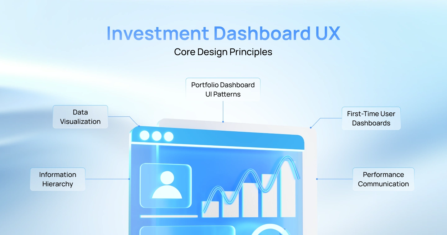
The layout of an investment dashboard should adhere to the principle of progressive disclosure. Essential information like total portfolio value, current invested capital, and absolute gains/losses should occupy the most visible and accessible sections of the screen.
Lower tiers of the visual hierarchy should present individual asset holdings and sector allocations. This approach resolves the clash between comprehensive data desired by professional investors and the immediate clarity sought by new-entry investors. Importantly, designers should avoid vague terminology in this area, focusing instead on delivering clear, concise information.
Investment dashboards must present financial data with absolute clarity—the user should understand their position without performing mental math. This requires matching chart type to the behavioral question being answered:
Portfolio dashboards face a fundamental tension: retail investors need comprehensive visibility into their holdings, but too much data on a single screen leads to cognitive overload and decision paralysis. Effective layouts resolve this through structured information design. Cards are the primary container for individual asset holdings, with each card displaying: asset name, current value, absolute gain/loss (with color indicator), and a small trend chart called a sparkline—a wordless, mini line graph showing 12-month performance at a glance, without axes or numbers. No calculations required.
The summary header (total portfolio value, today’s performance, and year-to-date return) must remain visible during scrolling as a sticky element at the top. This persistent anchor prevents users from losing context as they drill into individual asset details. Asset classes should be grouped in collapsible accordion sections (Equities, Mutual Funds, Gold, Fixed Deposits) to reduce visual clutter on mobile while maintaining full data accessibility on desktop. A floating action button (FAB) anchored to the bottom right provides one-tap access to the highest-value user actions: starting a new Systematic Investment Plan (SIP—regular automated deposits), depositing additional capital, or triggering a portfolio rebalance.
The first time a user opens an investment app after account creation, the dashboard is empty — and that empty state is one of the highest-risk moments in the entire product experience. Without guidance, users face three unanswered questions: What should I buy? How much should I invest? Is this app right for me? Uncertainty at this stage causes abandonment.
The solution is to treat the empty state as an active onboarding flow, not a blank screen waiting to be filled.
Structure the first-time experience as a five-step guided investment:
The visual presentation of a portfolio loss directly influences whether a user holds their position or exits impulsively. Dashboards that lead with daily P&L during a market downturn amplify anxiety rather than provide context — and anxiety-driven decisions are rarely in the investor’s long-term interest. Emotional design for investment dashboards means reframing the data, not hiding it. Three techniques matter most:
A robust wealth management application must feature an interconnected suite of screens to handle diverse financial tasks effectively:
Serving as the command center for users’ wealth, this screen features a comprehensive portfolio summary, real-time market updates, upcoming SIP reminders, and contextual nudges.
This screen provides detailed insights into specific holdings, including historical performance charts, asset allocation details, and prominent action buttons for buying, selling, or initiating SIPs.
The explore function helps users discover new investment opportunities through curated mutual fund categories, risk-based filters, and comparison tools.
This screen functions as a transparent log of financial movements, allowing users to filter records by asset type, date, or transaction status while facilitating tax-compliant statement downloads.
Visualizations here track user progress toward specific life milestones, employing linear bars and projected timelines to depict progression toward retirement, home purchases, or educational savings.
This section handles compliance and security, displaying statuses for document verification, registered nominee information, and linked banking accounts.
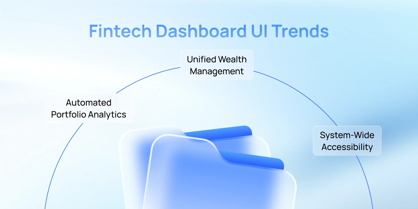
Three trends are reshaping investment dashboard design in 2026:
Creating a successful high-retention investment platform involves harmonizing complex financial data with clear and effective design solutions. At Lollypop Design Studio, we design investment platforms with that behavioral layer built in — from information hierarchy and emotional design to accessible data visualization and real-time system performance. For a consultation on enhancing your product’s user experience, reach out to our fintech design team today.
If you are building or redesigning an investment platform, contact our fintech design team to schedule a strategy session. And if you want to know how discoverable your platform is across AI-powered search and procurement tools, test it on Lollypop Spot.

Investment dashboard UX is the practice of designing portfolio management interfaces to structure, visualize, and display financial data clearly. It ensures users can assess their financial status and execute transactions confidently without experiencing cognitive overload.
A standard portfolio dashboard UI must feature an aggregated net worth calculation, absolute and percentage return values, asset allocation charts, chronological performance timeframes, and direct action entry points for purchasing, liquidating, or modifying systematic investments.
Wealth management layouts focus on extended financial horizons, milestone-based planning, and managing high emotional stakes. They require balancing complex variables like diverse asset classes and statutory tax rules with clean, reassuring visual design, setting them apart from simple transactional utilities.