Image
Cloudhop Bakeshop

Cloudhop Bakeshop :

Where sweet dreams come true

Redefining the shopping experience of cookies and cupcakes with stunning visuals and a personalized touch—so real, you’ll feel like grabbing them off the screen.

Cloudhop Bakeshop USA E-Commerce Website
Banner Image
Brief

Cloudhop Bakeshop is a pastry brand specializing in crafting premium custom cookies and cupcakes, celebrated for their exceptional quality, authenticity, and flavor.


The project focuses on bringing these elements to life through a visually engaging digital platform, complemented by a range of innovative services and tools. By redefining the traditional e-commerce pastry-ordering experience, Cloudhop Bakeshop aims to create a niche, authentic, refreshing, and deeply personal journey for its customers.

Challenge

With many e-commerce platforms in the food domain feeling templatized and repetitive, the primary challenge was to establish a distinctive brand identity that would differentiate from other competitors in the market. This involves creating an optimal user experience that leaves a lasting impression. Crafting an emotional journey that evokes nostalgia, joy, and happiness—while tailoring the experience to individual users—was a key focus.


Another challenge was instilling trust and fostering loyalty through carefully placed mechanisms at strategic touchpoints throughout the platform.


Finally, ensuring a seamless, cohesive experience from the moment users land on the homepage to the purchasing and delivery process requires careful attention to detail, aiming to build long-term engagement and encourage repeat visits.

DISCOVER

The research process began by understanding the users and their primary objectives when visiting the platform. As a greenfield initiative targeting Gen Z and Millennials, a discovery workshop was conducted with key stakeholders to uncover valuable insights into user pain points, desires, challenges, and frustrations with online ordering.


Key insights from users included :


  • The need for a seamless order and purchase flow with the ability to be assisted at any point.
  • Greater options for customization and personalization of products.
  • Scalability of services for scenarios like gifting, catering..
  • Easability of finding the products on the platform.
  • Feeling of reliability and trustworthiness for a long term engagement.


These insights served as the foundation for addressing user needs and shaping a more effective and engaging platform experience.

DEFINE

The discovery workshop provided valuable insights into the brand’s vision from both short-term and long-term perspectives, emphasizing its goal of becoming a happy place and comfort zone for users. With cupcakes and cookies symbolizing comfort, joy, and emotional upliftment, the brand aimed to be perceived as delicious, flavorful, and deeply emotion-evoking.


Focusing on trust-building, personalization, and fostering a conversational tone, the brand aspired to connect with users on a deeper level. It sought to be recognized as the go-to choice that fulfills every craving and satisfies both personal desires and gifting needs, truly hitting the user’s “sweet spot.”

Wireframes

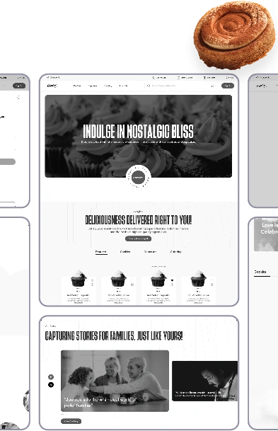
After finalizing the information architecture through multiple iterations, we moved on to wireframing. High-fidelity wireframes were created as a foundation, which then evolved into the visual design phase. Throughout the process, it was essential to address the pain points and opportunities while aligning with the key considerations identified earlier.
Main Wireframe
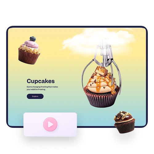
Cupcake
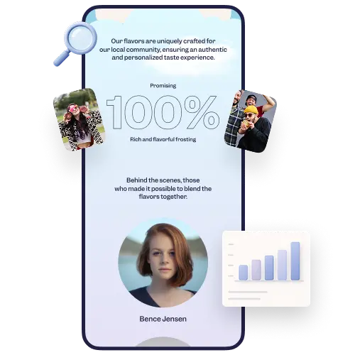
The wireframing process began with designing an intuitive, dynamic, and visually appealing homepage that highlighted the brand’s unique identity. This included showcasing the range of products, fostering a sense of community, emphasizing key services and USPs, and ensuring easy accessibility and reachability for users.
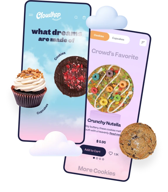
Mobiles
The Product Description page was designed with a focus on accessibility to key food and dietary information, complemented by rich visual imagery of the product. It also prioritized user-friendly customization options, allowing customers to quickly adjust quantity and explore additional product choices for a personalized experience.
UI Top

User Interface

The design process for the Cloudhop Bakeshop project was a highly creative and exploratory journey, focused on creating a whimsical, visually captivating experience that stood out in the e-commerce space. Below is a detailed account of the work:

Main Image
Number

Understanding the Client’s Vision

Icon
Initial Interaction:
During discussions with the client, they expressed a desire for a whimsical design theme, breaking away from the typical structured layouts of most 
e-commerce websites.
Icon
Brand Analysis:
The client already had a strong branding foundation, including specific fonts and a color palette. The challenge was to creatively work within these constraints while introducing innovative visual elements that amplified their identity.
Number

Research and Competitor Analysis

Icon
Conducted a deep dive into competitors’ websites in the food and dessert niche.
Icon
Observed that many lacked visual storytelling elements and emotional engagement that could tempt users into purchasing.
Icon
Identified opportunities to differentiate Cloudhop Bakeshop through dynamic visuals and a sense 
of playfulness.
Main Image
Main Image
Number

Introducing Visual Storytelling

Icon
Suggested adding a video showcasing the process of baking cookies and cupcakes to evoke sensory emotions and create an irresistible temptation 
for users.
Icon
Created a mood board using MidJourney AI to visualize the video’s whimsical tone and aesthetics.
Icon
Collaborated with the client’s media team, resulting in a visually stunning video that became a central feature of the website.
Number

Designing the Whimsical Theme

Icon
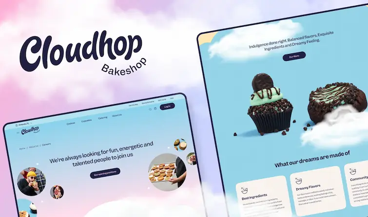
Instead of standard grid-based structures, used asymmetrical layouts to add a sense of whimsy.
Icon
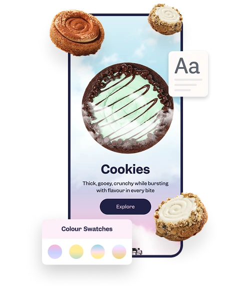
The page uses soft pastel gradients and floating cloud motifs to create an ethereal, dreamy vibe.
Icon
High-resolution product images are presented prominently, with careful attention to lighting, texture, and composition to make them look tempting and delicious.
Icon
When users hover over a button, animated clouds gracefully drift over the button, creating a magical and engaging effect. This interaction not only delights the user but reinforces the brand's dreamy identity.
Icon
Worked within the client’s existing font and color palette but emphasized vibrant, dessert-inspired tones to create a lively and inviting experience.
Icon
Highlighted headers and CTAs with bold, eye-catching typography to guide users seamlessly through the site.
Main Image
Main Image
Number

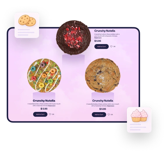
Enhancing the Product Showcase

Icon
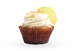
Designed product pages to include high-resolution images of cookies and cupcakes
Number

Creating a Cohesive Visual Language

Icon
Focused on maintaining a consistent whimsical tone throughout the site, from the homepage to checkout.
Icon
Designed icons, banners, and tailored to the theme, ensuring every visual element added value to the user experience.
Main Image
Main Image
Number

Testing and Iteration

Icon
Conducted multiple design reviews and usability testing to ensure the visuals resonated with the target audience (Gen Z and Millennials).
Icon
Iterated based on feedback, fine-tuning the balance between playfulness and functionality to avoid overwhelming users.

Impact of the UI

Successfully captured the whimsical essence envisioned by the client.

Enhanced emotional engagement through visual storytelling and dynamic interactions.

Created a distinct, playful user experience that not only reflected the brand’s identity but also boosted conversions by making the products irresistibly tempting.

Cupcake

UI Design

Conclusion

In conclusion,we were able to successfully develop a visually strong platform that aligns with the company’s brand identity and resonates with users. By emphasizing a cohesive visual language, we ensured the platform communicated the brand’s essence clearly. Mobile optimization was prioritized, recognizing it as the primary touchpoint for users.

The user journey was designed to be seamless, with the customer path to order streamlined to take no more than 3 minutes. By adhering to the 3-click rule, we made navigation intuitive and encouraged users to complete their purchase quickly.

Additionally, the platform was localized to Orlando, focusing on creating a tailored experience that connects with the city’s audience. The result is an easy-to-navigate, highly engaging platform that enhances the user experience and drives conversion rates.

Image