
Image
Mega We Care

Transforming Lives: Building a One-Stop Solution for Holistic Health and Wellness

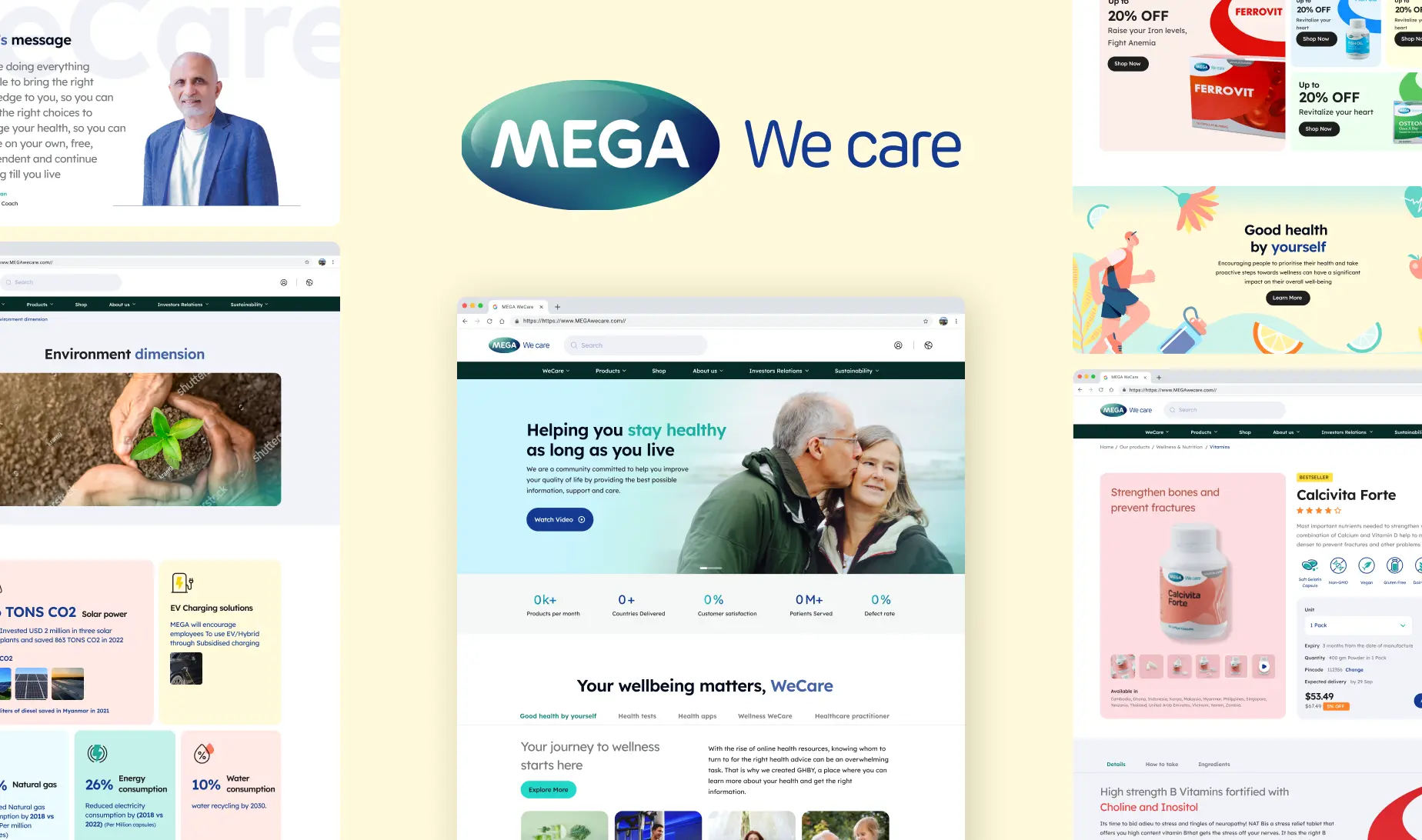
Mega We Care offers safe, high-quality pharmaceuticals, nutraceuticals, and FMCG items, providing comprehensive health solutions to millions worldwide.
South East Asia Web + Mobile Responsive Branding + UX & UI Design
Image
Brief

Mega We Care is dedicated to providing safe, high-quality nutritional supplements, herbal remedies, and medications to millions worldwide. Based in Thailand, their products span across pharmaceuticals, nutraceuticals, and FMCG items, offering a comprehensive solution.They are not just a manufacturer, they aim to revolutionise medical education to common people through innovative approaches.

With a new website and enhanced branding, they aim to expand their reach to a wider audience, transforming the healthcare landscape.

Our goal was to redesign their current website, make it more user friendly and engaging by telling stories, and elevate their online presence. The primary aim was to consolidate all their offerings, including products, services, and educational resources, into a cohesive, user-friendly platform. Additionally, we implemented a new e-commerce segment to enable the online sale of targeted medications, enhancing digital presence and improving customer accessibility.

Explore Our Intuitive User Interface
Challenge

The major challenge we faced was the sheer volume of platforms already saturating the market, each vying for the attention of health-conscious consumers. So to stand out amongst them, we knew that our process had to be innovative and should deeply resonate with our target audience.

The diverse age spectrum posed a significant challenge to us. From tech-savvy 20-year-olds to more mature individuals in their 60s, bridging this generational gap presented a unique set of challenges. Our platform needed to be intuitive, user-friendly, and engaging for digital natives while also being simple and accessible for those less familiar with technology.

Many factors influence user delight. A delightful experience will entice users to stay on the platform for longer and explore. We worked towards building a strong content structure and the overall navigation and discoverability of products on the platform.

Discover

We organised a 2 day discovery workshop with the MegaWeCare team to understand the business objectives, gain clarity and uncover any discrepancies in the project vision. We identified the intended personas for the application and the points of motivation for them to come to our platform.

We realized the key needs were:

  • To promote exploration and create an assistive user journey.
  • To work towards user delight.
  • To build a strong content structure.
Define

Upon delving deeper into user needs and business objectives, our initial steps involved pinpointing user personas and mapping out the current user journey. We identified challenges and redesigned the information architecture, focusing on user personas to improve navigation and established a design a direction as follows:

  1. Have a story unfold through each of the journeys, ensuring users don’t feel lost or confused at any stage.
  2. To communicate a story through the website and focusing on the resources section and ‘Mega Dharma’ to promote our values.
  3. To cross link various pages like blogs to trending product pages and product pages to other similar products, essentially cross selling products and services that we have to offer to entice the user to spend more time exploring products on the platform.
  4. Using a consistent and relevant tone of voice that reflect in CTAs, having a personalised touch has proven to make the user experience of any platform delightful.
  5. Having relevant, minimal and well designed micro-interactions  to explore possibilities of a product, application or space that can pleasantly surprise users and create a more engaging journey.
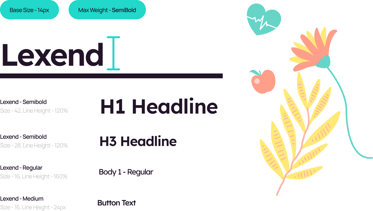
Typography

The main purpose is to optimize the user’s ability to accomplish a task. We wanted to make sure that the user has a seamless experience while using the app.

Image
Color

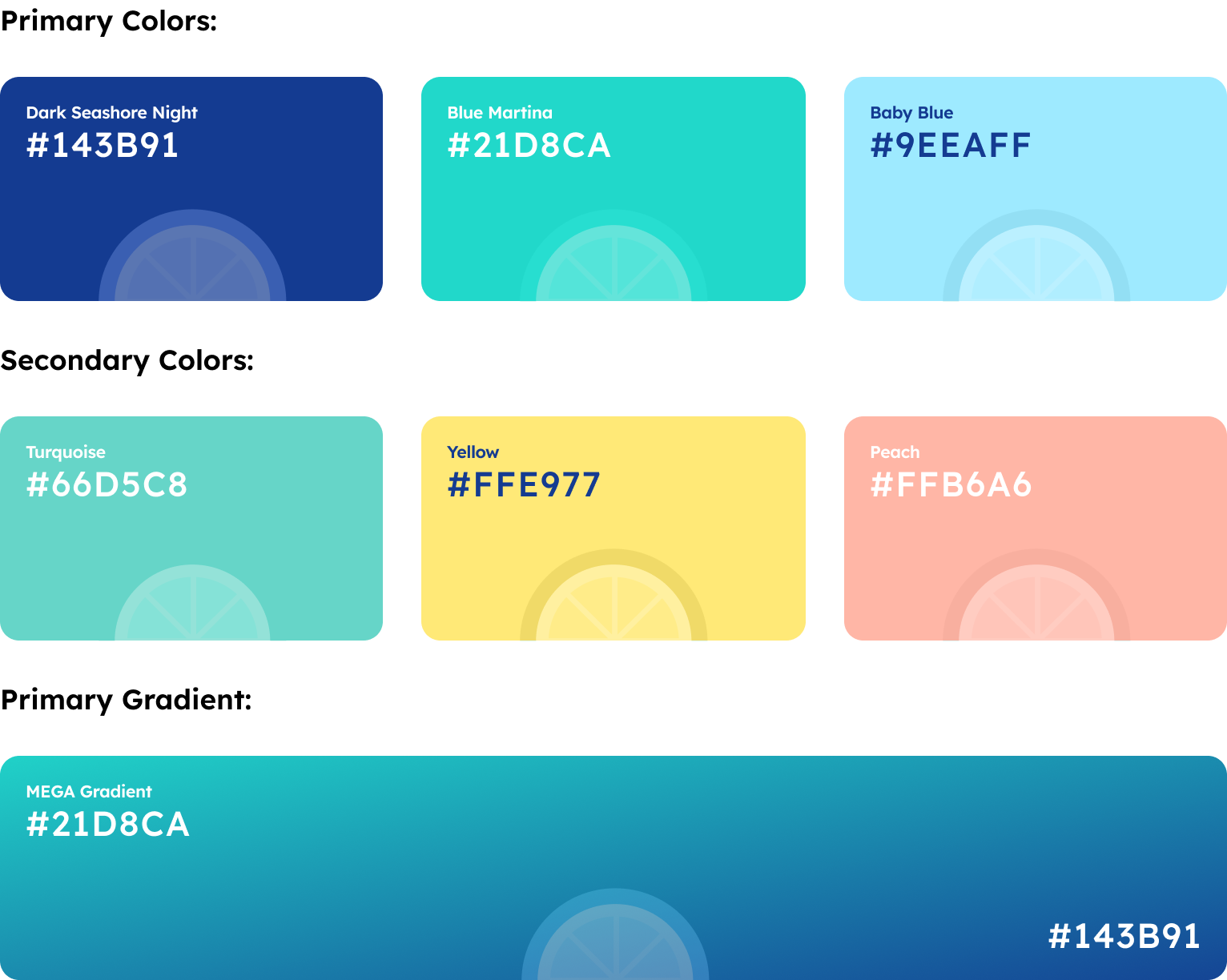
Utilizing Dark Seashore Night, Blue Marina & Baby Blue as primary colors creates a refreshing and authoritative visual presence, while our selection of pastel colors in the secondary palette adds a touch of sophistication and versatility.
Image
Image

Conclusion

What did we achieve from the project?

  • Added an robust e-commerce platform.
  • Enhanced the website’s aesthetics, infusing it with a fresh and appealing look to captivate users.
  • Emphasized educational content over products to effectively convey the company’s mission.
  • We’ve crafted a visually appealing, intuitive, and easily accessible user experience.
Image