

Stakeholder interviews and workflow mapping to uncover pain points across modules
Competitive analysis of solar SaaS platforms sites and audit of existing IA and user flows
Restructuring information architecture to align with user mental models
Low-fidelity concepts exploring new navigation patterns and modular layouts
Translating concepts into wireframes and high-fidelity screens across core modules
creating a language around the brand and setting some rules to make it consistent
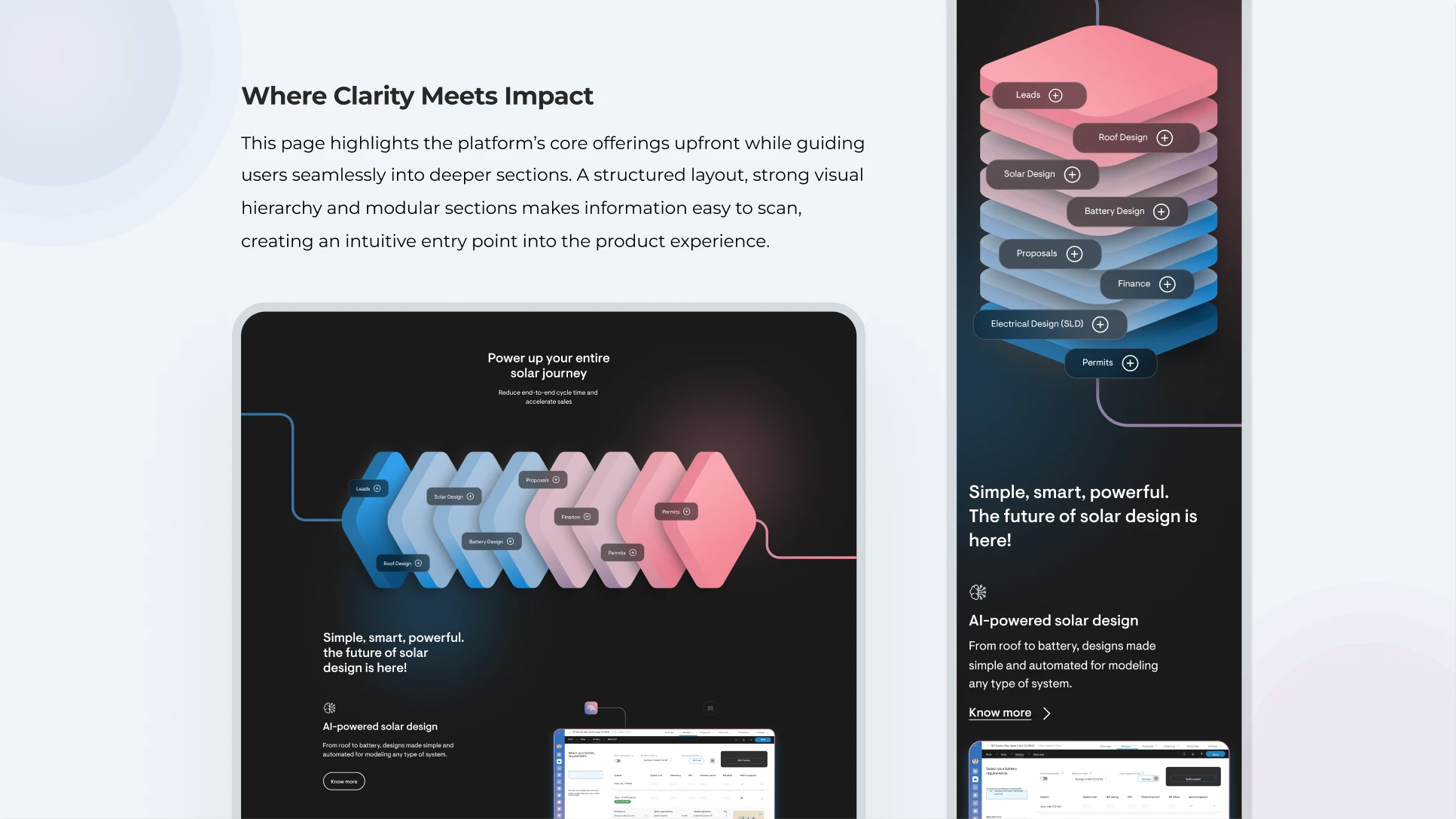
Solargraf set out with a clear mission: to transform how solar professionals interact with complex design and sales workflows. The platform brings together roof modeling, system design, proposal generation, permit planning, and financing into a single, unified journey — yet the existing experience wasn’t reflecting the sophistication of what lay under the hood.
Our goal was to redesign Solargraf’s platform experience to improve usability, strengthen visual clarity, and streamline key workflows, with the aim of enabling professionals to navigate complex processes more efficiently and with greater confidence. The platform needed to feel as powerful as it actually was — intuitive enough for sales teams and precise enough for solar designers and operations professionals alike.
The redesign presented a set of layered and interconnected challenges. At its core was the task of transforming complex, data-heavy workflows into clear, structured experiences — without stripping away the depth and precision that expert users rely on.
Users engaged with large volumes of information spread across multiple steps, often needing to interpret and connect data without sufficient visual guidance. Navigation across modules lacked continuity, and interaction patterns varied inconsistently, creating friction at every stage of the workflow.
A key challenge was creating a cohesive design language across multiple modules and journeys — from leads and roof design through to battery configuration, proposals, financing, and permits — while maintaining visual richness and precision. Balancing scalability with clarity, and building a system that could accommodate future growth, made this a deeply complex design problem to solve.
Through product exploration, stakeholder discussions, and in-depth workflow analysis, we developed a comprehensive understanding of how users interacted with the platform across different stages. We observed that users engaged with large volumes of information spread across multiple steps, often requiring them to interpret and connect data without sufficient visual guidance.
Navigation across modules lacked continuity, and interaction patterns varied — leading to inconsistencies in the overall experience. These insights highlighted the need for a more structured information architecture, clearer visual hierarchy, and a cohesive system that could better support users in navigating complex tasks with clarity and efficiency.
Based on the insights gathered, we identified restructuring the information architecture as a critical step in creating a more logical and scalable foundation for the platform. The focus was on organizing content and features in a way that aligns with user mental models — making navigation more predictable and efficient.
Alongside this, key user journeys were simplified to reduce unnecessary steps and improve continuity across workflows. We also established a consistent visual and interaction system to unify the experience across modules. Together, these focus areas aimed to create a more guided and cohesive experience that enhances clarity, efficiency, and precision at every stage of the workflow.
Our approach focused on creating a more structured and intuitive experience by aligning information architecture, workflows, and visual design. We reorganized the platform’s architecture to establish clear relationships between features and improve overall navigation.
Key user journeys were streamlined to ensure smoother transitions between steps, reducing friction and enhancing continuity. A strong visual hierarchy and modular layout system were introduced to present information in a more organized and scannable manner. This was supported by consistent interaction patterns and refined UI elements, ensuring a cohesive experience across modules.
Together, these efforts resulted in a system that is not only easier to navigate but also more scalable and adaptable to future needs.

The redesign of Solargraf’s platform experience resulted in a product that more accurately reflects the sophistication, power, and ambition of what Solargraf has built. By restructuring the information architecture, creating modular and scalable layouts, and establishing a consistent visual and interaction language across all modules, we delivered an experience that transforms complex, data-heavy workflows into clear and navigable flows. The website now serves as a compelling entry point into the Solargraf ecosystem — clearly communicating value to every user persona, from contractors and sales teams to solar designers and operations managers. The result is a platform experience that drives efficiency, instills confidence, and supports Solargraf’s continued growth as an industry leader with 2.1+ million proposals executed and 1000+ customers worldwide.


