
ACT Fibernet is a leading broadband service provider that offers high-speed internet connectivity across India.
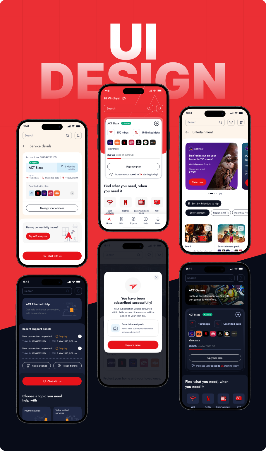
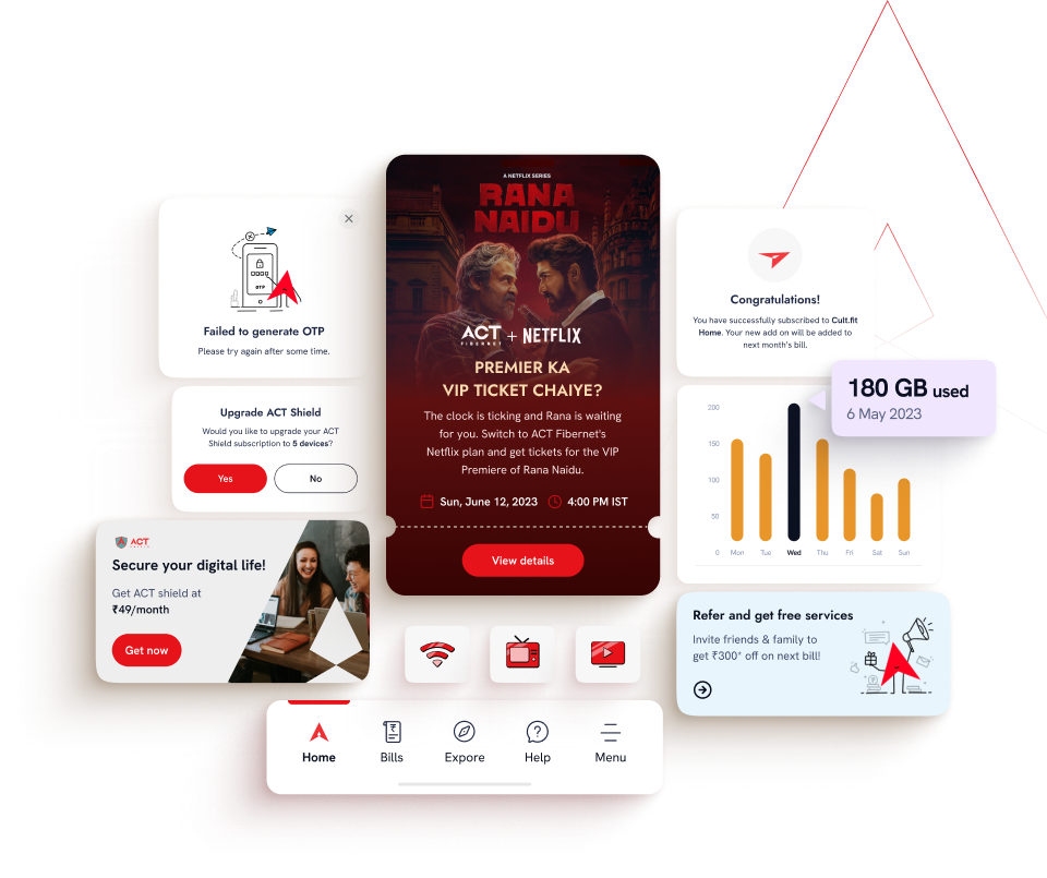
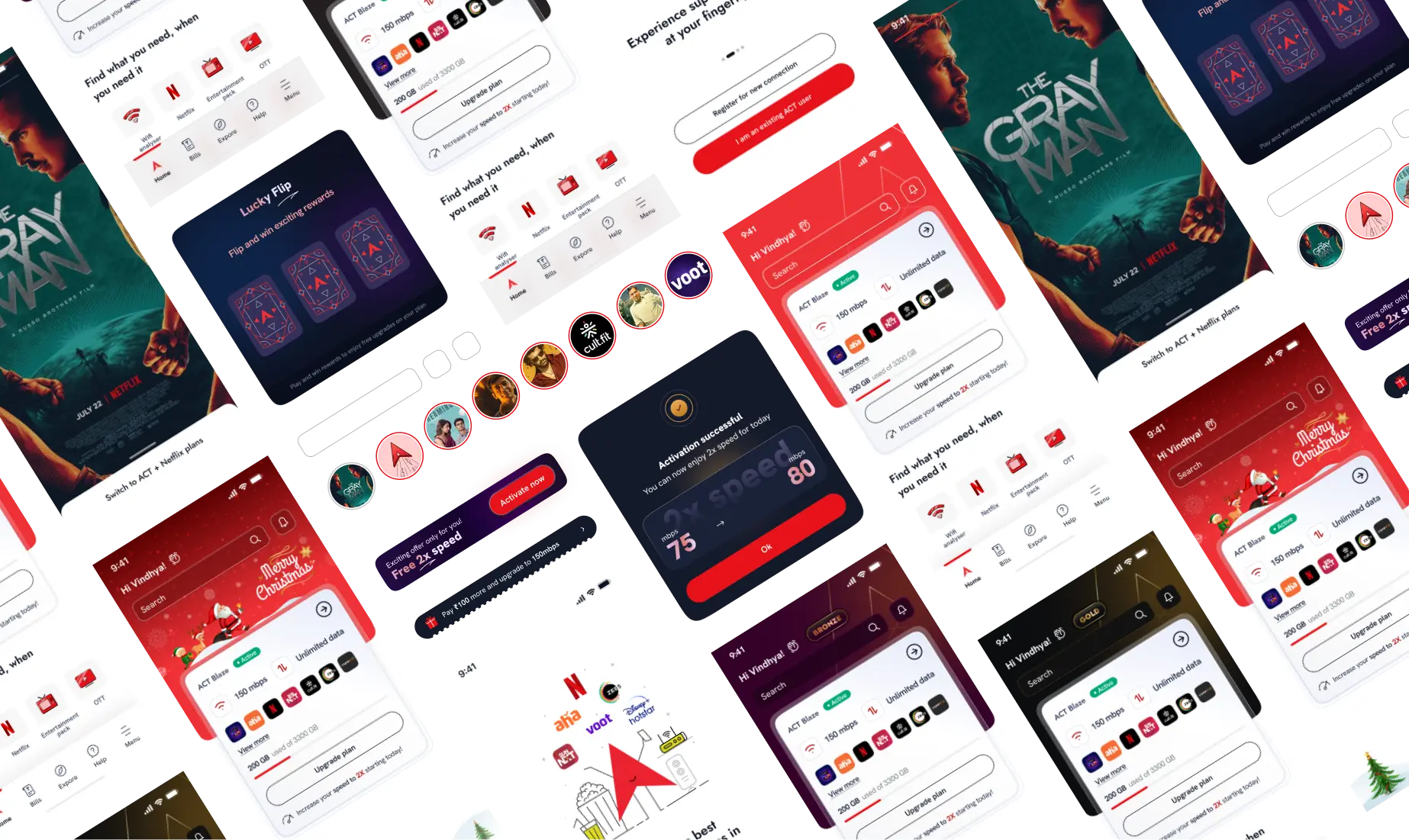
ACT Fibernet is a leading broadband service provider known for delivering high-speed internet across various regions across India. To further enhance its market position and provide a seamless digital experience, ACT Fibernet collaborated with us to design and develop a mobile application. Some of the key features of the design were
To understand user needs and improve the ACT app, we facilitated workshops and user interviews with stakeholders and end-users. Our research aimed to identify current usage, understanding, and expectations. Key findings included:
Our primary focus was to revamp the ACT customer app to align with the brand’s vision and marketing positioning. We defined multiple problem statements to address through design, by leveraging user research insights, user personas, journey maps, competitor analysis, information architecture, and task flows.
Taking into consideration all these points, our aim was to enhance user engagement by including cross-selling, understanding customer expectations, expanding the app while maintaining performance, meeting design preferences, ensuring flexibility for future features, and simplifying common transactions for user convenience.
With a clear approach, we mapped out the information architecture to illustrate flow across platforms and connectivity. Based on the user journeys and prerequisites, we introduced exceptional and distinctive features within the app, aiming to deliver an enhanced user experience.
User PersonasUser PersonasUser PersonasUser PersonasUser Personas
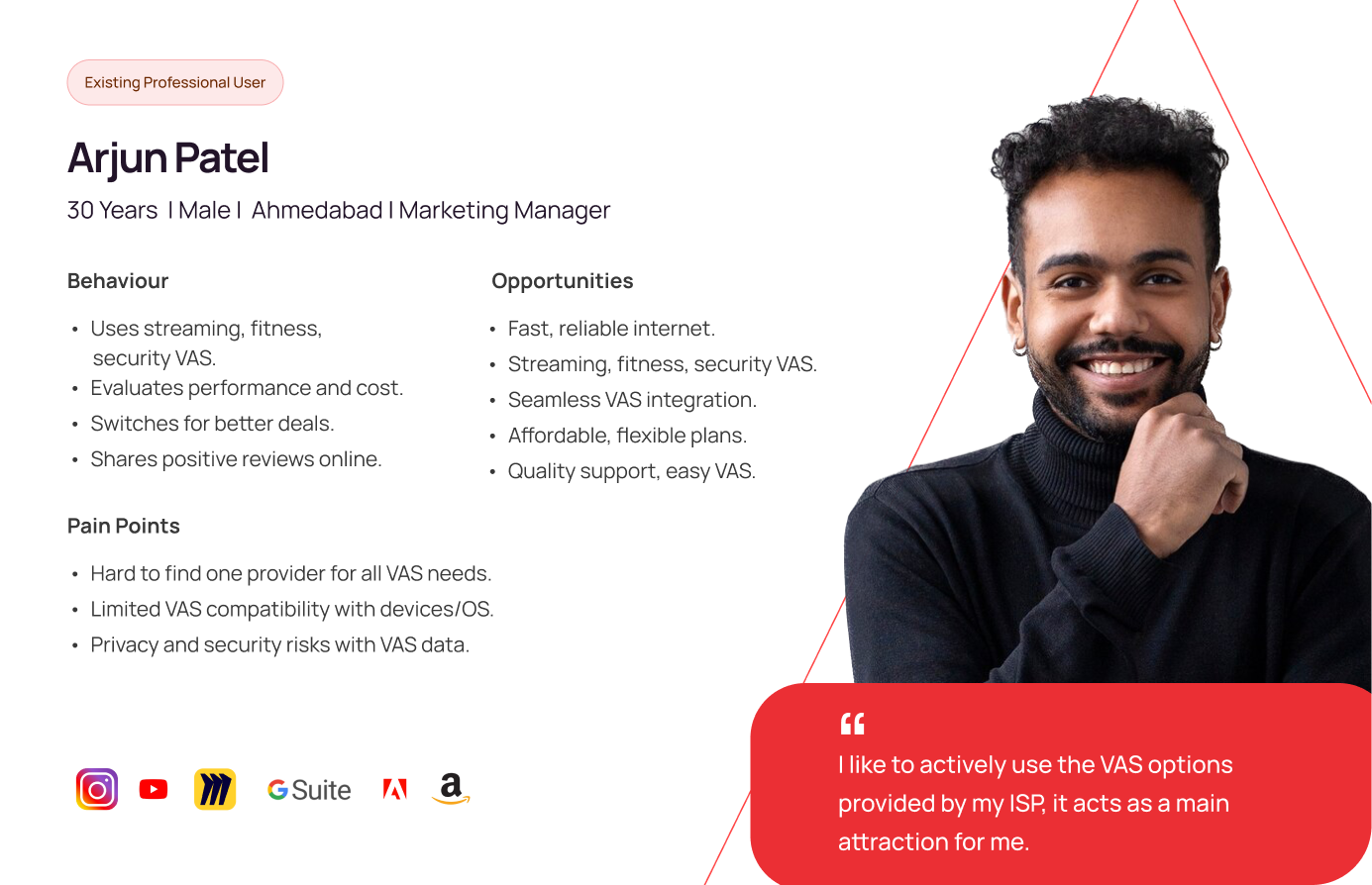
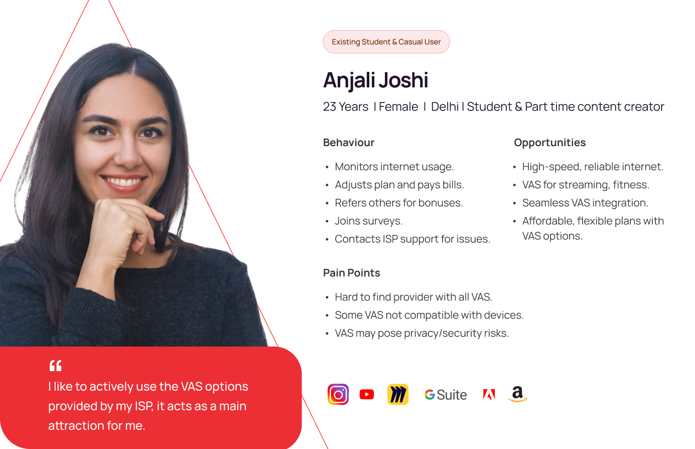
Once we finalized the information architecture through multiple iterations, we proceeded with creating wireframes. We developed high-fidelity wireframes and later progressed to the visual design stage. It was crucial to address the pain points and opportunities of each persona while adhering to the aforementioned considerations.
We prioritized a smooth and straightforward onboarding process, followed by designing an intuitive, dynamic, and visually appealing homepage. Ensuring the app was feature-rich yet simple to use for all personas was a key focus. Additionally, we redesigned the entire experience for managing plans and value-added services (VAS) by employing familiar mental models to ensure usability for every persona.

Half-filled icons are simple yet depthful, they convey information effectively with a clean aesthetic, enhancing user engagement.
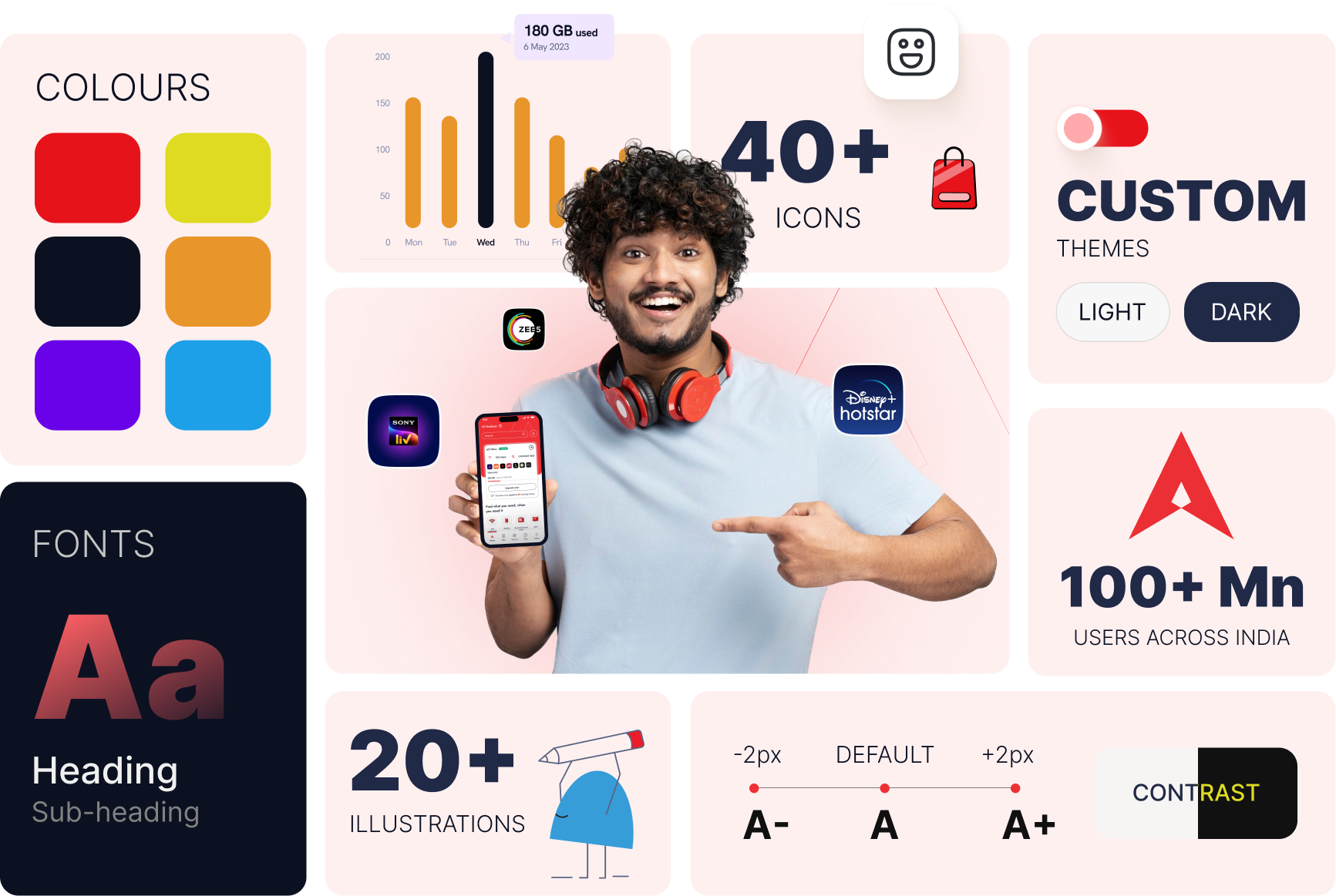
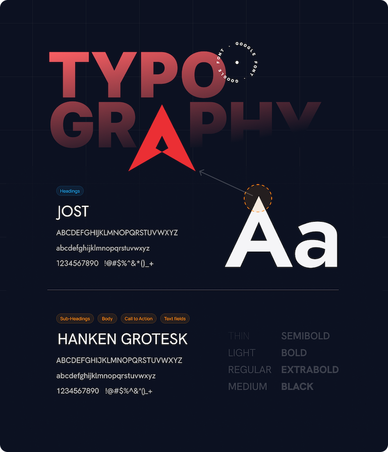
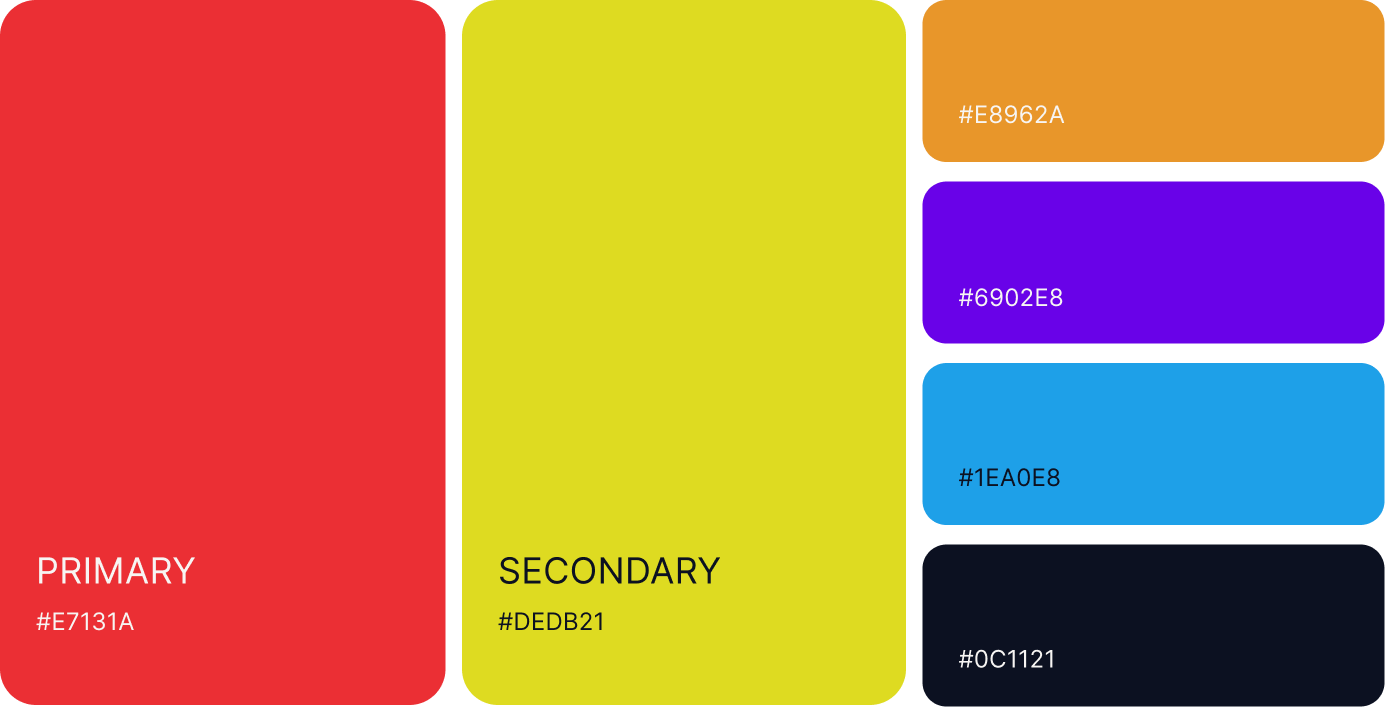
Both primary and secondary colors have been used in the application to establish a strong brand connection. These colors are derived from the brand guidelines and logo, ensuring consistency across the design.
