
It was a sunny morning, yeah it was a sunny Tuesday morning and everything looked and behaved like it should. We all had a lot on our plates and hands; drilling our minds, fingers and cells. And then Anil walked out of his cabin and put forth a proposition, ‘Why shouldn’t we revamp our website, we are DEFINITELY REVAMPED – new attitude, new shirts and pants, big projects, so why don’t we dawn on a new site identity?’ Because everything’s changed now – ‘Thought leads design’ Even though the need was evident and obvious, it took us a while to actually admit it.
After the realisation kicked in, we got together like how we get together for everything(we just need a reason to meet in a small room and argue) and spoke our minds and drew our thoughts on the whiteboard. Some of the things we wrote that Tuesday afternoon on the whiteboard :
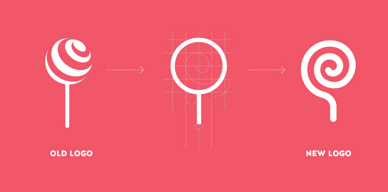
Simplifying the logo: Abstracting and achieving ambivalence that evokes curiosity and enthralls simultaneously.
Plan: From the current candy-lollipop-similar form to an abstract form represented by basic forms such as circles and lines with inward curves and turns that emanates aesthetic beauty, simplicity and a search for novelty.
A few iterations and sketches led to around 7 to 8 variations and combinations that also led to a clash of words, opinions, faces and sounds. And we finally settled on an abstract that is equal parts candy, eye-candy and an undefined factor. One that is bold and reflects minimalism, art and rediscovery.
Target Audience: Potential companies and startups from all around the globe.
Plan: Global branding and a startup friendly site.
We knew we had to exhibit our global list of clients and also acknowledge the startups that we have worked with in the past in order to expand our reach.
The Core: Figuring out our key touchpoints and strengths.
Plan: Giving prominence to our kick-ass team and work.

Blueprint: A website which is minimal, desirable and most of all, understandable.
Plan: Easy navigation, large representations and supporting content for each section.
The whole website was carefully divided into sections along with the prominence it holds when compared to each other. It was then prioritized and combined accordingly.
Content: Witty compelling content with a dash of humor, intelligence and arrogance.
Plan: Brainstorm, think, get inspired, observe, write, think and repeat.

Design: A website that conveys that ‘Lollypop’ is a UX/UI design studio that crafts meaningful interfaces and experiences.
Plan: Do what we do. Create beauty.
A simple grid was established, two gorgeous fonts with a we’re-so-complementary chemistry; four deep colors that wonder, clearly differentiated layouts and lastly the little divine details crafted to perfection – thickness of lines, spacing between labels and headings, saturation of overlays and it goes on and on and on….
PS: Long nights always give way to brighter days!


