

Enterprise portals are built to help people get work done—but too often, they become systems that users tolerate rather than rely on. Whether it’s a customer self-service portal, an employee workspace, or a complex SaaS platform, the success of a portal isn’t determined by the number of features it offers. It’s determined by how easily users can accomplish the tasks they return to perform every day.
When portal UX falls short, the business impact is immediate. Employees spend more time searching than completing work, customers abandon self-service in favor of support calls, and product teams struggle with low adoption despite continuous feature releases. In many organizations, these usability issues translate directly into higher operational costs, longer onboarding cycles, and slower digital transformation initiatives.
Unlike marketing websites that primarily communicate information, authenticated portals are designed for repeated use. Users log in with a clear goal—checking account information, managing inventory, approving requests, tracking performance, or collaborating with teams. Every interaction should reduce friction, not introduce it.
Effective portal UX design goes beyond visual polish. It requires thoughtful information architecture, role-based experiences, intuitive navigation, scalable design systems, and dashboards that help users prioritize what matters most. The best portals don’t simply look modern—they enable users to work with confidence and efficiency.
In this guide, we’ll explore what makes great portal UX design, the different types of web portals and their unique UX challenges, practical design principles, dashboard and navigation best practices, common pitfalls to avoid, emerging trends shaping enterprise platforms, and the metrics that matter when evaluating long-term adoption.
Portal UX design is the practice of designing authenticated, role-based digital platforms that enable users to complete recurring tasks as efficiently as possible. Unlike public-facing websites that focus on discovery, marketing, or content consumption, web portals are built for action. Users log in with a purpose—reviewing reports, approving workflows, managing accounts, submitting requests, or collaborating across teams—and expect to accomplish those tasks with minimal friction.
This distinction fundamentally changes the design approach. A marketing website typically guides visitors through a linear journey to learn about a product or make a purchase. A portal, on the other hand, must support users who return daily, often navigating between multiple modules, datasets, and workflows. Rather than optimizing for first impressions, portal UX design prioritizes long-term usability, efficiency, and adoption.
As organizations grow, portals also become significantly more complex. A single enterprise platform may serve employees, customers, partners, administrators, and executives—each with different permissions, responsibilities, and information needs. While they may all access the same underlying system, their ideal experience should feel tailored to their specific role. A finance manager shouldn’t see the same dashboard as a customer support agent, just as an external partner shouldn’t navigate the platform the same way an internal administrator does.
This is where role-based experience design becomes a defining principle of successful portal UX. Instead of exposing every feature to every user, effective portals surface the most relevant tools, data, and actions based on context. Progressive disclosure further reduces cognitive load by revealing advanced functionality only when users need it, helping both new and experienced users navigate the platform with confidence.
Another factor that sets portal UX apart is the scale of information architecture. Enterprise portals often contain hundreds—or even thousands—of pages spanning multiple business functions. Navigation systems must support deep hierarchies without overwhelming users, while search, filtering, and contextual navigation become essential tools rather than optional enhancements. As complexity increases, consistency across modules becomes just as important as usability within individual screens.
Successful portal UX is therefore about much more than creating attractive interfaces. It involves designing an ecosystem where navigation, dashboards, workflows, forms, permissions, and design systems work together to support real business processes. Every design decision should reduce the effort required to complete a task while increasing users’ confidence in the platform.
At Lollypop, we approach portal design as part of a broader enterprise UX strategy. Whether designing internal platforms, customer self-service experiences, or complex SaaS products, our focus is always the same: simplify complexity without sacrificing capability. You can explore more of our experience across enterprise products and digital platforms through our Industries page.
Designing a web portal is rarely about creating a new interface from scratch. More often, UX teams inherit years of accumulated business logic, legacy workflows, and growing feature sets that were built to solve immediate operational needs rather than deliver a cohesive user experience. As organizations scale, these complexities inevitably surface in the product—and users feel the friction every day.
One of the most common challenges is feature overload. Enterprise portals often evolve over many years, with new modules, tools, and integrations added as business requirements change. While each addition may solve a specific problem, the overall experience gradually becomes more difficult to navigate. Users are presented with too many options, unclear priorities, and interfaces that require significant effort just to locate the next action.
Another recurring issue is one-size-fits-all experiences. It’s not uncommon for organizations to expose the same navigation, dashboard, and functionality to every user, regardless of their role. In reality, an executive reviewing business performance, a customer submitting a support request, and an operations manager processing daily tasks have entirely different goals. When everyone sees the same interface, no one gets an experience optimized for their needs.
Navigation also becomes increasingly difficult as portals expand across departments and business functions. Users may need to move between HR, finance, operations, analytics, and customer management within a single platform. Without a clear information architecture, consistent navigation patterns, and effective search capabilities, even experienced users can spend unnecessary time searching for information instead of completing meaningful work.
Data density presents another challenge. Enterprise portals frequently display large volumes of information—from dashboards and reports to tables, forms, and activity logs. The goal isn’t simply to show more data, but to help users identify what matters most. Poor visual hierarchy, inconsistent layouts, and competing interface elements can quickly overwhelm users, increasing cognitive load and reducing decision-making efficiency.
Legacy systems introduce additional UX constraints. Many organizations continue to rely on platforms that have been expanded over years without a unified design system. As a result, users encounter inconsistent components, varying interaction patterns, and disconnected experiences across different modules. Every inconsistency forces users to relearn familiar actions, slowing productivity and reducing confidence in the platform.
Perhaps the biggest challenge isn’t usability alone—it’s adoption. A portal can meet every functional requirement on paper and still fail if people avoid using it. Employees may revert to spreadsheets, email, or manual workarounds. Customers may bypass self-service channels and contact support instead. Partners may struggle to complete onboarding or submit requests without assistance. In each case, the business continues paying for technology that users never fully embrace.
The most successful portal projects recognize that these problems are rarely solved by visual redesigns alone. Improving adoption requires rethinking information architecture, simplifying workflows, prioritizing role-based experiences, and validating design decisions through continuous user research and testing. Portal UX is ultimately about reducing operational complexity—not adding another layer on top of it.
Before exploring design principles and best practices, it’s important to recognize that not all portals are created equal. The users, goals, and workflows behind a customer portal differ significantly from those of an employee intranet or a SaaS platform. Understanding these differences is the first step toward designing experiences that truly fit their context.
Although many web portals share similar interface patterns—dashboards, navigation menus, search, forms, and user profiles—their UX priorities can vary dramatically depending on who uses them and what they are trying to accomplish. A customer logging in to track an order has very different expectations from an employee managing internal workflows or a sales manager reviewing business performance. Designing every portal the same way often leads to unnecessary complexity and lower adoption.
The most effective portal UX design begins by understanding the primary user, their goals, and the context in which they interact with the platform. Rather than asking “What features should this portal include?”, UX teams should first ask “What is the fastest path for this user to accomplish their most important task?”
The following comparison highlights how UX priorities shift across different types of web portals.

A customer portal design should reduce the need for human support by enabling users to resolve common requests independently. Whether customers are paying invoices, downloading documents, managing subscriptions, or checking delivery status, every interaction should feel straightforward and trustworthy. Clear navigation, visible account information, real-time status updates, and intuitive support flows help increase self-service adoption while reducing operational costs.
Employee portals serve as the digital workplace for an organization. Rather than focusing on marketing or engagement, these platforms prioritize productivity. Employees need to locate policies, collaborate with colleagues, submit internal requests, and access business systems quickly. Powerful search capabilities, logical information architecture, and personalized shortcuts often have a greater impact on usability than visual redesigns alone.
Partner ecosystems introduce an additional layer of complexity because different organizations require different levels of access. A distributor, reseller, or supplier may only need visibility into specific products, reports, or documents. Effective partner portal UX emphasizes permission-aware navigation, secure collaboration, and workflows that make sharing information feel seamless without exposing unnecessary data.
Whether supporting IT help desks, HR teams, healthcare organizations, or public services, service portals revolve around one central objective: helping users complete requests with minimal effort. Well-designed forms, transparent approval workflows, progress tracking, and timely notifications reduce uncertainty throughout the service journey. Users should never wonder whether their request has been received or what happens next.
Government portals often support millions of users with varying levels of digital literacy. As a result, accessibility and clarity become fundamental UX requirements rather than optional enhancements. Plain language, WCAG-compliant interfaces, multilingual support, and simplified navigation ensure that essential public services remain usable for everyone, regardless of ability or technical experience.
Unlike other portal types, SaaS platforms depend on continuous engagement rather than occasional visits. Success isn’t measured simply by whether users can access the software—it’s measured by whether they adopt its capabilities over time. Effective SaaS UX design focuses on reducing onboarding friction, surfacing relevant features based on user behavior, and helping users accomplish increasingly complex tasks as their familiarity with the product grows.
One of the strongest examples of large-scale web portal design is Amazon Seller Central. The platform brings together inventory management, advertising, fulfillment, financial reporting, customer communication, and performance analytics within a single authenticated environment. Despite supporting thousands of possible workflows, experienced sellers can move efficiently between modules because the platform maintains consistent navigation patterns, standardized layouts, and role-specific functionality across the experience.
This example illustrates an important principle: successful portals aren’t defined by how many features they contain, but by how effectively they help different users navigate complexity. Understanding the purpose of each portal type provides the foundation for the design principles explored in the next section.
Successful portals don’t happen because every screen looks polished. They succeed because every layer of the user experience—from information architecture to interface design—works together to reduce complexity and support real business workflows. Organizations often invest heavily in new features while overlooking the foundations that determine whether those features are actually discoverable, understandable, and usable.
Rather than viewing portal UX as a collection of isolated best practices, it’s more useful to think of it as a system composed of five interconnected layers. Weakness in any one layer creates friction throughout the entire experience, regardless of how visually appealing the interface may be.
Every successful portal begins with a well-structured information architecture. As products evolve, new modules, pages, and workflows are continuously added, making it easy for navigation to become fragmented. Without a logical structure, users are forced to remember where information lives instead of focusing on completing their tasks.
Effective information architecture organizes content around user goals rather than internal business structures. For example, employees shouldn’t need to know which department owns a process to find it. Related tools, documents, and workflows should naturally live together, supported by meaningful labels, predictable navigation, and robust search.
Before designing dashboards or visual interfaces, UX teams should validate whether users can actually find what they need. In many enterprise products, improving navigation and content structure delivers a greater usability gain than redesigning the interface itself.
One of the biggest mistakes in portal UX design is assuming every user needs access to the same interface. Enterprise platforms often support multiple audiences—from administrators and executives to frontline employees, customers, and external partners—each with distinct objectives and responsibilities.
Role-based design ensures that users see the information, actions, and workflows most relevant to them. Instead of overwhelming everyone with identical dashboards and navigation, the experience adapts to individual responsibilities. A finance manager might prioritize budget approvals, while a customer success manager begins the day by reviewing support cases and account health.
Progressive disclosure reinforces this approach by introducing complexity only when it’s needed. Advanced settings, infrequently used tools, and administrative functions remain accessible without competing for attention during everyday tasks. The result is an interface that feels both powerful and approachable.
Example: Salesforce has long embraced role-based UX. Sales representatives, managers, and administrators all work within the same platform, yet each sees dashboards, navigation, and workflows tailored to their responsibilities, reducing unnecessary complexity while improving productivity.
Navigation is one of the strongest predictors of portal usability. In complex enterprise platforms, users rarely complete their work on a single page. Instead, they move between dashboards, reports, settings, forms, and data tables throughout the day. Every unnecessary click, hidden menu, or inconsistent interaction slows productivity.
A well-designed portal typically combines multiple navigation layers. Global navigation supports movement between major modules, while local navigation helps users explore deeper sections within each module. Breadcrumbs provide orientation inside complex hierarchies, and search acts as a reliable shortcut for experienced users who already know what they’re looking for.
Consistency is equally important. Moving navigation elements between releases may seem like a minor visual change, but frequent users rely heavily on muscle memory. Even small inconsistencies can increase cognitive effort and generate unnecessary support requests.
Example: Google Workspace demonstrates this principle through its persistent top navigation and application switcher. Whether users move between Gmail, Drive, Calendar, or Docs, the navigation remains familiar, reducing the effort required to switch contexts.
Large portals are rarely built by a single team. Over time, multiple product squads contribute new features, modules, and integrations, making visual consistency increasingly difficult to maintain. Without shared standards, users encounter different button styles, inconsistent forms, conflicting interaction patterns, and varying terminology across the same platform.
A mature design system solves this problem by providing a common language for designers and developers. Shared components, design tokens, typography, spacing, accessibility rules, and interaction guidelines ensure that every new feature feels like part of the same product rather than an independent application.
The benefits extend beyond visual consistency. Design systems accelerate product development, simplify maintenance, improve accessibility compliance, and reduce design debt over time. For organizations managing enterprise platforms over multiple years, they become a strategic product asset rather than simply a UI library.
Users rarely praise a portal for loading quickly—but they immediately notice when it doesn’t. Performance is therefore not just an engineering metric; it’s a core component of user experience. Slow dashboards, delayed search results, or unresponsive forms undermine confidence in the platform, especially when users rely on it throughout the workday.
Modern portal experiences improve perceived performance through thoughtful design techniques such as skeleton loading states, optimistic updates, lazy loading, and progressive data rendering. Even when operations require additional processing time, users receive immediate feedback that the system is responding.
Accessibility is equally fundamental. Enterprise platforms serve people with different abilities, devices, and working environments, making inclusive design a business requirement rather than a compliance checklist. Keyboard navigation, screen reader compatibility, sufficient color contrast, visible focus states, and clear error messaging enable more users to complete tasks independently.
For organizations operating in regulated industries—including government, healthcare, finance, and education—meeting WCAG 2.1 AA standards is often essential. More importantly, accessible design creates better experiences for everyone, regardless of ability
These five layers—information architecture, role-based experiences, interaction design, design systems, and performance—work together to create portals that users can navigate confidently and efficiently. Focusing on only one layer, such as visual design, rarely solves deeper usability issues.
Among all these layers, however, one screen has an outsized influence on user adoption: the dashboard. As the primary destination for returning users, it shapes first impressions, daily productivity, and long-term engagement. Designing dashboards effectively is therefore one of the highest-impact investments any portal team can make.
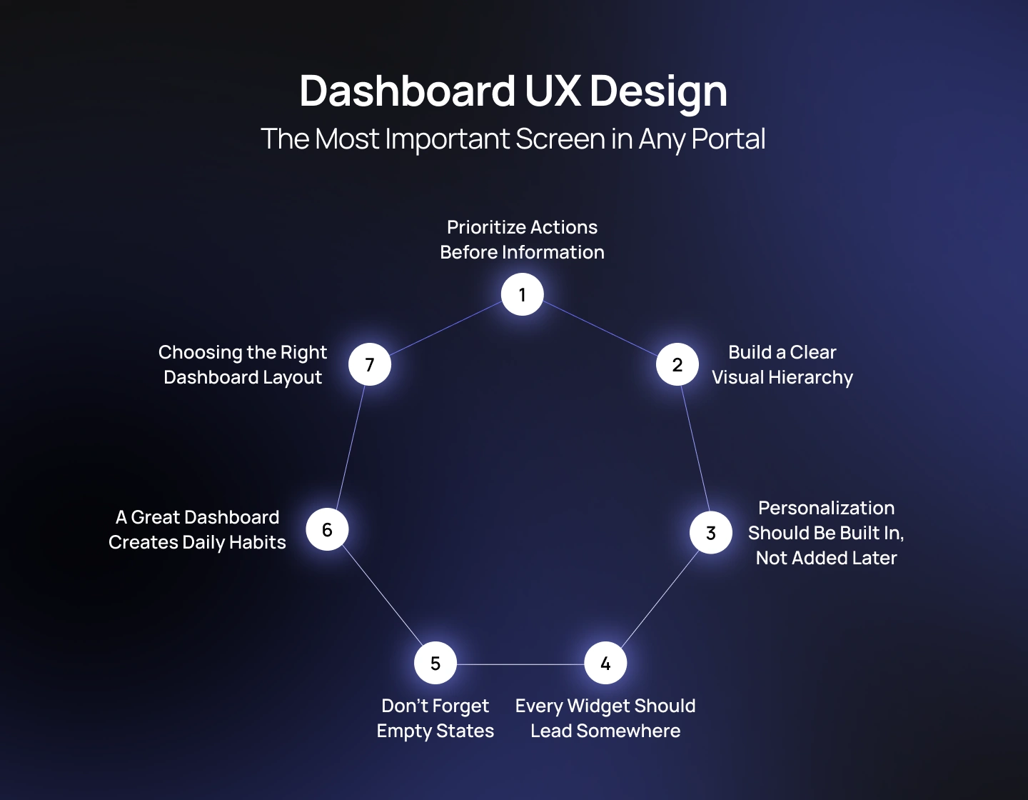
For most users, the dashboard is the first screen they see after logging in—and often the screen they return to multiple times throughout the day. It serves as the operational hub of the entire platform, helping users understand what requires attention, what has changed, and what actions should come next. A well-designed dashboard reduces decision fatigue by surfacing the right information at the right time. A poorly designed one becomes little more than a collection of disconnected widgets competing for attention.
One of the most common misconceptions in dashboard UX design is that dashboards should display as much information as possible. In reality, effective dashboards are carefully curated rather than comprehensive. Their purpose is not to replicate every available report or data table but to provide users with a clear starting point for completing their work.
The most valuable dashboards are action-oriented rather than data-oriented. Instead of asking, “What information should we display?”, product teams should ask, “What does this user need to do next?”
For example, a customer support manager may need to review unresolved tickets before checking monthly performance metrics. A warehouse operator is more likely to prioritize pending shipments than inventory forecasts. Even when users share the same platform, the sequence of information should reflect the urgency and frequency of their daily tasks.
This is why successful portals organize dashboards around decisions and actions—not simply around available data.
Every dashboard competes for a user’s limited attention. Without a deliberate visual hierarchy, users spend unnecessary time deciding where to look first.
Above the fold, the interface should highlight the most important KPIs, notifications, or priority tasks. Supporting analytics, historical trends, and secondary reports can appear further down the page or within expandable sections. By progressively revealing information instead of presenting everything at once, dashboards become easier to scan and significantly less overwhelming.
Hierarchy should also be reflected through typography, spacing, grouping, and visual emphasis—not just card size. When every widget demands equal attention, nothing truly stands out.
No two users interact with a portal in the same way. A static dashboard may satisfy one audience while slowing another.
Role-based customization allows users to see metrics and workflows relevant to their responsibilities without manually filtering unnecessary information every time they log in. Beyond predefined role views, many enterprise platforms also allow users to rearrange widgets, pin frequently used reports, or hide modules they rarely access.
This flexibility creates a sense of ownership while supporting diverse working styles without increasing interface complexity.
Example: HubSpot CRM demonstrates this approach effectively. Sales representatives see their pipeline, upcoming meetings, and individual performance, while managers are presented with team-wide forecasts, coaching insights, and organizational metrics. Although both groups work within the same product, the dashboard adapts to support different decision-making needs while maintaining a consistent design language.
Dashboards are not destinations—they are launchpads.
Every chart, metric, notification, or activity feed should naturally connect users to the next step in their workflow. Clicking an overdue invoice should open billing details. Selecting a performance metric should reveal supporting analytics. A pending approval should take users directly into the approval flow.
When widgets become isolated pieces of information with no clear path forward, users are forced to navigate elsewhere to complete their work, introducing unnecessary friction into the experience.
Designing dashboards as interconnected workflow hubs keeps users moving efficiently through the platform.
Every portal has first-time users. Every portal also has moments when there simply isn’t any data to display.
Unfortunately, many products treat empty states as an afterthought, leaving users with blank tables, empty charts, or generic messages such as “No Data Available.” While technically accurate, these screens provide little guidance and often create uncertainty about whether the system is functioning correctly.
Thoughtfully designed empty states should explain why content is missing and, more importantly, suggest what users should do next. This might include creating the first project, inviting teammates, uploading data, or completing onboarding tasks. Instead of representing a dead end, empty states become opportunities to guide users toward successful product adoption.
Different portal types benefit from different dashboard structures. Selecting the right layout depends on user goals, information density, and workflow complexity rather than visual preference alone.
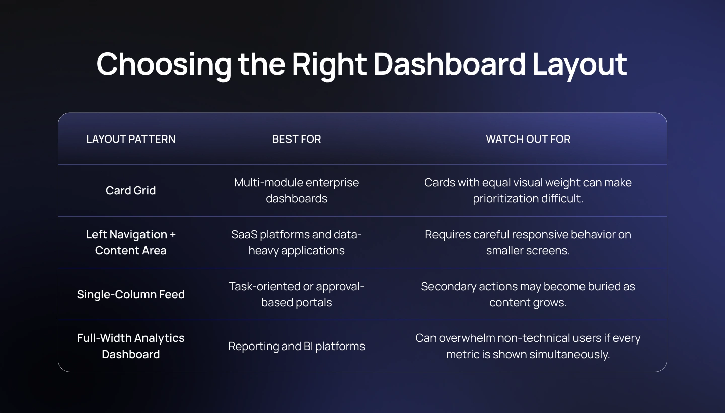
Rather than searching for a universally “best” layout, UX teams should choose the structure that best supports users’ primary workflows while minimizing cognitive effort.
Users rarely judge a portal based on its login screen or settings page. They judge it by the dashboard they rely on every day. When that experience is organized, personalized, and action-oriented, users build confidence in the platform and return to it naturally as part of their workflow.
Designing an effective dashboard, however, is only part of the equation. Users still need intuitive navigation to move between modules and streamlined forms to complete their most important tasks. These interaction patterns determine whether a portal feels efficient—or frustrating—over months and years of daily use.
As enterprise portals grow, navigation becomes far more than a menu system—it becomes the framework that determines how easily users can move between tasks, departments, and workflows. Even the most thoughtfully designed dashboard loses its value if users struggle to locate the information or functionality they need next.
Unlike traditional websites, where visitors often follow a relatively linear journey, portals support non-linear behavior. Users frequently jump between modules, revisit previous tasks, compare records, and switch contexts throughout the day. A successful navigation system therefore needs to reduce orientation effort while allowing users to move confidently across increasingly complex environments.
One of the biggest mistakes in portal design is trying to solve every navigation need with a single sidebar. As platforms expand, this approach inevitably creates overcrowded menus that become difficult to scan and even harder to maintain.
Instead, effective web portal design typically separates navigation into distinct layers, each serving a specific purpose.
When these layers work together, users spend less time thinking about where to go next and more time completing meaningful work.
As portals accumulate hundreds of pages and thousands of records, navigation menus alone are no longer sufficient.
Search becomes an essential part of the experience—not simply a convenience feature.
Users should be able to search for customers, documents, products, reports, support tickets, or settings from virtually anywhere within the platform. Intelligent search can further improve efficiency by offering autocomplete suggestions, recently viewed items, and relevant results based on user permissions.
For experienced users, search often becomes the fastest way to navigate a portal. Designing it as a secondary feature hidden deep within the interface underestimates how people actually work in complex systems.
Enterprise workflows frequently involve deep navigation structures. A user reviewing an invoice may arrive there through multiple paths—customer profiles, search results, financial reports, or approval queues.
Breadcrumb navigation helps users understand both where they are and how they got there. More importantly, it provides an effortless way to move back through the hierarchy without repeatedly using the browser’s back button.
While breadcrumbs may appear to be a minor interface element, they significantly reduce disorientation in large-scale portals where information is deeply nested.
Users should never have to memorize where information lives.
Navigation labels should reflect the language users naturally use in their daily work rather than internal organizational terminology. A finance team may understand “Accounts Receivable,” but a customer is more likely to look for “Invoices” or “Billing.” Likewise, employees searching for leave requests should not have to know whether the functionality belongs under HR, Employee Services, or Workforce Management.
Clear naming conventions, predictable iconography, and consistent placement reduce the mental effort required to navigate the product. The less users have to remember, the more confidently they can work.
Many enterprise users access portals from laptops during work hours but increasingly rely on tablets and mobile devices when traveling, working remotely, or responding to urgent requests.
Responsive navigation should therefore preserve core workflows instead of simply shrinking the desktop experience.
A common pattern is transforming a left-hand navigation rail into a bottom navigation bar on smaller screens while moving secondary actions into expandable menus. High-frequency tasks remain immediately accessible, while less common administrative functions stay available without cluttering the primary interface.
Responsive design should prioritize continuity. Users should feel like they are using the same product regardless of screen size—not learning a different interface.
Example: Google Analytics 4 adapts its navigation hierarchy across desktop and mobile experiences while maintaining familiar information architecture, allowing users to transition between devices without losing orientation.
Good navigation is rarely noticed because it feels effortless. Poor navigation, on the other hand, quickly becomes one of the most common sources of frustration in enterprise software.
The goal isn’t simply to help users move through the interface—it’s to reduce decision-making, eliminate unnecessary clicks, and create confidence that the information they need is always within reach.
Once users arrive at the right destination, however, another critical UX challenge begins: completing tasks efficiently. In most portals, that responsibility falls to forms. Whether users are submitting support requests, creating customer records, approving expenses, or configuring system settings, well-designed forms determine how quickly work gets done—and how often users encounter preventable errors.
In most enterprise portals, forms are where work actually happens. Users submit support requests, approve expenses, create customer records, update employee information, configure system settings, and complete countless other business processes through forms. While dashboards help users understand what requires attention, forms determine whether those tasks can be completed quickly and accurately.
Poor form design introduces friction at the exact moment users are trying to accomplish something important. Confusing field labels, unnecessary inputs, unclear validation messages, and lengthy workflows increase completion time, generate avoidable errors, and often lead users to abandon the process altogether. In customer portals, this translates into higher support volumes. In employee portals, it slows productivity. In SaaS products, it creates unnecessary barriers to adoption.
One of the simplest ways to improve form design is to reduce the amount of information users are required to provide.
Every additional field increases cognitive effort and creates another opportunity for mistakes. Before adding a question, product teams should ask whether the information is essential for completing the current task—or whether it can be collected later, inferred automatically, or retrieved from existing user data.
Progressive disclosure is particularly effective for complex workflows. Rather than presenting dozens of fields at once, the interface reveals additional inputs only when they become relevant. This keeps forms focused and prevents users from feeling overwhelmed before they even begin.
Nothing frustrates users more than completing a lengthy form only to discover multiple errors after clicking “Submit.”
Modern portal experiences use inline validation, providing immediate feedback while users complete each field. Email formats, password requirements, duplicate entries, and mandatory fields can all be validated in real time, allowing users to correct mistakes before moving forward.
Validation should also explain why something is wrong and how to fix it. Messages such as “Please enter a valid business email address” are significantly more helpful than generic notifications like “Invalid input.”
The objective is not simply to prevent errors but to help users recover from them with as little effort as possible.
Enterprise workflows often involve large amounts of information that cannot realistically fit on a single page.
Multi-step forms reduce perceived complexity by dividing long processes into smaller, logical sections. Progress indicators help users understand how much remains, while allowing them to focus on one decision at a time rather than dozens simultaneously.
Grouping related information—such as company details, billing information, user permissions, and final review—creates a more structured experience and reduces cognitive load throughout the workflow.
Whenever possible, users should also be able to save their progress and continue later, particularly for forms involving approvals, compliance documentation, or large data submissions.
Enterprise users rarely complete a form only once.
Employees submit recurring requests, customers update account information, and administrators repeatedly configure similar settings. Good portal UX recognizes these repetitive behaviors and minimizes unnecessary effort through smart defaults and intelligent automation.
Pre-filled profile information, remembered preferences, suggested values, date pickers, and contextual recommendations all reduce manual input while improving accuracy. Rather than forcing users to repeat the same information, the system should remember what it already knows.
Designing for returning users often produces greater productivity gains than optimizing for first-time visitors alone.
Error handling is one of the clearest indicators of UX maturity.
Many enterprise platforms still rely on technical system messages that make sense to developers but provide little guidance for end users. Messages such as “Error 403”, “Request Failed”, or “Unknown Exception” rarely explain what happened or what users should do next.
Effective error messages use plain language, clearly describe the issue, explain why it occurred when appropriate, and offer a specific next step. If a file exceeds the upload limit, tell users the maximum supported size. If a required field is missing, highlight it directly instead of displaying a generic notification at the top of the page.
Good error handling transforms moments of frustration into opportunities to build user confidence.
Example: Typeform popularized a conversational, one-question-at-a-time approach that significantly reduced the perceived length of forms. While enterprise portals don’t always follow this exact interaction model, the underlying principle remains highly relevant: breaking complex tasks into smaller, manageable interactions makes users feel that progress is faster and less overwhelming.
The best forms rarely attract attention because they quietly remove friction from the user’s workflow. They ask only what is necessary, guide before errors occur, remember information users have already shared, and communicate in language people naturally understand.
Together with intuitive navigation, effective form design enables users to move through even the most complex business processes with confidence. But usability alone isn’t enough—especially for SaaS products. Long-term success depends on whether users continue discovering value after onboarding. That’s where product adoption becomes the next critical layer of portal UX.
Enterprise portals are evolving beyond static dashboards and transactional workflows. Advances in artificial intelligence, behavioral analytics, and product design are creating experiences that are increasingly proactive, personalized, and adaptive. Rather than simply responding to user input, modern portals are beginning to anticipate user needs.
The next generation of dashboards will be personalized not only by user role but also by behavior.
Instead of presenting fixed layouts, AI can prioritize tasks, surface relevant reports, recommend workflows, and highlight anomalies based on how users interact with the platform over time. This reduces navigation effort and helps users focus on the work that matters most.
Users increasingly expect insights to appear within the context of their work instead of requiring them to open separate reporting tools.
Rather than exporting data into business intelligence platforms, embedded analytics allows users to make informed decisions without leaving the workflow they’re currently completing. This creates a more seamless experience while reducing context switching between multiple applications.
AI-powered assistants are becoming an integral part of customer and employee portals.
Instead of navigating multiple pages to reset a password, check an order status, or submit a routine request, users can increasingly accomplish these tasks through conversational interfaces integrated directly into the portal. This shift doesn’t replace traditional navigation entirely—it complements it by simplifying repetitive, low-complexity interactions.
As enterprise products continue to grow, maintaining consistency across dozens of teams and hundreds of screens becomes impossible without a mature design system.
Leading organizations now treat their design systems as evolving products with dedicated ownership, versioning, governance, and cross-functional collaboration between design and engineering. This approach accelerates development while ensuring that every new capability feels like a natural extension of the existing experience.
Portal UX design is about much more than creating attractive interfaces. It’s about designing digital environments where people can navigate complexity, complete meaningful work, and confidently return day after day.
Whether you’re building a customer portal, an employee workspace, a partner platform, or a SaaS application, long-term success depends on more than adding new features. It requires thoughtful information architecture, role-based experiences, intuitive navigation, scalable design systems, and continuous optimization based on real user behavior.
The organizations that build successful portals aren’t necessarily the ones with the largest development teams or the most functionality. They’re the ones that place user experience at the center of product strategy from the very beginning.
At Lollypop, we help organizations design enterprise platforms that balance business complexity with intuitive user experiences. From discovery and UX research to interaction design, design systems, and product strategy, our team works with businesses to create portals that people actually adopt—not simply access. Explore our work across industries or get in touch to discuss your next digital product.
Portal UX design is the practice of designing authenticated, role-based digital platforms that help users complete recurring tasks efficiently. Unlike public websites that focus on attracting and informing visitors, portals are built for people who return regularly to accomplish specific goals—such as managing accounts, approving workflows, accessing business data, or collaborating with teams.
A successful portal UX considers every aspect of the user journey, including information architecture, navigation, dashboard design, forms, accessibility, and role-based personalization. The objective is not simply to create an attractive interface, but to reduce complexity and help users complete work with confidence.
A good web portal design enables users to complete their most important tasks with minimal effort.
This typically includes intuitive navigation, a clear information architecture, personalized dashboards, streamlined workflows, accessible interfaces, and a consistent design system that scales across multiple modules. Rather than exposing every feature equally, effective portals prioritize the information and actions that matter most for each user role.
Ultimately, successful portal design is measured not by the number of available features, but by user adoption, task completion, and long-term engagement.
Although both are accessed through a web browser, websites and portals serve fundamentally different purposes.
A website is primarily designed to communicate information, build brand awareness, and help visitors discover products or services. Most website visitors are anonymous and may never return.
A web portal, by contrast, is an authenticated environment where users sign in to complete ongoing tasks. Portals support role-based permissions, personalized content, dashboards, workflows, and complex business processes. Because users interact with them repeatedly, portal UX focuses on efficiency, productivity, and long-term usability rather than first impressions alone.
An effective customer portal should enable users to solve common problems independently without needing to contact support.
Core capabilities often include a personalized dashboard, account management, billing and subscription information, order or request tracking, support ticket management, searchable knowledge bases, notifications, and secure profile settings. These features should be supported by intuitive navigation, responsive design, and streamlined forms that reduce friction throughout the customer journey.
The goal of a customer portal isn’t simply to provide access to information—it’s to create a self-service experience that saves time for both customers and support teams.


