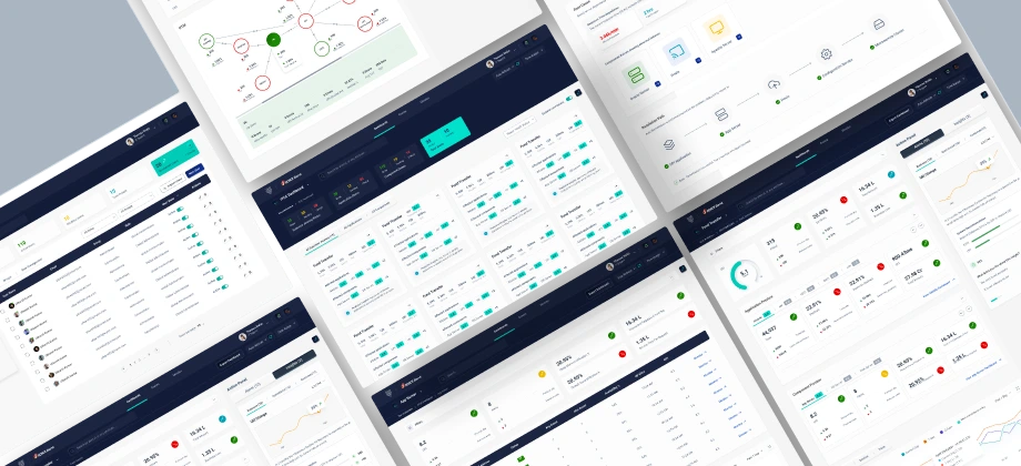


Provide a holistic view of the end to end user journey.
Help in turning organisations from reactive to proactive.
Capability to adapt and personalise the workflows for an organisation.
Provide real time business insights & analytics
Fast and quick remediation process.
The team facilitated workshops with stakeholders and end-users to gather insights around current understanding, usage & expectations
Interviewing key stakeholders to gather insights about business goals
This phase typically includes both user research and market research
Drawing insights from all the data collected during the research phase
Visualizing the basic structure of future pages and how they fit together
Creating a system of components, patterns, and styles for UI design
Verifying that every function of an app is working exactly as required

Understand the product as they had already an MVP released.
Gathered more ideas that leaded solving in the form of requirements.
Which user group spends how much time on the VuSmart Maps platform.
We covered the watching behavior of every user group this product intends to cater


User story: L0 / L1 users are techops team members who are trained to do 24x7 eyeball monitoring for the application infrastructure. They monitor dashboards and raise incidents when issues occur.
A few users face difficulty in using the Dashboard as there is not enough contextual data on the dashboard and the UI is cluttered and not organised. They usually login to the platform only when there is an alert.
The users have to enter the exact values and tags in order to access data, select category/type and have to identify if the issue is external or internal, hence exceeding more than the recommended 3 clicks to do the root cause analysis
To make sure that the application is always up and running.
To alert the L2 / L3 users about the incident efficiently and quickly.
To gather insights about the health of an app quickly and in an efficient way
Feels frustrated as the dashboard’s response time is slow
Has to remember specific keywords in order to search any data metric.
Has to go through multiple steps to identify the problem.
Doesn’t find the platform user friendly


User story: L0 / L1 users are techops team members who are trained to do 24 x7 eyeball monitoring for the application infrastructure. They look at the storyboards/ visualization and gather insights about the status of the application. If they find any problem, they reach out to L1 / L2 teams and notify them about the problem via mail/ call.
A few users face difficulty in using the Dashboard as there is not enough contextual data on the dashboard and the UI is cluttered and not organised. They usually login to the platform only when there is an alert.
The users have to enter the exact values and tags in order to access data, select category/type and have to identify if the issue is external or internal, hence exceeding more than the recommended 3 clicks to do the root cause analysis
To identify root cause of an issue and take corrective actions.
To check on alerts from monitoring products.
To provide different datasets to Support Head.
To create various reports for Support head and CIO/CTO.
Feels frustrated as the dashboard’s response time is slow
Does not regularly monitor as he finds plaform difficult to use.
Does not regularly monitor as he finds plaform difficult to use.
Only uses the platform if any alert is raised by L0 / L1 team.
Provide quick and easy access to operational storyboards.
Contextual alerts with lot of relevant data.
A ticketing system within Vunet for smoother internal communication.
Provide quick and easy access: To download reports
A revolutionary idea of having a single language streaming platform. An opportunity to increase user base and subscriptions by:
Improved visual hierarchy of the components and better visibility of data to ensure a much more efficient workflow.
Optimizing and understanding user behavior and increasing task effectiveness & Efficiency.
Improved UX by giving users the ability to have personalization/customization built into the core of the product that can significantly improve their workflow.
Using historical data to predict future outcomes and thereby assisting users to take decisions and perform tasks that are more efficient and beneficial to the user.
Our primary focus was to design the Dashboard. We defined multiple problem statements to solve through design, by understanding our different user personas, journey maps, empathy maps, competitor analysis, information architecture and task flows. Taking into consideration all the above points, our aim was optimized the current structure and designed a system that worked intuitively for all the users
Once the approach was set and finalized, we started with mapping out the IA which shows flow across the platforms and their connectivity.
Based on the user stories & prerequisites, Lollypop design studio introduced exceptional & distinctive features in the dashboard.
Once we had the IA finalized after iterations, we started with wireframes, Below are the high fidelity of wireframes which were created and later pushed to Visual design stage. Keeping in mind all the above points, we need to ensure that the pain points and the opportunity of each perona was addressed. We ensured a very smooth and simple onboarding process, followed by a very intuitive, dynamic and visually rich dashboard.

We chose Heebo for simple, clear and bold letters. Our team focused on the proportions, the spacing, the overall look and feel. It didn’t have a lot of fussy details or mannerisms. The open, circular forms gave it a “friendly” appearance, especially in the lowercase and also number focused.

40px Regular, Line Height 48px
31px Regular, Line Height 42px
28px Regular, Line Height 40px
20px Regular, Line Height 30px
16px Regular, Line Height 24px
13px Regular, Line Height 20px
10px Regular, Line Height 14px
An AI enabled analytical tool
Vunet allows a comprehensive bird's eye view of the IT operations to derive real time business and operational insights on the platform with ITSM tools.
Heebo is a Hebrew and Latin typeface family, which extends Christian Roberton's Roboto Latin to Hebrew. The Hebrew was drawn by Oded Ezer and the font files were mastered by Meir Sadan.
aha wished to bring in a new-wave of orange in entertainment for the Telugu-speaking audience, across the world

We evaluated our designs internally with proven practices to measure their effectiveness in regards to credibility and usability. The resultant was a cohesive experience ecosystem around that felt curated, usable and useful for users.
The value add we brought in was with an intuitive and interactive regionalized experience, faster way of exploring content and easy to use interface that gave a feeling of personalised experience and interface across Mobile, Web and Television.


Help in turning organisations from reactive to proactive.
• Seamlessly introduced payment process from TV to Mobile
• Elevated user experience through easy personalizationa and easy navigation
• Revamped the Login/Signup process to be more user friendly
• Improved playback experience by providing features which weren’t provided before
• Improved TV experience by following familiar mental models.
• Intuitive UI and simplified viewing experience
• Built a multi-experience for users – Viewers are consuming content on multiple devices
• Seamless delivery of content on multiple devices is no longer an option for OTT players, it is mandatory.
• Indepth research and competitor analysis plays an important role in the output of the design.
• Learnt designing experiences for TV.
• How to seamlessly build a multi-experience for users
• While the variety and quality of the content will be important to acquire new viewers, UI/UX will plays a decisive role in retaining them
• A simple and delightful user experience will always remain the most important factor that will define the success of any OTT platform.
