

Colours form an integral part of the world we live in. And more often than not, our feelings, emotions and even taste can be validated with colours! According to an article written by Charles Spence in BioMed Central 2015, five colour-taste studies were conducted and their results indicate some startling results. For example, the colours black, purple and violet are widely associated with bitterness. White and blue is associated with the salty sea. Yellow and green represent a sour taste, because of its obvious recall to limes and lemons. Sweet is linked to pink or red.
Truth be told, colours can have a major influence on people’s purchase decisions. Most brands are associated with one or more colours; organizations have embraced the colour psychology as a major driver in their branding strategy. Why? Because people are drawn to certain colours for certain reasons and they carry associations with objects and tend to feel them.

As designers, we need to pay detailed attention to the colours we choose while designing a brand. Colour creates contrast, hierarchy, balance & rhythm. Choosing the right colour palette is really important as it not only creates interest but also creates an emotional or subconscious connect with the people.

Research indicates that 85% of the decision made by individuals towards choosing a product was based on colours only. Colours carry an emotional value; each colour emotes different feelings and perception; these aren’t general emotions that are associated with it but the whole nature itself is built around it and perceived in a psychological aspect. For example:
Before I get to explaining how to pick colours and go on to explaining the colour wheel, let’s be clear about a few fundamental questions that we should ask ourselves even before jumping on to the branding elements of the product. The questions would give you a sense of direction and make life simpler:
Brand New Product: Fresh branding might require you to understand the reasoning and the emotional connect of the brand. It will give you much-needed freedom to chose and play with your colours, unlike the defined products. I generally prefer to choose either monochromatic or complementary as they create more emotional value and a sense of purpose.
Defined product: One should understand the product and the guidelines it comes with. There might be many limitations or directions that we need to follow. So get acquainted with it. For example, Google or Microsoft has strict guidelines. In such cases, I choose Analogous/ Triadic palette as they allow me to stick to the prominent brand colour while allowing me to play with the other colours from the wheel as an accent. It is like choosing a group of friendly neighbors to build a harmonious product.
Read more: Emotional Design – The Secret to Impactful Storytelling

What is the intent of the product? What does it want to communicate? What problem does it want to solve? Who will use this product? These questions will lead us to shortlist the primary and secondary colours of the product.

Who are the users we are targeting? What are there behavioral graphs? What their mental models like? How tech-savvy are they? What region do they belong to? What is their culture? Everything comes into play when you are deciding on the brand colours. Ask as many relevant questions as possible.

Choosing a palette also involves accessibility as one of the major challenges for a product designer. As a designer, you must ensure that the product is accessible by all sets of colour vision deficiency personas. Adding to that, textual contrast check is really important which needs to be done before adding any coloured text over any background colour. This allows us in covering the CVD people by providing them with an accessible product.
Finally, let’s decode the different sets of colours and principles that will always make life easier as designers. I always look up to the nature of the product when it comes to choosing colours but before you go overboard looking for inspiration you have to understand the basics of the colour wheel. I follow Colour theory 101; there are many diverse ways of picking colour sets that work together. I pick the combination best suited for me ranging from those that are easy to use till difficult to use. I’ll explain this further below:
As the name suggests, these colours are placed adjacent to each other in the colour wheel. They complement each other perfectly. This colour scheme works best for brands that are trying to communicate reliability and a sense of balance. It’s like the colour blue says ‘you are beautiful’ to the colour orange, which complements its attributes, and vice versa.
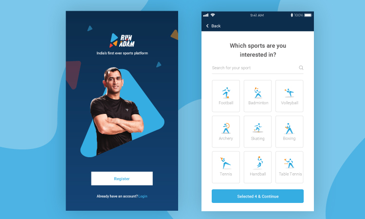
RunAdam or Paytm Money are good examples of the brands with complementary colours.
These colours share the hues and tones of a base colour. When you use shades of the same colour, the ideal notion behind this is that it creates harmony and natural sync. Monochromatic colour sets are easy to remember since the user can associate these shades with one another and still can remember what brand or product it is.

Farmrise would be a great example of a monochromatic colour brand.
The word analogous means ‘comparable’. By virtue of this, analogous colours refer to any set of colours on the colour wheel that are immediately adjacent, ie, three colours left or right from the one of your choosing. As a set, these four colours will be considered as analogous colours. Analogous colours are preferred when there is a need to create a sense of harmony and contentment for brand design.

Paypal, Mastercard are good examples of the brands with analogous colours.
This method is akin to choosing colours that are evenly spaced in an equilateral triangle. These colours are selected from the wheel in such a way that they provide high contrast and rich vibrancy in design. How do we do this? By picking colours, (to the left or right) that are equally spaced from one another on the colour wheel. For example, if you pick a specific colour on the wheel, you can go ahead and pick a colour that is three colours away on either side. These contrasting colours make for an effective, yet tough to create a palette.

Mozilla and Burger king are good examples of the brands with triadic colours.
This is a four-colour structure evenly spaced on the colour wheel. This scheme is best suitable if you want to create an accent with colours, ie, you choose one dominant colour and three accents supporting it. This colour scheme is similar to triadic, which creates a vibrant and strong palette but is tough to handle.

Google & Microsoft is a good example of a Tetradic colour scheme
My suggestions towards tools that can be used to choose your palette:
Coolors.co – My favorite tool it’s super easy to use and it can show you multiple analogous variations of a single hue.
Canva Colour wheel – This is my handy tool towards choosing the type of combination that I want to pick I’ll be able to generate my combinations. I use Canva Colour wheel to build my palette.
Hope this helps you in building a beautiful palette for your product, Happy branding!


