


Design and technology have worked together to create a world of design interfaces like never before. The Indian sports industry has been no stranger to this wondrous feat. With increased participation and viewership, it is only fitting that a whole new industry – the sports tech industry – has emerged. Sports tech has enabled a lot of things to take place in ways that they never could before. In cricket, the third umpire is able to make decisions better, with different technology giving them inputs and data.
The rise of sports tech has also given rise to sporting events, including league challenges. Today, analytics have taken fantasy sporting to an unforeseen level, where people can form their teams based on real statistical data, rather than on gut instincts. In the last 3 years, we have seen a large increase in users engaging in fantasy sports in India. Crunching numbers has become a trend amongst fans, who actively take an interest in statistical data.
Incorporating design thinking in the strategy will define the pioneers in this industry; In this piece, we have laid out a few basic principles that an entrepreneur or a designer should consider while designing a sports platform:

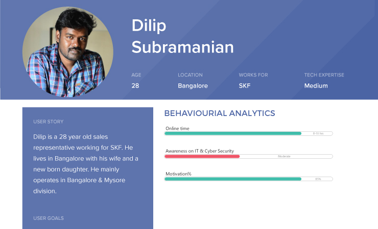
Research is fundamental to strategizing; It is absolutely critical to have complete clarity on the target audience, how they are classified based on similar parameters, their needs and preferences, and motivations and frustrations. The research will help you identify the ecosystem and the hidden opportunities within. Research insights often help us to define and give inputs in the business processes and strategies, thereby enabling us to craft a solution that is meaningful and holistic. For an entrepreneur, research is an eye-opener and for a designer, it serves as a learning curve.
A compelling story can make or break your brand. For a business, a good story can increase engagement and turn your users into brand advocates. For a designer, the story helps you craft a meaningful experience as it enhances empathy and forces you to ask the right questions. Always ask why questions; why are you designing a platform? Why will a user use it? Why is this a good solution? Who is the hero of the platform? (Your users, remember that!) Create conflicting scenarios where you are solving a problem of your user, create structure, how a user will progress in his/ her journey when on your platform, evoke emotions by incorporating elements and calls to action. Voila! You now have a guided and compelling storyline that will stay etched in your users’ minds.

When you have a well-defined user persona, a good storyline, and different scenarios; prioritizing features becomes easy. The more specific the nuances, the better clarity you would gain and creating a clutter-free structure that gets straight to the point will be easier to comprehend.
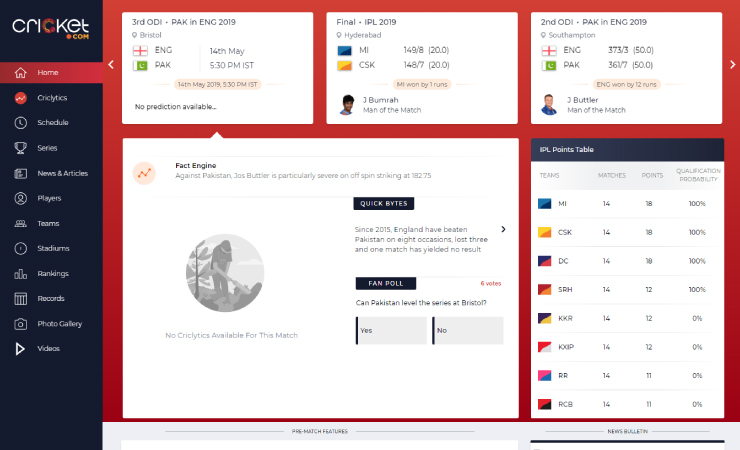
The Gestalt principles of similarity and proximity are important to consider. These principles identify that humans perceive information cumulatively. Understanding what information is similar can help you group together similar data points and give you the right idea of how exactly they must be grouped together. For instance, in cricket, the current over, the run rate of the team, and the score are closely related. Knowledge of all these factors can help one make sense of them and even create new information, in the form of predictions and projections. These factors need to be grouped together in the correct order, in the right position, so as to make sense to the user. These principles are extremely helpful for a designer when designing a sports platform.

Users are usually multitaskers who expect quick results. A platform needs to be designed keeping in mind that the human mind can comprehend a minimum of 5 and a maximum of 9 elements, such that they engage the person and are not visually cluttered. When designing a sports platform, data is crucial; it is, thus, of immense importance to create a simple layout that is useful and easy to comprehend.
A well-defined and an easy to use navigation system can be a winner for the sports tech platforms. From experience, we have seen that an open navigation system works far better than a tree navigation system, wherein navigation options are hidden. Research can help you decide what is important to your users and the business, thus allowing you to define the elements that will be presented on the platform.
Fast paced evolution of technology has led to a lifestyle that requires us to constantly be on the move. It is thus important to build apps and platforms that cater to users that are always on-the-go. For a sports tech platform, keeping this in mind is all the more critical; everyone needs to catch a score or watch a highlight in a matter of seconds; hence, we recommend always taking a mobile-first approach and designing for the smallest screen first with the most important data pointers. Later the designs could be extended to bigger screens.

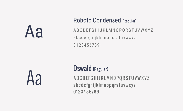
If you are a designer, you already know how important an appropriate typeface is for the creation of a brand. A balanced typeface is what showcases the personality of the brand; It is very important to select a typeface that allows readability and can evoke brand emotions. Since the sports domain is extremely number heavy, it is important to use fonts with clear numerical characters. For example, Roboto Condensed or Oswald can be a good choice.
Icons follow the principle of relatability and help you aid a quick understanding of the users. For a sports platform, incorporating basic sports iconography helps, as it is identifiable on the basis of the experiences of the users.
![]()
Understanding the psychology of colour is especially beneficial when designing a platform because you are then in charge of the emotion you evoke from the user. When designing a sports platform, it is advisable to keep colour swatches that do not pump your blood too hard; we generally experience an adrenaline rush while we are watching our favourite sports and thus no color that increases the blood pressure should be used. We suggest using soothing colours to neutralize the emotions and provide a minimalistic effect, helping you ensure a balance of emotions for the target audience.

Perhaps one of the most important considerations, it is important to know how to fulfill the business goal of ensuring high customer acquisition and profitable revenues. The only way to do this is by understanding the needs of the users, as highlighted in the first pointer.
If you follow the above pointers, you are sure to be on the right path towards creating an interface for the sports tech industry that is engaging, informative and serves the needs of the business and users.
If you loved this, check out our blogs Innovation in Sportstech and Designing Sports Analytics.


